Options
Which do you prefer - for cataloging - displaying purpose?
 Numiven
Posts: 382 ✭✭✭
Numiven
Posts: 382 ✭✭✭
Hello!
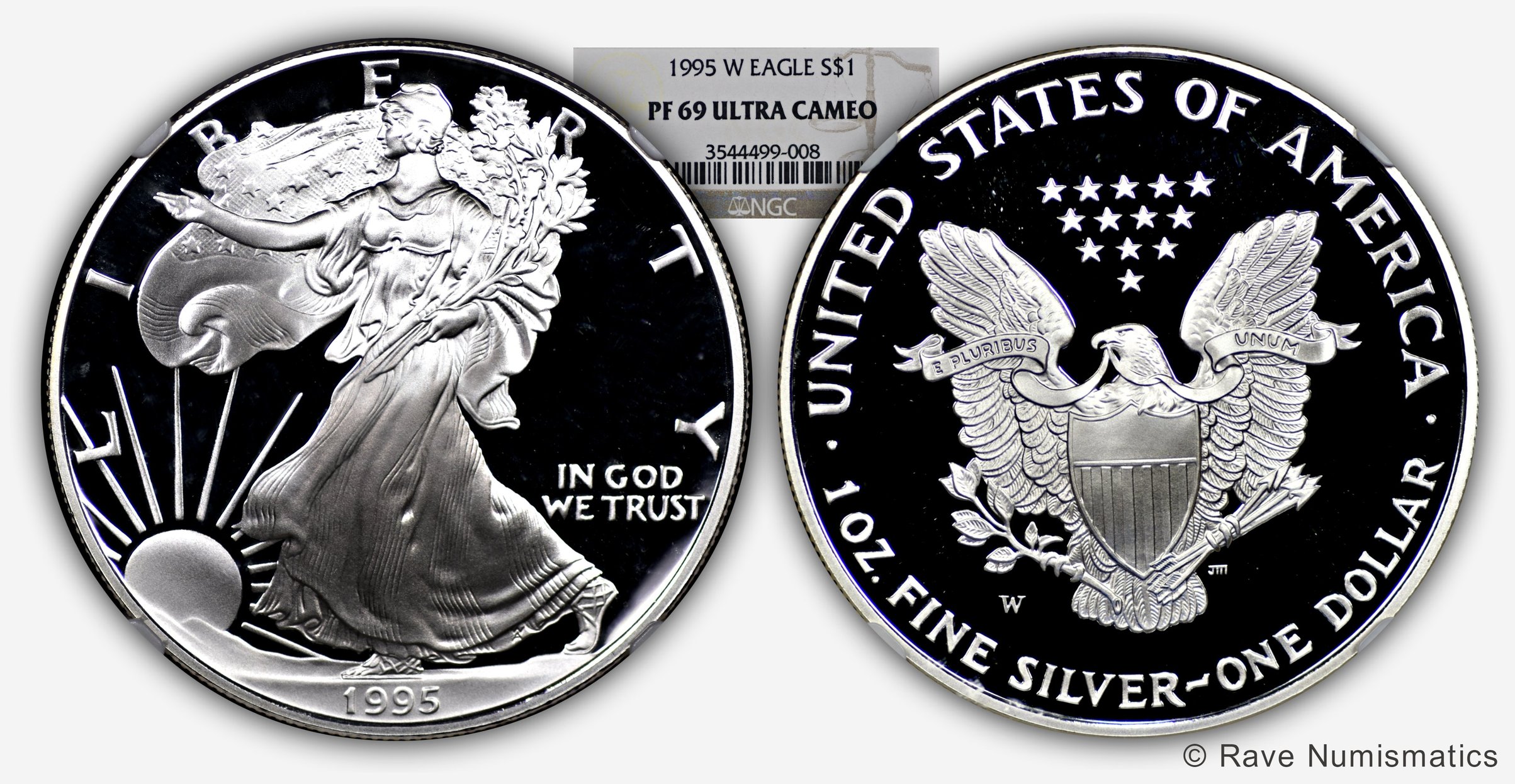
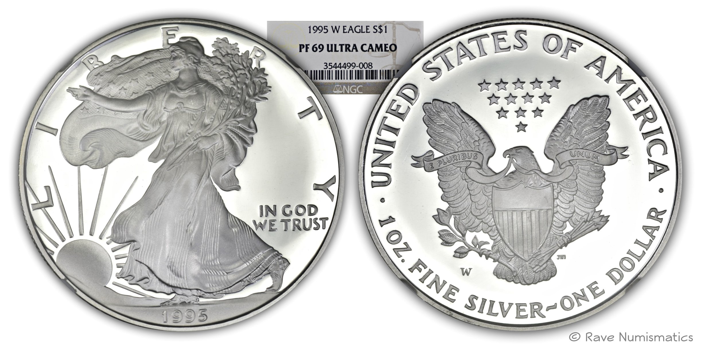
A Saturday spent in photographing ASE proofs!
I have tried to capture the beauty of my 1995-W silver eagle proof in two different ways. I am split between two different views and would need help in suggesting me the best view for cataloging purposes.
Is there a standard in the industry for imaging Ultra Cameo Proof Coins?
PCGS coin facts page has these two types of views, so not sure which is better than the other.
Love and respect all your inputs!
Note: My images have some imperfections for the pro photographic eyes, but does not change the way the overall coin looks in these two views.
Thank you.
View 1: Dark Fields - I see this type of images in most auction sites such as HA, GC etc
View 2: Fields are lit up
4
Comments
Option 1 for me - I like the white and black contrast.
White on black is the traditional way to show cameo contrast on coins.
Keeper of the VAM Catalog • Professional Coin Imaging • Prime Number Set • World Coins in Early America • British Trade Dollars • Variety Attribution
The US Mint uses the lit fields approach as well as a half and half approach where half is dark and half is lit.
If catalog space permits, why not use both?
Option 1
RMR: 'Wer, wenn ich schriee, hörte mich denn aus der Engel Ordnungen?'
CJ: 'No one!' [Ain't no angels in the coin biz]
I like them both... but if only keeping one, for me, it would be option one....Because that supports the UCAM designation.....Cheers, RickO
Both. I like how the combination of the two shows you that the field isn't perfectly flat.
ANA 50+ year/Life Member (now "Emeritus")
Author: 3rd Edition of the SampleSlabs book, https://sampleslabs.info/