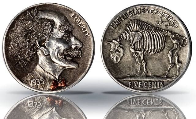
I don't know the specifics for these carvings -- when was this one done? My first thought is that it must be fairly modern, as it does not resemble the pieces I have seen from the depression era.
Its modern, which I have nothing against... if I was taking a guess at the artist I would say its similiar to Alex Ostrogradsky but Alex usually puts his mark on his work.... most of the modern folks do nowadays so not sure off hand who did it...
If they can carve coins they could carve dies. Why doesn't the mint hire actual artists who work with actual metal instead of computer cartoon illustrators?
If they can carve coins they could carve dies. Why doesn't the mint hire actual artists who work with actual metal instead of computer cartoon illustrators?
Originally posted by: BryceM If they can carve coins they could carve dies. Why doesn't the mint hire actual artists who work with actual metal instead of computer cartoon illustrators?
Originally posted by: BryceM If they can carve coins they could carve dies. Why doesn't the mint hire actual artists who work with actual metal instead of computer cartoon illustrators?
The US Mint enlists artists to create pencil drawings. The drawings are reviewed, selected, and approved. Then US Mint staff converts those pencil drawings into 3D sculpture via traditional and/or computerized methods.
I think this is a flawed process, but not because of the computerized component. The computer is just another sculpting tool, and it is only as good as the skill or the sculptor.
The reason that the US Mint's process is flawed is because there are too many people involved. First, a committee decides on and mandates the design theme for a coin. Then the original artist creates a design in pencil. Various committees (CFA, CCAC, etc) review the designs and request modifications. By this point, much of the style and vision has been stripped out of the design. Then a different artist (a US Mint sculptor/engraver) sculpts the design in 3D.
Having one artist design a coin and a different one sculpt it will usually yield something that neither artist is happy with. It is far better for a coin or medal to be the product of ONE artist, from start to finish.
The US Mint may be learning. The recently-announced US Mint design competition for the WW1 commemorative coins requires submitting artists to design AND SCULPT their proposals. We well see how that turns out.
PS: Here are a couple designs that I minted using a sculpting software program that I wrote myself:
If they can carve coins they could carve dies. Why doesn't the mint hire actual artists who work with actual metal instead of computer cartoon illustrators?
The mandate that dies last a long time is one of the weak links. Dull, flat designs don't wear out as quickly as sharply detailed high relief ones. For what the Mint charges for commemoratives, you'd think they could treat their customers to some stunning coinage, but they don't.
Create me something that looks like the fields of a buffalo nickel or Liberty's hair on the Peace dollar with a computer program and I'll be a believer. I admire Dan's work (quite a bit actually), but his original works looks like they came from a computer. They are artistic, yes, but they still lack the soul of this nation's renaissance coinage. The surfaces are too uniform, the texture of the fields too perfect. The overstruck Peace dollars, Barbers and such might be an exception, but they're probably transferred from the originals, which were created by hand. That aside, I wholeheartedly agree with Dan's points about design and production by committee.
I am aware of the issues with die life and high relief coins. It's clear that the mint had plenty of striking issues with most of the coins of the renaissance and earlier eras. With a little effort they overcame most of them. I'm sure if they put their minds to it, with today's superior materials and stress-analysis tools, they could find a way to avoid the uber-perfect faux-textured look of their modern designs while maintaining something suitable for mass production. It's not like everything they've produced in the clad area has been well-struck either.
Besides that, I love die cracks, die polish lines, imperfect hubbing, hand retouching, clashes, cuds, irregular surface textures, lines cut beyond their boundaries, overdates, and variable mint mark placements. Part of the allure of classic series such as Morgans, Saints, Peace dollars, CBH, & SLQs is that the different issues within the series have personality and quirky characteristics. Everyone knows what a 1923-D Saint looks like. Everyone knows that 1926 Peace dollars have a curiously emboldened "GOD" in the lettering. Lincolns from different eras are vastly different in their look. Thirty years of SAEs have mostly given us 30 identical coins.
Apologies to the OP for derailing the intent of his initial post. It is a stunning hobo nickel. Some of the modern work being produced is really impressive.
That nickel is stunning!! I have a deep appreciation for that kind of art.
Dan, you just proved your own point. The mint has far too many people involved with the creative process. You have the luxury of full control over your creative process, the results speak for themselves. Your artistry is inspiring and your mastery of your tools shows.
Imagine if they let Charles Barber perform all the requested modifications to Hermon MacNeil's Standing Liberty Quarter design. Sure Charles was a competent artist, but the SLQ was not his vision. The mint was wise in letting the original artist see the design all the way through. Why do you think that era is now known as the renaissance of U.S. coinage. Nearly every coin of that era was designed by different artists, with the exception to Saint Gaudens and Weinman who each designed (2) coins.
Originally posted by: BryceM Create me something that looks like the fields of a buffalo nickel or Liberty's hair on the Peace dollar with a computer program and I'll be a believer. I admire Dan's work (quite a bit actually), but his original works looks like they came from a computer. They are artistic, yes, but they still lack the soul of this nation's renaissance coinage. The surfaces are too uniform, the texture of the fields too perfect. The overstruck Peace dollars, Barbers and such might be an exception, but they're probably transferred from the originals, which were created by hand. That aside, I wholeheartedly agree with Dan's points about design and production by committee.
I am aware of the issues with die life and high relief coins. It's clear that the mint had plenty of striking issues with most of the coins of the renaissance and earlier eras. With a little effort they overcame most of them. I'm sure if they put their minds to it, with today's superior materials and stress-analysis tools, they could find a way to avoid the uber-perfect faux-textured look of their modern designs while maintaining something suitable for mass production. It's not like everything they've produced in the clad area has been well-struck either.
Besides that, I love die cracks, die polish lines, imperfect hubbing, hand retouching, clashes, cuds, irregular surface textures, lines cut beyond their boundaries, overdates, and variable mint mark placements. Part of the allure of classic series such as Morgans, Saints, Peace dollars, CBH, & SLQs is that the different issues within the series have personality and quirky characteristics. Everyone knows what a 1923-D Saint looks like. Everyone knows that 1926 Peace dollars have a curiously emboldened "GOD" in the lettering. Lincolns from different eras are vastly different in their look. Thirty years of SAEs have mostly given us 30 identical coins.
Apologies to the OP for derailing the intent of his initial post. It is a stunning hobo nickel. Some of the modern work being produced is really impressive.
Here is a highly-textured field that I sculpted and carved digitally:
Here is another example with textured fields:
I wrote my sculpting program with this sort of free-form thing in mind, and in that regard, it is different than other "CAD" software.
 grip
Posts: 9,962 ✭✭✭✭✭
grip
Posts: 9,962 ✭✭✭✭✭
 [/URL]
 ![http://s57.photobucket.com/user/coinsareus10/media/hobo nic.Buff.jpg.html]](https://forums.collectors.com/home/leaving?allowTrusted=1&target=http%3A%2F%2Fs57.photobucket.com%2Fuser%2Fcoinsareus10%2Fmedia%2Fhobo%2520nic.Buff.jpg.html%5D)
Comments
PCGS Registries
Box of 20
SeaEagleCoins: 11/14/54-4/5/12. Miss you Larry!
There are some amazing artists out there.
+1
imo, this is one of the top quality ones ive seen and ive seen a lot of em.
.
"You ain't seen nothing yet". LOL
That's amazing work!!
that it is
HAPPY COLLECTING
If they can carve coins they could carve dies. Why doesn't the mint hire actual artists who work with actual metal instead of computer cartoon illustrators?
Where is the LIKE button.
If they can carve coins they could carve dies. Why doesn't the mint hire actual artists who work with actual metal instead of computer cartoon illustrators?
Where is the LIKE button.
Double LIKE
Coins for Sale: Both Graded and Ungraded
https://photos.app.goo.gl/oqym2YtcS7ZAZ73D6
If they can carve coins they could carve dies. Why doesn't the mint hire actual artists who work with actual metal instead of computer cartoon illustrators?
The US Mint enlists artists to create pencil drawings.
The drawings are reviewed, selected, and approved.
Then US Mint staff converts those pencil drawings into 3D sculpture via traditional and/or computerized methods.
I think this is a flawed process, but not because of the computerized component.
The computer is just another sculpting tool, and it is only as good as the skill or the sculptor.
The reason that the US Mint's process is flawed is because there are too many people involved. First, a committee decides on and mandates the design theme for a coin. Then the original artist creates a design in pencil. Various committees (CFA, CCAC, etc) review the designs and request modifications. By this point, much of the style and vision has been stripped out of the design. Then a different artist (a US Mint sculptor/engraver) sculpts the design in 3D.
Having one artist design a coin and a different one sculpt it will usually yield something that neither artist is happy with. It is far better for a coin or medal to be the product of ONE artist, from start to finish.
The US Mint may be learning. The recently-announced US Mint design competition for the WW1 commemorative coins requires submitting artists to design AND SCULPT their proposals. We well see how that turns out.
PS:
Here are a couple designs that I minted using a sculpting software program that I wrote myself:
If they can carve coins they could carve dies. Why doesn't the mint hire actual artists who work with actual metal instead of computer cartoon illustrators?
The mandate that dies last a long time is one of the weak links. Dull, flat designs don't wear out as quickly as sharply detailed high relief ones. For what the Mint charges for commemoratives, you'd think they could treat their customers to some stunning coinage, but they don't.
Keeper of the VAM Catalog • Professional Coin Imaging • Prime Number Set • World Coins in Early America • British Trade Dollars • Variety Attribution
I am aware of the issues with die life and high relief coins. It's clear that the mint had plenty of striking issues with most of the coins of the renaissance and earlier eras. With a little effort they overcame most of them. I'm sure if they put their minds to it, with today's superior materials and stress-analysis tools, they could find a way to avoid the uber-perfect faux-textured look of their modern designs while maintaining something suitable for mass production. It's not like everything they've produced in the clad area has been well-struck either.
Besides that, I love die cracks, die polish lines, imperfect hubbing, hand retouching, clashes, cuds, irregular surface textures, lines cut beyond their boundaries, overdates, and variable mint mark placements. Part of the allure of classic series such as Morgans, Saints, Peace dollars, CBH, & SLQs is that the different issues within the series have personality and quirky characteristics. Everyone knows what a 1923-D Saint looks like. Everyone knows that 1926 Peace dollars have a curiously emboldened "GOD" in the lettering. Lincolns from different eras are vastly different in their look. Thirty years of SAEs have mostly given us 30 identical coins.
Apologies to the OP for derailing the intent of his initial post. It is a stunning hobo nickel. Some of the modern work being produced is really impressive.
Dan, you just proved your own point. The mint has far too many people involved with the creative process. You have the luxury of full control over your creative process, the results speak for themselves. Your artistry is inspiring and your mastery of your tools shows.
Imagine if they let Charles Barber perform all the requested modifications to Hermon MacNeil's Standing Liberty Quarter design. Sure Charles was a competent artist, but the SLQ was not his vision. The mint was wise in letting the original artist see the design all the way through. Why do you think that era is now known as the renaissance of U.S. coinage. Nearly every coin of that era was designed by different artists, with the exception to Saint Gaudens and Weinman who each designed (2) coins.
And Dan Carr's inputs are absolutely correct. Cheers, RickO
Create me something that looks like the fields of a buffalo nickel or Liberty's hair on the Peace dollar with a computer program and I'll be a believer. I admire Dan's work (quite a bit actually), but his original works looks like they came from a computer. They are artistic, yes, but they still lack the soul of this nation's renaissance coinage. The surfaces are too uniform, the texture of the fields too perfect. The overstruck Peace dollars, Barbers and such might be an exception, but they're probably transferred from the originals, which were created by hand. That aside, I wholeheartedly agree with Dan's points about design and production by committee.
I am aware of the issues with die life and high relief coins. It's clear that the mint had plenty of striking issues with most of the coins of the renaissance and earlier eras. With a little effort they overcame most of them. I'm sure if they put their minds to it, with today's superior materials and stress-analysis tools, they could find a way to avoid the uber-perfect faux-textured look of their modern designs while maintaining something suitable for mass production. It's not like everything they've produced in the clad area has been well-struck either.
Besides that, I love die cracks, die polish lines, imperfect hubbing, hand retouching, clashes, cuds, irregular surface textures, lines cut beyond their boundaries, overdates, and variable mint mark placements. Part of the allure of classic series such as Morgans, Saints, Peace dollars, CBH, & SLQs is that the different issues within the series have personality and quirky characteristics. Everyone knows what a 1923-D Saint looks like. Everyone knows that 1926 Peace dollars have a curiously emboldened "GOD" in the lettering. Lincolns from different eras are vastly different in their look. Thirty years of SAEs have mostly given us 30 identical coins.
Apologies to the OP for derailing the intent of his initial post. It is a stunning hobo nickel. Some of the modern work being produced is really impressive.
Here is a highly-textured field that I sculpted and carved digitally:
Here is another example with textured fields:
I wrote my sculpting program with this sort of free-form thing in mind, and in that regard, it is different than other "CAD" software.
That's cool! Definitely a step in the right direction.
Dan,
That's cool! Definitely a step in the right direction.
Well, that capability isn't really new. The skeleton fossil was first sculpted in 2011 and the ski medal in 2008.
I think that is a really good carving, especially the bison skeleton.