Home U.S. Coin Forum

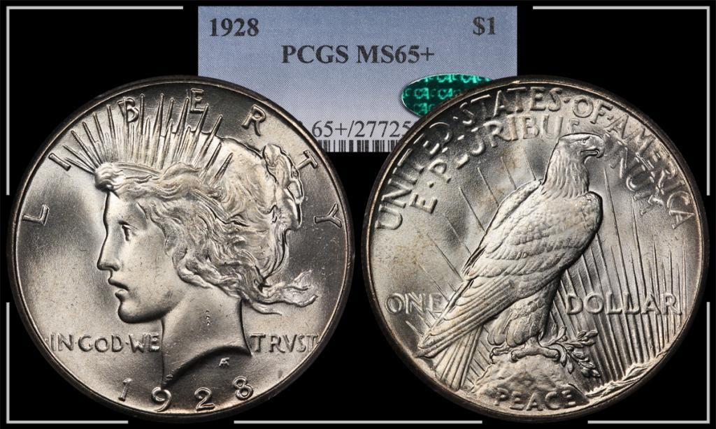
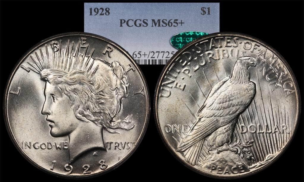
Which photo template do you prefer?

BryceMBryceM Posts: 11,801 ✭✭✭✭✭
Just messing around on a Saturday.......

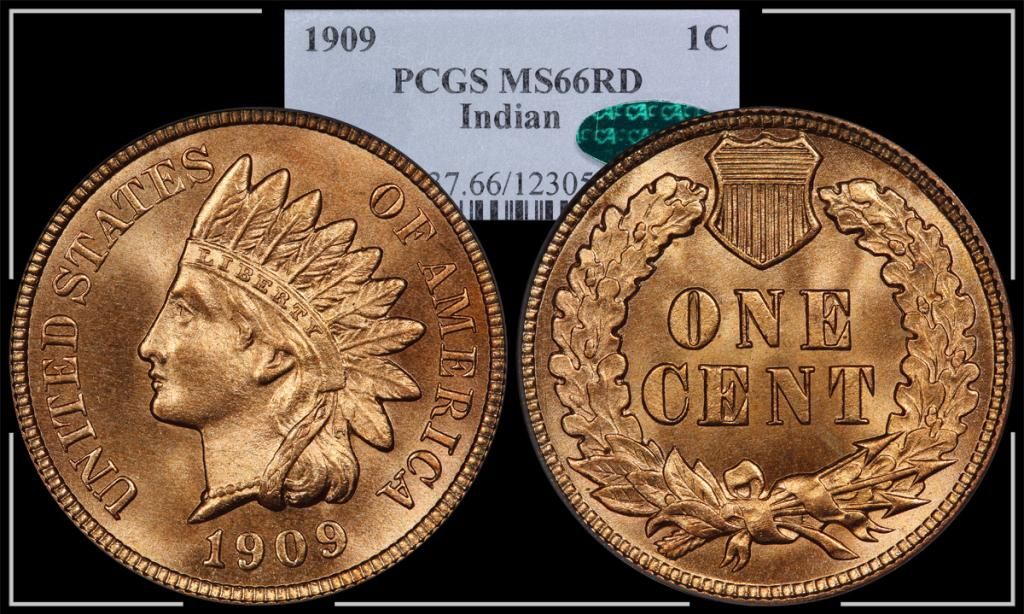
Which template do you prefer? The one with a frame or the simple look? The Indian is a NewP that seems to be easy on the eyes.....
image

image

image

image

Comments

  • 291fifth291fifth Posts: 24,388 ✭✭✭✭✭
    I prefer the plain style. It puts more emphasis on the coin.
    All glory is fleeting.
  • ModCrewmanModCrewman Posts: 4,039 ✭✭✭✭✭
    Just the coin...but it wasn't an easy choice. I don't dislike the border, just as 291fifth said, it's about the coin.
  • sparky64sparky64 Posts: 7,040 ✭✭✭✭✭
    I also slightly prefer the simple look.

    Excellent work, by the way.

    "If I say something in the woods and my wife isn't there to hear it.....am I still wrong?"

    My Washington Quarter Registry set...in progress

  • lasvegasteddylasvegasteddy Posts: 10,408 ✭✭✭


    << <i>I prefer the plain style. It puts more emphasis on the coin. >>


    +1
    everything in life is but merely on loan to us by our appreciation....lose your appreciation and see


  • GRANDAMGRANDAM Posts: 8,544 ✭✭✭✭✭
    Forget the templates I LIKE the coins!!!! image

    Both coins are image but the Indian Cent blows me away!

    I would add the full cert number below the coins so it can be verified if needed.

    I agree the white border isn't needed.

    GrandAm image
    GrandAm :)
  • keyman64keyman64 Posts: 15,507 ✭✭✭✭✭
    Forget the templates, I like the coins!

    As for the templates, I have NEVER been a fan of the ones that cut off the serial numbers. Either put them in or leave them out. It makes no sense to me why one goes through the trouble of taking that 3rd image and then cutting off the numbers like that. It just isn't for me. Some people want the entire label which is fine but just shrink it down to show the entire thing. As for the BOX/NO BOX, I would keep it simple and go without the box, although it is not a negative to me.
    "If it's not fun, it's not worth it." - KeyMan64
    Looking for Top Pop Mercury Dime Varieties & High Grade Mercury Dime Toners. :smile:
  • epcjimi1epcjimi1 Posts: 3,489 ✭✭✭


    << <i>Forget the templates, I like the coins!

    As for the templates, I have NEVER been a fan of the ones that cut off the serial numbers. Either put them in or leave them out. It makes no sense to me why one goes through the trouble of taking that 3rd image and then cutting off the numbers like that. It just isn't for me. Some people want the entire label which is fine but just shrink it down to show the entire thing. As for the BOX/NO BOX, I would keep it simple and go without the box, although it is not a negative to me. >>


    +! Show the cert number.
  • This content has been removed.
  • YorkshiremanYorkshireman Posts: 4,579 ✭✭✭✭✭
    Plain and simple...
    Yorkshireman,Obsessed collector of round, metallic pieces of history.Hunting for Latin American colonial portraits plus cool US & British coins.
  • OGDanOGDan Posts: 3,748 ✭✭✭✭✭
    Definitely no border. Nice coins!
  • rkprkp Posts: 444 ✭✭✭
    I find the broken borders to be distracting. Perhaps if it was complete and the coin was slightly smaller?
  • OldIndianNutKaseOldIndianNutKase Posts: 2,702 ✭✭✭✭✭
    I too prefer the plain (non-framed) template. I think that the cert. no. should be complete, even if you have to dissect the PCGS label into two parts, with the cert. below the coin.

    OINK
  • This content has been removed.
  • mozinmozin Posts: 8,755 ✭✭✭
    Forget the borders, especially since they are in pieces.
    I collect Capped Bust series by variety in PCGS AU/MS grades.
  • BaleyBaley Posts: 22,661 ✭✭✭✭✭
    Great looking coins and templates.

    My opinion is to try making the borders thinner, closer to the edges of the black, and not white, but grey or a pale blue similar to the slab tag blue, and as said, do not break them but make it more of a frame.

    I do find the plain black a little.. plain, but the white broken borders are a bit distracting.. a little more subtle will frame the image and give it some depth, I think

    Liberty: Parent of Science & Industry

  • Rayman311Rayman311 Posts: 423 ✭✭✭
    Nice coins! Like the plain ones.
  • bolivarshagnastybolivarshagnasty Posts: 7,351 ✭✭✭✭✭
    Love the 09 Indian. Looks like a high end example of a 66RD. Plain format for me, choosing from the two.
  • ms70ms70 Posts: 13,954 ✭✭✭✭✭
    Plain.

    Great transactions with oih82w8, JasonGaming, Moose1913.

  • BroadstruckBroadstruck Posts: 30,497 ✭✭✭✭✭
    W/O the white boarder as it's way too busy.
    To Err Is Human.... To Collect Err's Is Just Too Much Darn Tootin Fun!
  • goldengolden Posts: 9,706 ✭✭✭✭✭
    I like the plain . Super Indian!image
  • oih82w8oih82w8 Posts: 12,289 ✭✭✭✭✭
    Gotta go with the plain style as well...less clutter and the viewer can focus on what is important...the coin!
    oih82w8 = Oh I Hate To Wait _defectus patientia_aka...Dr. Defecto - Curator of RMO's

    BST transactions: dbldie55, jayPem, 78saen, UltraHighRelief, nibanny, liefgold, FallGuy, lkeigwin, mbogoman, Sandman70gt, keets, joeykoins, ianrussell (@GC), EagleEye, ThePennyLady, GRANDAM, Ilikecolor, Gluggo, okiedude, Voyageur, LJenkins11, fastfreddie, ms70, pursuitofliberty, ZoidMeister,Coin Finder, GotTheBug, edwardjulio, Coinnmore, Nickpatton, Namvet69,...
  • CoinJunkieCoinJunkie Posts: 8,772 ✭✭✭✭✭
    The broken border look doesn't really work for me.
  • BryceMBryceM Posts: 11,801 ✭✭✭✭✭
    Thanks for the input everyone. I'll probably just leave it like it was. My goal has always been to show the coin to maximum advantage. The label insert contains enough relevant information to be worth including. Beyond that it's probably just clutter.

    As far as the cert number, I have mixed feelings. Sometimes I like the anonymity of not having everyone & their dog know how, when, and for what amount it was acquired. In reality though, it doesn't matter that much 99% of the time.
  • This content has been removed.
  • BochimanBochiman Posts: 25,418 ✭✭✭✭✭
    The border, particularly when used with broken lines, distracts.
    If using a border, best to use a solid border and not have it broken up.

    Also agree that, if certs are shown, then the entire cert should be shown.

    I've been told I tolerate fools poorly...that may explain things if I have a problem with you. Current ebay items - Nothing at the moment

  • CameonutCameonut Posts: 7,302 ✭✭✭✭✭
    Plain. Simpler is better as it helps to focus on the coin.

    “In matters of style, swim with the current; in matters of principle, stand like a rock." - Thomas Jefferson

    My digital cameo album 1950-64 Cameos - take a look!

  • rickoricko Posts: 98,724 ✭✭✭✭✭
    No frame... great pictures and really nice coins...Cheers, RickO
  • lcoopielcoopie Posts: 8,873 ✭✭✭✭✭
    Don't like the label in the photo
    LCoopie = Les
  • RollermanRollerman Posts: 1,869 ✭✭✭✭✭
    Well, I'm in the minority, but I like the border as it kind of looks classy to me. I think the numbers should show however and do agree with everyone that those are a couple of really nice coins.
    Pete
    "Ain't None of Them play like him (Bix Beiderbecke) Yet."
    Louis Armstrong
  • TopographicOceansTopographicOceans Posts: 6,535 ✭✭✭✭


    << <i>Don't like the label in the photo >>

    I agree with that and without the frame.
    The label takes up a lot of real estate and is distracting but does have some useful information.

    Perhaps use a variation of the TrueView format but with the grade centered in bold on the bottom and a smaller font below it for the cert number.


    MS66RD
    12305999

Leave a Comment

BoldItalicStrikethroughOrdered listUnordered list
Emoji
Image
Align leftAlign centerAlign rightToggle HTML viewToggle full pageToggle lights
Drop image/file