Recent Purchases with New Photo setup.... Opinions welcome
 Oney
Posts: 1,394 ✭✭✭✭
Oney
Posts: 1,394 ✭✭✭✭
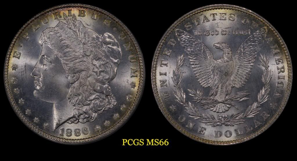
Have not posted in a while, thought this might be an opportunity to become a regular again. I finally went out and bought a copy stand to improve the quality of my coin pictures. What do you think of the new photo? The coins are also a recent pick ups.


Brian
0
Comments
I think it's an outstanding pic. Nice presentation too.
Looking forward to more.
"If I say something in the woods and my wife isn't there to hear it.....am I still wrong?"
My Washington Quarter Registry set...in progress
Looking for Top Pop Mercury Dime Varieties & High Grade Mercury Dime Toners.
<< <i>great pic if you get the lights at 10 and 2 and at an angle you will show more luster on the fields. (bigger cartwheels) >>
I seem to prefer lighting to shine on the FACE of any coin. Yours seem to be doing this. I like to light a Lincoln cent from 2 oclock and have the front of Lincolns face as a focal point. The same lighting puts a shadow on an indian cents face and makes it too dark. Doing some of both is good but I emphasize the face when I can. Great work!
To be picky...I would brighten them up a little. They look underexposed. Focus could be a little crisper. And there's a little too much blue to them, especially the '79. Maybe a white balance temperature tweak.
Lance.