Eww, check out this nasty chart I came across today.
 Pokermandude
Posts: 2,713 ✭✭✭
Pokermandude
Posts: 2,713 ✭✭✭
Possibly not very good looking for silver!
Edit: although the scale of the chart makes it hard to tell. It takes a lot bigger move in prices to get near the bottom of the Y axis.
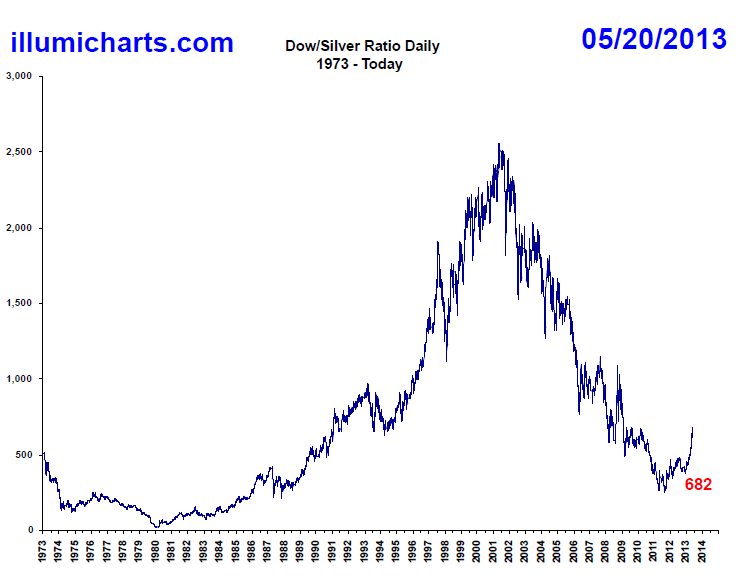
Edit: although the scale of the chart makes it hard to tell. It takes a lot bigger move in prices to get near the bottom of the Y axis.
http://stores.ebay.ca/Mattscoin - Canadian coins, World Coins, Silver, Gold, Coin lots, Modern Mint Products & Collections
0
Comments
<< <i>Possibly not very good looking for silver! >>
only if the short term trend continues. If the long term trend continues silver will be looking pretty good.
When gold and silver move together, it signals the coming end of fiat money.
The reverse is also true. Stocks could drop and silver could rise, causing the Dow/Silver ratio to decrease.
Which brings us back 'round to the fundamentals - for both the stock market and for silver.
In my mind, the Fed has no choice but to support the stock market. The politics won't permit any other option.
Unfortunately, supporting the stock market isn't exactly the same as helping the economy. In my opinion, silver reacts best to a vibrant economy these days. It used to be that silver would react to world news and monetary policy, and I don't think that that relationship has been completely extinguished. So, with silver we have a metal that does react to various (and sometimes divergent) stimuli.
Remembering some basic mathematical relationships, a number such as 15,000/25 will be much more sensitive to changes in the denominator.
Which makes this ratio a bit over-stated if you think that it reflects much about the stock market. To me, the usefulness of this ratio is about on par with the price of silver. Why not just monitor silver instead?
That's my analysis.
I knew it would happen.
<< <i>
<< <i>Possibly not very good looking for silver! >>
only if the short term trend continues. If the long term trend continues silver will be looking pretty good. >>
Indeed, the short term trend looks quite bad as it leaves the long term "channel". Then again, due to the nature/scale of the chart, there will be much more "noise"/volatility when it is near the bottom of the Y axis.
What if the stock market is "supporting" the stock market and not the FED?
Knowledge is the enemy of fear
What if the stock market is "supporting" the stock market and not the FED?
Define "play out". How's this one playing out?
The stock market can be reacting to the news and not particularly to QE at this moment, I'll grant you that.
But, let's see what happens if, and when they taper. Then we'll know more than we do now, won't we?
I knew it would happen.
When gold and silver move together, it signals the coming end of fiat money.
Each one goes up or down depending on the specific developments with the company's business, as well as the trend of the sector it's in and the overall "market" sentiment.
The Fed cannot be blamed for the poor stock performance of a relatively poorly performing company (versus its peers), any more than the Fed can be credited for the good performance of a good company, imo.
Dow components:
NYSE MMM Conglomerate 1976-08-09 as Minnesota Mining and Manufacturing
Alcoa NYSE AA Aluminum 1959-06-01 as Aluminum Company of America
American Express logo.svg American Express NYSE AXP Consumer finance 1982-08-30
AT&T NYSE T Telecommunication 1999-11-01 as SBC Communications
Bank of America NYSE BAC Banking 2008-02-19
Boeing wordmark.svg Boeing NYSE BA Aerospace and defense 1987-03-12
Caterpillar logo.svg Caterpillar NYSE CAT Construction and mining equipment 1991-05-06
Chevron Corporation NYSE CVX Oil & gas 2008-02-19 also 1930-07-18 to 1999-11-01
Cisco logo.svg Cisco Systems NASDAQ CSCO Computer networking 2009-06-08
The Coca-Cola Company logo.svg Coca-Cola NYSE KO Beverages 1987-03-12 also 1932-05-26 to 1935-11-20
DuPont.svg DuPont NYSE DD Chemical industry 1935-11-20 also 1924-01-22 to 1925-08-31
Exxon Mobil Logo.svg ExxonMobil NYSE XOM Oil & gas 1928-10-01 as Standard Oil of New Jersey
General Electric NYSE GE Conglomerate 1907-11-07
HP logo 2012.svg Hewlett-Packard NYSE HPQ Computers and technology 1997-03-17
TheHomeDepot.svg The Home Depot NYSE HD Home improvement retailer 1999-11-01
Intel-logo.svg Intel NASDAQ INTC Semiconductors 1999-11-01
IBM logo.svg IBM NYSE IBM Computers and technology 1979-06-29 also 1932-05-26 to 1939-03-04
JohnsonandJohnsonLogo.svg Johnson & Johnson NYSE JNJ Pharmaceuticals 1997-03-17
J P Morgan Chase Logo 2008 1.svg JPMorgan Chase NYSE JPM Banking 1991-05-06 as J.P. Morgan & Company
McDonald's Golden Arches.svg McDonald's NYSE MCD Fast food 1985-10-30
Merck NYSE MRK Pharmaceuticals 1979-06-29
Microsoft logo and wordmark.svg Microsoft NASDAQ MSFT Software 1999-11-01
Pfizer NYSE PFE Pharmaceuticals 2004-04-08
Procter and Gamble Logo.svg Procter & Gamble NYSE PG Consumer goods 1932-05-26
Travelers NYSE TRV Insurance 2009-06-08 Property, casualty and personal insurance.
UnitedHealth Group logo.jpg UnitedHealth Group NYSE UNH Managed health care 2012-09-24
United Technologies Corporation NYSE UTX Conglomerate 1939-03-14 as United Aircraft
Verizon logo.svg Verizon NYSE VZ Telecommunication 2004-04-08
New Walmart Logo.svg Wal-Mart NYSE WMT Retail 1997-03-17
Disney wordmark.svg Walt Disney NYSE DIS Broadcasting and entertainment 1991-05-06
each of those companies has buildings, plants, equipment, vehicles, inventory, raw material and finished product supply chains and logistics, and of course thousands of employees...
.. and then there are pieces of silver molded in various shapes
Liberty: Parent of Science & Industry
<< <i>Anyone who believes the FED is not responsible for record stock market highs is not paying attention. When and if the FED tapers you will get further proof, but you gotta be paying attention. >>
It not just QE though. Five straight years of ZIRP and record deficit spending have as much to do with supporting equities as QE does.
Remove the QE, return interest rates to reasonable levels, and end deficit spending. We'll then find out our economy is 3/4 the size of what we're so busy destroying our currency to prop up.
It has to happen sometime so we can start anew and get legitimately stronger. We're on course for 80% of America to be on public aid within 25 years. That has to change too.
It would be good to find out what our economy is really doing. Stock market juiced by QE, half the population free riding on the backs of the worker bees, gov giving out Ben's all over the world (bags of cash in some circumstances) and we seem to keep sliding closer and closer to insolvency.
So what about a quick test: raise the overnight rate a whole point, pull QE back 25% (just for a couple of quarters), raise real estate mortgage rates by a whole point, and stop deficit spending for a couple of quarters. Then maybe we can see just what a righteous equities market looks like and what an more honest USD actually buys.
The SP-500 is only about 10% higher than it was 13 years ago. THIRTEEN YEARS AGO. Companies have cut A LOT of dead weight and are much leaner and meaner than over a decade ago.
Now im not saying stocks cant drop 20%, but to say that the ONLY reason stocks are higher is due to the FED shows that someone definately is not paying attention.
Knowledge is the enemy of fear
Ratio charts are great tools because they often go to parabolic extremes. This of course means there will be a reversion to the mean.
They way I read the chart is that while there is a possibility for silver to appreciate vs stocks such as in the 1976 to 1980 time period, there is also high probability that the ratio goes towards a mean of approximately 9-10.
Knowledge is the enemy of fear
My problem with ratio charts, while they may show a trend, is that they do not indicate direction of either of the two assets.
When gold and silver move together, it signals the coming end of fiat money.
<< <i>The "stock market" is made up of thousands of individual securities. Even the "Dow" index is made up of the stock of 30 assorted companies.
Each one goes up or down depending on the specific developments with the company's business, as well as the trend of the sector it's in and the overall "market" sentiment.
The Fed cannot be blamed for the poor stock performance of a relatively poorly performing company (versus its peers), any more than the Fed can be credited for the good performance of a good company, imo.
Dow components:
NYSE MMM Conglomerate 1976-08-09 as Minnesota Mining and Manufacturing
Alcoa NYSE AA Aluminum 1959-06-01 as Aluminum Company of America
American Express logo.svg American Express NYSE AXP Consumer finance 1982-08-30
AT&T NYSE T Telecommunication 1999-11-01 as SBC Communications
Bank of America NYSE BAC Banking 2008-02-19
Boeing wordmark.svg Boeing NYSE BA Aerospace and defense 1987-03-12
Caterpillar logo.svg Caterpillar NYSE CAT Construction and mining equipment 1991-05-06
Chevron Corporation NYSE CVX Oil & gas 2008-02-19 also 1930-07-18 to 1999-11-01
Cisco logo.svg Cisco Systems NASDAQ CSCO Computer networking 2009-06-08
The Coca-Cola Company logo.svg Coca-Cola NYSE KO Beverages 1987-03-12 also 1932-05-26 to 1935-11-20
DuPont.svg DuPont NYSE DD Chemical industry 1935-11-20 also 1924-01-22 to 1925-08-31
Exxon Mobil Logo.svg ExxonMobil NYSE XOM Oil & gas 1928-10-01 as Standard Oil of New Jersey
General Electric NYSE GE Conglomerate 1907-11-07
HP logo 2012.svg Hewlett-Packard NYSE HPQ Computers and technology 1997-03-17
TheHomeDepot.svg The Home Depot NYSE HD Home improvement retailer 1999-11-01
Intel-logo.svg Intel NASDAQ INTC Semiconductors 1999-11-01
IBM logo.svg IBM NYSE IBM Computers and technology 1979-06-29 also 1932-05-26 to 1939-03-04
JohnsonandJohnsonLogo.svg Johnson & Johnson NYSE JNJ Pharmaceuticals 1997-03-17
J P Morgan Chase Logo 2008 1.svg JPMorgan Chase NYSE JPM Banking 1991-05-06 as J.P. Morgan & Company
McDonald's Golden Arches.svg McDonald's NYSE MCD Fast food 1985-10-30
Merck NYSE MRK Pharmaceuticals 1979-06-29
Microsoft logo and wordmark.svg Microsoft NASDAQ MSFT Software 1999-11-01
Pfizer NYSE PFE Pharmaceuticals 2004-04-08
Procter and Gamble Logo.svg Procter & Gamble NYSE PG Consumer goods 1932-05-26
Travelers NYSE TRV Insurance 2009-06-08 Property, casualty and personal insurance.
UnitedHealth Group logo.jpg UnitedHealth Group NYSE UNH Managed health care 2012-09-24
United Technologies Corporation NYSE UTX Conglomerate 1939-03-14 as United Aircraft
Verizon logo.svg Verizon NYSE VZ Telecommunication 2004-04-08
New Walmart Logo.svg Wal-Mart NYSE WMT Retail 1997-03-17
Disney wordmark.svg Walt Disney NYSE DIS Broadcasting and entertainment 1991-05-06
each of those companies has buildings, plants, equipment, vehicles, inventory, raw material and finished product supply chains and logistics, and of course thousands of employees...
.. and then there are pieces of silver molded in various shapes
History seems to point to whims/sentiment more than fundamentals in the gauging of which way the wind blows. Lets never forget the Tulips, and those grand stout companies of 1929.
In a sane, fair and just world, spared of greed and fear, fundamentals would be the "it" factor to beat all.
We just don't seem to be in that environment though.
Very bullish long term, but right now , hoarding FRNs.
when FED signals real tapering start, silver should plummet to $15-$18 oz and then slowly
recover on its inherit strength.
Long term, its a bargain at this price, it is all a matter of how long you are.
I did buy some around $19.
Loves me some shiny!
“Often wrong, but never in doubt.”
<< <i>Ratio charts are great for historians. I do enjoy studying RSI patterns assoicated with ratio charts.
My problem with ratio charts, while they may show a trend, is that they do not indicate direction of either of the two assets.[/]
Actually I think they are extremely good at predicting direction of one or even both components, especially on a relative level, which is where over time, good investors become great investors.
Knowledge is the enemy of fear
<< <i>Ratio charts are great for historians. I do enjoy studying RSI patterns assoicated with ratio charts.
My problem with ratio charts, while they may show a trend, is that they do not indicate direction of either of the two assets. >>
<< <i>Actually I think they are extremely good at predicting direction of one or even both components, especially on a relative level, which is where over time, good investors become great investors. >>
OK, i'll bite. Assume a ratio chart indicates ratio is going up. Is it because asset A is going up, asset A is going down, asset B is going up, asset B is going down, or is is it a combination of any of the two and if so at what percentage?
Might as well flip a coin.
When gold and silver move together, it signals the coming end of fiat money.
``https://ebay.us/m/KxolR5
<< <i>
<< <i>Ratio charts are great for historians. I do enjoy studying RSI patterns assoicated with ratio charts.
My problem with ratio charts, while they may show a trend, is that they do not indicate direction of either of the two assets. >>
<< <i>Actually I think they are extremely good at predicting direction of one or even both components, especially on a relative level, which is where over time, good investors become great investors. >>
OK, i'll bite. Assume a ratio chart indicates ratio is going up. Is it because asset A is going up, asset A is going down, asset B is going up, asset B is going down, or is is it a combination of any of the two and if so at what percentage?
Might as well flip a coin. >>
I think that question is easily answered by looking at the price of each component. And future direction is easily discernible when the ratio is parabolic.
Knowledge is the enemy of fear
<< <i>
<< <i>
<< <i>Ratio charts are great for historians. I do enjoy studying RSI patterns assoicated with ratio charts.
My problem with ratio charts, while they may show a trend, is that they do not indicate direction of either of the two assets. >>
<< <i>Actually I think they are extremely good at predicting direction of one or even both components, especially on a relative level, which is where over time, good investors become great investors. >>
OK, i'll bite. Assume a ratio chart indicates ratio is going up. Is it because asset A is going up, asset A is going down, asset B is going up, asset B is going down, or is is it a combination of any of the two and if so at what percentage?
Might as well flip a coin. >>
I think that question is easily answered by looking at the price of each component. And future direction is easily discernible when the ratio is parabolic. >>
So, the ratio chart doesn't tell me individual asset price direction and if ratio is parabolic i would not even need to look a chart to determine asset price direction - it should be obvious even to a blind man. Were back to ratio charts being great for historians.
When gold and silver move together, it signals the coming end of fiat money.
Nope, and this is why you have no respect for technical analysis, and its ability to "predict" future prices.
I would have thought by now with the 100s of charts I've posted that the idea of charts only being good at showing the past had been proven a fallacy.
Knowledge is the enemy of fear
<< <i>i would not even need to look a chart to determine asset price direction
Nope, and this is why you have no respect for technical analysis, and its ability to "predict" future prices.
I would have thought by now with the 100s of charts I've posted that the idea of charts only being good at showing the past had been proven a fallacy. >>
Market distortions due to money pumping, asset accounting unreliability, and lack of regulatory control make technical analysis (based on past performance) no longer valid. We are now trying to compare apples of the past to today's oranges in a chart. Current price movements may be beneficial in future technical analysis provided the market distortions remain and we keep looking at oranges for the next ten years. The paradigm shift in market influence/stimulus has not been factored into current technical analysis. It is a big consideration in fundamental analysis. Until the chartists recognize market distortion, their charts will remain not much more reliable than luck.
I find it amusing to read the "professional" take on the same chart by various technical experts who somehow cannot seem to agree on future predictions. Face it, chart analysis is guesswork.
When gold and silver move together, it signals the coming end of fiat money.
Let us await the future, with a well diversified portfolio, and see what asset class outperforms the other, willingly switching to an undervalued class when the pendulum begins its swing favoring such a move.
<< <i>
<< <i>i would not even need to look a chart to determine asset price direction
Nope, and this is why you have no respect for technical analysis, and its ability to "predict" future prices.
I would have thought by now with the 100s of charts I've posted that the idea of charts only being good at showing the past had been proven a fallacy. >>
===============================================================================
Market distortions due to money pumping, asset accounting unreliability, and lack of regulatory control make technical analysis (based on past performance) no longer valid. We are now trying to compare apples of the past to today's oranges in a chart. Current price movements may be beneficial in future technical analysis provided the market distortions remain and we keep looking at oranges for the next ten years. The paradigm shift in market influence/stimulus has not been factored into current technical analysis. It is a big consideration in fundamental analysis. Until the chartists recognize market distortion, their charts will remain not much more reliable than luck.
I find it amusing to read the "professional" take on the same chart by various technical experts who somehow cannot seem to agree on future predictions. Face it, chart analysis is guesswork. >>
Taken from above quote by derryb, "Market distortions due to money pumping, asset accounting unreliability, and lack of regulatory control make technical analysis (based on past performance) no longer valid".
Technical analysis has lost some its value in our quasi-socialist business environment. I don't believe it has lost all value and validity. One of my MBA professors was a native of Romania where he lived throughout the 1950's and 1960's. This man is now nearly 65 years old. He flat out stated that none of the equity market theories we studied were currently valid. We were not studying technical analysis. There is still some value there even if it's not as valuable as it once was........