Home U.S. Coin Forum
Options

Army Comm half and Bicentennial quarter - designs too similar?

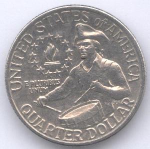
When I see the US Army half dollar reverse it harkens back to the Bicentennial quarter reverse design.
image
1976 quarter


image
2011 Army comm half dollar

Now granted, one shows a drummer, while the other shows a soldier with a rifle; one faces left, one faces right. However, when I first look at them, my brain cell thinks they are the same coin.

I guess design recycling was at work here.

Comments

  • Options
    I felt the same way when I saw it. The Army half dollar was designed by Thomas Cleveland of Cypress, Texas. Coincidently, he gave an educational presentation to our club last Thursday night at our annual holiday party. I didn't get a chance to ask him about the simililarites with the bicentennial design, but he did mention how he had someone get in costume for a photograph to base the design on. He was only able to pick up some sort of generic tri-corner hat, which turned out to be oversized for the model and didn't look good at first.
  • Options
    I'm just not feeling any recent modern compositions...all so bland to me....
    (and I think the quarter and the half definitely look almost exactly the same)
  • Options
    The bicentennial quarter is one of my all time favorites. This is the first I have seen of the Army, its nice, and yes looks similar. If I was in charge, I would permanently bring back the Bicentennial quarter as an obverse design. perhaps even replacing George! image

    It would be the start of the return to depictions of liberty on coins, rather than dead old white guys.
  • Options
    Mint designer Thomas Cleveland also told us last Thursday that the Native American chief on the reverse of next year's Native American dollar was inspired by the Indian $5 & $2.50 gold piece designs, but his is not incuse like they were.
    imageimage
  • Options
    I think that the Army half design is well-done. I like it.
    Q: Are You Printing Money? Bernanke: Not Literally

    I knew it would happen.
  • Options
    Similar in a number of ways: same hat, similar posture.

    I like both though.
    HAPPY COLLECTING!!!
  • Options


    << <i>Similar in a number of ways: same hat, similar posture.

    I like both though. >>


    Which is the main reason why when collectors do like a new design, it's because it reminds them of an old, familiar design.

    Personally, I find a lot of the older designs from the 19th century pretty weak.
    Robert
  • Options
    Same basic war. BTW the bicentennial quarter reverse is one of the finest designs of the second half of the 20th century and hopefully will someday again grace the quarter dollar.
  • Options
    I see the similarity, although, if not pointed out, I do not think I would have associated the two... Cheers, RickO
  • Options


    << <i>
    I guess design recycling was at work here. >>


    Something is at work, but I don't think it's design recycling.
  • Options


    << <i>When I see the US Army half dollar reverse it harkens back to the Bicentennial quarter reverse design.

    image
    1976 quarter


    image
    2011 Army comm half dollar

    Now granted, one shows a drummer, while the other shows a soldier with a rifle; one faces left, one faces right. However, when I first look at them, my brain cell thinks they are the same coin.

    I guess design recycling was at work here. >>


    ...ditto here too.
    "government is not reason, it is not eloquence-it is a force! like fire, it is a dangerous servant and a fearful master; never for a moment should it be left to irresponsible action." George Washington
  • Options

    ...makes me think of the president and how he wants to draw a correlation between teddy roosevelt and himself. too bad he doesn't re-design the coinage like ted did by making beautiful designs across the board. image
    "government is not reason, it is not eloquence-it is a force! like fire, it is a dangerous servant and a fearful master; never for a moment should it be left to irresponsible action." George Washington
  • Options
    The only similarity i see is the hat , the drummer is in shirtsleeves and the rifleman has a coat , the stars are presented very different in both as well. It does put me in mind of the quarter but they don't actually look the same.
    I still think the "chief" on the $1 looks feminine , not a patch on the old design.

Leave a Comment

BoldItalicStrikethroughOrdered listUnordered list
Emoji
Image
Align leftAlign centerAlign rightToggle HTML viewToggle full pageToggle lights
Drop image/file