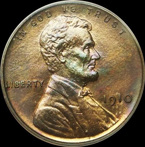
I am actually very impressed with the return to a version more like the original portrait. Looks quite good - especially if you put it side by side with a 2009.
Id say they got the obverse pretty "right". Damn why didnt they do that last year? and add the S...and add the wheat back...oh sigh..............................
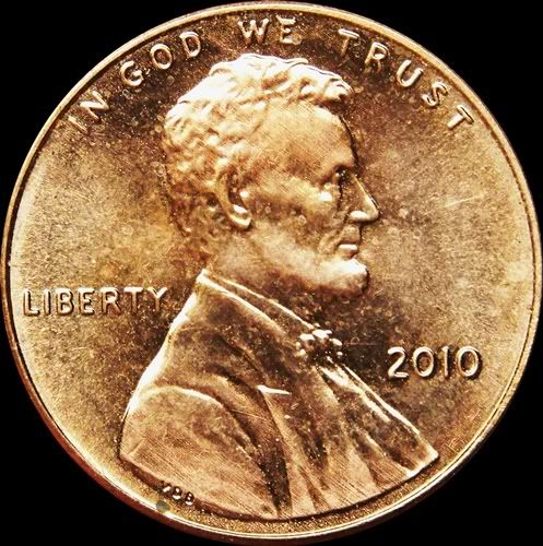
2010 has lost the detail. No eye lid, poorly formed concha (ear) and bow tie. Better but not the pizazz of the original. But, after all it's just a copy, right?
bob
Registry: CC lowballs (boblindstrom), bobinvegas1989@yahoo.com
I think these new 2010's will look good when they go brown. remember too Im showing a matte proof there so the BS coin of the era would have less detail also, and compare better with the 2010.
I wonder why they did not go back to the original date position? TD
Numismatist. 50 year member ANA. Winner of four ANA Heath Literary Awards; three Wayte and Olga Raymond Literary Awards; Numismatist of the Year Award 2009, and Lifetime Achievement Award 2020. Winner numerous NLG Literary Awards.
The 2010 date is more even. I've always thought the 1910 date was ugly - the zero is way too big, and round instead of oval. It doesn't match the other digits at all.
<< I think these new 2010's will look good when they go brown. remember too Im showing a matte proof there so the BS coin of the era would have less detail also, and compare better with the 2010. >>
It might be interesting to compare it with a Satin Finish 2010 when they become available.
<< <i>The 2010 date is more even. I've always thought the 1910 date was ugly - the zero is way too big, and round instead of oval. It doesn't match the other digits at all. >>
The early numerals, which varied in size, shape and style from year to year, are much more artistic and attractive than the boring uniform ones in modern coins...IMO, anyway. I love the tails on 3's, 5's, and 9's. I like the different placement, the shapes of 0's, and stubby numbers, like the 1 and 5 in 1915. To each his own, I guess. Lance.
Different shaped forehead. Different lips. Different beard. Different profile on the 2010 all together! Why?
Advanced collector of BREWERIANA. Early beer advertising (beer cans, tap knobs, foam scrapers, trays, tin signs, lithos, paper, etc)....My first love...U.S. COINS!
2010 cents are much thinner than 1910, so there's less metal to work with. Also, the shield reverse bleeds metal from the obverse relief, which Brenner's wheat ears did not.
<< <i>2010 cents are much thinner than 1910, so there's less metal to work with. Also, the shield reverse bleeds metal from the obverse relief, which Brenner's wheat ears did not. >>
Huh?
If this were so, wouldn't the rolls be a lot shorter????
I have not noticed any difference.
TD
Numismatist. 50 year member ANA. Winner of four ANA Heath Literary Awards; three Wayte and Olga Raymond Literary Awards; Numismatist of the Year Award 2009, and Lifetime Achievement Award 2020. Winner numerous NLG Literary Awards.
Here are the Reverses. I hate to say it...but it is possible to imagine Brenner himself coming up with the shield initially in 1909....he liked ribbons, the design is somewhat French, the one cent is in similar style lettering....who knows...anyway, these shields will look good BN also> I want one in a nice chocolate brown VF! Ive decided I LIKE the reverse. And I like it because there isnt one iota of political correctness in it. It IS what it IS. Certainly beats any of the 4 "photomural" reverses in 2009! I like all the die finish lines on the reverse. they must have turned the pressure UP on these coins, in order to fully strike the relief required. Id be on the lookout for die cracks that could be the result of this....just speculation .
"government is not reason, it is not eloquence-it is a force! like fire, it is a dangerous servant and a fearful master; never for a moment should it be left to irresponsible action." George Washington
They should have used the same font for "one cent" on the shield cent as they did on the wheat back cent...
There is something to be said about the simple beauty of the wheat cent... so many minted yet still classy to this day.
The only recent "circulating" design we may look back on 50 years hence in the same way would possibly be the Sacajawea dollar from 2000-2008, especially the reverse.
Always looking for attractive rim toned Morgan and Peace dollars in PCGS or (older) ANA/ANACS holders!
"Bongo hurtles along the rain soaked highway of life on underinflated bald retread tires."
<< 2010 cents are much thinner than 1910, so there's less metal to work with. Also, the shield reverse bleeds metal from the obverse relief, <<which Brenner's wheat ears did not. >>
Huh?
If this were so, wouldn't the rolls be a lot shorter????
I have not noticed any difference.
TD >>
If you want to see a shorter roll of cents, compare a roll of pre 1993 cents with a roll of 1993 or later cents. And the cents weigh the same! It is the lower relief reverse making the difference. And after 1993 they went to the old reverse to strike proofs.
I would agree when I first saw the shield it felt like it was older then 2010. I don't know much though. I have only been collecting cent (from circulation and the bank.)
I have come across quite a few rolls of these from a local department store that seems to have them all the time. Are these rolls worth holding on to?
You have to see me at the tolls circulating all the "junk" pennies. The looks I get from the toll workers. It really is priceless.
 ambro51
Posts: 13,604 ✭✭✭✭✭
ambro51
Posts: 13,604 ✭✭✭✭✭
 [/URL]
Comments
Lance.
Thanks for showing this.
I have to say, seeing both side by side, I'm still liking the 1910 better.
Better but not the pizazz of the original. But, after all it's just a copy, right?
bob
TD
<< I think these new 2010's will look good when they go brown. remember too Im showing a matte proof there so the BS coin of the era would have less detail also, and compare better with the 2010. >>
It might be interesting to compare it with a Satin Finish 2010 when they become available.
My Adolph A. Weinman signature")

<< <i>The 2010 date is more even. I've always thought the 1910 date was ugly - the zero is way too big, and round instead of oval. It doesn't match the other digits at all. >>
The early numerals, which varied in size, shape and style from year to year, are much more artistic and attractive than the boring uniform ones in modern coins...IMO, anyway. I love the tails on 3's, 5's, and 9's. I like the different placement, the shapes of 0's, and stubby numbers, like the 1 and 5 in 1915. To each his own, I guess.
Lance.
Dead Cat Waltz Exonumia
"Coin collecting for outcasts..."
<< <i>2010 cents are much thinner than 1910, so there's less metal to work with. Also, the shield reverse bleeds metal from the obverse relief, which Brenner's wheat ears did not. >>
Huh?
If this were so, wouldn't the rolls be a lot shorter????
I have not noticed any difference.
TD
Ive decided I LIKE the reverse. And I like it because there isnt one iota of political correctness in it. It IS what it IS. Certainly beats any of the 4 "photomural" reverses in 2009!
I like all the die finish lines on the reverse. they must have turned the pressure UP on these coins, in order to fully strike the relief required. Id be on the lookout for die cracks that could be the result of this....just speculation .
...i'm still looking for the 2012 coin.
Lance.
There is something to be said about the simple beauty of the wheat cent... so many minted yet still classy to this day.
The only recent "circulating" design we may look back on 50 years hence in the same way would possibly be the Sacajawea dollar from 2000-2008, especially the reverse.
"Bongo hurtles along the rain soaked highway of life on underinflated bald retread tires."
~Wayne
<< <i>I think these new 2010's will look good when they go brown. >>
2012?
My Adolph A. Weinman signature")

<< <i>
<< <i>I think these new 2010's will look good when they go brown. >>
Looks like the idea for the new Lincoln Cent reverse came from a pattern cent coin minted 114 years ago?
Great post Brian!
Huh?
If this were so, wouldn't the rolls be a lot shorter????
I have not noticed any difference.
TD >>
If you want to see a shorter roll of cents, compare a roll of pre 1993 cents with a roll of 1993 or later cents. And the cents weigh the same! It is the lower relief reverse making the difference. And after 1993 they went to the old reverse to strike proofs.
I don't know much though. I have only been collecting cent (from circulation and the bank.)
I have come across quite a few rolls of these from a local department store that seems to have them all the time.
Are these rolls worth holding on to?
You have to see me at the tolls circulating all the "junk" pennies. The looks I get from the toll workers. It really is priceless.
That 1910 sure is pretty
<< <i>HeY Id submit that 2010-D Youd probably have the only AU58 certified example! A Pop 1 (wow think of THAT!) >>
and ...AU58 is easy......give me a F12 - now this one would keep your Pop 1 for some time
Rok
LA KINGS #11 - KOPITAR