yes i know the coin is from Europe but what do you think of the design?? New!
 fc
Posts: 12,796 ✭✭✭
fc
Posts: 12,796 ✭✭✭
Link to the article i read.
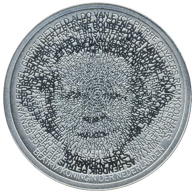
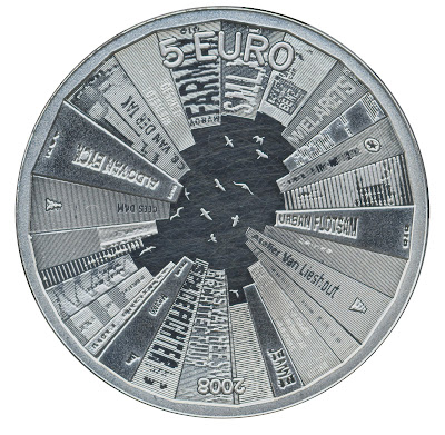
The Dutch Ministry of Finance organized an architecture competition
for which a selected group of architectural offices (unstudio, nox, ...)
and artists were invited, including myself. The goal of the
competition was not to design a building, but the new 5 euro
commemorative coin with the theme 'Netherlands and Architecture'.
The winner will be rewarded with a nice price, but most of all with
the honor: his design will be realized and will be a legal coin within
the Netherlands.
obv
rev
0
Comments
Reaction #2: A dyslexia test that sure looks like a colorblind test.
Reaction #3: The date is upside down.
<< <i>Reaction #1: Wheel.... Of.... Fortune!!! >>
What a mess
Chris
Innovative for sure.
Vertigo inducing, I think.
Alas, however, I fear it looks like it was conceived by someone who has more familiarity with computers than with metal.
Specifically, rendering text as has been done to achieve that image on the obverse is fairly easy to do with a computer - but when recreated in metal, many of the letters are reduced into oblivion, which IMHO renders the coin somewhat pretentious.
I think the reverse is more successful - it sort of reminds me of a Radiohead album cover, which sort of reminded me of the paintings of Stuart Davis.
Still, I give the coin major points for its daringness - something like that is eons beyond anything the U.S.'s 'design-by-committee' process could ever, ever allow.
>>>My Collection
<< <i>It is different, and modern, and innovative, but I don't much care for the way it looks. >>
My feelings as well.
Stefanie
.
CoinsAreFun Toned Silver Eagle Proof Album
.
Gallery Mint Museum, Ron Landis& Joe Rust, The beginnings of the Golden Dollar
.
More CoinsAreFun Pictorials NGC
I like it!
Many members on this forum that now it cannot fit in my signature. Please ask for entire list.
<< <i>FC, I didn't know you were a artist! I thought you were just a pm buyer/flipper!
I like it! >>
hey now! i just sell the bullion because of the strangeness of the market right now.
i collect liberty half eagles seriously. I like 1859-1869 as my area
of interest.
i thought this coin was worthy of a posting here on the US coin forum
due to its different design.
Worry is the interest you pay on a debt you may not owe.
"Paper money eventually returns to its intrinsic value---zero."----Voltaire
"Everything you say should be true, but not everything true should be said."----Voltaire
b. Is that Richard Simmons?
I would like it more without all of the writing on the buildings.
I love going to Amsterdam. I'm too old to parktake in the fun, but it's a neat place to visit.
Didn't wanna get me no trade
Never want to be like papa
Working for the boss every night and day
--"Happy", by the Rolling Stones (1972)
Keeper of the VAM Catalog • Professional Coin Imaging • Prime Number Set • World Coins in Early America • British Trade Dollars • Variety Attribution
<< <i>I love going to Amsterdam. I'm too old to parktake in the fun, but it's a neat place to visit. >>
Too old, or too married?
Keeper of the VAM Catalog • Professional Coin Imaging • Prime Number Set • World Coins in Early America • British Trade Dollars • Variety Attribution
I frankly don't like the look of it but then I don't like modern art or skyscrapers either...so what do I know?
Reverse, ok, something like modern architecture crowds out / displaces nature theme as first reaction. I'd think the issue is that it has the same theme (architect's names) on both sides. I'd gone for a mot traditional building design... actually I'd picked a old style Fachwerkhaus or an even older roundhouse; people can see modern architecture just by looking out their window, but the generations that remember the roots of their society are dying out rapidly. But that' s the traditionalist within me.
BS&T
Ebay: + <waitin'> NEG: Chameleoncoins
NonBST/Ebay:
WTB: Toners, BU Darkside, Sovs & 20 Mark, LMU/SMU Gold.
Link
It explains the concept and the software he used to develop the design:
The "portrait is constructed with names of important Dutch architects. On the outside the names are clearly readable, while they slowly get smaller to the center. Under a magnifying glass all names are readable, but not with only the human eye"
"On the back side of the coin I treated the edge of the coin as a book shelve. The books rise as buildings towards the center. Through their careful placement they combine to outline the Netherlands, while birds’ silhouettes suggest the capitals of all the provinces."
Here's an image that shows how the reverse was designed:
The design is a bit too avant-garde for my taste, but it's certainly creative.
BS&T
Ebay: + <waitin'> NEG: Chameleoncoins
NonBST/Ebay:
WTB: Toners, BU Darkside, Sovs & 20 Mark, LMU/SMU Gold.
<< <i>99.99% of people will not know that. Oddly enough art is not what the artist wants it to say but what it evokes in people. >>
Sounds like Longacre's threads on these boards.
Didn't wanna get me no trade
Never want to be like papa
Working for the boss every night and day
--"Happy", by the Rolling Stones (1972)
Interesting coin, tho.
I wouldn;t wanna see a lot of coins designed in this manner, but it's a great change of pace
<< <i>
<< <i>99.99% of people will not know that. Oddly enough art is not what the artist wants it to say but what it evokes in people. >>
Sounds like Longacre's threads on these boards.
Except, I am the REAL Longacre
BS&T
Ebay: + <waitin'> NEG: Chameleoncoins
NonBST/Ebay:
WTB: Toners, BU Darkside, Sovs & 20 Mark, LMU/SMU Gold.
sips thru a straw.
hi, i'm tom.
i do not doctor coins like some who post in here.