Speaking of blue Proof Indians... How about these 2?
 BlindedByEgo
Posts: 10,754 ✭✭✭✭✭
BlindedByEgo
Posts: 10,754 ✭✭✭✭✭
Both have amazing blue flash, but the 1864 is truly stunning. Even non-collectors have seen it and said how beautiful the color is.
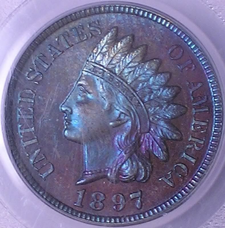
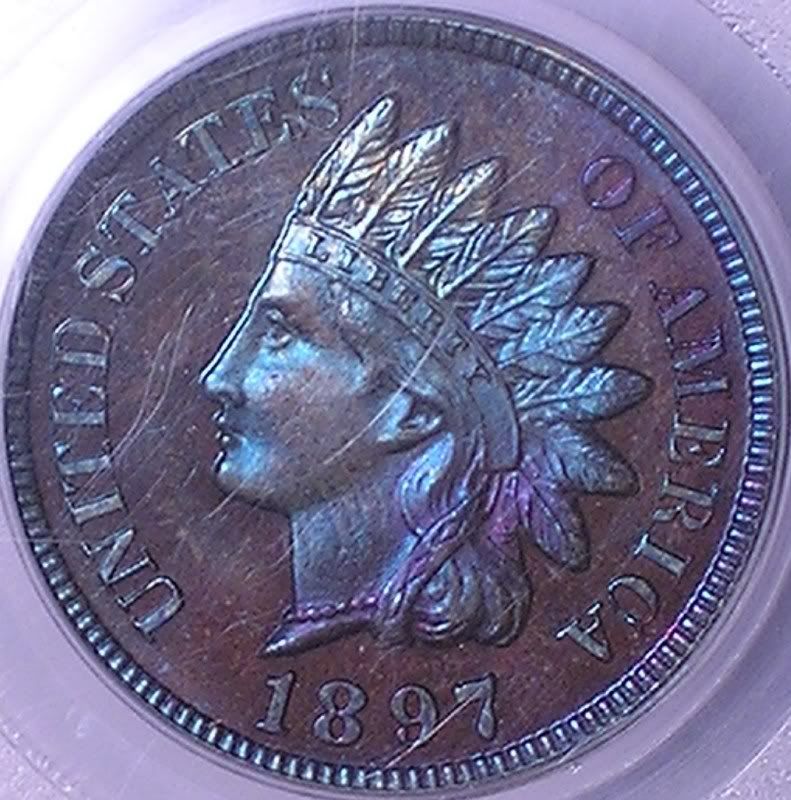
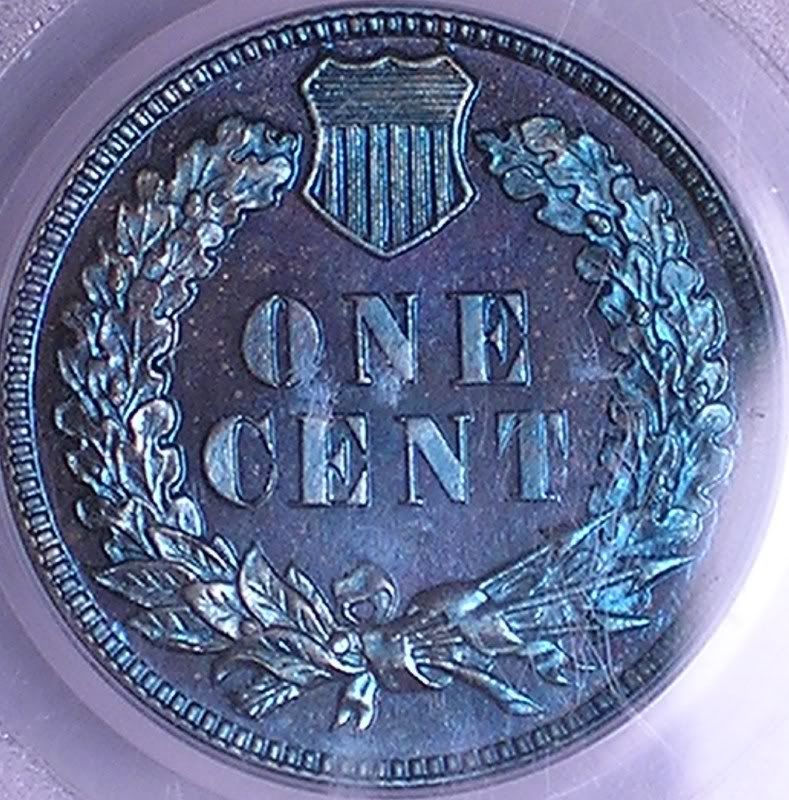
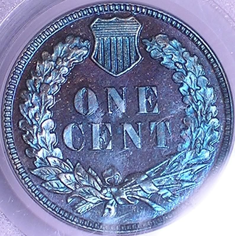
Let me know your thoughs on my 1864 and 1897 PCGS PF65's
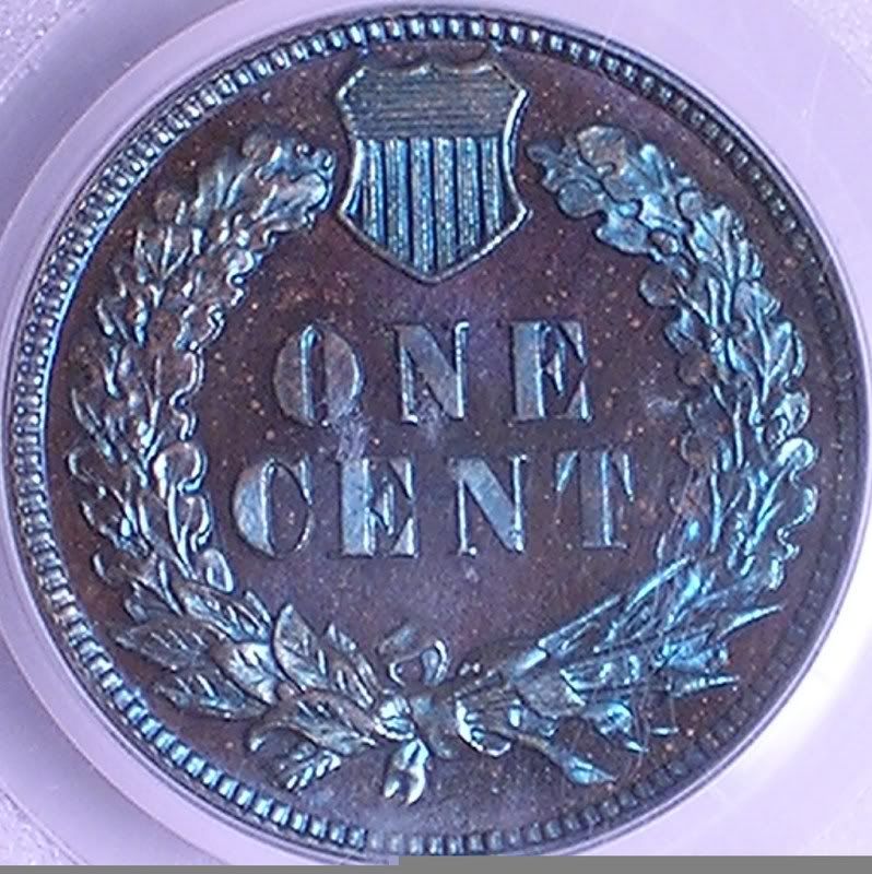
1897 PCGS PF65:
1864 PCGS PF65:
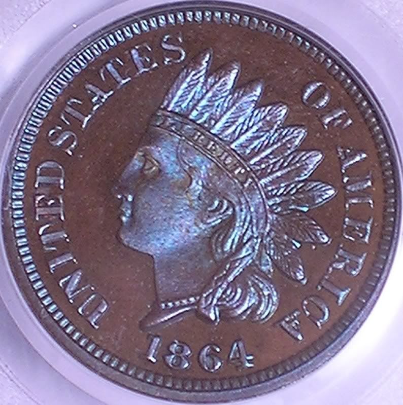
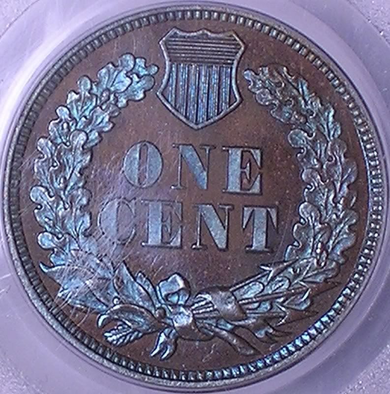
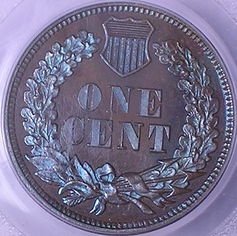
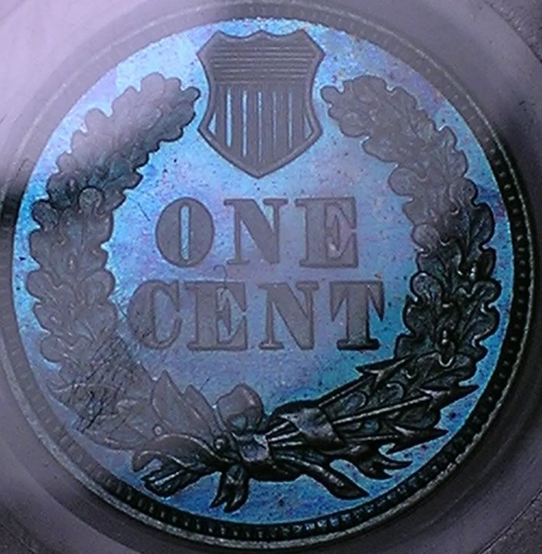
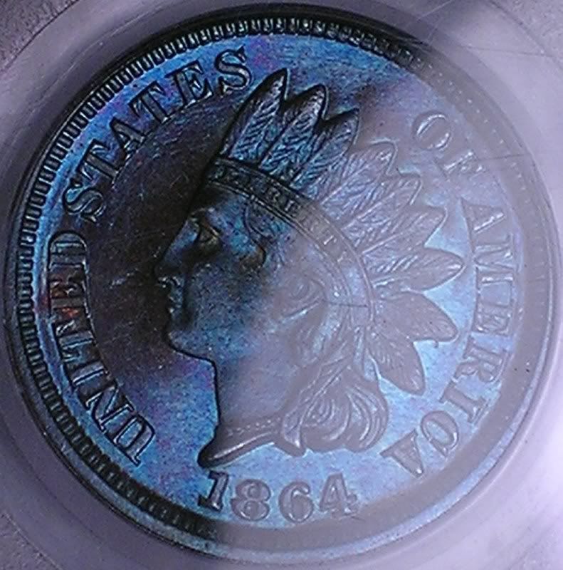
Let me know your thoughs on my 1864 and 1897 PCGS PF65's
1897 PCGS PF65:
1864 PCGS PF65:
Check out my current listings: https://ebay.com/sch/khunt/m.html?_ipg=200&_sop=12&_rdc=1
0
Comments
An authorized PCGS dealer, and a contributor to the Red Book.
U.S. Type Set
<< <i>Where are these coins, and how much?
In my registry set... Priceless
Check out my current listings: https://ebay.com/sch/khunt/m.html?_ipg=200&_sop=12&_rdc=1
Edited to add: Besides Rick, who has a good inventory of these?
I really enjoy the mint wrapper coins, they are getting hard to find. The blue looks a little too cobalt blue from I'm used to seeing, but I'm sure it's the pics. I'd like to see these in hand......I'm sure they are spectacular.
<< <i> >>
Your silence speaks volumes
Check out my current listings: https://ebay.com/sch/khunt/m.html?_ipg=200&_sop=12&_rdc=1
I would like them even more if they were Red Brown as opposed to Blue, however I felt that even before the whole MS70 fiasco.
<< <i>I believe that if you viewed those coins in hand it would display the blue even more vibrantly then the pictures.
I would like them even more if they were Red Brown as opposed to Blue, however I felt that even before the whole MS70 fiasco. >>
I tend to raise more of an eyebrow on NGC blues. But I know what you mean - my absolute favorites are the red-violet-magenta ones.
Check out my current listings: https://ebay.com/sch/khunt/m.html?_ipg=200&_sop=12&_rdc=1
Check out my current listings: https://ebay.com/sch/khunt/m.html?_ipg=200&_sop=12&_rdc=1
Knowledge is the enemy of fear
<< <i>Where are ya Snow? Hook me up!
Edited to add: Besides Rick, who has a good inventory of these? >>
Check with Brian Wagner (BWRC), he used to work with Rick Snow and went out on his own a few years ago.
42/92
Knowledge is the enemy of fear
John
Awhile back, Shylock posted some images of toned PF IHCs. The difference is that the original, tissue-toned PF IHCs tend to have the toning at issue on the raised portions of the coin, like the wreath on the reverse, and not on the coin's protected areas. Re toned PF IHCs, these are the ones that interest me.
OTOH, if you are looking at coins which are neon blue in both protected and raised areas of the surfaces, imo, you are looking at artificially toned coins, which to me = damaged goods and I don't like them.
As long as people want coins which are 'pretty,' will pay premiums for them, and really don't care whether they are original, the coin doctors will provide as many of them as you like.
"Seu cabra da peste,
"Sou Mangueira......."
<< <i>Keith, I can't really tell what the coins look like because the images look so different re their color. This is not meant to rag on you or anyone else, but I am more concerned about a coin's authenticity rather than whether it has a color which a viewer thinks is pretty.
Awhile back, Shylock posted some images of toned PF IHCs. The difference is that the original, tissue-toned PF IHCs tend to have the toning at issue on the raised portions of the coin, like the wreath on the reverse, and not on the coin's protected areas. Re toned PF IHCs, these are the ones that interest me.
OTOH, if you are looking at coins which are neon blue in both protected and raised areas of the surfaces, imo, you are looking at artificially toned coins, which to me = damaged goods and I don't like them.
As long as people want coins which are 'pretty,' will pay premiums for them, and really don't care whether they are original, the coin doctors will provide as many of them as you like. >>
You are correct, of course. It is a preference and personal taste issue. I tend to trust the experts in this - and just so you know, I have passed on a lot of "blue" toned PF Indians. To my eye, there is a substantial difference between the blatant AT examples and what has been represented to me as original. One major difference that I have seen is the thickness of the appearance of the toning - a delicate blue flash versus a thicker layer of "stuff" on the coin.
Also, the concentration of toning effect on the coins represented to me as original does in my opinion tend to concentrate towards the raised portion of the coin, versus evenly over the entire surface.
I appreciate your opinion, but if I can own a coin that has both exceptional eye appeal AND has been validated by experts, I'll take that over an ugly-but-guaranteed-authentic-to-the-Nth-degree coin all day.
Check out my current listings: https://ebay.com/sch/khunt/m.html?_ipg=200&_sop=12&_rdc=1