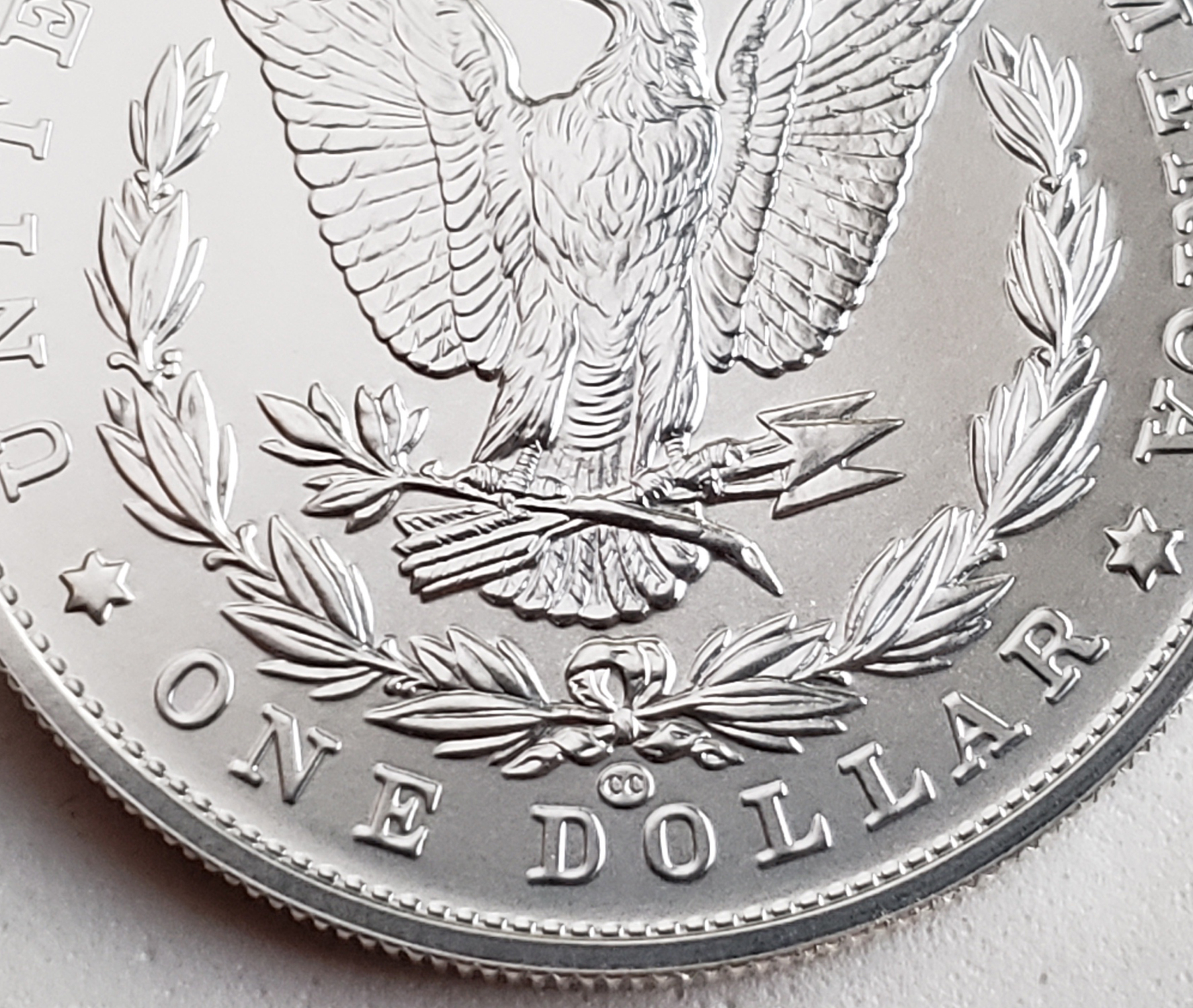
I like how the O privy mark just looks like an "O"
 Weiss
Posts: 9,942 ✭✭✭✭✭
The single initial allowed the mint to make the privy berm™ vertical rather than horizontal, resulting in a privy that really just kind of looks like an "O", albeit slightly stylized. Compare and contrast with the "CC":


We are like children who look at print and see a serpent in the last letter but one, and a sword in the last.
--Severian the Lame
--Severian the Lame
6
Comments
--Severian the Lame
You’re saying the “O” looks like an “O”. Weird!
I do see your point... almost like an O from the Orleans mint.... Interesting. Cheers, RickO