SLQ design variety question
 rmpsrpms
Posts: 1,968 ✭✭✭✭✭
rmpsrpms
Posts: 1,968 ✭✭✭✭✭
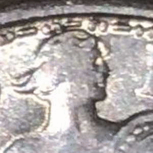
Over on another forum there was some controversy regarding a 1917 SLQ being FH or not, and whether an auction listing showed the actual coin or something else. I made an animated gif of the two heads in question, and saw a surprising difference in the design between the two. There is an obvious difference in the spacing between the "cowlicks" at back of head. The "forelocks" are also a bit different, and there may be other differences as well. Is this a known design difference? See the comparison gif below:
0
Comments
I've known about it but I don't know how "well known" it is. The main giveaway to me is the one type the nose is way more "roman".
Never noticed it.
Might be a touch up on a working die.
Pete
I have noticed that, however, not being a collector of the series, thought it was due to die work. Your GIF shows the differences quite well. Cheers, RickO