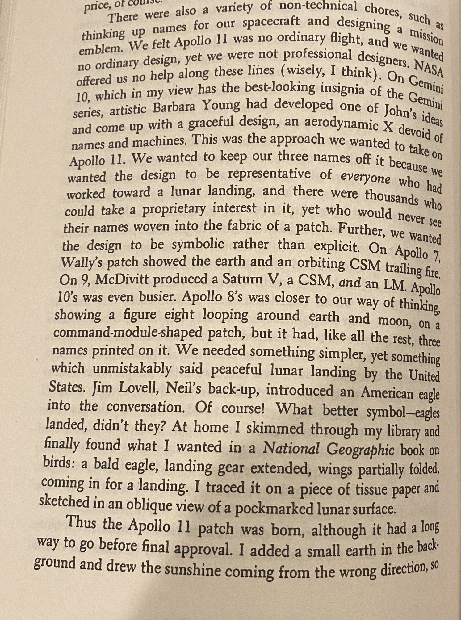
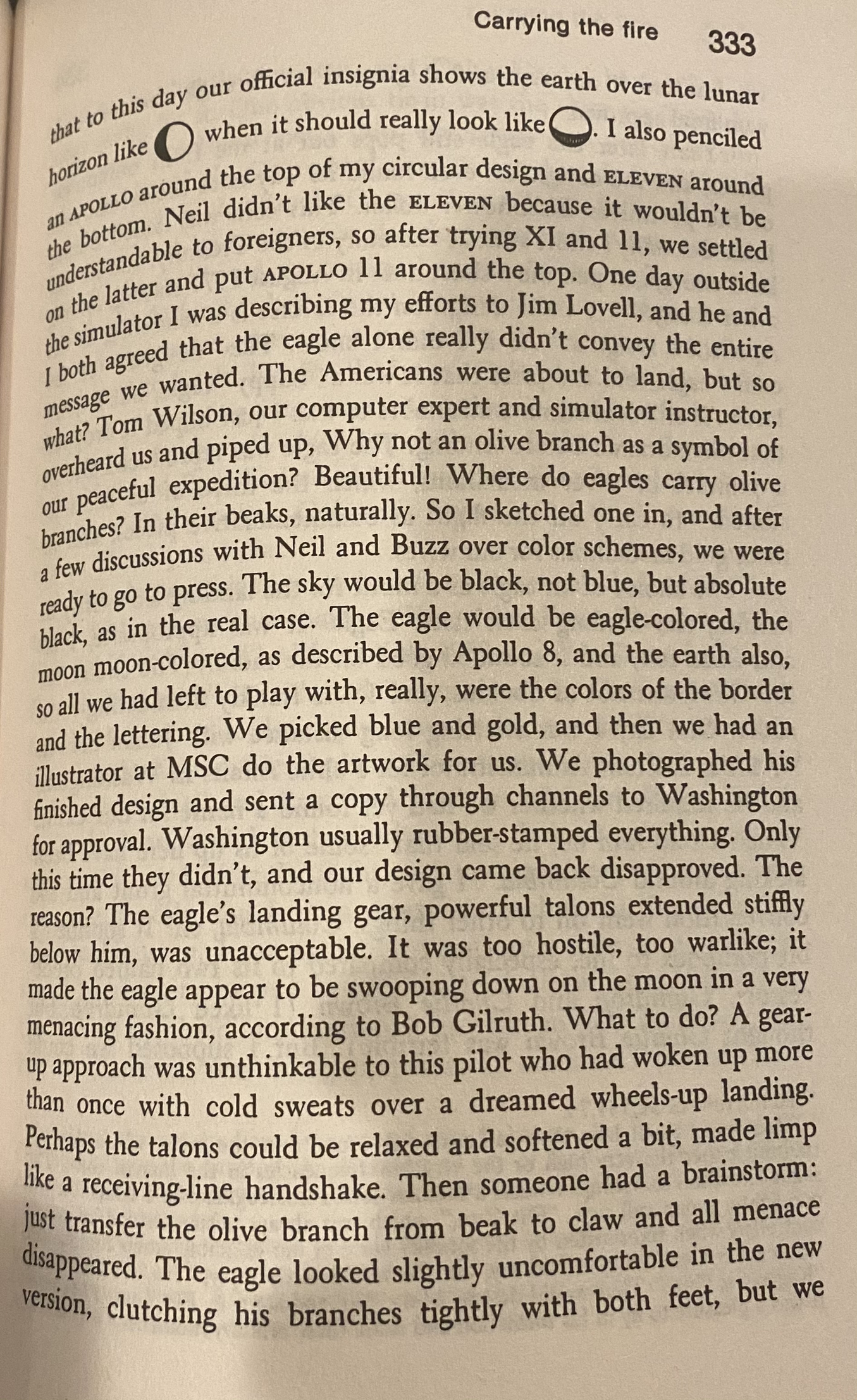
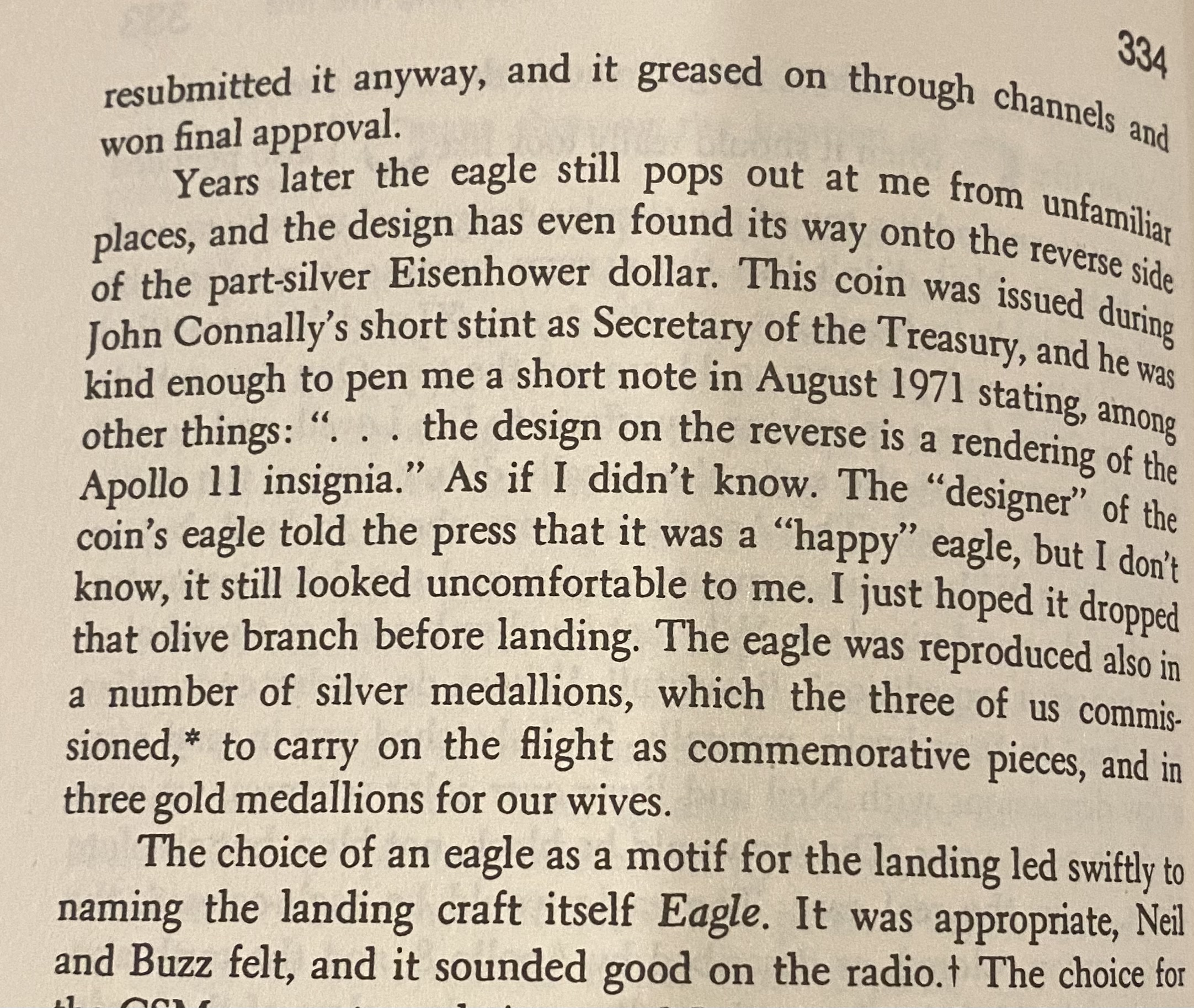
The Eisenhower Dollar Reverse was Designed by an Astronaut--The Process in Mike Collins' Own Words
 airplanenut
Posts: 22,536 ✭✭✭✭✭
airplanenut
Posts: 22,536 ✭✭✭✭✭
A couple of months ago, an organization I work with had an online interview with three astronauts. One of them, Mike Massimino, mentioned he recently wrote a book, so I grabbed a copy. Some other astronaut-written books popped up as recommended, and I bought two more. One of them is "Carrying the Fire: An Astronaut's Journeys," written by Mike Collins. The book covers Collins' background and Air Force career through astronaut selection, with specific detail regarding his roles on Gemini 10 and Apollo 11 (the first lunar landing). If there's more beyond Apollo 11, I haven't gotten there yet... the next chapter has the lunar landing, and I hope it's successful!
I've been reading the book for the last few weeks, and if you have any interest in space or aviation (or frankly just want a superb read), it's extremely well written, not too technical (for those who would think technicalities are a bad thing), and overall a really great book. I'm much more an airplane person than a space guy (as you may be able to tell from my username or spending 30 seconds with me), but really, it's a wonderful read. In other words, go buy it.
Anyway, I was reading on Saturday afternoon and came across a few pages on how the Apollo 11 patch was designed... by Collins himself. This design, of course, went on to become the Eisenhower dollar reverse. I've know for years that the two designs were tied to each other, but I never knew the history of the design itself, nor that it was sketched by an astronaut. I'm not sure how novel a discovery this is, but it was something I never knew and found interesting. I thought it would be of interest here, as well.
Comments
@airplanenut.... Thanks for an interesting article and the link to the dollar coin. Cheers, RickO
Neat read - thanks for the post.
He sounds like a coin collector mentioning that the design was used on silver Ikes without saying the same design was used on nearly half a billion cu/ ni clad Ikes which actually saw some limited circulation, and were struck in proof also.
I've always like the reverse of the clad Ike (and the silver!). But then I like the obverse nearly as much as well. The problem with modern coins is that they are all so busy and wordy and that they usually are poorly made because they are struck on high speed presses with little concern for quality product. Otherwise I like Ike quite a bit (clad and silver). Throw in the less well designed but equally interesting bicentennial issues and it's a wonderful series,
This I agree with. I'm not a huge fan of the uncirculated clad version, but I really like the higher grade uncirculated silver examples, which have a very appealing cleanliness about them--lovely matte lustre and endless, mark-free fields make for quite the duo.
The silver coins are quite attractive. They are 80% silver bonded to 10% silver so the surfaces you see are real silver. These come nice and the only date that requires any effort to find nice is the '71-S. The others are usually nice and sometimes spectacularly nice. The '72-S even comes as a stunning PL on rare occasion.
There are plenty of desirable varieties and types throughout the series and this includes the silver Uncs and Proofs. The clads in Gem are usually pretty elusive with only the '77 and '78-D being "common" (a few thousand coins each).
There is some more discussion of this patch and how it came to be used for the Ike in "Collectible Ike Varieties" By Rob Ezerman (et al) May, 2011 Chapter 23. this book is a little esoteric but extremely well done (and I wasn't paid to say it). It is remarkably comprehensive.
+2
My 1866 Philly Mint Set
I love the inclusiveness of the design. There were lots of classy astronauts in that early bunch - a few egos of course too, but they earned it in my book. It translated to a nice coin design too. To bad they recirculated it for the Susie B.