Options
As a generalization, why is the reverse often nicer than the obverse?
 winesteven
Posts: 5,521 ✭✭✭✭✭
winesteven
Posts: 5,521 ✭✭✭✭✭
I recognize there are at least thousands of exceptions, but my sense is that more often than random odds, the reverse of a coin is nicer than the obverse. The purpose of this post is not to debate if this observation is true or not (whether you agree or not), but for those of you that do agree, what is the cause of this phenomenon?
A day without fine wine and working on your coin collection is like a day without sunshine!!!
My collecting “Pride & Joy” is my PCGS Registry Dansco 7070 Set:
https://www.pcgs.com/setregistry/type-sets/design-type-sets/complete-dansco-7070-modified-type-set-1796-date/publishedset/213996
My collecting “Pride & Joy” is my PCGS Registry Dansco 7070 Set:
https://www.pcgs.com/setregistry/type-sets/design-type-sets/complete-dansco-7070-modified-type-set-1796-date/publishedset/213996
4
Comments
I agree that there seems to have been the more complete use of the rev planchet easel in applying a design concept. If that makes any sense. Good morning everyone. Peace Roy
BST: endeavor1967, synchr, kliao, Outhaul, Donttellthewife, U1Chicago, ajaan, mCarney1173, SurfinHi, MWallace, Sandman70gt, mustanggt, Pittstate03, Lazybones, Walkerguy21D, coinandcurrency242 , thebigeng, Collectorcoins, JimTyler, USMarine6, Elkevvo, Coll3ctor, Yorkshireman, CUKevin, ranshdow, CoinHunter4, bennybravo, Centsearcher, braddick, Windycity, ZoidMeister, mirabela, JJM, RichURich, Bullsitter, jmski52, LukeMarshall, coinsarefun, MichaelDixon, NickPatton, ProfLiz, Twobitcollector,Jesbroken oih82w8, DCW
Really depends on what coin you are talking about. If you are talking about classic period coins, the culprit is usually coin cabinets and the choice over what side to display. The downward-facing side will tend to pick up cabinet friction while the top side remains pristine.
All comments reflect the opinion of the author, even when irrefutably accurate.
Take the Morgan dollar as an example. The obverse has a lot of open area such as Liberty's cheek and the fields that show bag marks quite well. The reverse has far less open area and any bag marks that are well hidden and camouflaged by the busy design. The same can be said of similar classic coins with an obverse portrait design such as the Barber coins.
Worry is the interest you pay on a debt you may not owe.
"Paper money eventually returns to its intrinsic value---zero."----Voltaire
"Everything you say should be true, but not everything true should be said."----Voltaire
First, I agree. Second, I always thought the obverse was susceptible due to the design being more pronounced and taking up more of the field. (i.e. Liberty/President/Indian)
I also think it has to do with the reverse typically having more design elements than the obverse. Most obverse sides have open areas around the central device and the central device may have open areas like the cheek of a portrait. Any light damage is simply more noticeable.
Since coins are more likely to be stored with the obverse side facing up, your explanation is opposite to what I’d expect.
Mark Feld* of Heritage Auctions*Unless otherwise noted, my posts here represent my personal opinions.
my understanding has always been it's because the obverse has a higher probability of facing up after ejection from the press into the hopper. as a result of that it also has a higher probability of being struck by subsequently ejected coins.
As far as marks on the coin during commerce or handling, I would agree with @PerryHall ....as far as new coins or very early after distribution, I agree with Al @keets.... That being said, much will depend on the type of coin (Circulation, proof, special issue)....and that would affect handling and storage or general commerce. Cheers, RickO
Oh, I'm not saying I agree with the OP's original thesis... LOL
All comments reflect the opinion of the author, even when irrefutably accurate.
This.
IMHO, often the obverse had a dead dog ugly portrait of somebody, real or legendary, that has the artistry of a bucket of warm spit, often looking like they are staring horrified out of the basket of a French Guillotine.
Meanwhile the reverse often works with the eagle, and often it looks like a kick butt eagle (thinking the WLH eagle, for example).
Popping them in and out of albums and books, the obv is more prone to fingerprints and nicks and rub.
https://pcgs.com/setregistry/showcase/2819
Agree with Perry. The reverse is usually busier-- more places for marks to hide.
While there are more places for flaws to hide on many reverse designs, I don't think that tells the whole story. Relative to obverses, there are countless reverses which are clearly and vastly superior in quality (and without the benefit of hidden marks).
Mark Feld* of Heritage Auctions*Unless otherwise noted, my posts here represent my personal opinions.
It does seem that there's an inordinate number of higher graded reverses. So many times I've said to myself, "Man I wish the obverse was this nice."
I think that is is because most U.S. coins that have a highly vulnerable cheek have it on the obverse. The only two pieces that I can think of that have a "cheek" on the reverse are the Lewis & Clark Dollar and the 1920 Manila Mint "Dollar!"
In addition to that, many obverses exhibit noticeably more flaws in the fields, than their reverse counterparts, however.
Mark Feld* of Heritage Auctions*Unless otherwise noted, my posts here represent my personal opinions.
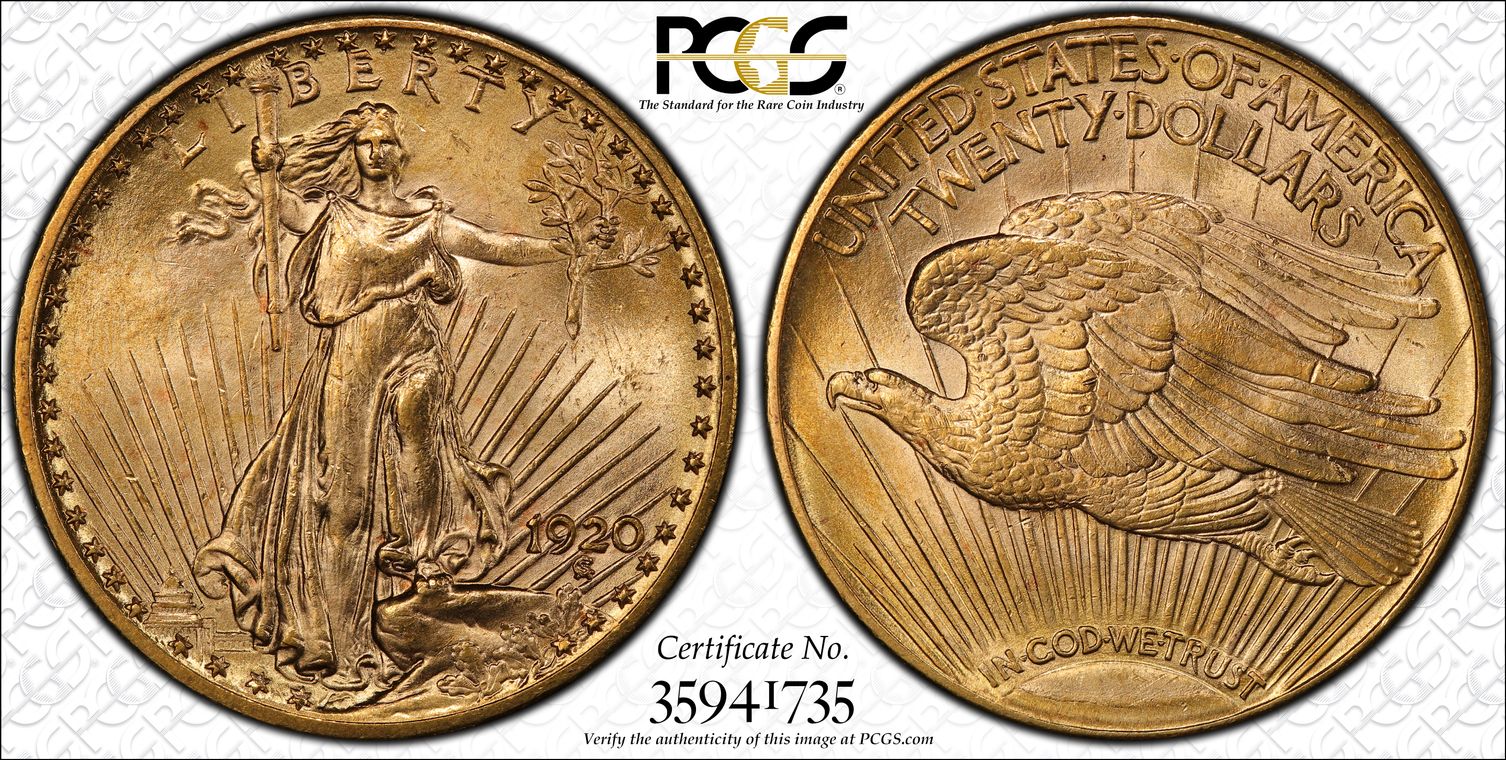
I want to know why there are always lots of hits in this part of a Peace dollar:
It happens often enough that it's not coincidence. Maybe it was the way they were ejected from the press. Similar things happen on other coins. In general though, it's probably big, open fields or large design elements that show the hits worse. As others have said, those are generally on the obverse.
Really couldn’t have been said any better
"Today the crumbs, tomorrow the
loaf. Perhaps someday the whole damn boulangerie." - fictional Jack Rackham
I was thinking this had to do with business strike coins that had been in circulation. Then of course the obvious that the coins were in a collection book, which was very popular. The obverse would get touched, the reverse was hidden away.
I think I have been focusing mostly on the obverse when deciding on a coin that is graded. I check the reverse, but expect the obverse to be the focal point. I am sure that many dealers have purchased many collections, they part of most of them individually, yes?
Isabella quarter.
Oregon commem, ox butt cheek.
Most series are somewhat convex on the obverse and concave on the reverse. ie- the center of gravity is a little closer to the reverse than the obverse. Heads is more likely to land down AND more importantly the reverse is a little better protected.
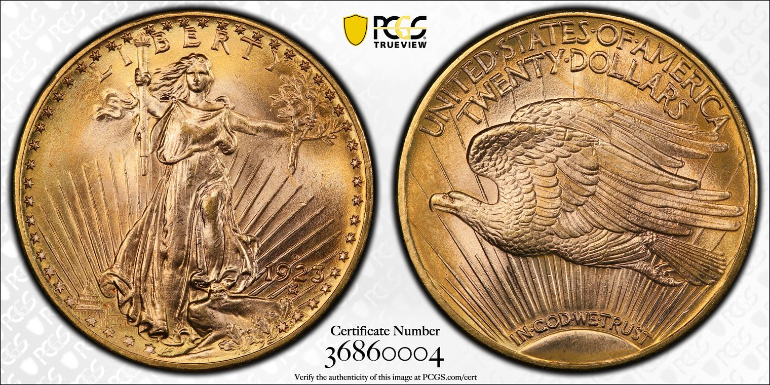
I notice the same sort of thing in saints on the leading edge of the wing or nearest, long feather.
Mostly post WWI if you can believe that???
Often it is one massive hit.
My Saint Set
IMO, storing a coin face up in a cabinet does not put contact marks (the main distraction) on it. I once had a theory that it depended some on how the coin dropped off the press. Mathematically, it should even out as some landed face up and others landed reverse up allowing falling coins to hit that particular side. So I am also convinced that @Perryhall has posted the generally accepted answer for all these years.
Maybe it was the way they were ejected from the press.
Is your coin shop open?