Unusual high relief?
 joeykoins
Posts: 17,972 ✭✭✭✭✭
joeykoins
Posts: 17,972 ✭✭✭✭✭
Hi guy's. I was going through a box of quarters, seeking for the "W", when I came across a 2017 "Effigy Mounds". I don't know if this question ever came up before but doesn't it seem that the reverse would appear to be over exaggerated of the high relief on the mounds? This just jumped out at me! What do you guy's think? Thanks in advance. 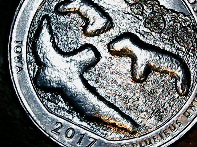
"Jesus died for you and for me, Thank you,Jesus"!!!
--- If it should happen I die and leave this world and you want to remember me. Please only remember my opening Sig Line.0
Comments
This effect is more noticeable on the "Effigy Almond Joy" than on "Effigy Mounds."
;]
The mounds are raised so they look like mounds. Very stupid design anyway IMO. Just goes to show that IOWA is not actually just flat farmland as I learned in kindergarten school.
If you're talking about this specific coin being higher than others, I have a roll of them and mine all look the same. I actually like the design; it evokes what the mounds and surrounding countryside really look like, if you've been there. That area of Iowa is very rugged. The Upper Iowa River near there is geologically categorized as a "gorge".
Although I like the real effigy mounds, I never really cared for the coin... just too small to represent reality... Cheers, RickO
Most people I've talked to consider the Effigy Mounds as their least favorite design of the ATB quarters & bullion coins. Personally, I like the design because of the history of the mounds. The mounds were built during prehistoric times, before the USA even existed.
My YouTube Channel
My Instagram Gallery
Also, the 1976 quarters (Bicentennials) seem to show that same High relief?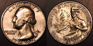
"Jesus died for you and for me, Thank you,Jesus"!!!
--- If it should happen I die and leave this world and you want to remember me. Please only remember my opening Sig Line.OT
The reverse reminds me of something...
Abraham Lincoln: Vampire Hunter