I'm trying to improve my imaging.....Help!
 Raybo
Posts: 5,343 ✭✭✭✭✭
Raybo
Posts: 5,343 ✭✭✭✭✭
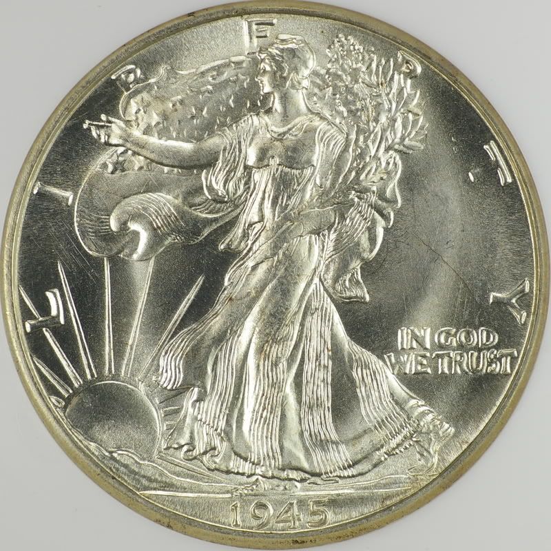
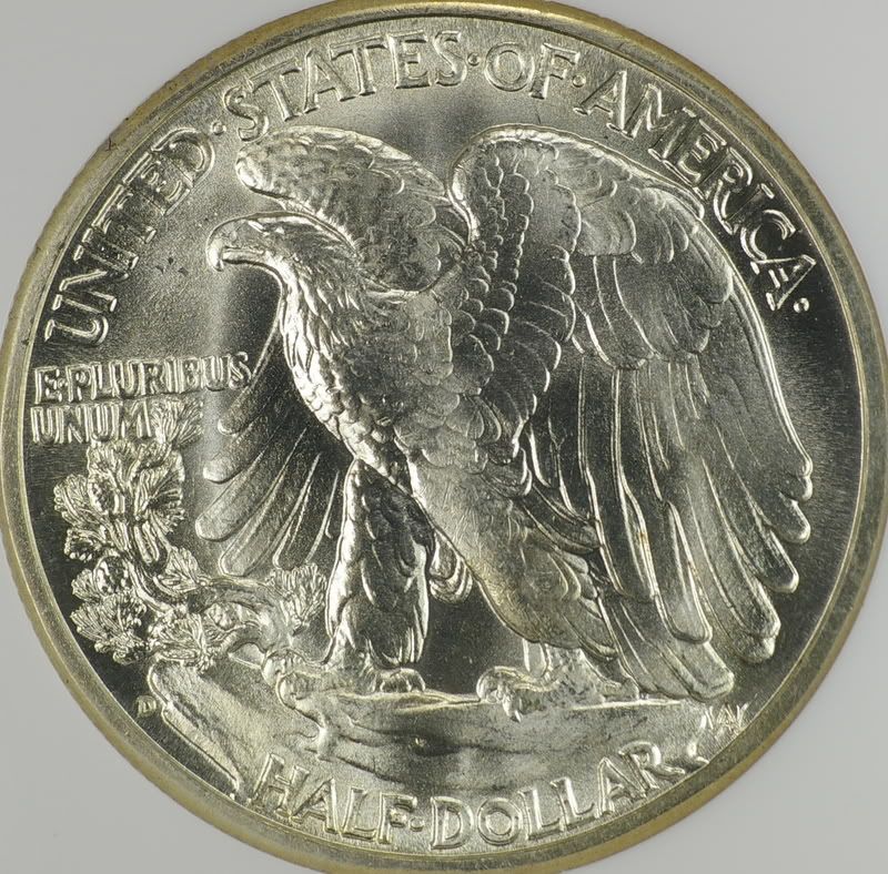
I have imaged and posted this coin in the past, tried imaging the same coin again tonight. 
The vertical marks are from my feeble attempt at cleaning the holder, other than that just a few different things.
How did I do?
Guess the grade if you want and give me some pointers about my imaging.
Thanks as always.
BTW, this is a jpeg right out of the camera with no PP.
Proofs are tough!


What the heck, let's post two!
Ray
The vertical marks are from my feeble attempt at cleaning the holder, other than that just a few different things.
How did I do?
Guess the grade if you want and give me some pointers about my imaging.
Thanks as always.
BTW, this is a jpeg right out of the camera with no PP.
Proofs are tough!
What the heck, let's post two!
Ray
0
Comments
<< <i>One more..............
Excellent lustre Ray!!!!! Great pics!!!!!!
The JFK: The image is a bit overexposed, hence everything looks a bit washed out. You can play with brightness/contrast in a photo editor (or the Levels from your histogram if you have more advanced software) to blacken the fields and bring out what I think will be a more realistic view. I think the picture was taken with diffused lighting, and I don't think it's helping in this case. I would try putting two lights at about 10:00 and 2:00 as near to the slab as possible with no diffusion. Angle the bulbs so there is no reflection over the coin. While you'll have to make some adjustments for each coin, that's my general setup for similar pieces, and I like the results I get.
The Walker: I like this image much more than the JFK. I think the image is a matter of taste. The lustre comes off very glossy to me, and a bit "soft." Again, it looks like diffused light. If you used two bulbs on this piece with no diffusion, you would likely end up with two large bands of lustre, while still lighting the "non-lustred" part of the fields. That picture, I think, would look a bit more like the coin does in hand. While the photo looks nice, there's a small hint of something funny with the fields, and I think it's caused by the lighting.
Jeremy
<< <i>Not bad attempts. Here are my thoughts...
The JFK: The image is a bit overexposed, hence everything looks a bit washed out. You can play with brightness/contrast in a photo editor (or the Levels from your histogram if you have more advanced software) to blacken the fields and bring out what I think will be a more realistic view. I think the picture was taken with diffused lighting, and I don't think it's helping in this case. I would try putting two lights at about 10:00 and 2:00 as near to the slab as possible with no diffusion. Angle the bulbs so there is no reflection over the coin. While you'll have to make some adjustments for each coin, that's my general setup for similar pieces, and I like the results I get.
The Walker: I like this image much more than the JFK. I think the image is a matter of taste. The lustre comes off very glossy to me, and a bit "soft." Again, it looks like diffused light. If you used two bulbs on this piece with no diffusion, you would likely end up with two large bands of lustre, while still lighting the "non-lustred" part of the fields. That picture, I think, would look a bit more like the coin does in hand. While the photo looks nice, there's a small hint of something funny with the fields, and I think it's caused by the lighting.
Jeremy >>
OE crossed my mind several times AN............my images do look a bit washed out.
I'm getting a "milky" look on the JFK, might partly be do to the holder, also the lighting.
Thanks as always...............thanks GB!
Ray
JFK was 1/125 of a second at iso 200 (lowest my camera can go) and f8
Walker (same lighting) 1/160 and everything else the same (scratch head).
Ray
This one did look kinda darkish to me.
Same coin that I re-imaged today with different............... stuff.
Thanks again,
Ray
Ray