Comment on my picture taking..
Just trying a little bit of camera work and would like a second, third or fourth, ect.. opinion.
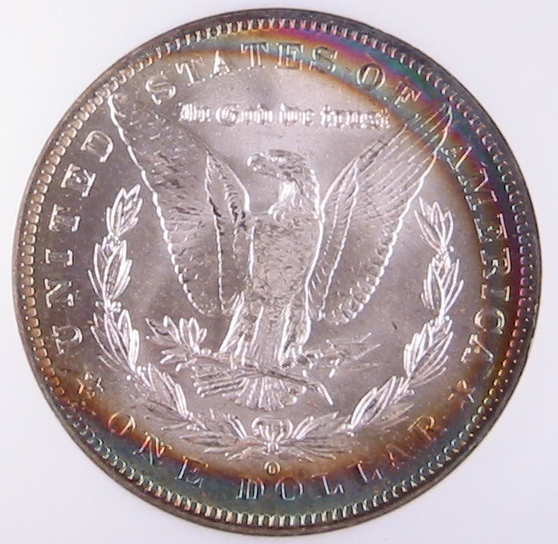
The pic is a reverse of a 1885-O ngc 63*.
The first pic is with the white balance set to 1 and the second is set to zero.
The first pic brings out the color more but is it to "bright" in the center(eagle)?
This is by far the best pics I hace taken of any coin and hopefully the rest should turn out this good.
Thanks
Tom
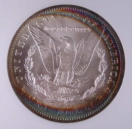
0
Comments
----------------------------------------
My ebay auctions
Suggestion: Come in just a bit closer on the focusing. I've found that around 15 cm is perfect.
Check out a Vanguard Roth IRA.
GSAGUY
We'll use our hands and hearts and if we must we'll use our heads.
Gsaguy.. I guess I shouldn't have rubbed her belly so much for good luck..
Dollaerdude... I realy cant get and closer because of the lousy macro feature of the camera.
Here's another with the same coin angle to the light then hitting the "quick fix" button on this Dell photoshop to soften the glare from the reflection of the lamp.
Thanks again
Tom
President, Racine Numismatic Society 2013-2014; Variety Resource Dimes; See 6/8/12 CDN for my article on Winged Liberty Dimes; Ebay
That was my first "it sucks"
I guess I'm doing something right.
Thanks!!!!
Tom