Options
1931 Washington quarter design competition info - List added
 RogerB
Posts: 8,918 ✭✭✭✭✭
Anyone interested in examining the 1931 Washington quarter design competition will find many letters similar to this one that might help in matching designs in the NARA Project file with the sculptors who submitted models. Letters will be found in NARA College Park, MD; RG104 Entry 235 Volumes 555 through 558. These are now available on the Newman Numismatic Portal (NNP).
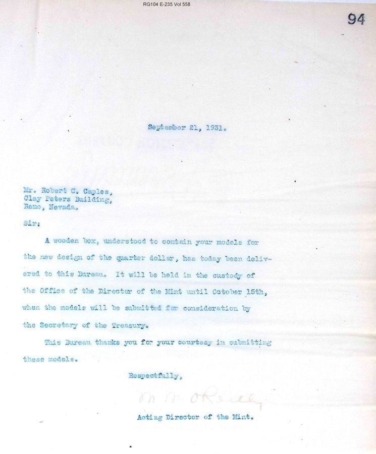
For the Washington quarter project files look in:
"Case Files on U.S. Coins," Entry A1 328-I, Box 2. These include letters drawings, photos, etc. of many entries. Entrants had the option of requesting return of rejected models.
- Coins, George Washington Quarter Dollar-Competitive Designs 1931-1932.
- Coins, George Washington Quarter Dollar-Competitive Designs 1931-1932.
Coins, Geo. Washington Quarter Dollar Act Approved March 4, 1931.
9
Comments
The artist
https://en.wikipedia.org/wiki/Robert_Cole_Caples
Caples established his first studio in 1928 at the Masonic Building in Reno, and then the Clay Peters Building in 1929, at which time he specialized in charcoal portraiture.[7][6]
By 1932, Caples moved on to specializing in charcoal drawings of American Indians – the work for which he was best known.[8][6]
The Washington quarter committee accepted only sculpted plaster models which limited submissions to trained artists. Each artist was sent an acknowledgement letter (as above) and the committee did not enforce the "hard" October 15 deadline. (The Mint Engraver and his Assistant entered the competition.)
The RG104 Entry 235 Volumes are not indexed, but include a lot of bits of information about the design competition that don't seem to be found elsewhere. (If anyone wants a complete copy of a volume, send me a PM and I'll provide a copy via Dropbox. Each volume is about 500 pages.)
Here is a list compiled from NARA documents with the names and addresses of 95 out of the 99 quarter design participants. If anyone wants the master spreadsheet, drop me a note. Names with [ * ] followed by a number were the five finalists. The number was approximate order of receipt.
Cool list. Do we know what Chester Beach sent in? I see he was a finalist, but don't recall off-hand any model from him.
In honor of the memory of Cpl. Michael E. Thompson
any indication the plasters were returned?
Beginning about November 21, letters were sent to artists who had requested return of their models. I have not examined all of them, but there seem to about a dozen. A couple letters explicitly state the artists' wish to have the plasters destroyed, and 2 or 3 ask if the artists can use the designs elsewhere. (Answer: "Yes.")
I did not copy all the files in 4 thick project folders way back when I first looked at them.However, the pages I copied do not mention Mr. Beach and include only 4 finalists -- omitting Beach.
That's interesting. I wonder if a submitter of the stature of Chester Beach might have been able to request that if he was not chosen outright that he be dropped from the list. Thank you, Roger.
In honor of the memory of Cpl. Michael E. Thompson
I found a link to an NGC board thread from 2011 started by LeeG and he has an image of the Beach obverse. The link is below and the image in the thread is under that-
https://boards.ngccoin.com/topic/207351-1932-washington-quarter-obverse-plaster/
In honor of the memory of Cpl. Michael E. Thompson
Chester Beach's Washington quarter design.
Like the letter to Fraser, Beach’s designs came in for substantial criticism from treasury (i.e.: Mellon). Beach’s entry was design #93.
_Dear Mr. Beach:
…The head of Washington does not show sufficient care in finish and treatment, or to carry a decided resemblance to Washington. It should be placed in the center of the coin with the letters composing the word “Liberty” in a semi-circle around the coin. The number 1732 should not appear on the coin, as this is somewhat confusing with the date of issue, that is, 1932, which is sufficient for the purpose and should appear on the coin in some suitable place. The words “In God We Trust” are partly obscured by being placed underneath the throat of Washington and should appear in some other position; perhaps, in smaller lettering on the obverse or reverse of the coin.
On the reverse, the eagle is vigorous in treatment and shows excellent possibilities, but somewhat confused in the lower part, and could be simplified and reworked, especially in the legs and claws of the eagle, which seem to be involved. The star is unnecessary and adds to the confusion of the coin in view of the number of emblems which must find a place. The words “United States of America” are well placed, but the lettering “quarter dollar” should appear at the bottom of the reverse beneath the eagle and should not be obscured in any way or overlapped by any other emblem, as these words are of great importance in showing the denomination of the coin and should be easily read and appear in the place where one would expect to find them – at the bottom of the coin. The words “E Pluribus Unum” should find some other place on the coin. _
Chester Beach revised his models and submitted them in December 1931. He prepared at least three obverse versions, but we don’t know which were part of the original submission and which were revised. The author’s speculation is that the bronze colored models shown below are his final version.
Figure 44. Final Washington quarter models by Chester Beach. Compare with the description of corrections, above. (Courtesy Stack's Rare Coins of New York)
"Dear Mr. Beach:
…The head of Washington does not show sufficient care in finish and treatment, or to carry a decided resemblance to Washington. It should be placed in the center of the coin with the letters composing the word “Liberty” in a semi-circle around the coin. The number 1732 should not appear on the coin, as this is somewhat confusing with the date of issue, that is, 1932, which is sufficient for the purpose and should appear on the coin in some suitable place. The words “In God We Trust” are partly obscured by being placed underneath the throat of Washington and should appear in some other position; perhaps, in smaller lettering on the obverse or reverse of the coin.
On the reverse, the eagle is vigorous in treatment and shows excellent possibilities, but somewhat confused in the lower part, and could be simplified and reworked, especially in the legs and claws of the eagle, which seem to be involved. The star is unnecessary and adds to the confusion of the coin in view of the number of emblems which must find a place. The words “United States of America” are well placed, but the lettering “quarter dollar” should appear at the bottom of the reverse beneath the eagle and should not be obscured in any way or overlapped by any other emblem, as these words are of great importance in showing the denomination of the coin and should be easily read and appear in the place where one would expect to find them – at the bottom of the coin. The words “E Pluribus Unum” should find some other place on the coin. "
Thank you, Roger. I don't know why, but your reply containing the quote of the letter came out on my screen as simply two lines that went on forever and I had to scroll to read them so I just copy-pasted what you wrote above.
I agree with your speculation that the bronze colored models are a subsequent version of the submission after the critique from Treasury. In truth I don't care for Beach's squatting eagle on the reverse, but isn't it with a touch or irony that IGWT was eventually placed in the same position as the earlier Beach model, albeit in a somewhat more vigorous or expanded way.
In honor of the memory of Cpl. Michael E. Thompson
The left-facing Beach design is composed exactly like the Mercury dime, and it looks better to me than the bronze colored one. The V-shaped eagle looks like an anatomically unrealistic art deco eagle. Not really a fan.
The list of participants with finalists marked seems to put to bed any assertion that Thomas Cremona's design, which looks like a cartoonish George III from the spade guinea reversed in front of a bunch of bars, was one of them.
Keeper of the VAM Catalog • Professional Coin Imaging • Prime Number Set • World Coins in Early America • British Trade Dollars • Variety Attribution
I thought the same thing about the Cremona design!
In honor of the memory of Cpl. Michael E. Thompson
TomB -- I don't know why the formatting went nutz for a few lines. It did the same on my Baltimore Hoard post.
Beach also had a brief exchange of letters about original models. He seemed to be concerned that they might have been damaged in transit, so the Mint Bureau folks removed protective covers and told Beach the models were undamaged.
messydesk -- The competitor list is evidently missing 4 entrants. (I compiled the list from letters sent to participants. It is not part of the NARA files.) I plan to go to NARA when time permits and scan the complete project file. Something interesting might turn up. Only plaster models were accepted (per the contest rules).
The following excerpt by Charles Moore, CFA Chairman is of interest:
On the completion of legislation by Congress authorizing a new quarter-dollar, the Treasury Department instituted a wide-open competition, which resulted in the submission of about one hundred models, the great majority of which were sent in by persons unskilled in medallic art and were easily rejected.
Among the number, however, were designs for an obverse and reverse which were highly acceptable, subject to slight modifications easily made by the medalist. The Commission recommended that these models be restudied and resubmitted. The Department then selected five models for resubmission. These five sets of models again came before the Commission, and one of the number [Laura Fraser] was approved as entirely acceptable. The reasons for the rejection of the others were given.
Then one of the unacceptable sets of models [Flanagan] was sent back to the Commission with the suggestion that it be again restudied. It is this set that the Commission now returns with the advice that the objections are too serious to be overcome.
[Extract from letter March 31, 1932 CFA to Sec Treasury Mills.]
If you have 4 leading spaces in a paragraph, the formatting turns into what you saw. That type of formatting is typically used to show code fragments.
Keeper of the VAM Catalog • Professional Coin Imaging • Prime Number Set • World Coins in Early America • British Trade Dollars • Variety Attribution
Thanks! Just fixed one and will fix the other in a min.