Complete 1939 Proof Set – Requesting Opinions on Grades, Toning, and Value Impact
 HyperCrab
Posts: 4 ✭
HyperCrab
Posts: 4 ✭
Hello everyone,
I’m seeking objective opinions on a complete 1939 Proof Set (cent through half dollar) and would appreciate feedback in three areas:
• Estimated grade ranges for each coin
• Whether the toning across the set appears natural vs. artificial
• How the toning might affect overall market value (positive, neutral, or negative)
The set has remained intact for a long period of time, though I can’t say with certainty that it has always been in the same holder. The photos were taken recently under controlled lighting as best as I can manage and include straight-on obverse/reverse views, angled lighting, and rim close-ups to better show surface texture and color transitions.
I’m particularly interested in insight from those familiar with early proof set toning patterns, including rim-first oxidation, inner-rim color concentration, and whether the toning progression appears consistent across multiple denominations stored together.
I understand that photos can only provide a limited view and that any opinions offered are estimates rather than guarantees. I’m mainly looking for confidence ranges rather than absolutes. Any constructive feedback is appreciated.
If the general consensus is that submission makes sense, I’d also welcome guidance on best practices for removing the coins from the holder and preparing them for submission so as to minimize any risk to the surfaces or existing toning.
Specifically, I’m curious whether it’s generally better to:
• Remove and submit carefully at home using appropriate holders, or
• Wait and handle removal/submission in person at a major show or PCGS event
I’m in no rush and would prefer the lowest-risk approach.
Thank you for your time and expertise.
IMGUR link:
Complete 1939 Proof Set – Full Album
Comments
I'm far from expert on toning or proof sets but that toning looks artificial to me.
chopmarkedtradedollars.com
The silver in the set appears to be artificially toned, electric blue is a color that appears on coins of this era, but I have never seen it in combination with deep purples. To be honest, I can't remember ever seeing deep purples on any coin of this era that did not appear to be artificially toned. The toning reduces the value of the set significantly.
Original blues appear more like this for the era:
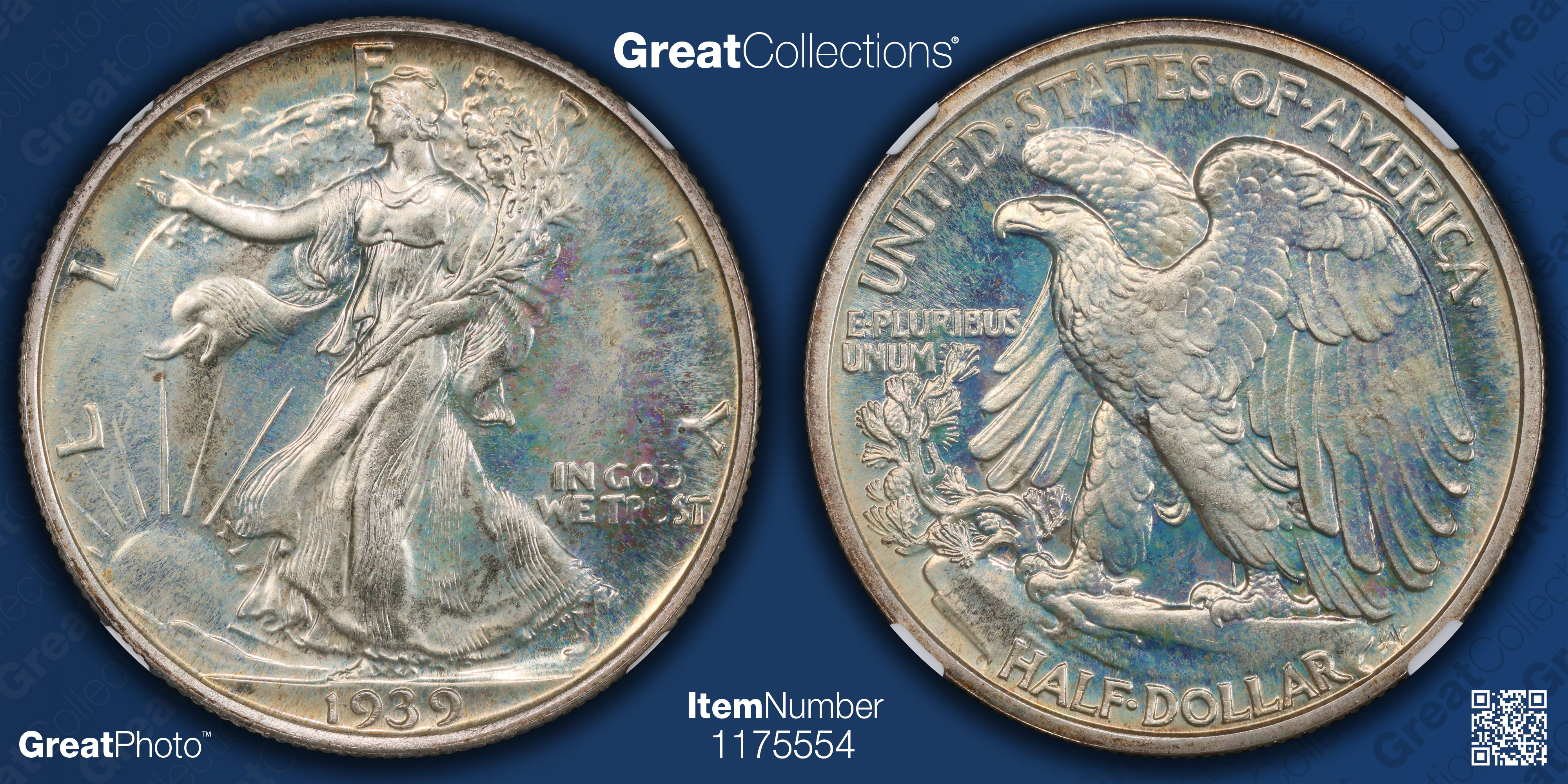
The nickel appears to be original and high in quality, I'd wager a guess of PR66+.
The cent appears to be roughly PR64RB. The spots on the reverse are troubling. If sent in with the rest of the coins in the set it too would likely be dubbed at a minimum questionable color, more likely artificially toned.
I would not grade the coins unless the artificial toning could be removed, perhaps with a dip. The coins would then need to be re-evaluated for grade.
Thank you for taking the time to lay out your perspective — I appreciate the detail.
I’ve been looking at some documented auction and CoinFacts examples from the same era, and I’m finding a few that appear to show similar blue-to-violet peripheral progression that were nevertheless straight-graded.
In particular, the Stack’s Bowers Mercury dime discussed here, as well as the PCGS CoinFacts images for the 1939 Proof Mercury Dime and the 1942 Proof Mercury Dime, seem to show blue transitioning into violet or magenta at the periphery rather than electric blue alone.
That obviously doesn’t mean color alone settles anything, but it does make me think the combination of colors may not be disqualifying by itself, and that progression and consistency across the surfaces — and across coins — may be just as important.
I’m very open to being wrong here; I’m mainly trying to better understand where the line tends to fall on early proof silver.
Is this just confirmation bias or am I onto anything here?
It would be a shame if those coins are AT. They look pretty nice to me.
I dont know as much about toning as others here do.
Student of numismatics and collector of Morgan dollars
Successful BST transactions with: Namvet Justindan Mattniss RWW olah_in_MA
Dantheman984 Toyz4geo SurfinxHI greencopper RWW bigjpst bretsan MWallace logger7 JWP
To my eyes, the silver coins in your set look artificially toned and the pieces you linked appear distinctively different in color from yours.
Even with excellent images it’s often impossible to provide meaningful grade guesses for proof coins. That's because their grades are usually based largely upon the extent of hairlines (which aren’t typically fully discernible in images).
Mark Feld* of Heritage Auctions*Unless otherwise noted, my posts here represent my personal opinions.
Thank you for weighing in — I appreciate you taking the time to look and to share your perspective.
If you’re willing, I’d really like to understand what specific diagnostics are leading you to conclude the silver appears artificially toned, and in what ways you see it as distinctively different from the Heritage / CoinFacts examples I linked. Maybe I'm blind after all but I'm genuinely curious where I went wrong.
In particular, I’m trying to focus on observable features rather than overall impression, such as:
I fully understand that proof grading — especially hairlines — can’t be meaningfully assessed from images, and I’m not trying to pin down grades from photos. I’m mainly trying to learn which visual or physical cues you’re seeing that push this into the artificial category in your view.
Any clarification you’re willing to share would be genuinely helpful.
To my eyes the silver coinage absolutely appears to be artificially toned. I can't give you a thorough reason short of a treatise on toning other than because I have specialized in toned coins for several decades and these coins never look like this, in my opinion. Sorry.
In honor of the memory of Cpl. Michael E. Thompson
Run Forrest run! I wouldn't touch that set for any price. Looks pretty, but coins of that period do not look like that.
“In matters of style, swim with the current; in matters of principle, stand like a rock." - Thomas Jefferson
My digital cameo album 1950-64 Cameos - take a look!
You’re most welcome.
In particular, the peripheral color on the dime and half dollar looks artificial - wrong colors to be natural.
I understand that you’d prefer something more objective and specific. But I am basing my assessment on having viewed a lot of coins in my 40+ years spent as a full time dealer/grader.
Mark Feld* of Heritage Auctions*Unless otherwise noted, my posts here represent my personal opinions.
Grading is an art, not a science. In this case, the art is the dogs playing poker on velvet
As others have stated, you begin to get a “feel” for what is natural and what is not natural by seeing large numbers of these coins and what toning patterns they exist in. I’ve been specializing in this series for a number of years and have seen a large number of these coins.
I have never seen the toning patterns your coins have on another silver coin of the era, especially with the vibrancy and abundance of the blues. The coins you linked have a very yellow/orange dominant tone consistent with hundreds of other examples, whereas yours have a high concentration of blue that is not repeated at quantity. Blue is also a very common color for artificially toned coins, and vibrant blue even more so.
Thank you — I appreciate you taking the time to explain your perspective.
I completely understand the “pattern recognition” aspect, and I agree that vibrant blue is often associated with artificially toned coins, which is why this set gave me pause initially.
What I’m struggling with — and what I’d genuinely like to understand better — are some of the specific physical behaviors of the toning on these coins, particularly:
• The way the color consistently concentrates at the inner rim / protected areas, while largely avoiding the flat outer rim face
• The fact that the toning terminates cleanly at the rim rather than bleeding onto the faces or across devices
• The mirrored consistency on both obverse and reverse, especially given that these were stored together
• The smooth gradient progression rather than mottled or patchy application
From a purely mechanical standpoint, those features feel more consistent with long-term, environment-driven oxidation than with any kind of deliberate surface treatment — but I fully acknowledge that my experience is more limited.
Are there known artificial or accelerated toning methods that tend to produce:
• rim-confined color
• inner-rim concentration
• symmetric behavior on both sides
• and clean stopping points at exposed edges
…particularly on early proof silver?
I’m not asking to debate conclusions — I’m genuinely trying to understand how experienced specialists reconcile those specific physical patterns with an AT assessment.
I saw what I thought were hairlines but they continued over the white Capital plastics holder so obviously on the clear layer of the holder. Grading from those pictures of proof coins is inaccurate. The blue to purple transition looks odd. I would not be very excited with this set.