Citizens Coinage Advisory Committee Meeting Recap (October 2025)
 KellenCoin
Posts: 1,248 ✭✭✭✭✭
KellenCoin
Posts: 1,248 ✭✭✭✭✭
My name is Kellen Hoard, and I currently serve as one of the Representatives of the General Public on the Citizens Coinage Advisory Committee. I am an undergraduate student, and the youngest person to ever serve on the Committee. For those of you unfamiliar with the CCAC, it was established in 2003 by Congress to advise the Secretary of the Treasury on the themes and designs of all US coins and medals. The CCAC serves as an informed, experienced and impartial resource to the Secretary of the Treasury and represents the interests of American citizens and collectors.
This is the eleventh installment of my updates about what the CCAC is doing at its meetings. I think it is critical that the collecting community have insight into and input to the CCAC, and will try to answer any questions you may have.
Here is my update for the CCAC meeting on October 21, 2025.
- The Fiscal Year 2025 Report was approved by the committee. This should hopefully be published publicly soon.
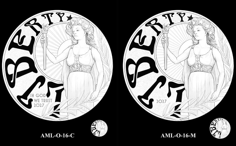
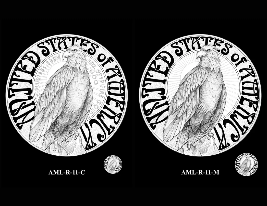
- Candidate designs for the 2027 American Liberty Gold Coin and Silver Medal were discussed. The CCAC recommended the following obverse and reverse designs:
Let me know if you have any questions about the work done in this meeting; I will try to answer as well as I can, but there are contraints on what I am able to share publicly. Please remember that the CCAC does not make the final decision; instead, it makes its recommendation (alongside the Commission of Fine Arts) to the Secretary of the Treasury. If you would like to watch the October meeting in full in order to see all of the deliberations, it is available on Youtube here.
Fan of the Oxford Comma
CCAC Representative of the General Public
2021 Young Numismatist of the Year
Comments
Groovy!
I like it 👍
The FONT 👎
USAF veteran 1984-2005
Thank you, Kellen.
Thanks for your effort. Wishing you the best.
Thank you for the updates.
I think the designs recommended are quite cool and it appears to me that the lettering is largely incuse and will be brilliant against the fields. I think it is really cool and they only needed to put flowers in her hair instead of stars!
In honor of the memory of Cpl. Michael E. Thompson
Are the coins images generated by CAD?
Disclaimer: I'm not a dealer, trader, grader, investor or professional numismatist. I'm just a hobbyist. (To protect me but mostly you! 🤣 )
I like the design on both sides very much.
Is Lady Liberty inspired by Sydney Sweeney?
chopmarkedtradedollars.com
A less bored look on Liberty's face would be nice. Give us strong or joyful, not tired of holding the torch.
Collector of Liberty Seated Half Dimes, including die pairs and die states
Oof....there were some woke stinkers in those designs. A butch bald chick? Seriously? With variants of it that look like tats? I liked the Pegasus design and the gray wolf even more.
That late 60's font just looks awful in my opinion.
Throw a coin enough times, and suppose one day it lands on its edge.
More like the "How much longer do I have to stand here holding this torch?" look.
Throw a coin enough times, and suppose one day it lands on its edge.
Kellen - Thanks again for posting your monthly meeting summaries! Greatly appreciated!
Like many of the recent designs we’ve seen, “Oh well”.
Steve
My collecting “Pride & Joy” is my PCGS Registry Dansco 7070 Set:
https://www.pcgs.com/setregistry/type-sets/design-type-sets/complete-dansco-7070-modified-type-set-1796-date/publishedset/213996
Liberty looks sad. Or very serious.
Sorry, but for the fact that the cartoonish font represents a lack of commitment on the designs being put forth and selected by your committee, says to me we have completely moved beyond artistry and talent. As if a kid with a c&c machine is now considered and acceptable numismatic artist. This is beyond my appreciation. Kellen, I do appreciate your time and input to the forum to keep us informed, but its no longer something I care to view. JMO
Jim
When a man who is honestly mistaken hears the truth, he will either quit being mistaken or cease to be honest....Abraham Lincoln
Patriotism is supporting your country all the time, and your government when it deserves it.....Mark Twain
Heavy duty Art Nouveau! I wonder if Alphonse Mucha would approve?
The last three coin designs that were well received involved nature and animals, so that theme could have been followed going forward beyond another eagle. Some of the designs are so far out there it is hard to believe that these are serious artists.
Does the committee have the option of declining to recommend any of the designs? Or do they have to choose from among the proposals?
.
Yes, that is an option, and it was raised by some members this time.
Fan of the Oxford Comma
CCAC Representative of the General Public
2021 Young Numismatist of the Year
The recommended design is far and away the best!
good eye
"Inspiration exists, but it has to find you working" Pablo Picasso
Leaning particularly heavily on Alphonse Mucha (not that I'm complaining)
Phil Arnold
Director of Photography, GreatCollections
greatcollections.com
I think a New England Shilling is better looking than any of those “artistic” coins.
I see the new post by @Russell12 that all CFA members have been fired (Commission of Fine Arts). Their function is different than CCAC.
Steve
My collecting “Pride & Joy” is my PCGS Registry Dansco 7070 Set:
https://www.pcgs.com/setregistry/type-sets/design-type-sets/complete-dansco-7070-modified-type-set-1796-date/publishedset/213996
Awful designs in my opinion. Pass
I'd like to thank the Mint for saving me money in 2027.
Maybe they can still pick this one.
Lawrence Talbot approves!
The Mysterious Egyptian Magic Coin
Coins in Movies
Coins on Television
I'm hoping they go with the wolf. Don't know about the reverse. I haven't really looked at the reverse designs.
Throw a coin enough times, and suppose one day it lands on its edge.
Wolf looks pretty damn good!
Proud follower of Christ!
Of all the candidate designs, the wolf (a predator) says "Liberty" the least.
Maybe that was what was intended.
Free Bird !!!!
Suddenly, the Eunice Shriver commemorative is looking like the Mona Lisa. We’ll be looking back at this design, longing for the days of true “classical artistry”.
Founder- Peak Rarities
Website
Instagram
Facebook
Maybe that's why they were fired (the CFA), and not a minute too soon.
I don't think the CFA is involved with coin design.
They are - almost every coin/medal series the CCAC reviews is also reviewed by the CFA.
Fan of the Oxford Comma
CCAC Representative of the General Public
2021 Young Numismatist of the Year
Are the coins images generated by CAD?
Disclaimer: I'm not a dealer, trader, grader, investor or professional numismatist. I'm just a hobbyist. (To protect me but mostly you! 🤣 )
If that is the case then you should expect some big changes in the near future.
The Art Nouveau influence is obvious- I agree with TomB that flowers or even some type of viny laurel in her hair would be an improvement. The look of Ms. Liberty is typical for how women were portrayed at that time. I would replace the eagle with a different eagle- perhaps something comparable to the eagle on the Illinois Commem or even the Peace Dollar. The eagle really compromises the whole Art Nouveau theme. The font is bold and has potential.
The larger issue is that it has this computer generated look instead of that hand crafted look which was part of the Art Nouveau Moment. If the coin has a chiseled look similar to EARLY 20th century coinage, this could be something special.
I will not hold my breath.
Experience the World through Numismatics...it's more than you can imagine.
Commercial art is increasingly computer generated. With the advent of AI generated art added you should expect to see a dramatic decline in originality. Don't be surprised if AI completely takes over the process of commercial art as it becomes cheap to produce.
You should also expect a movement in the art world to develop that completely rejects both computer generated and AI art. Will it catch on? Who knows?
I can't believe one of these didn't win.
We could have had the:
"Someone help me carry the groceries in" obverse.
or
"Bundled up for new assignment to Alaska" with a side of "side eye"
or
"No more deciding on hairstyles, now check out my new piercings and tats for the protest"
.
.
.
"To Be Esteemed Be Useful" - 1792 Birch Cent --- "I personally think we developed language because of our deep need to complain." - Lily Tomlin
the
Back when I was in college at Northern Illinois University the original building (Altgeld Hall) had been built in the 1895-99 period and had a main staircase that had an elaborate art nouveau staircase railing. The building went through some modernization in about 1967-8 and the original staircase railing was replaced by a modern and very boring railing. I recall thinking at the time about what an artistic loss had just taken place.
@Rc5280 I was sharing my perception on coin designs for America. I have no political party affiliation, I am just an American veteran and coin collector. I think the Wolf design is the best looking choice among the options offered, and should have said that more clearly. It is the highest quality design.
https://www.autismforums.com/media/albums/acrylic-colors-by-rocco.291/
the
I don't mind the Art Nouveau in theory, but the wild variations in text size somehow give it a 1960s hippie vibe, as others have picked up on.
The wolf design is reminiscent of the seemingly endless variety of animal coins issued by Australia.
It is unlikely that I would be a buyer of any of it. The mint jumped the shark (great idea for a new coin! 🙄 ) long ago and I am mostly done with trying to keep up with the latest hot issue that fades as soon as the next big thing comes out.
By total coincidence, last night I came across my stash of presidential reverse proof dollar sets. I looked them up on ebay to see what they are selling for, and it seems they are worth about what I paid for them back when I was furiously trying to beat the sellout, despite the fact that each set also contains an ounce of silver that has skyrocketed in value since then. It didn't necessarily surprise me but it was still a sobering realization.