I've often thought about how disappointing it must have been back in the days of the Topps monopoly to wait all winter for the new card release, luck into pulling a card of your favorite player, and then be stuck with a weird Pic of the guy, and have to hope next year was better. Or not the same Pic just cropped differently, like what occurs in a lot of the 60s sets. Even in 1981, when I got my start with cards, as bad as Donruss and Fleer could be, at least you had choices.
@bgr said:
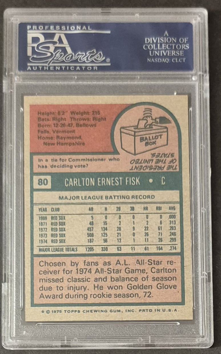
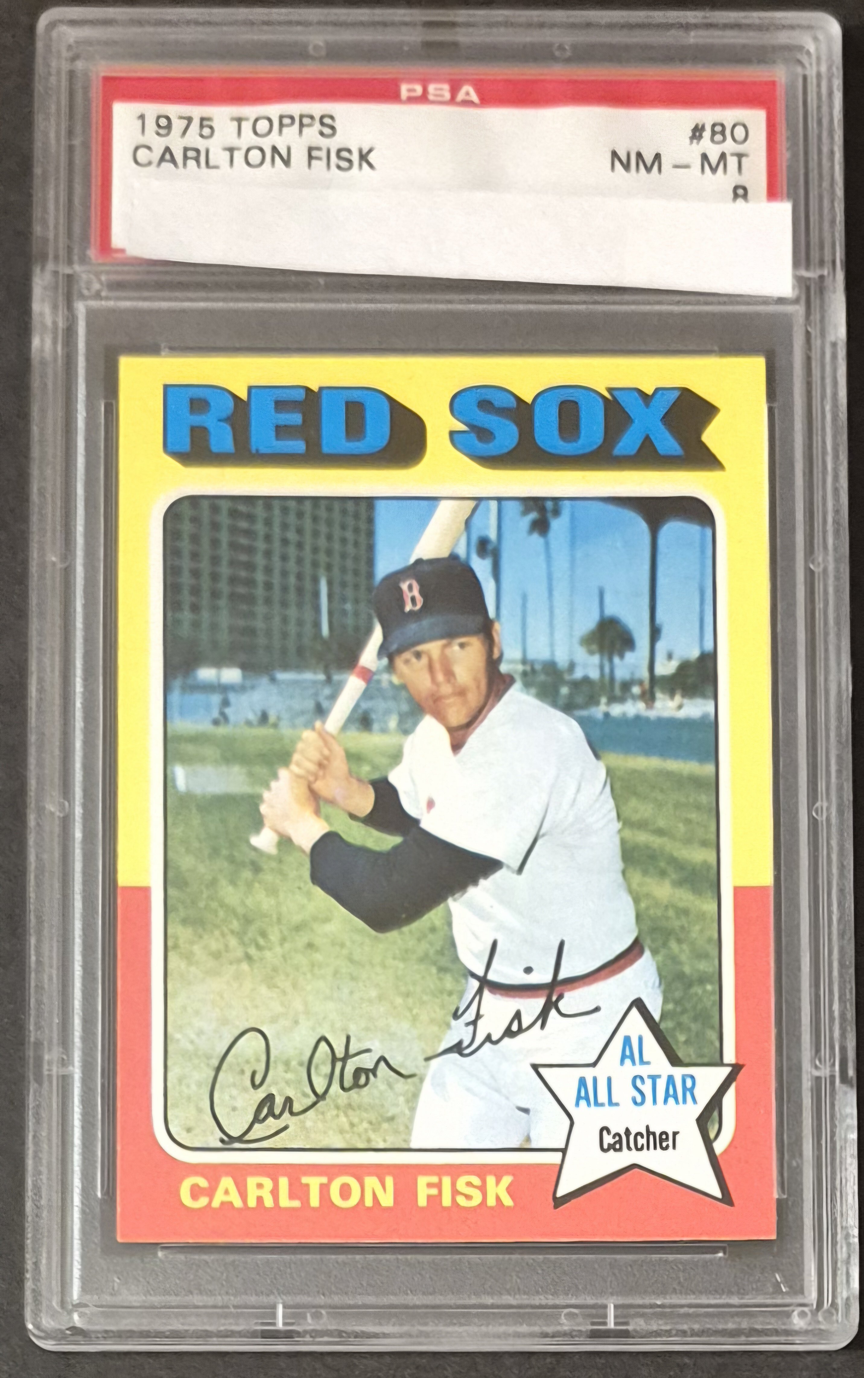
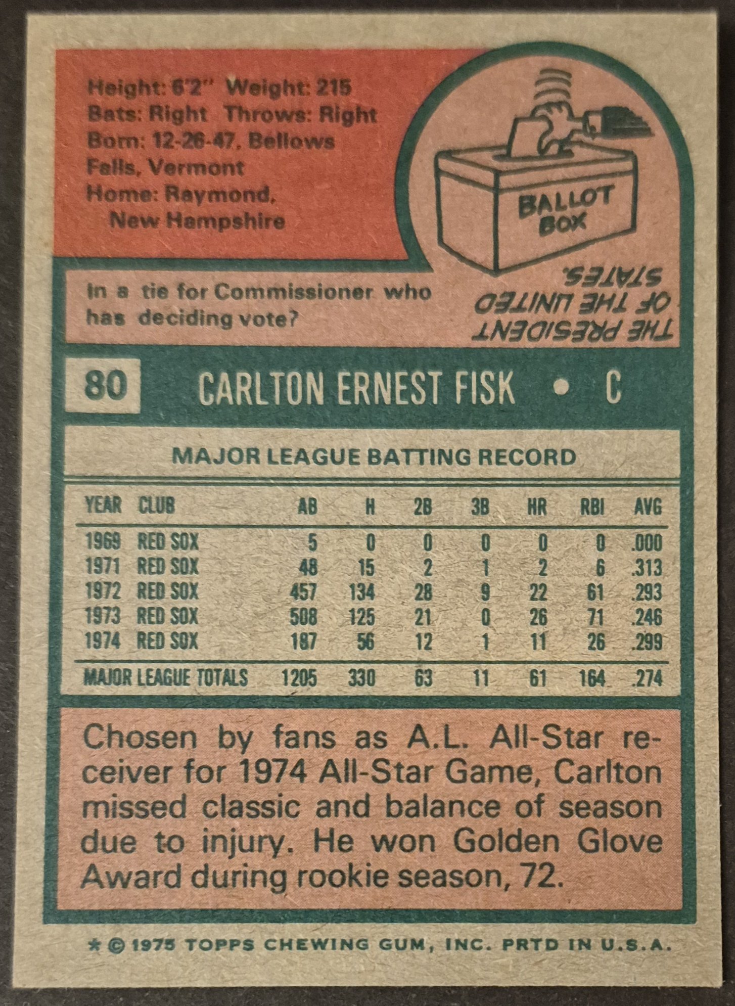
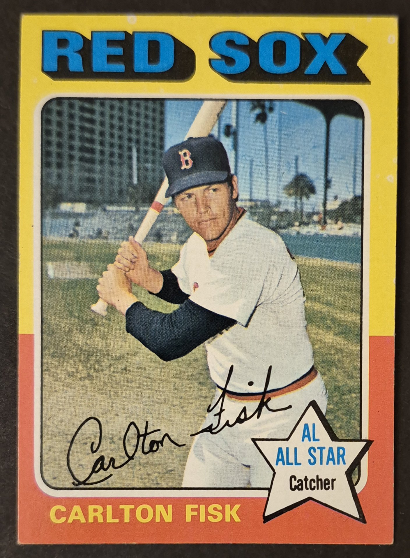
The Fisk (slabbed) is quite nice for a PSA 8.
Thank you. I haven't looked at most of these cards in roughly 10 years, so this has been quite enjoyable for me to slowly look through and appreciate what I have. Some of them are better than I remembered, and then some are not as nearly as nice as I thought. I would agree the Fisk is pretty nice.
I'm not sure what the pop report says for Joe Lis, but this card was always ugly in my stack of raw ones. Plagued by print issues, often terribly OC or diamond cut, and a lot of time Joe's skin was jaundiced with an excess of yellow ink in the printing of the card.
George Foster was another tough one on all of the raw examples that I accumulated. Often diamond cut or OC. This is the best I could come up with, and it required me to overlook the slight wax stain on the back.
@BBBrkrr said:
I love the 75 set because so many spring training photos look like they’re taken in some random pasture.
I agree with that assessment. On that same note, one thing that has always stood out as a little trippy about the 1975 set (you see it in other years, as well) is how the picture will be shot and cropped in such a way that the earth in the background seems tilted. All of those photos in Oakland Coliseum, especially, look like they're in the middle of an earthquake and the field is about to be swallowed up into a giant hole.
Comments
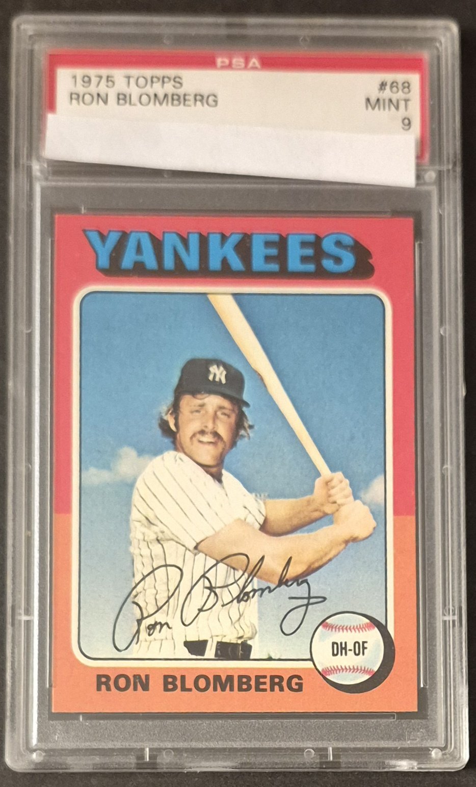
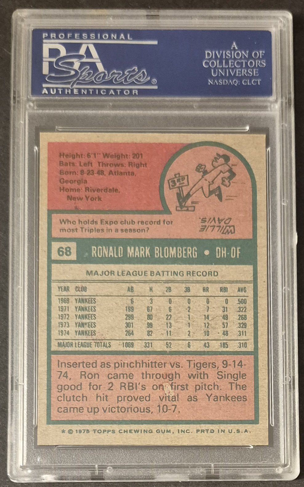
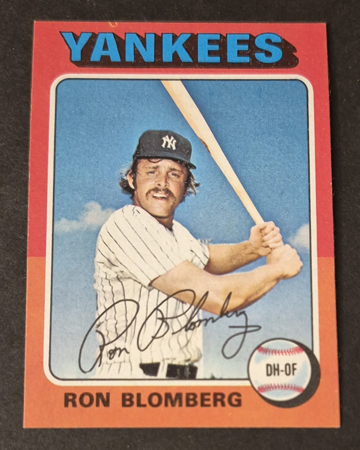
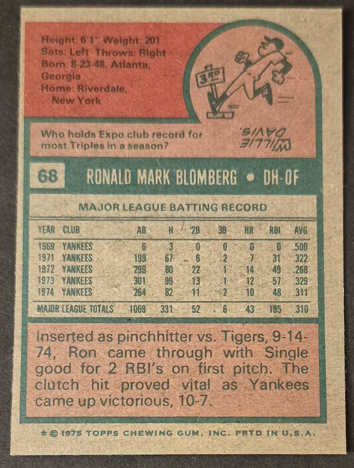
#68 Ron Blomberg
.
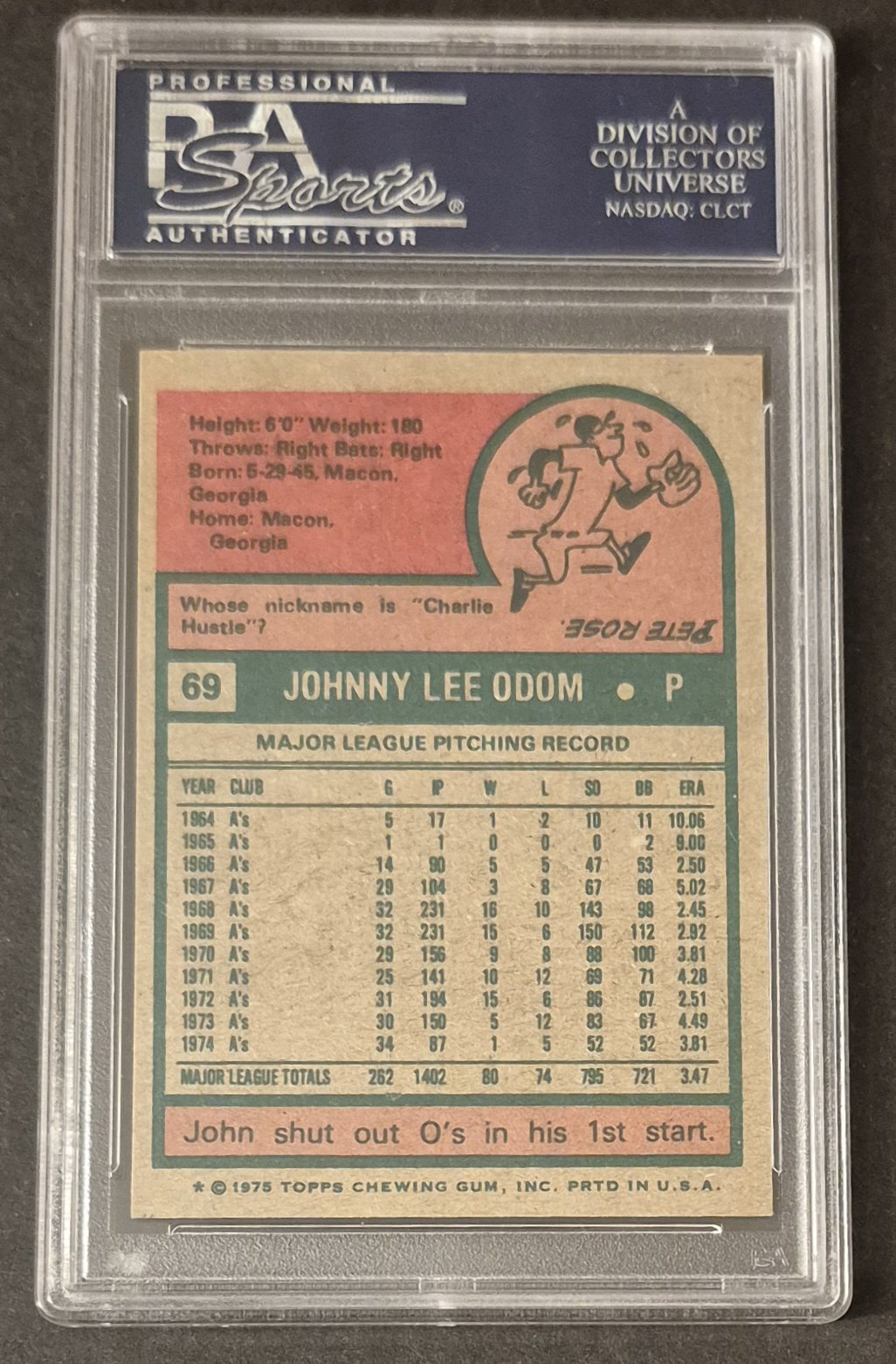
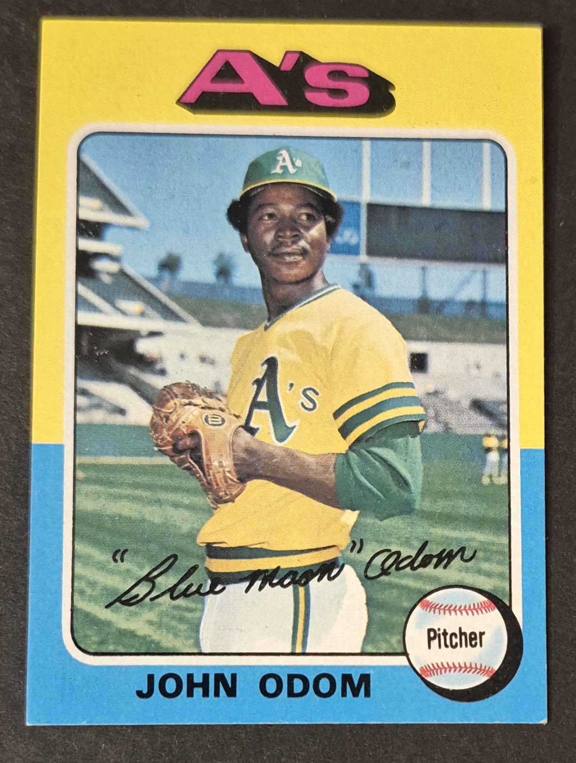
#69 John Odom
.
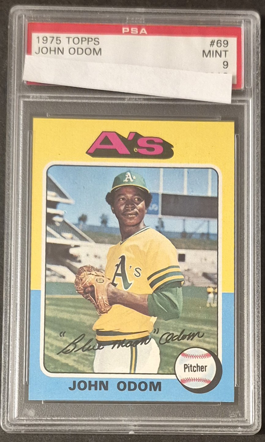
What could have been....
It's the singer not the song - Peter Townshend (1972)
Not even a minute do I buy the whole buh buh buh I'm a man-child japery - Me (2025)
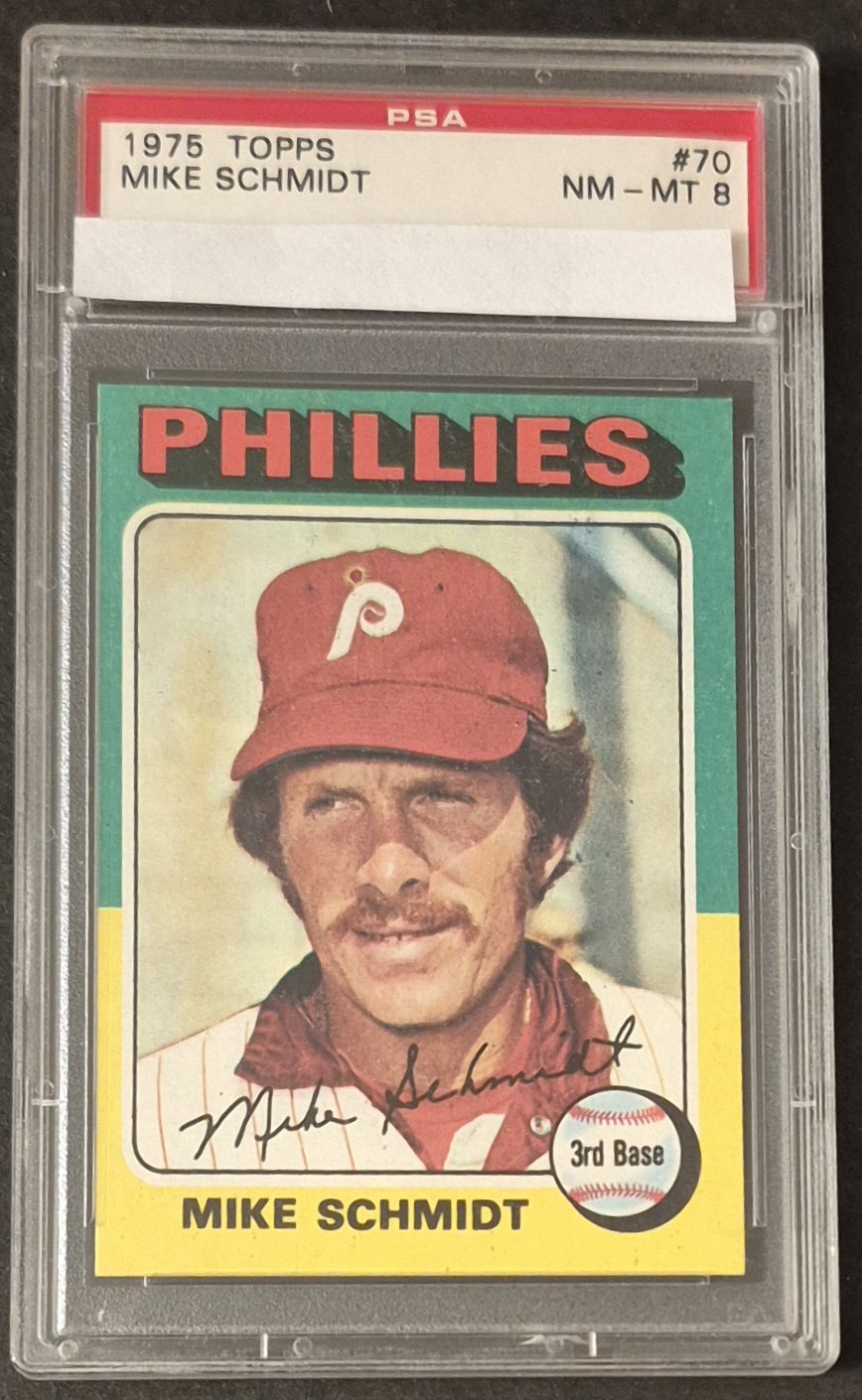
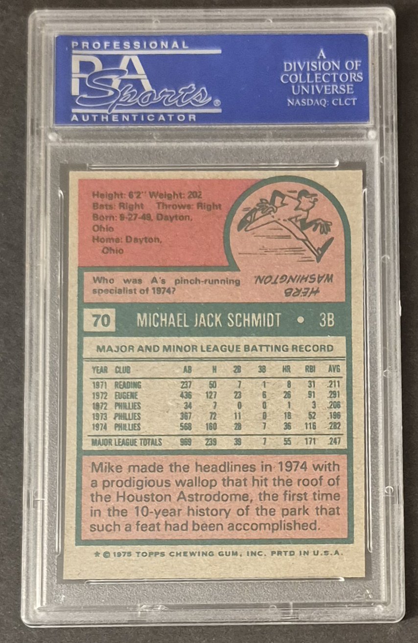
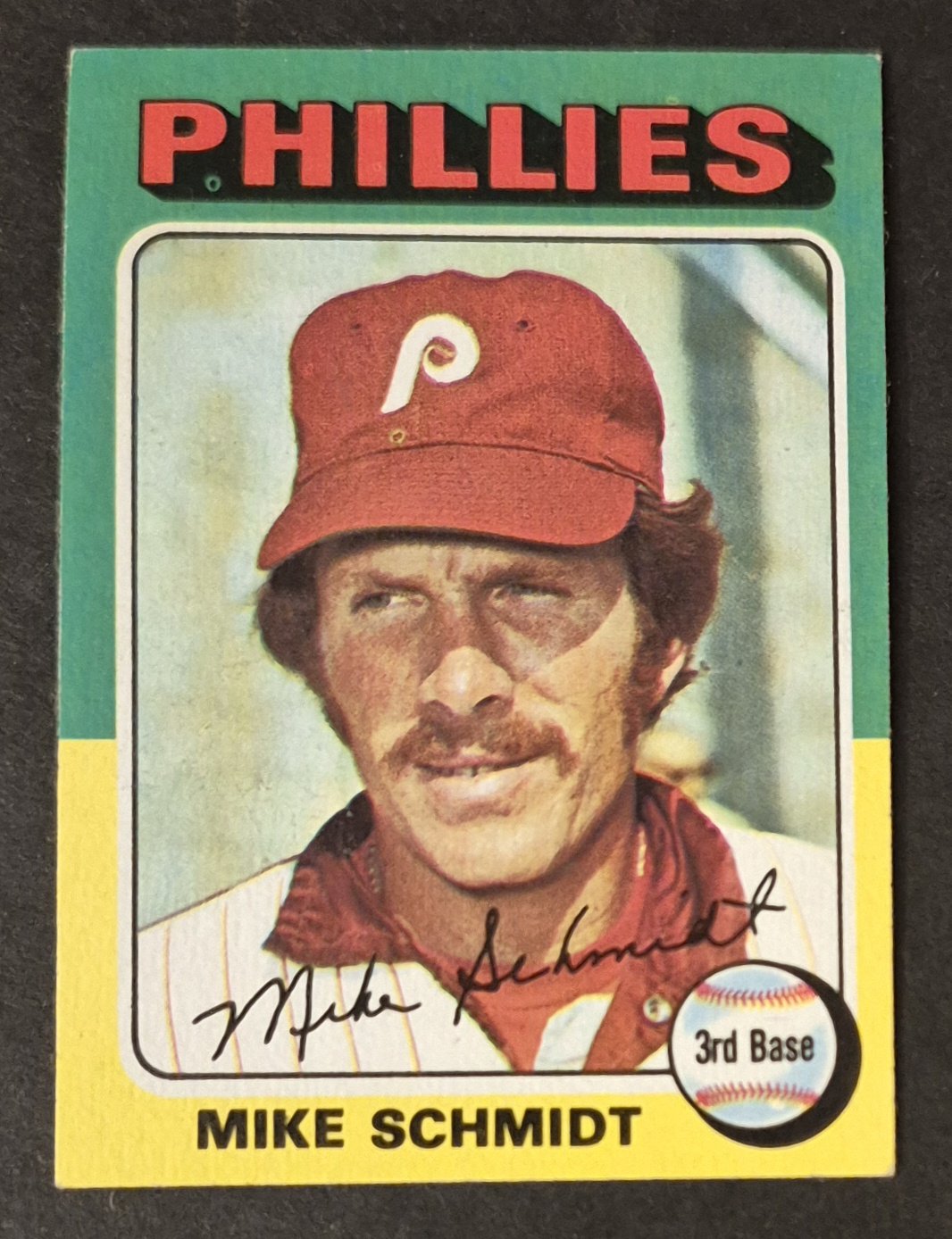
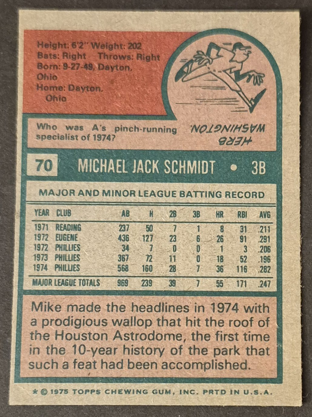
#70 Mike Schmidt
.
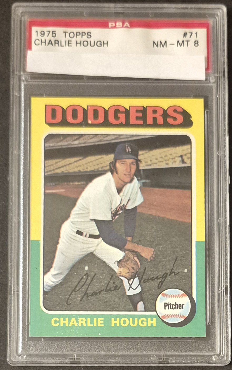
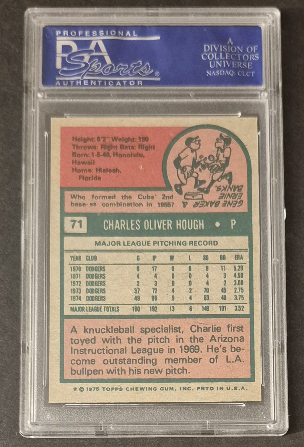
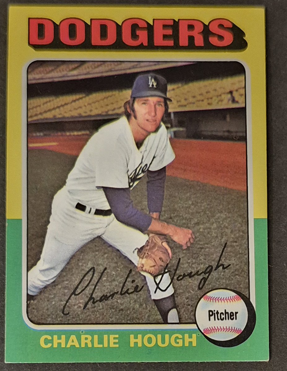
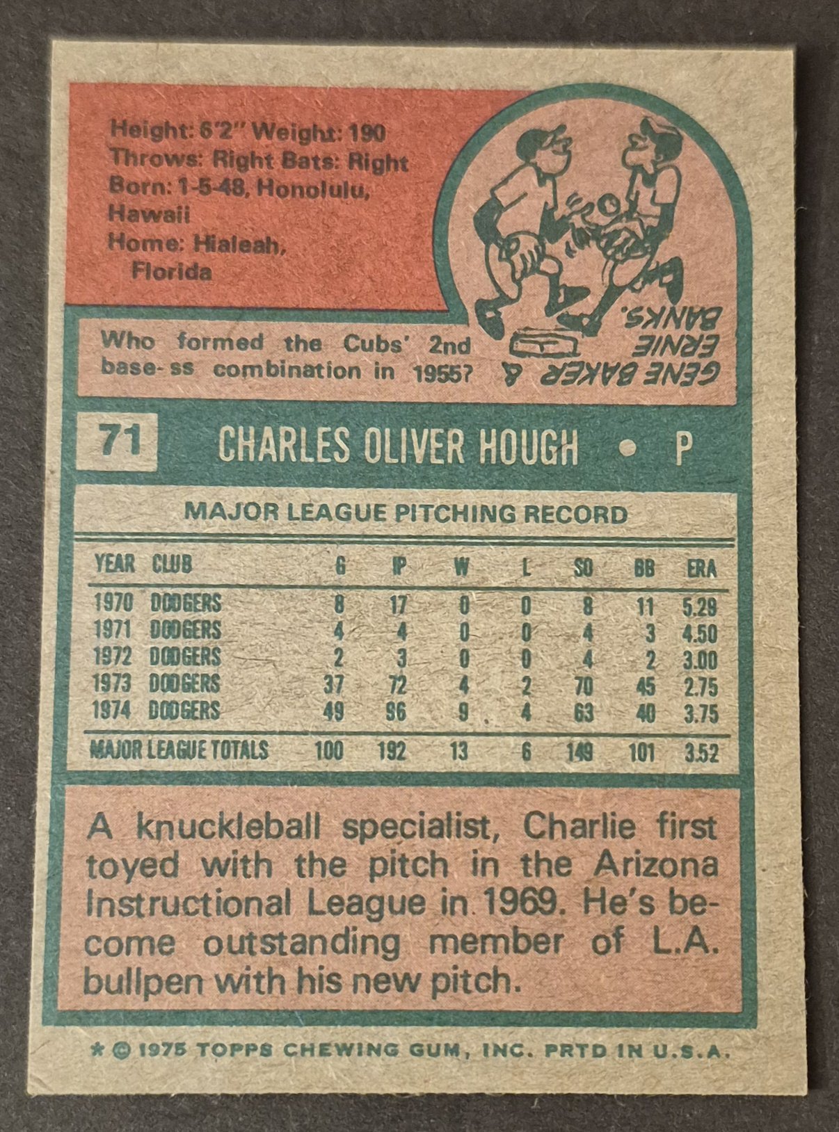
#71 Charlie Hough
.
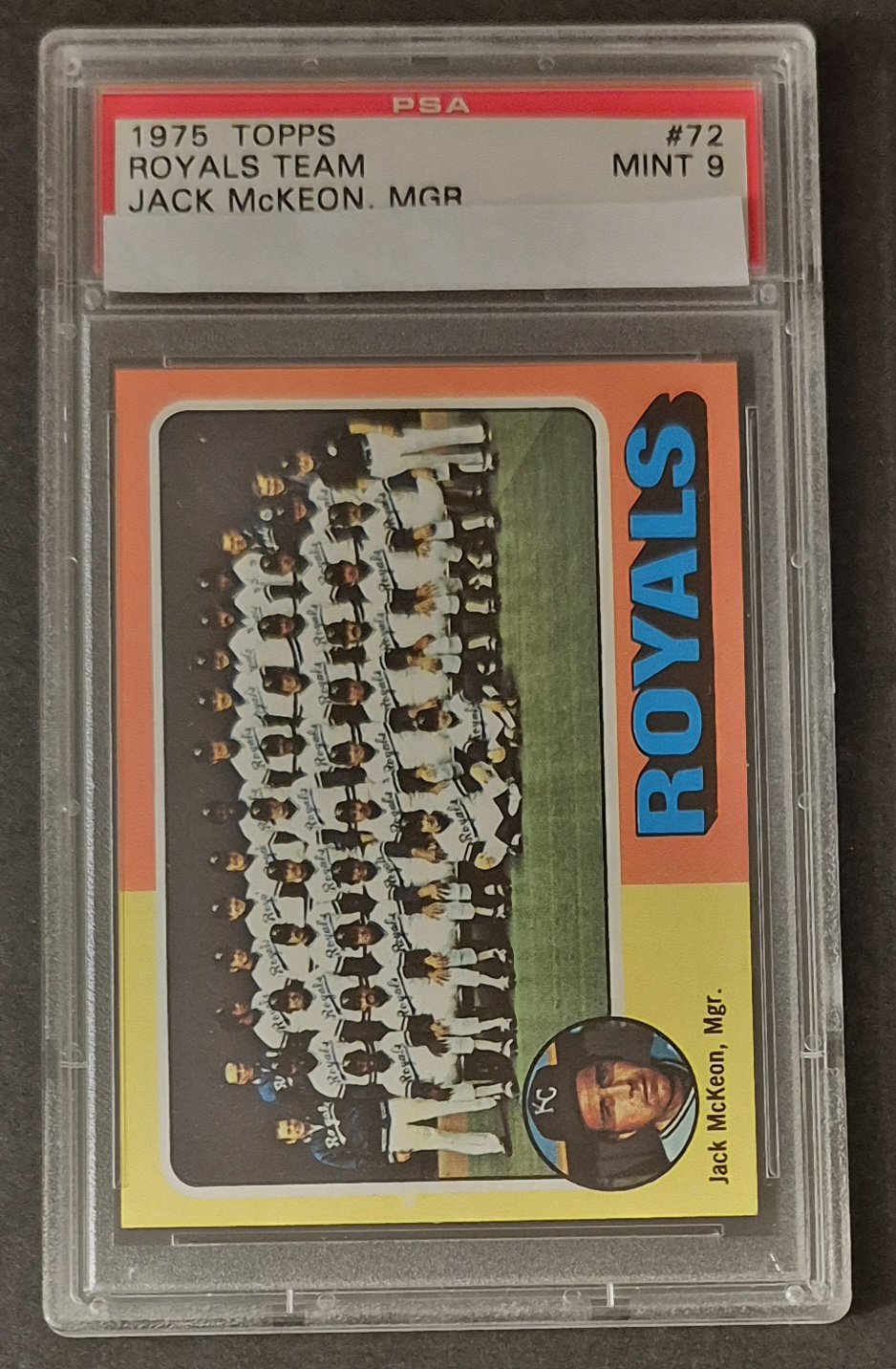
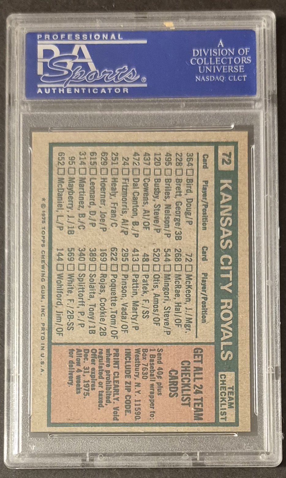
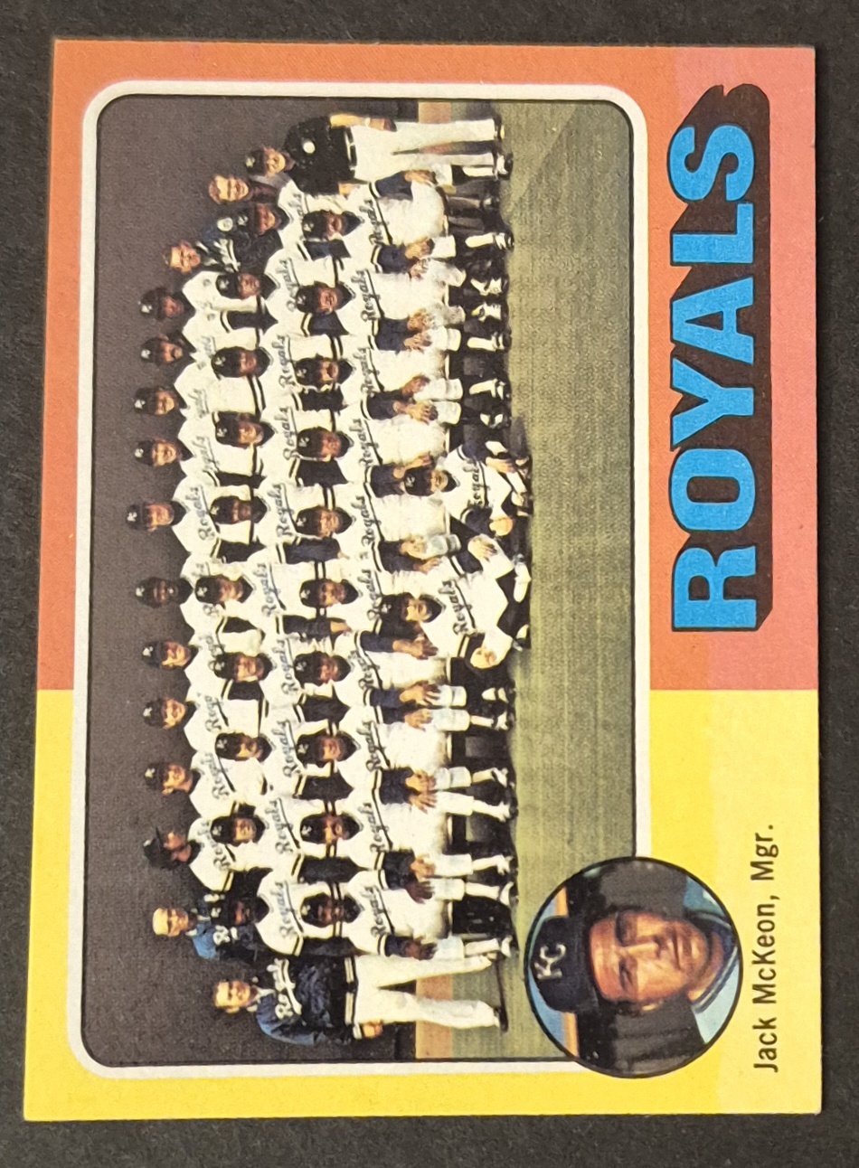
#72 Royals Checklist
.
The 75 has to be one of the worst photos of Schmidt on any card, right? That thing is so weird and bad.
I tend to nickname my cards. I refer to his 79 as "the bad whiff" cause that's what I assume caused that face.
I've often thought about how disappointing it must have been back in the days of the Topps monopoly to wait all winter for the new card release, luck into pulling a card of your favorite player, and then be stuck with a weird Pic of the guy, and have to hope next year was better. Or not the same Pic just cropped differently, like what occurs in a lot of the 60s sets. Even in 1981, when I got my start with cards, as bad as Donruss and Fleer could be, at least you had choices.
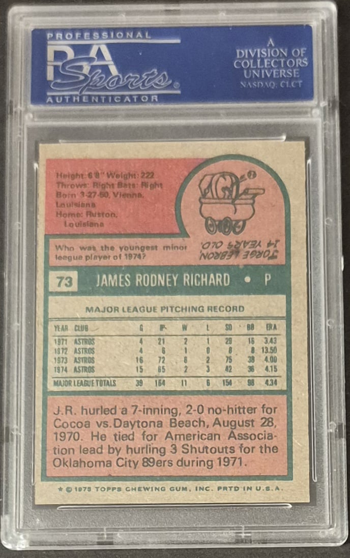
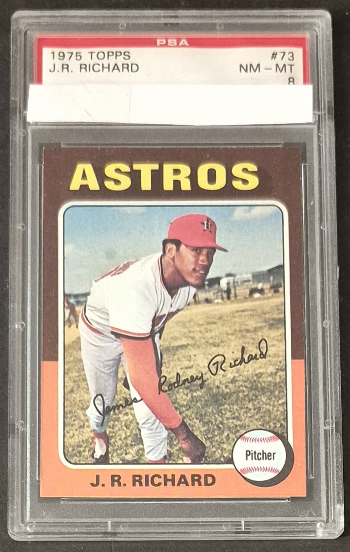
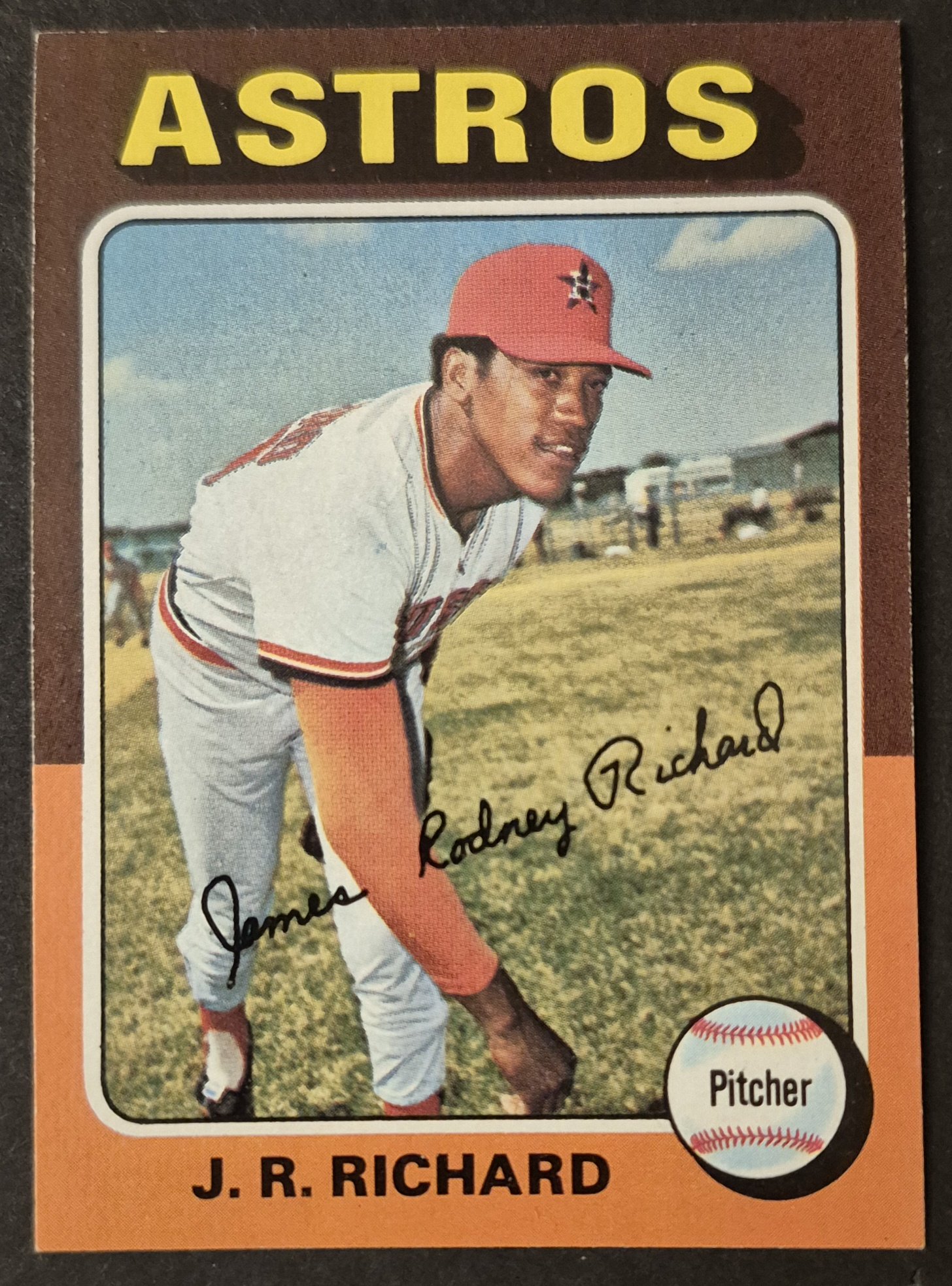
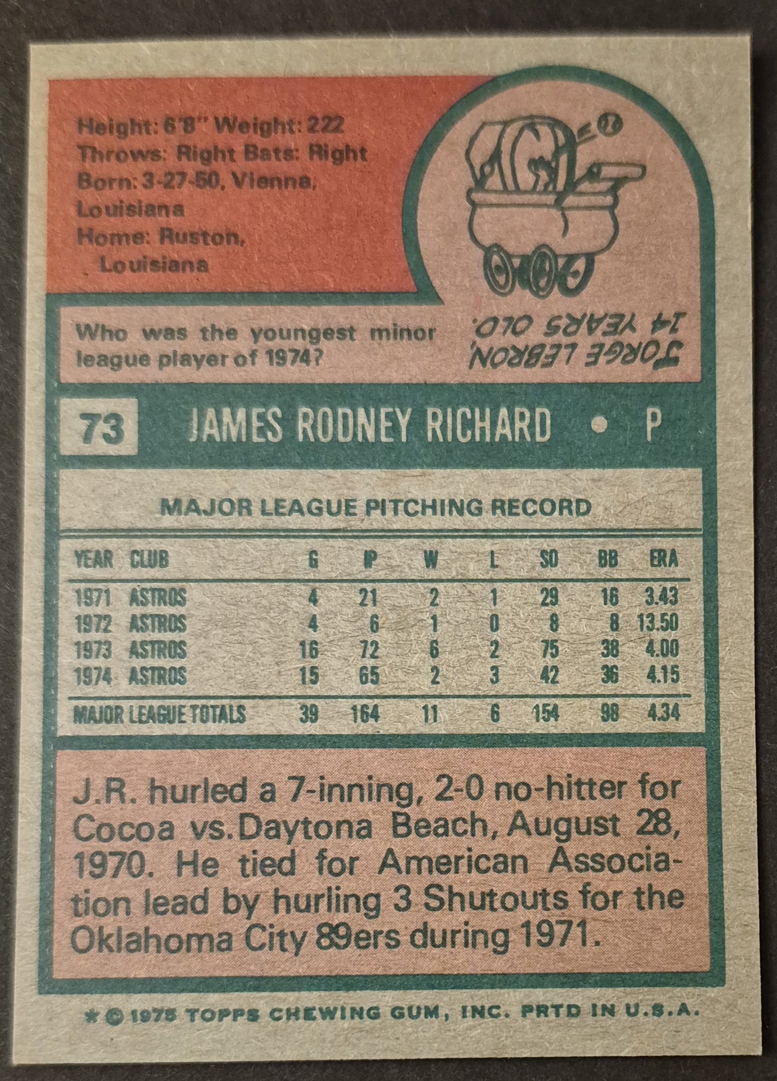
#73 J. R. Richard
.
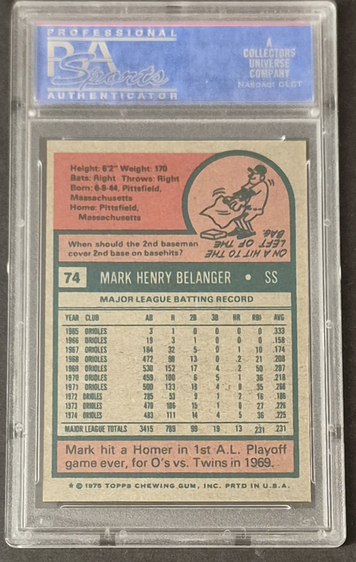
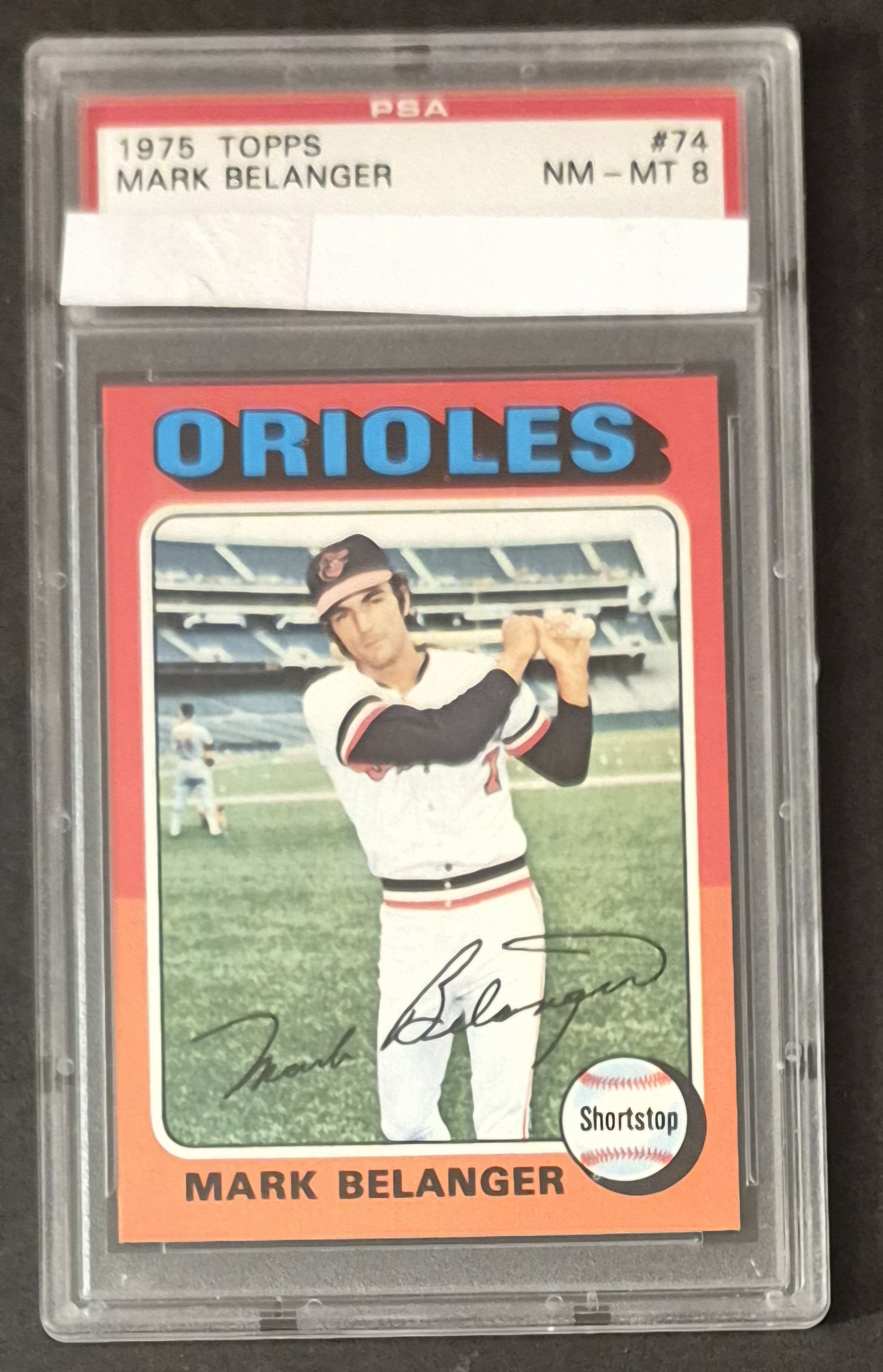
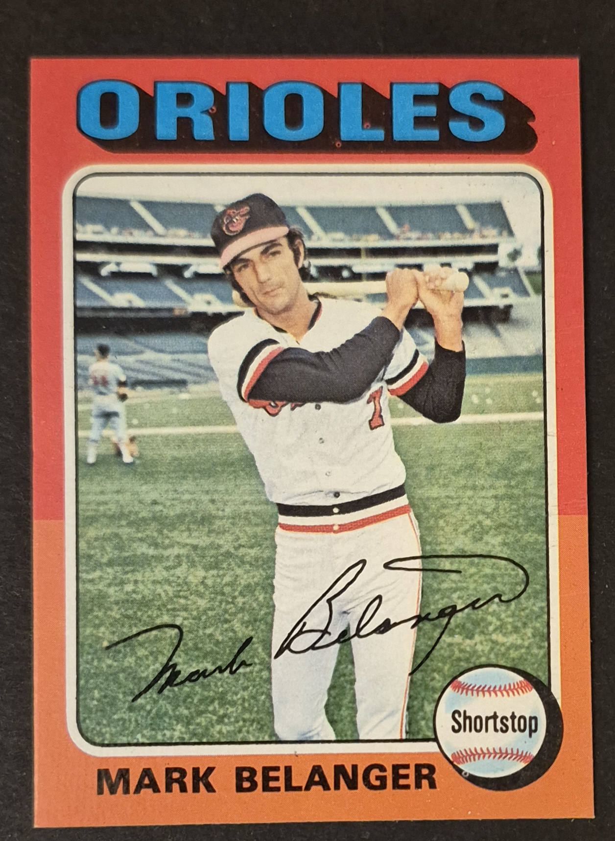
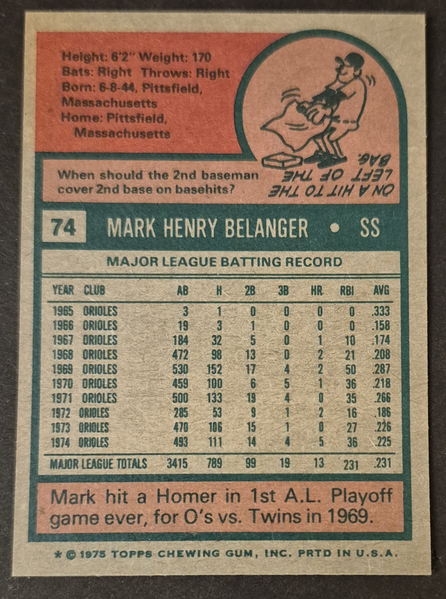
#74 Mark Belanger
.
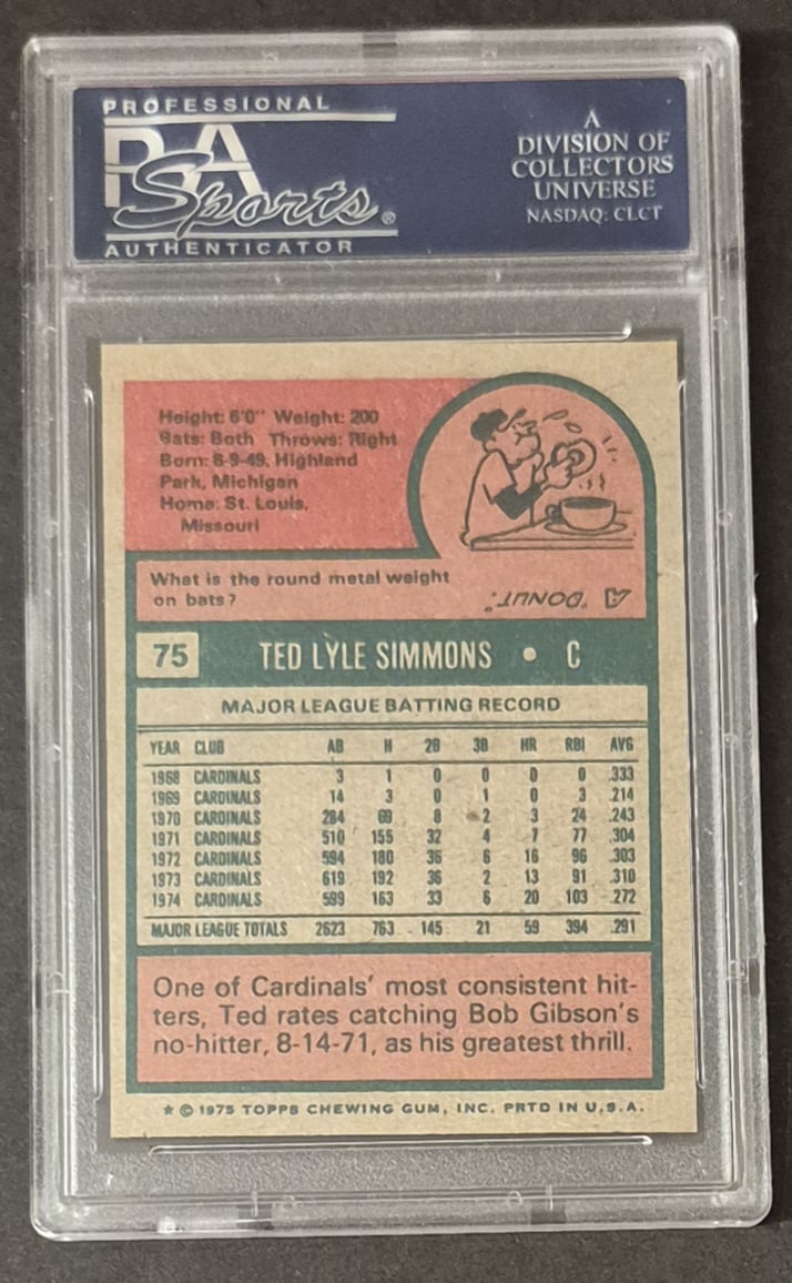
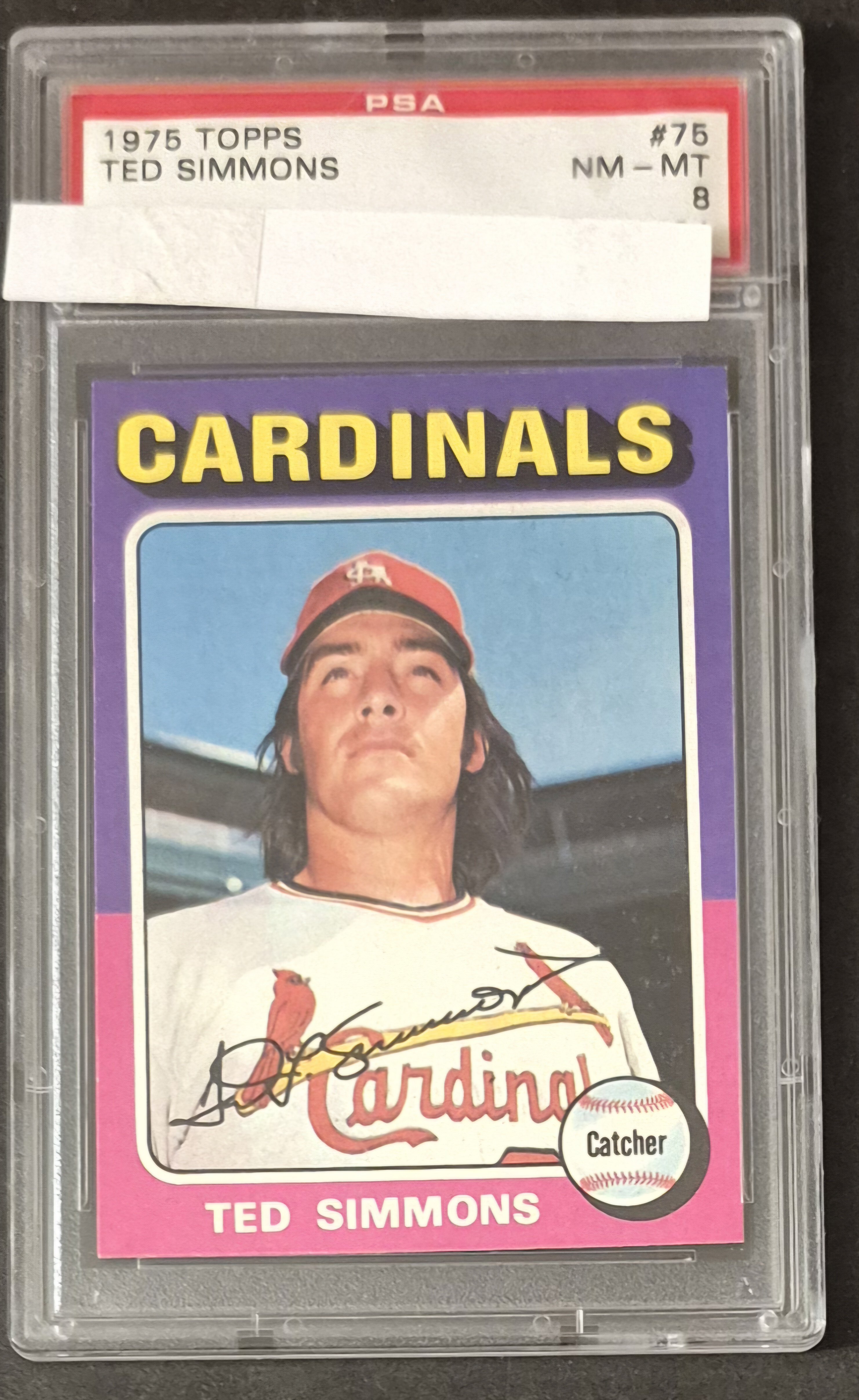
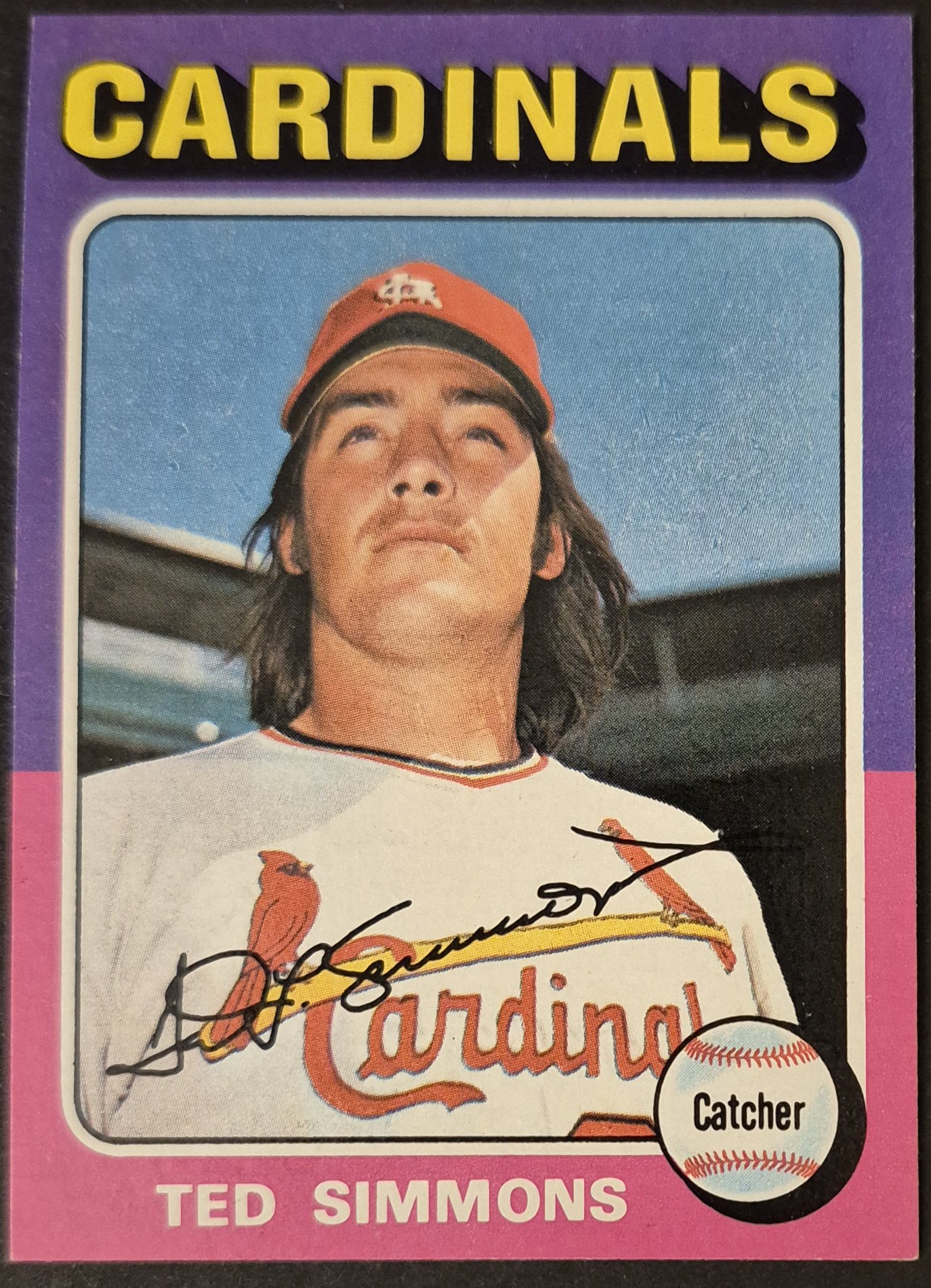
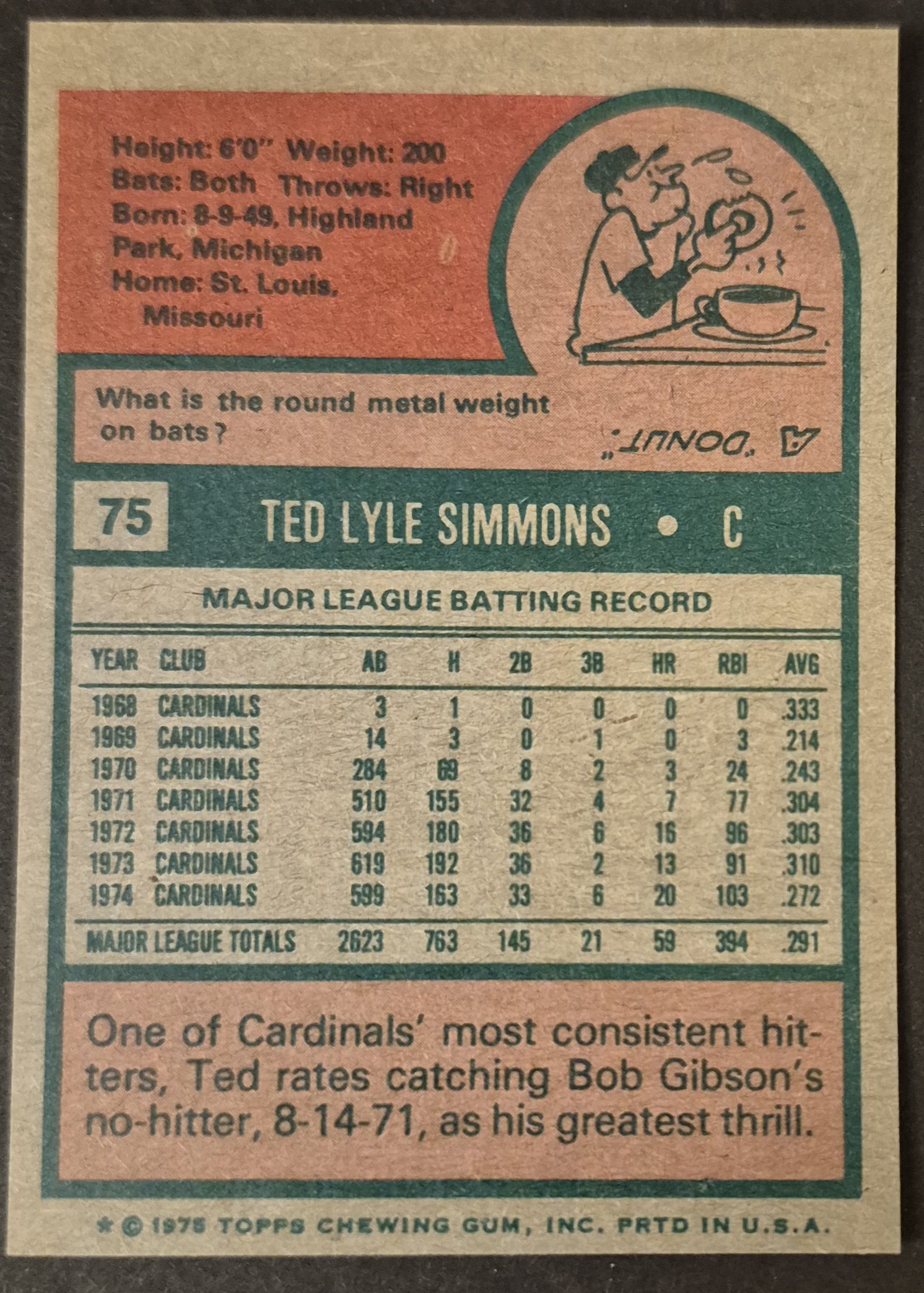
#75 Ted Simmons
.
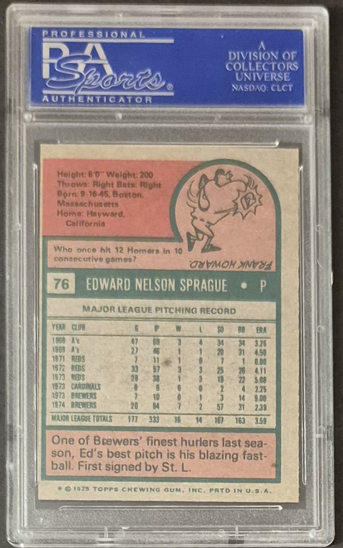
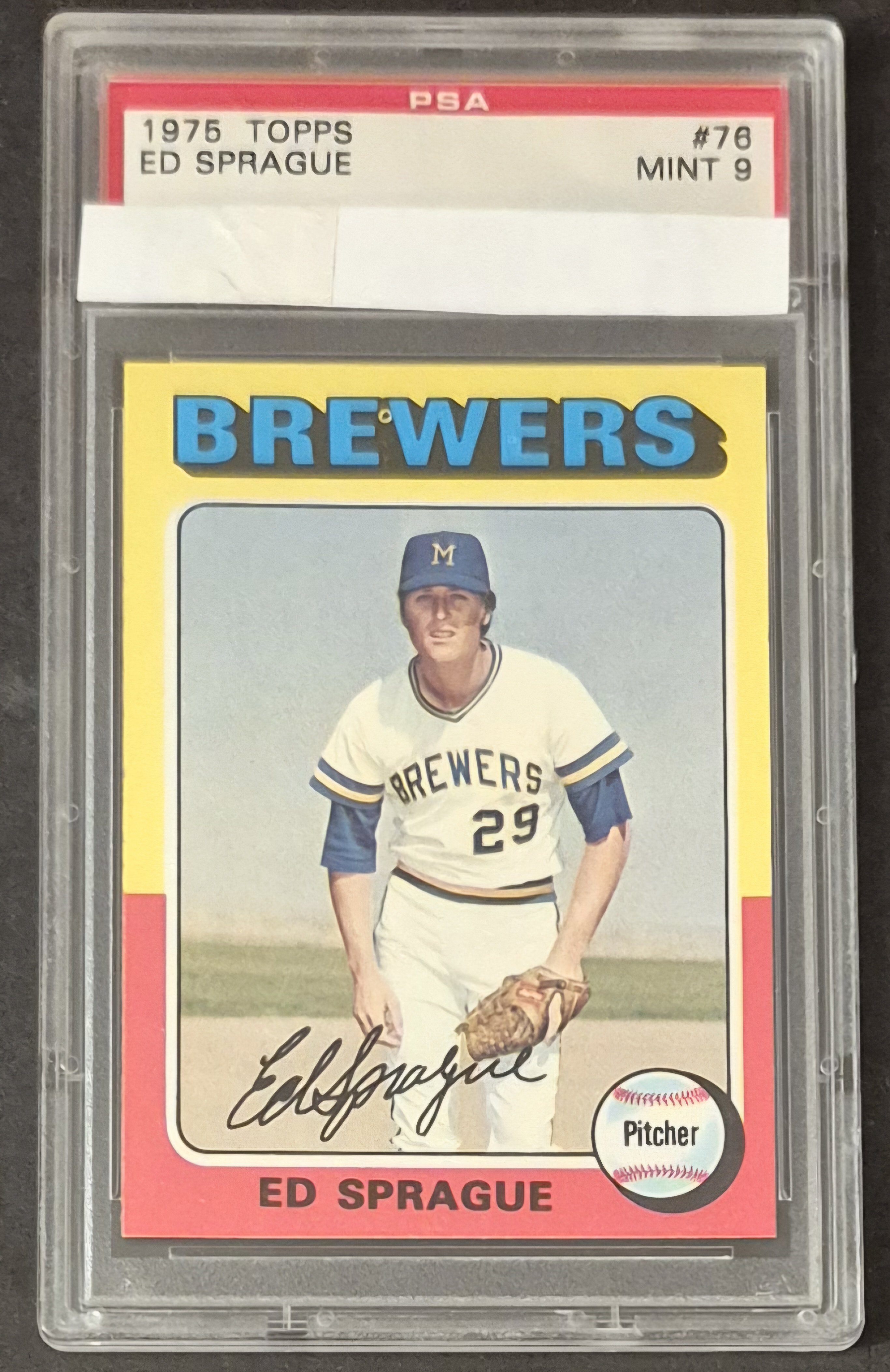
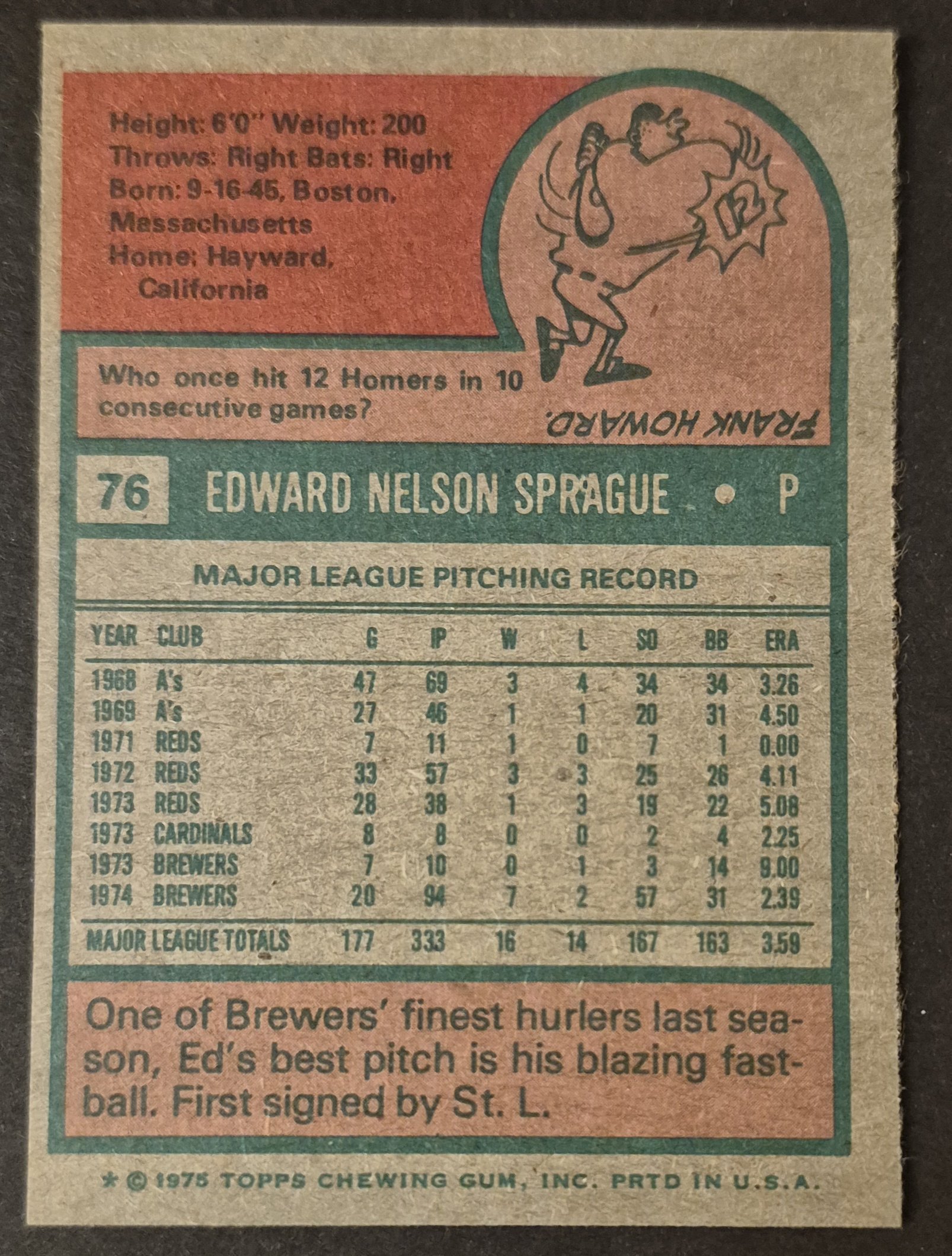
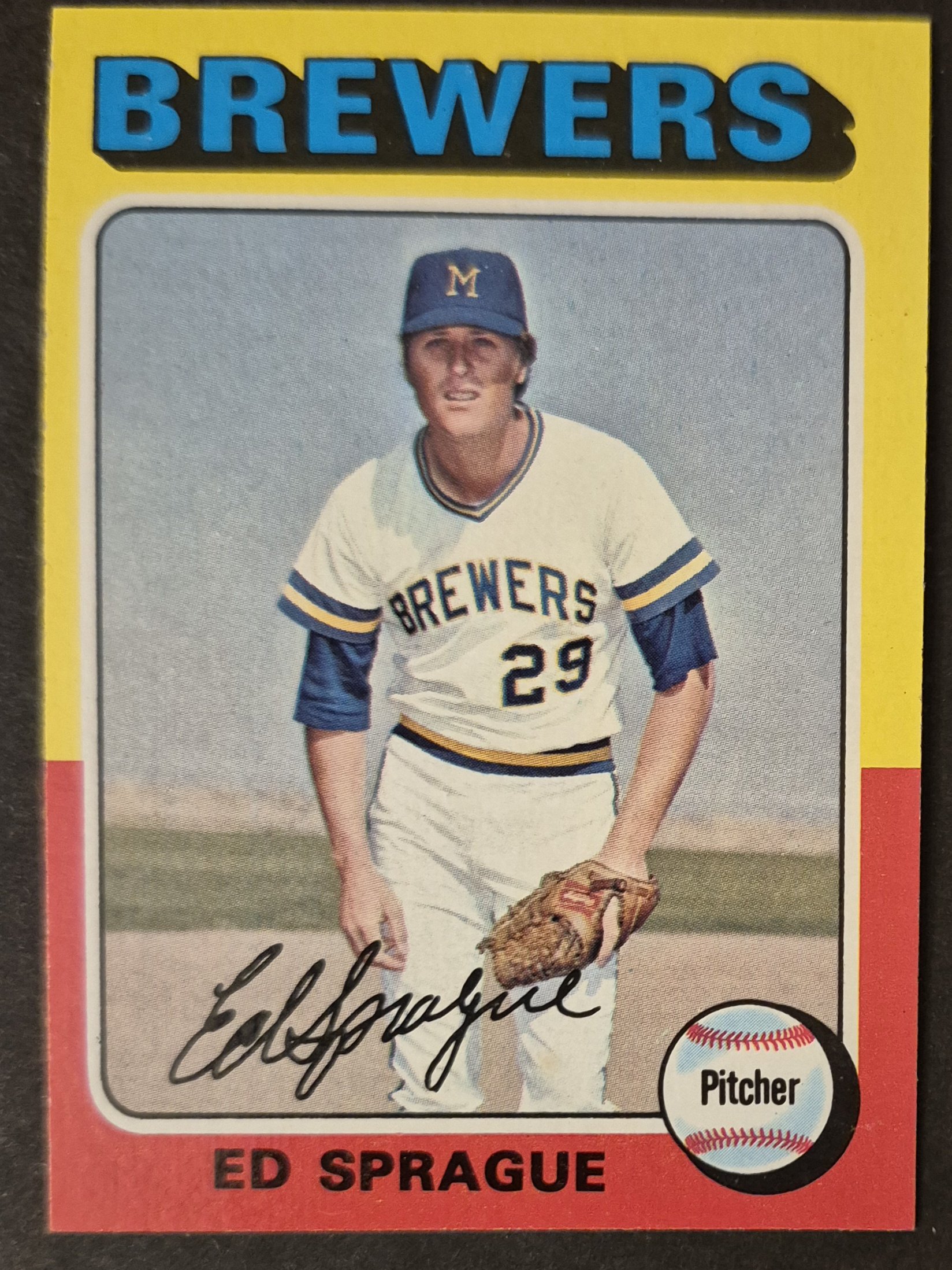
#76 Ed Sprague
.
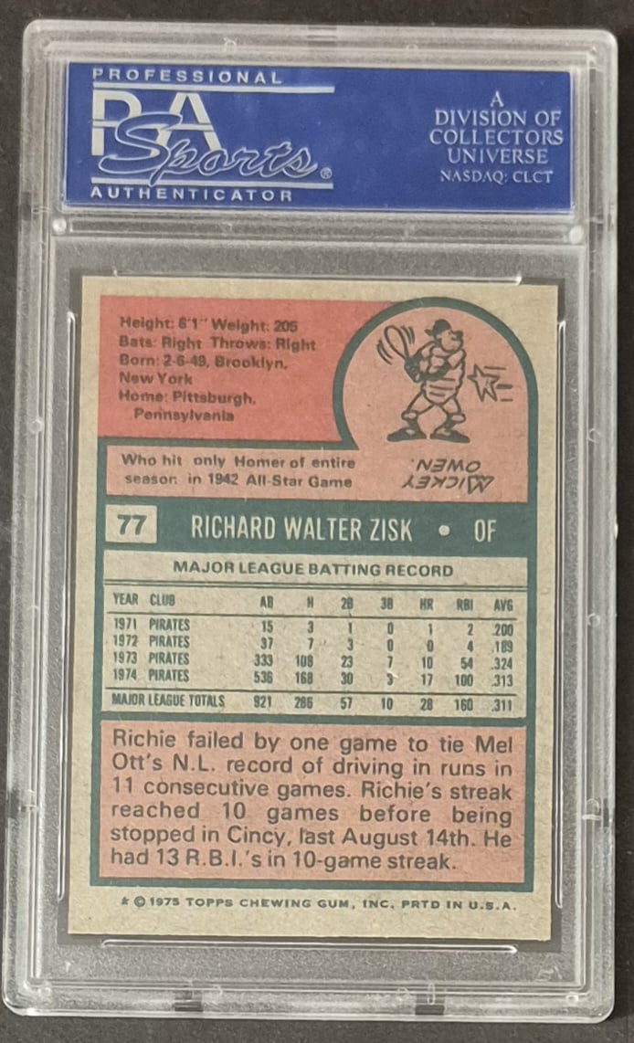
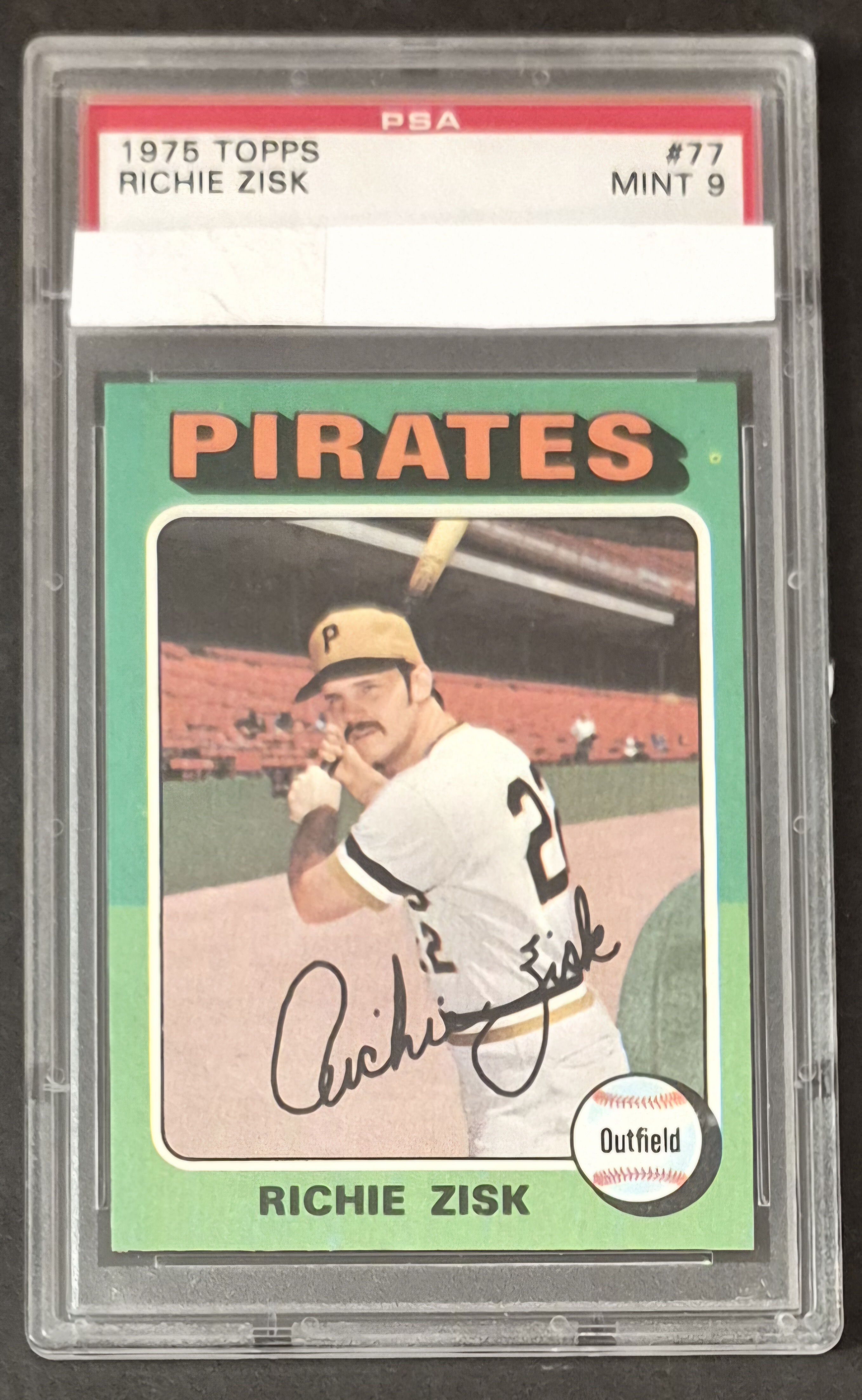
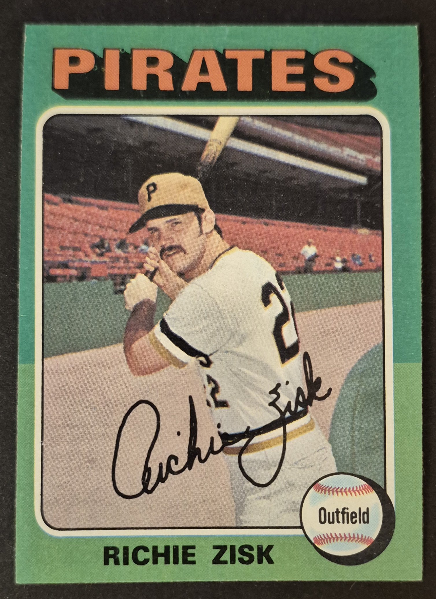
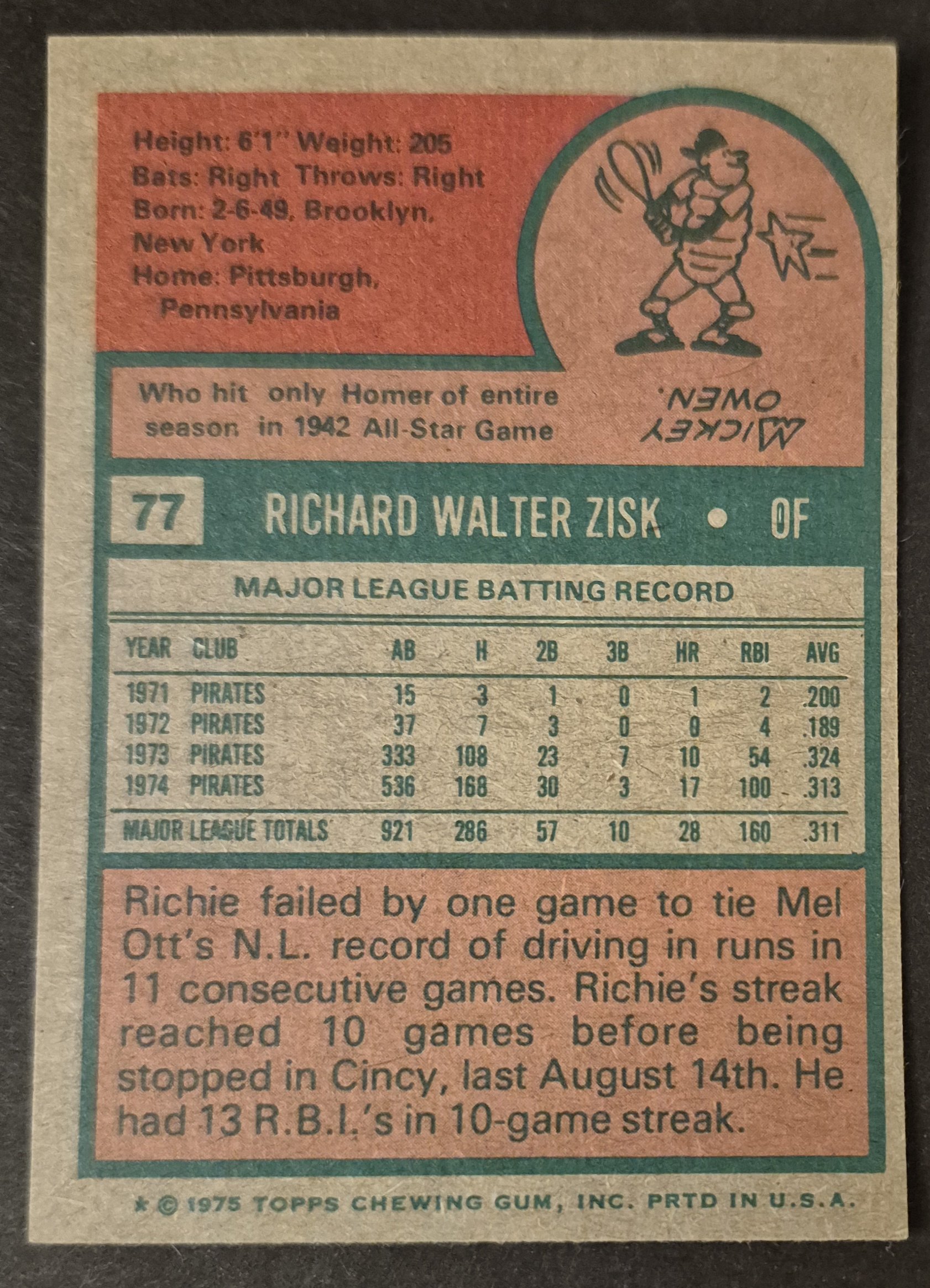
#77 Richie Zisk
.
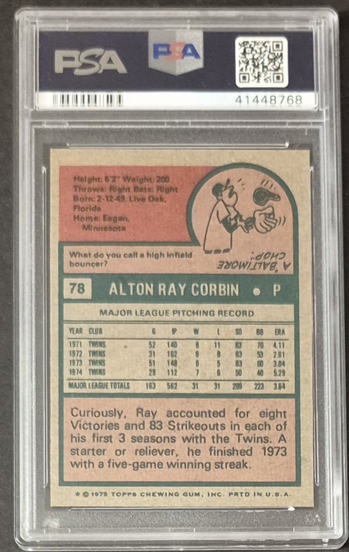
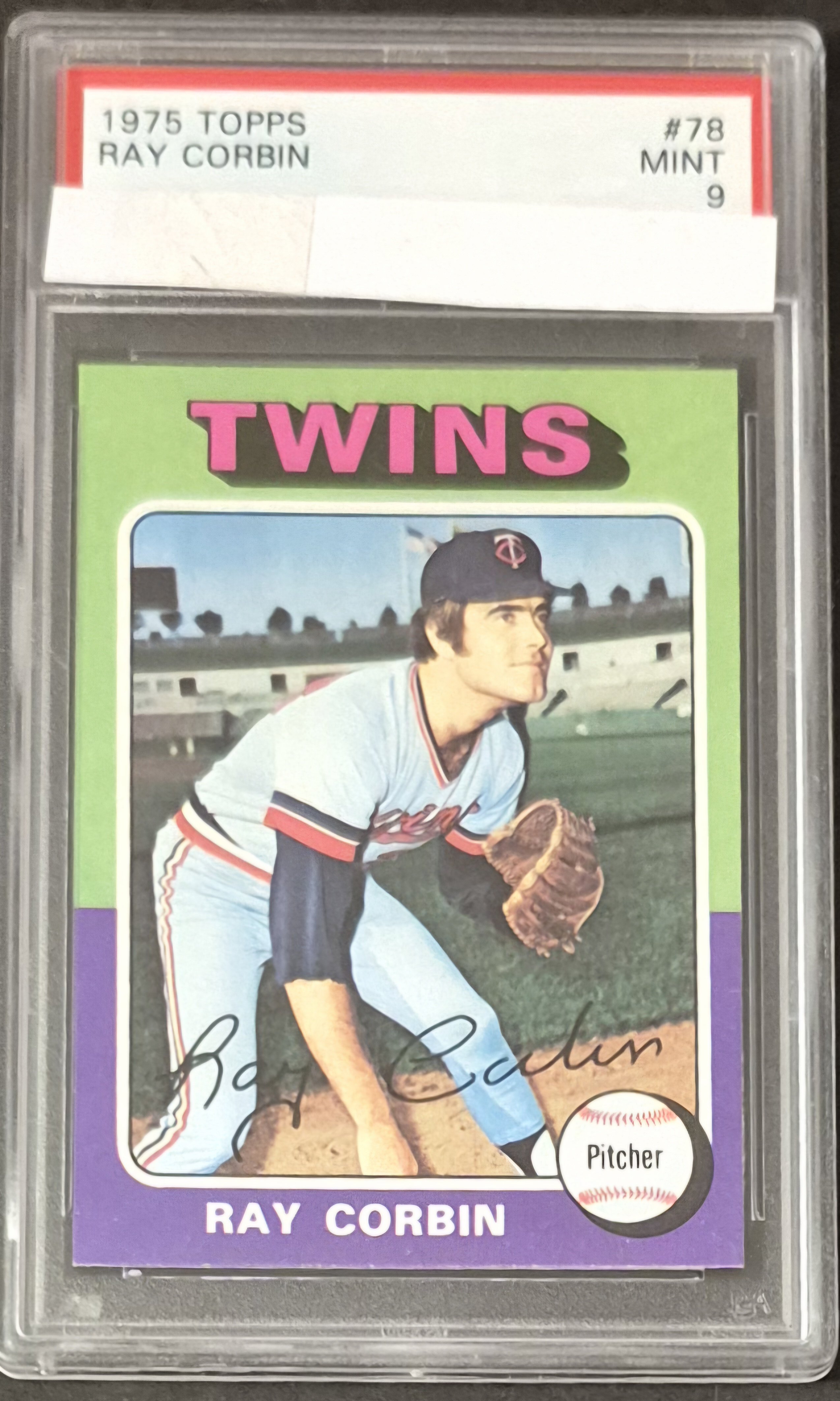
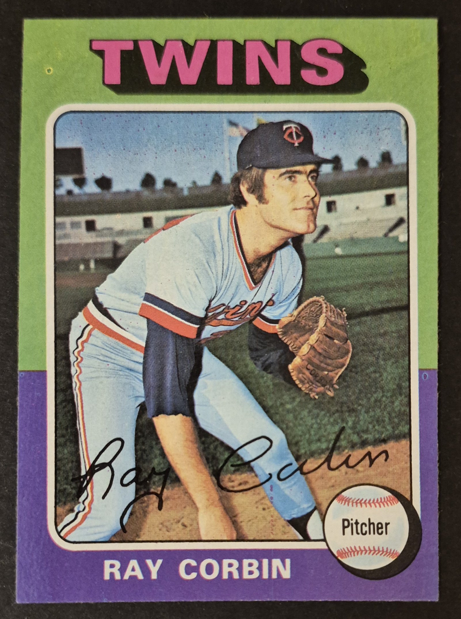
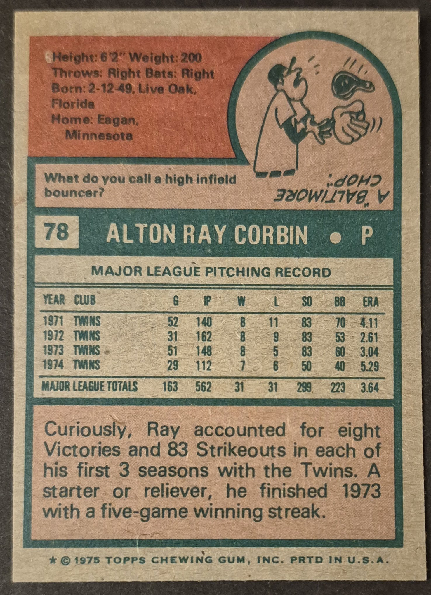
#78 Ray Corbin
.
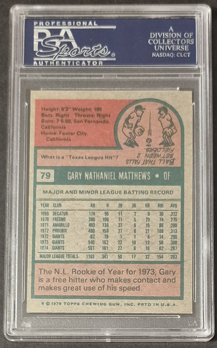
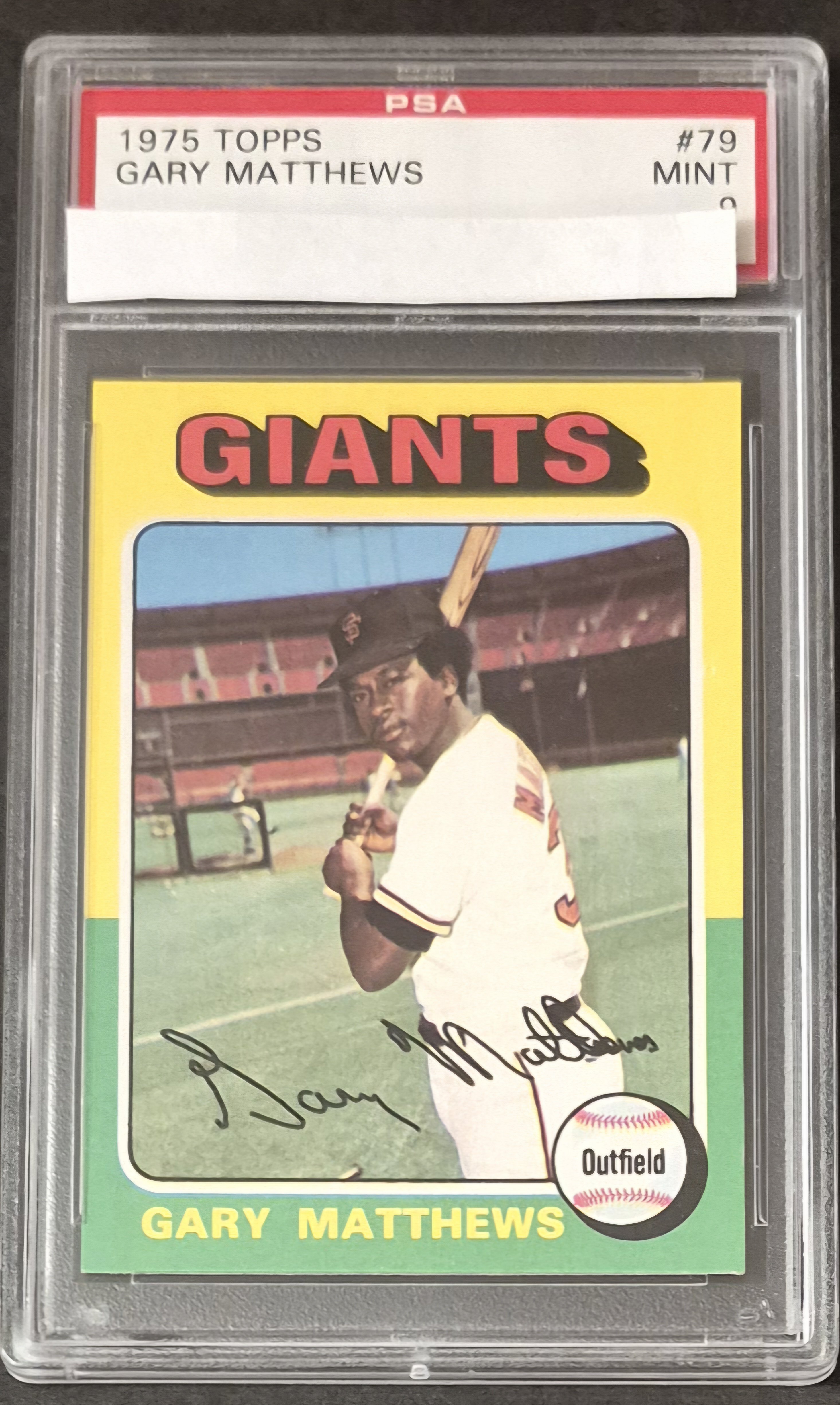
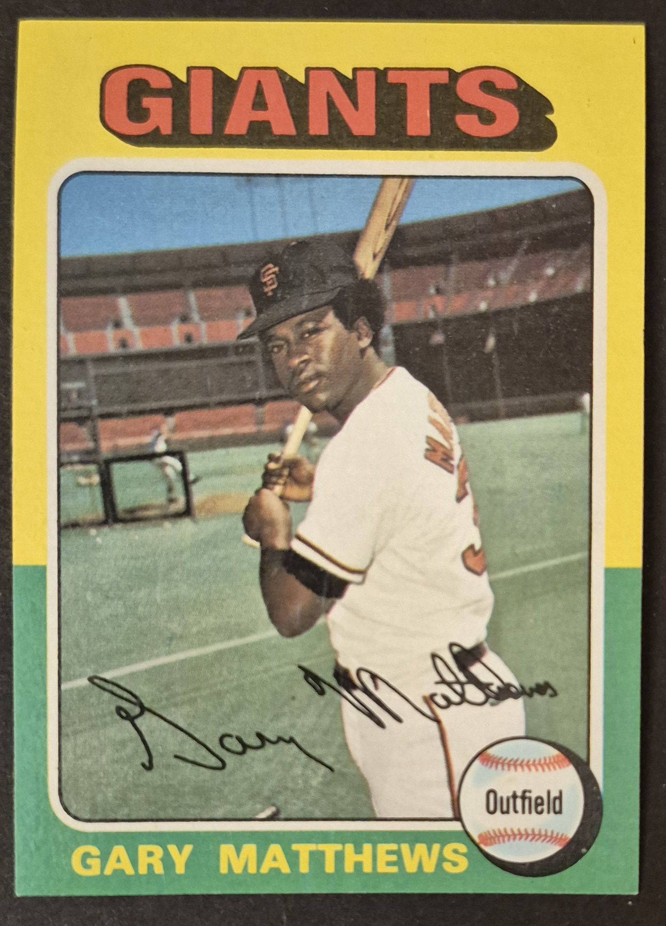
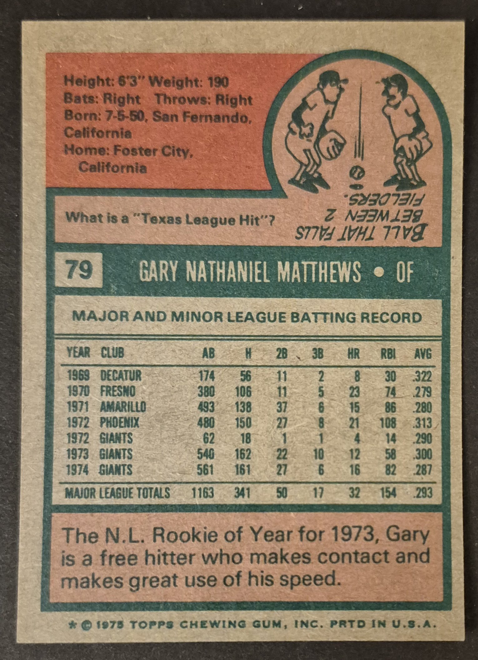
#79 Gary Matthews
.
#80 Carlton Fisk
.
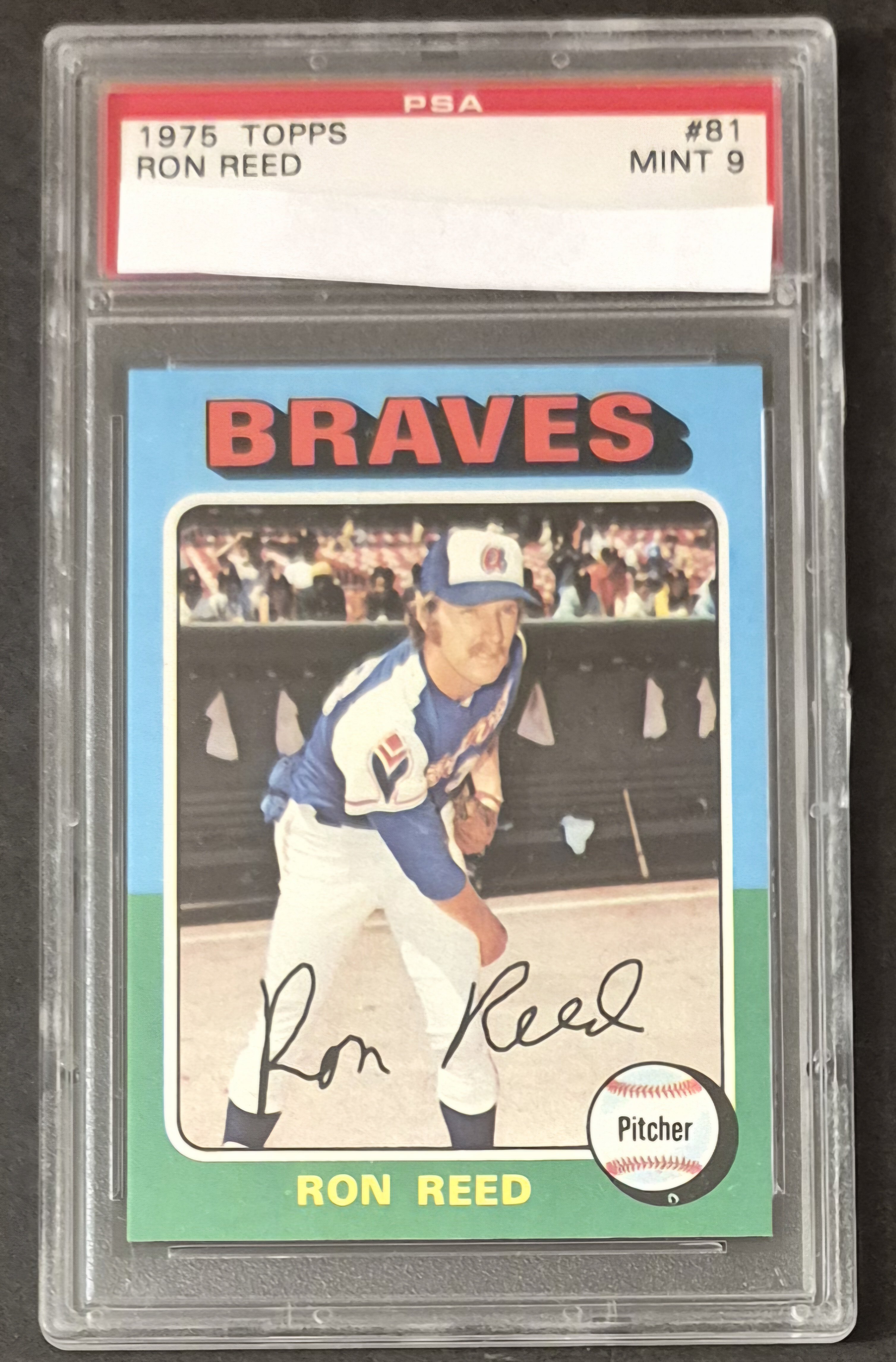
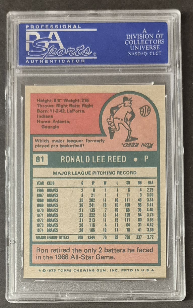
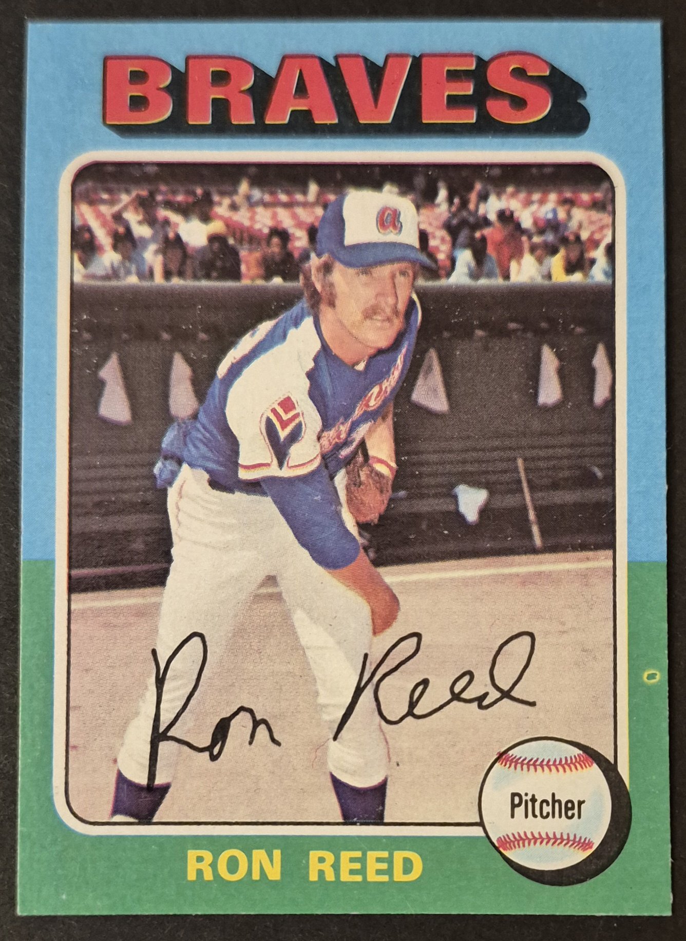
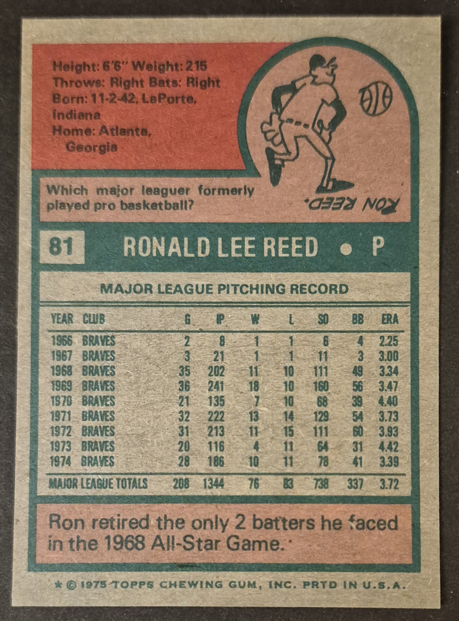
#81 Ron Reed
.
The Fisk (slabbed) is quite nice for a PSA 8.
Thank you. I haven't looked at most of these cards in roughly 10 years, so this has been quite enjoyable for me to slowly look through and appreciate what I have. Some of them are better than I remembered, and then some are not as nearly as nice as I thought. I would agree the Fisk is pretty nice.
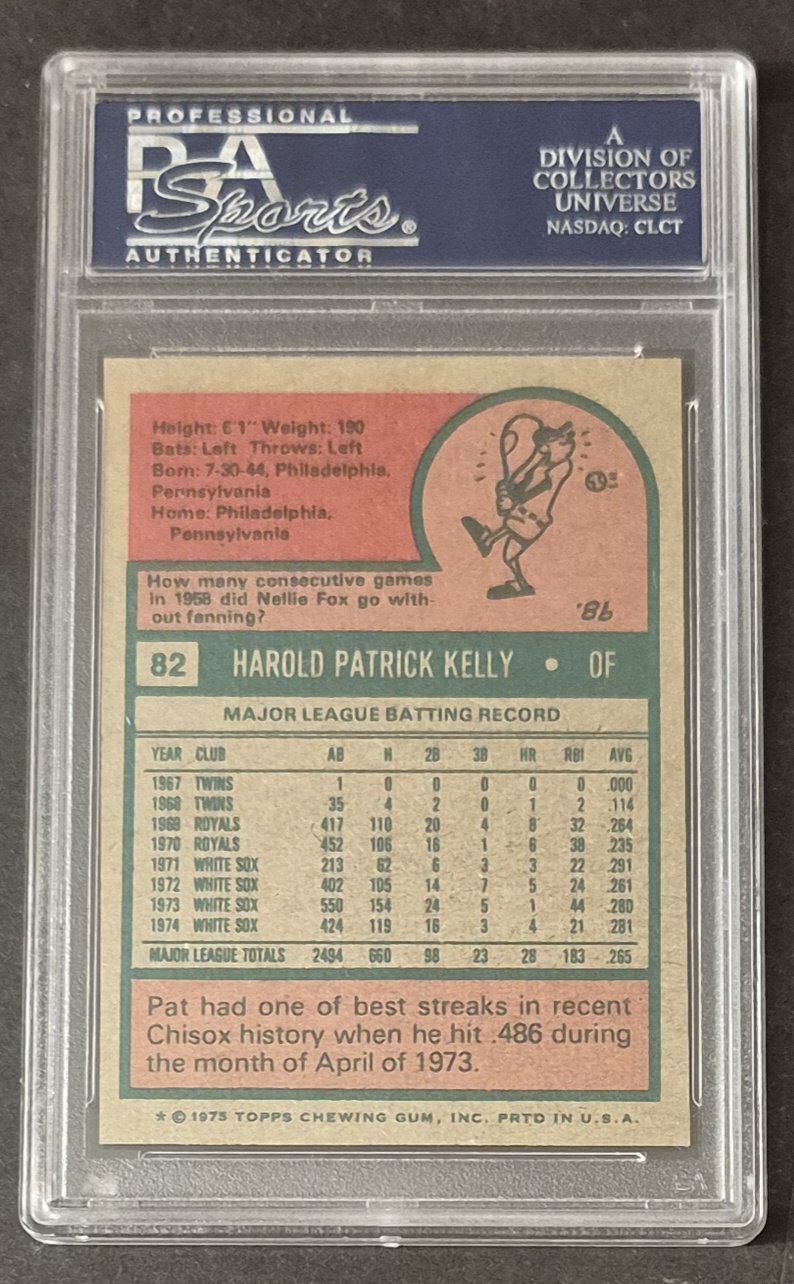
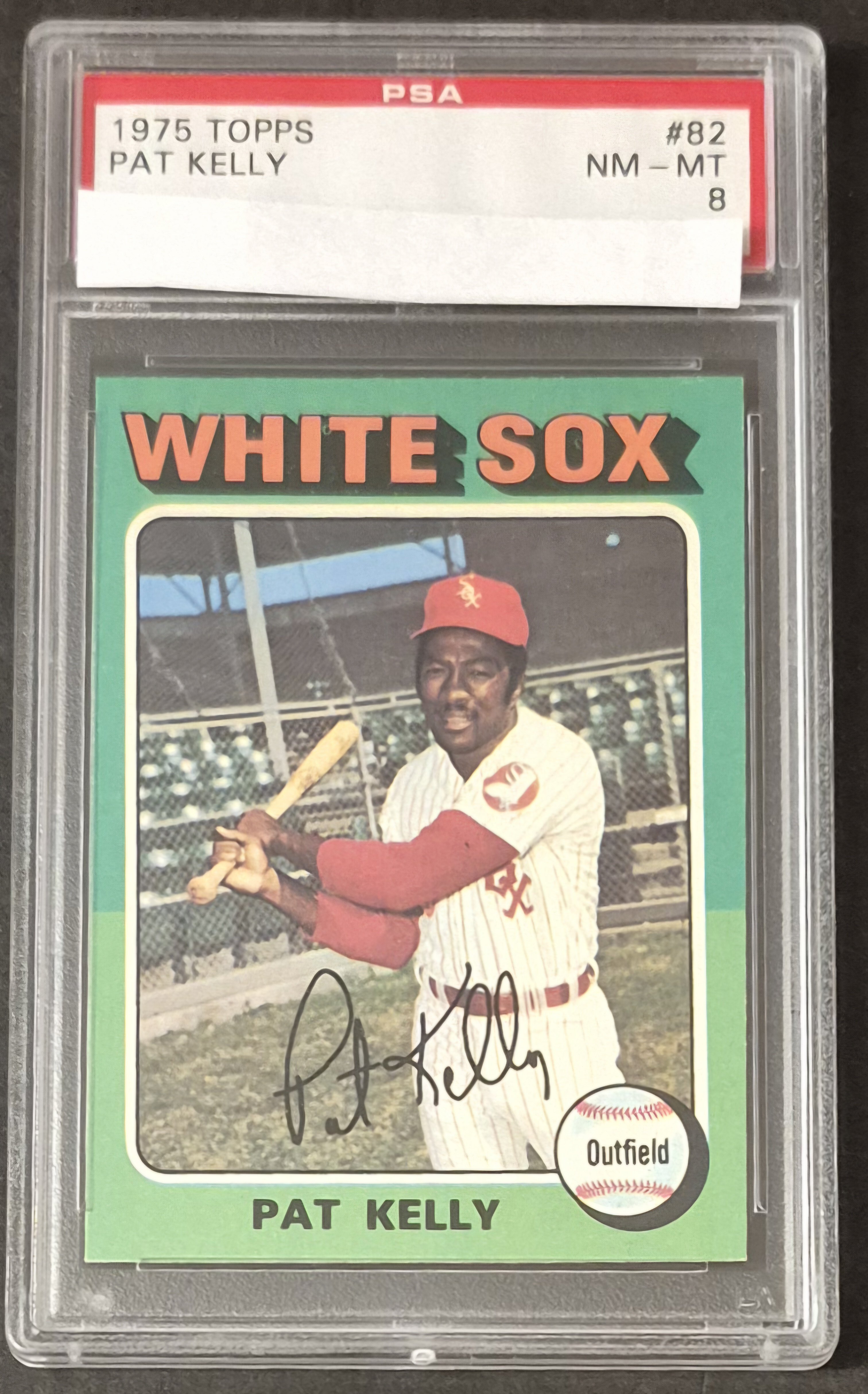
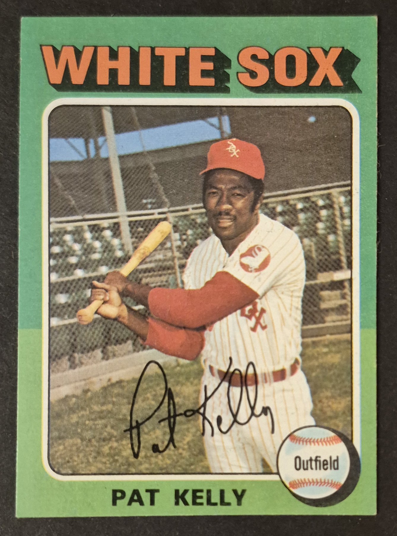
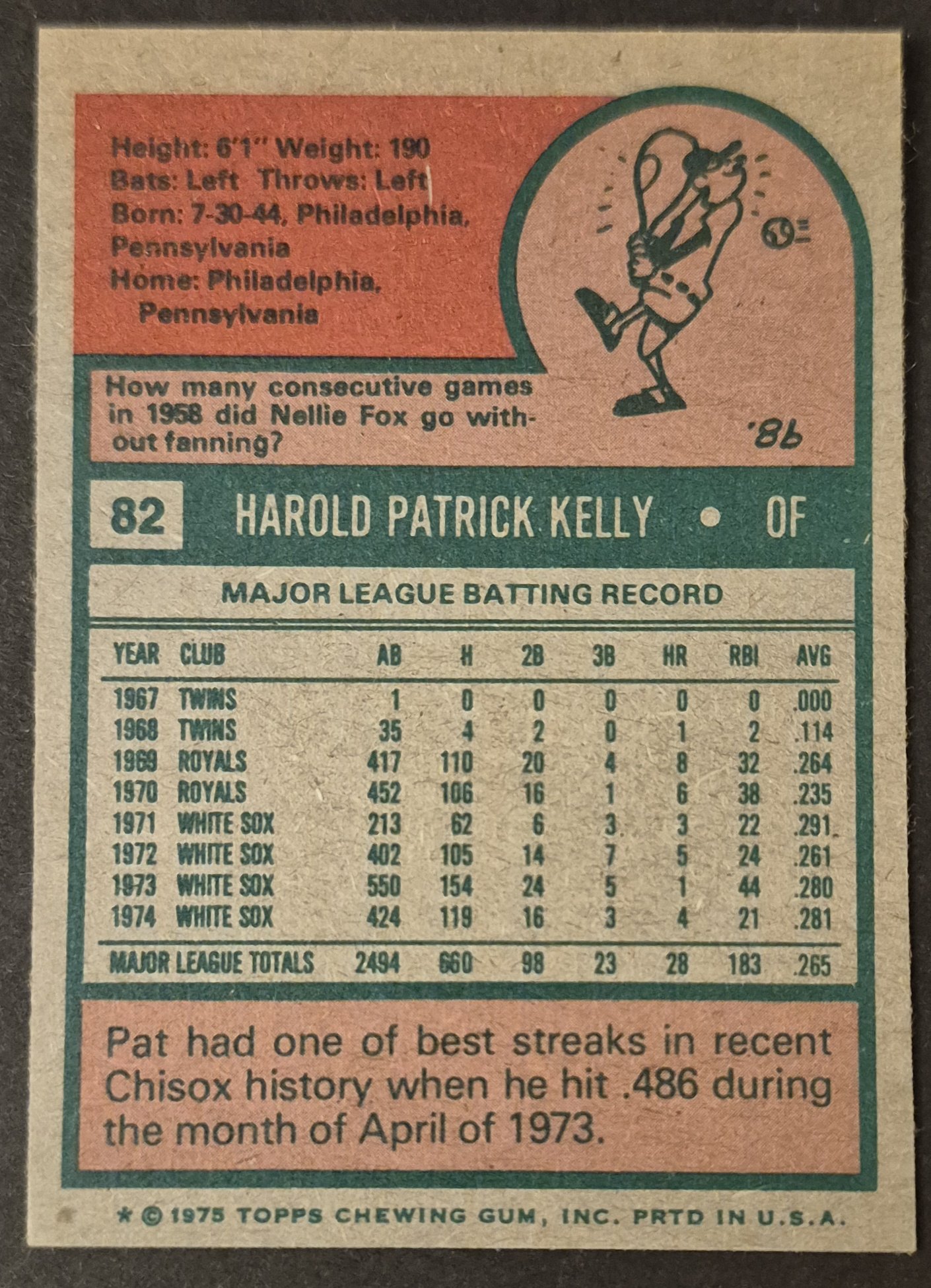
#82 Pat Kelly
.
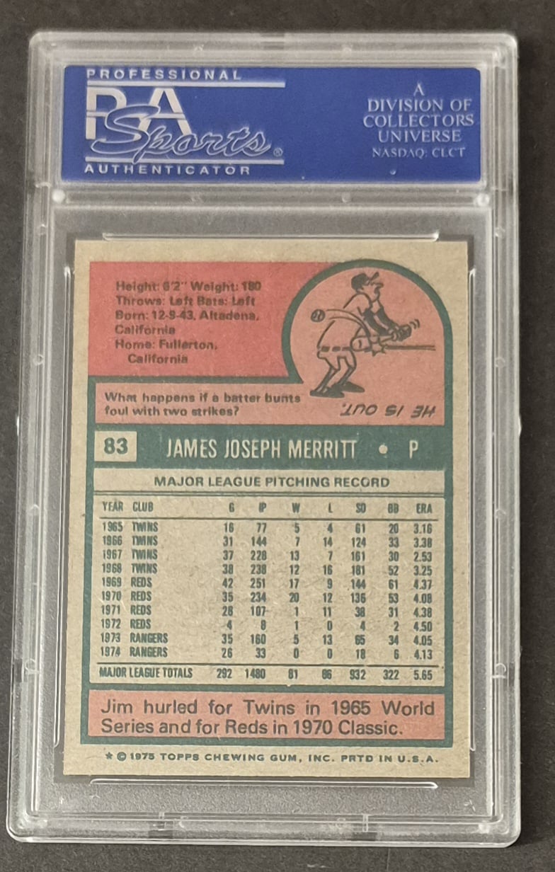
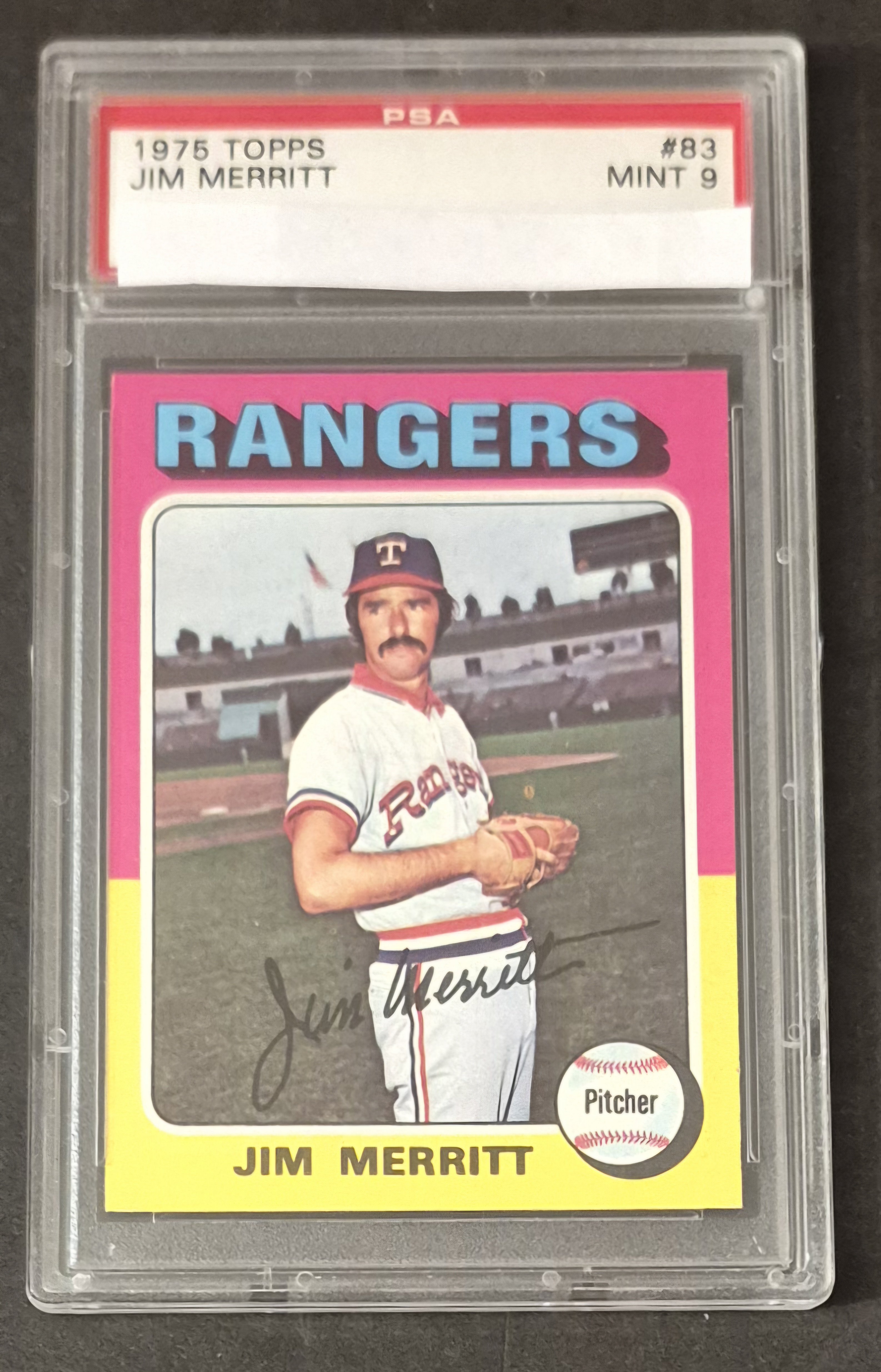
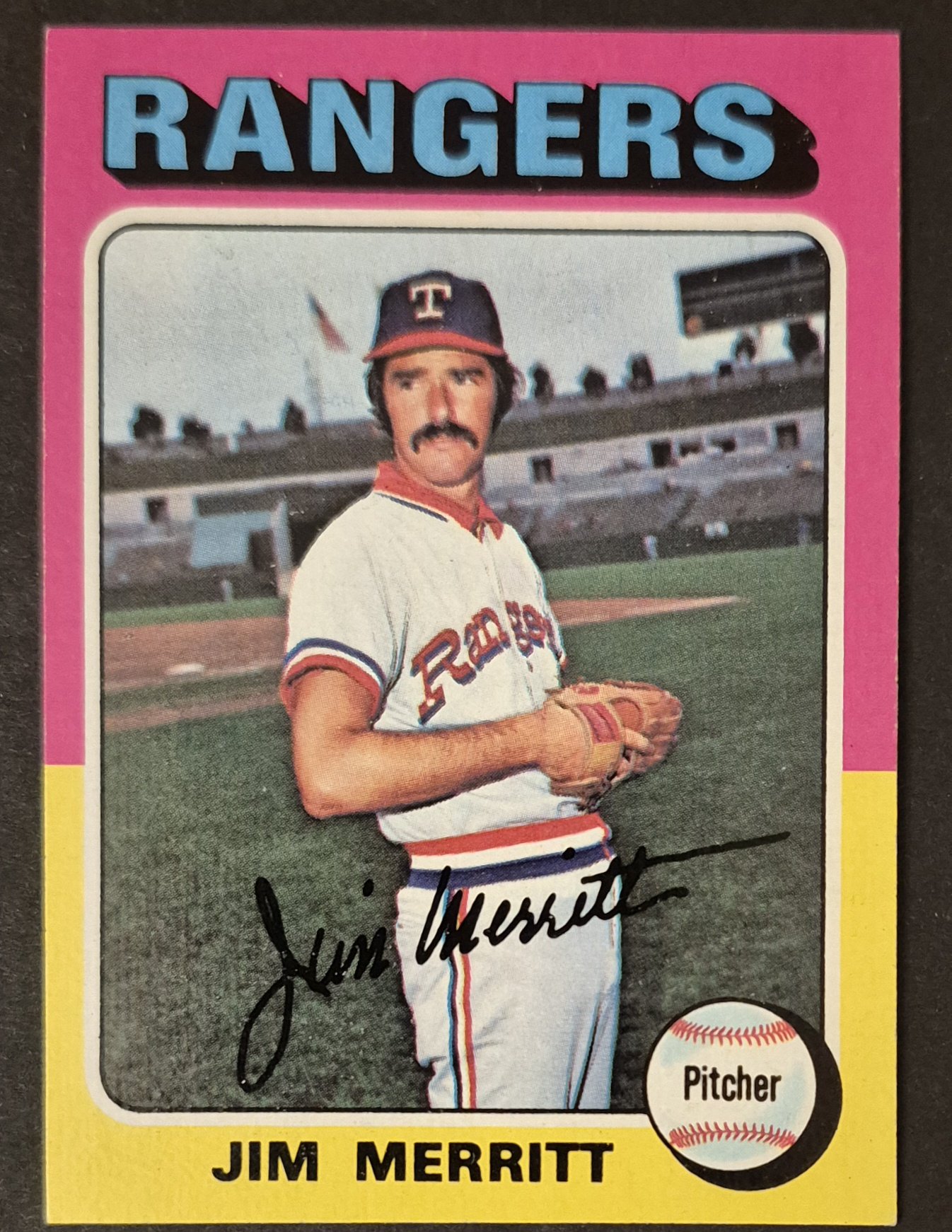
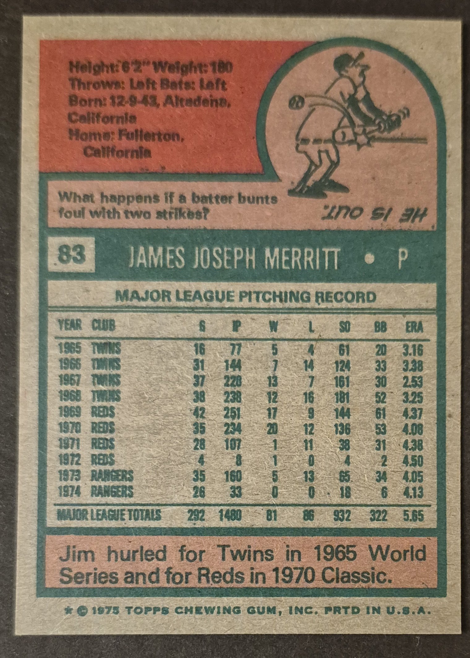
#83 Jim Merritt
.
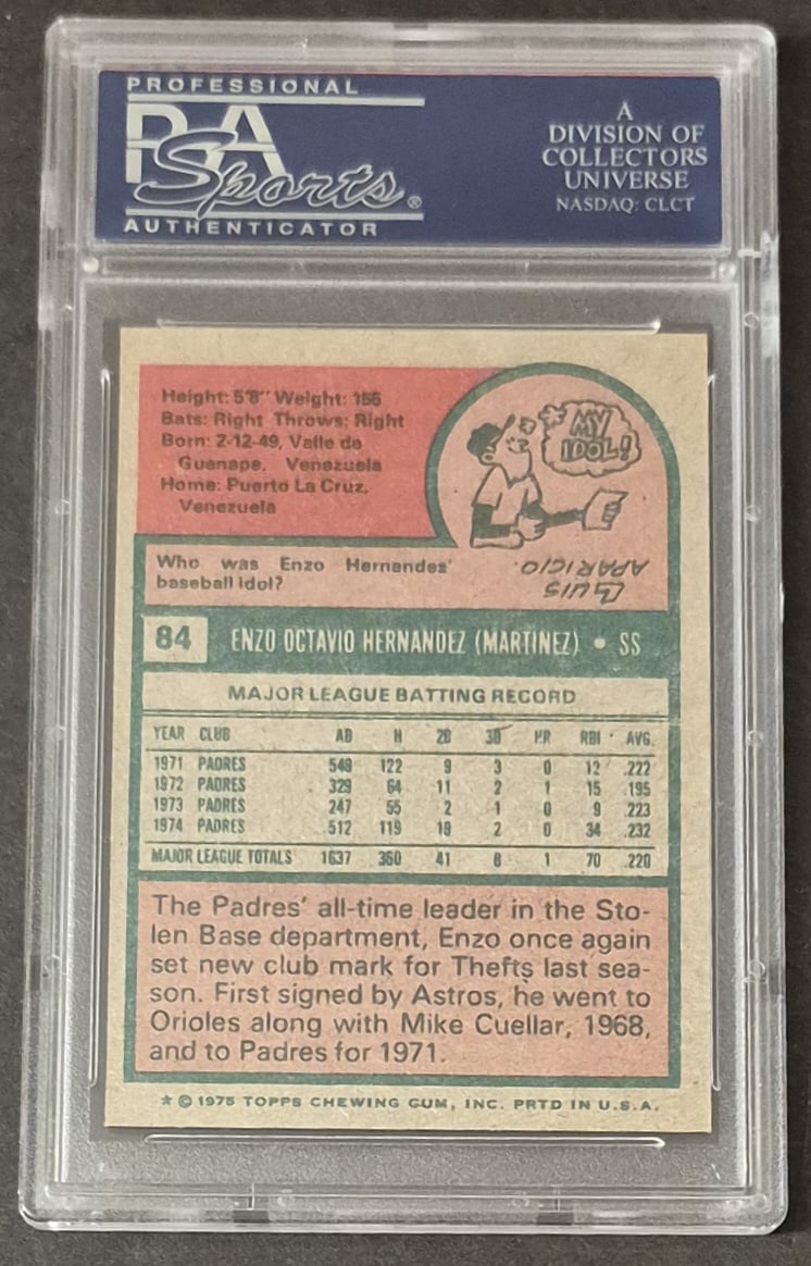
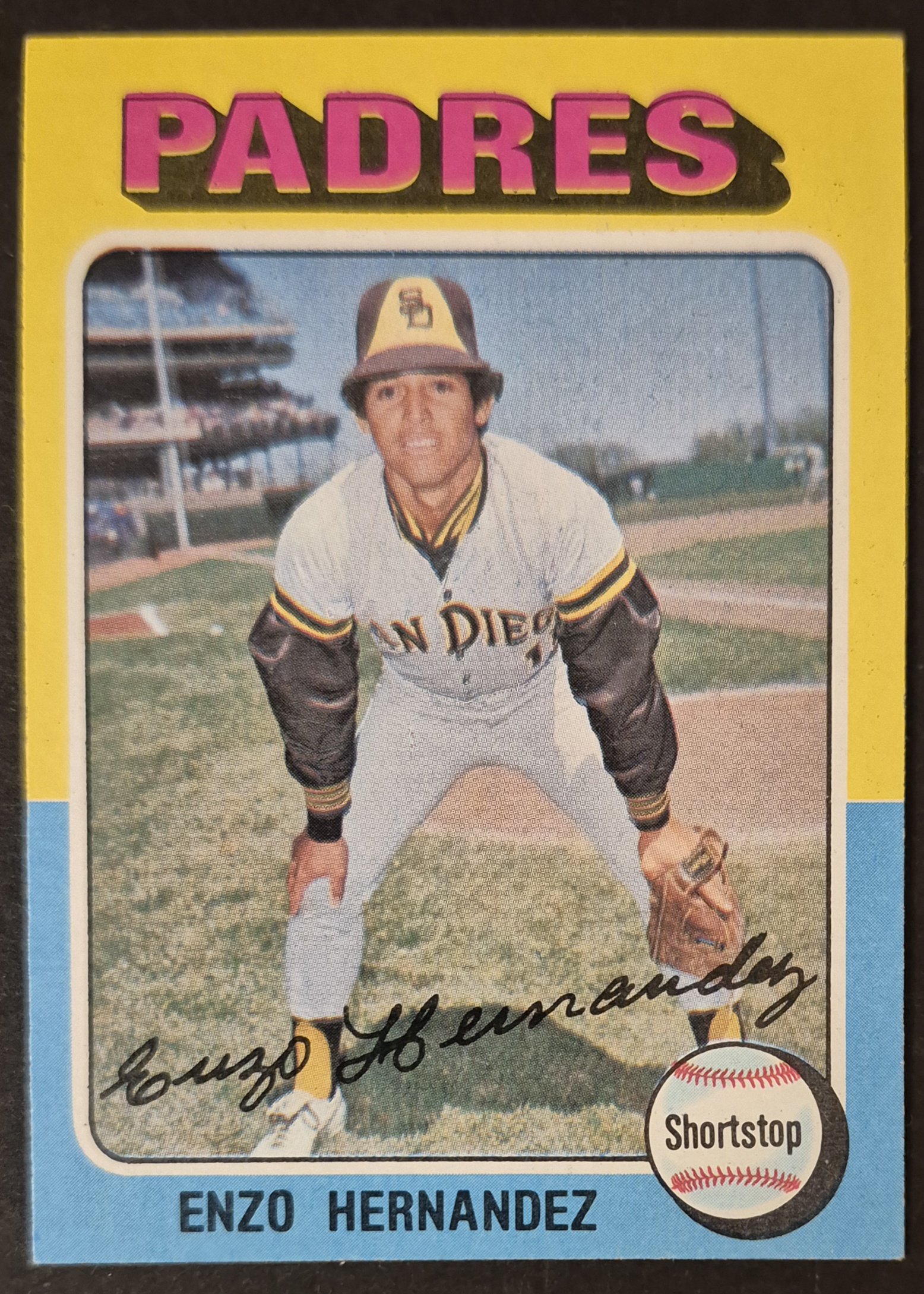
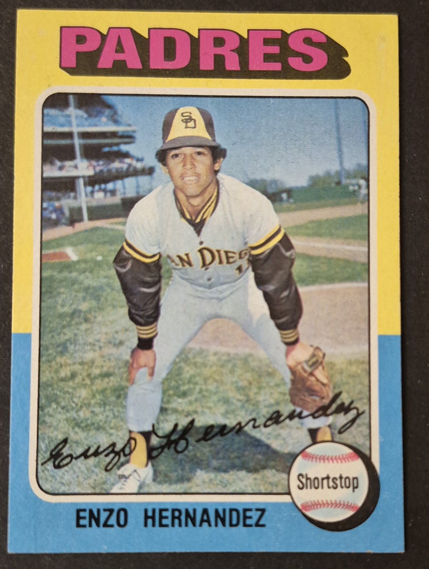
#84 Enzo Hernandez
.
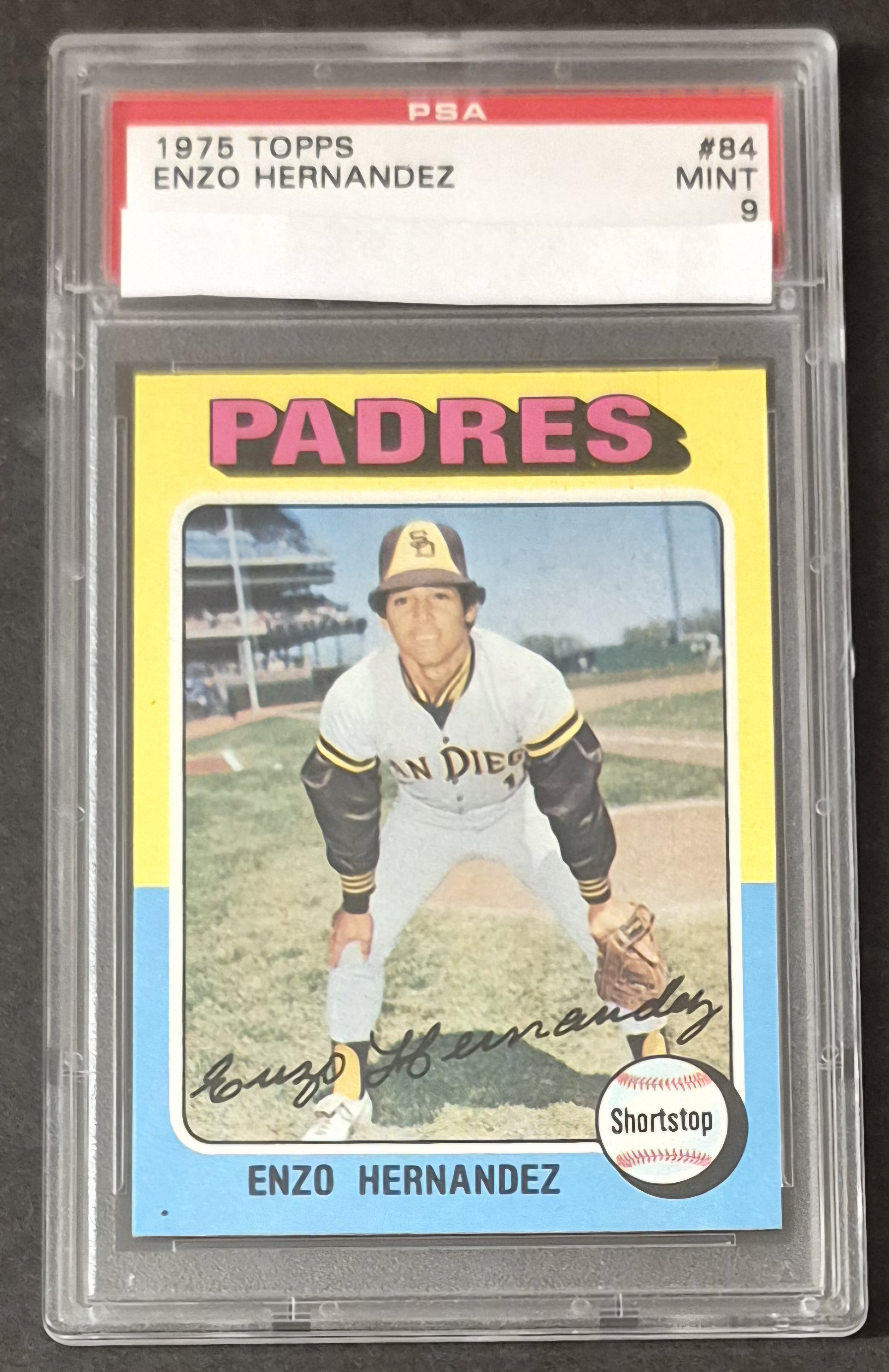
I believe that black dot on the graded Enzo is a common occurrence on many of the copies.
I'm not sure what my thought process at the time was for selecting that raw version for my #1 set. The registration in Padres is way off.
Here is a Pic from what I deemed my #2 raw version. It also is not presenting the dot. I believe I will switch them. Lol
.
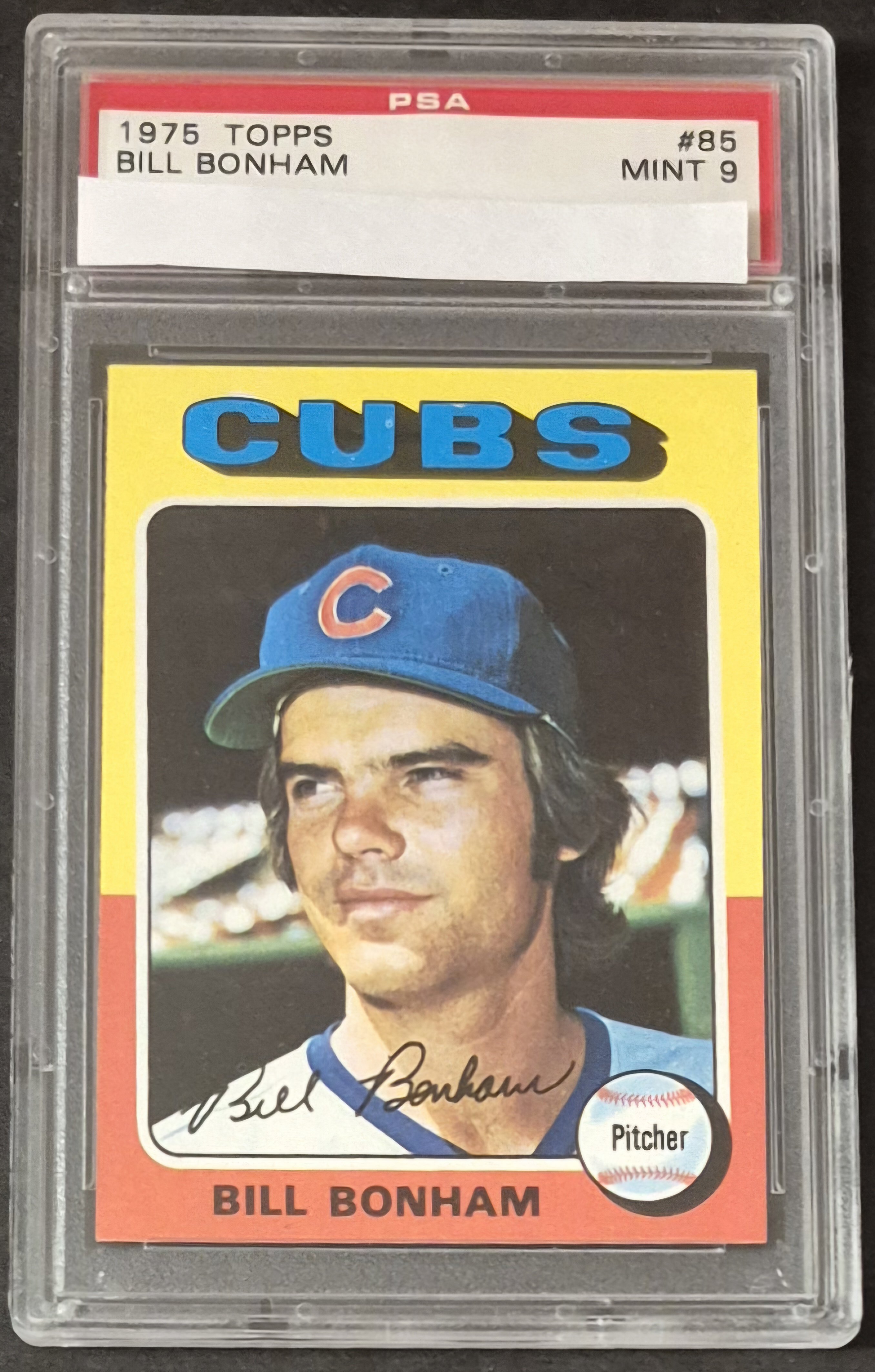
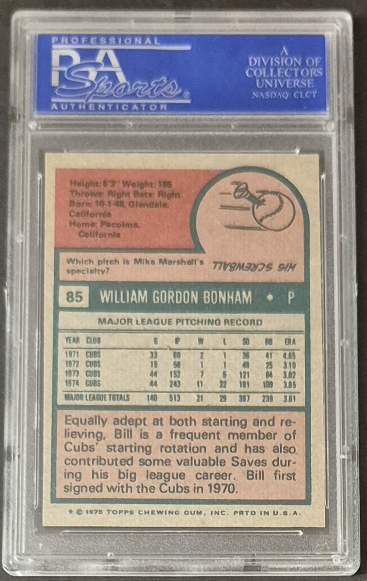
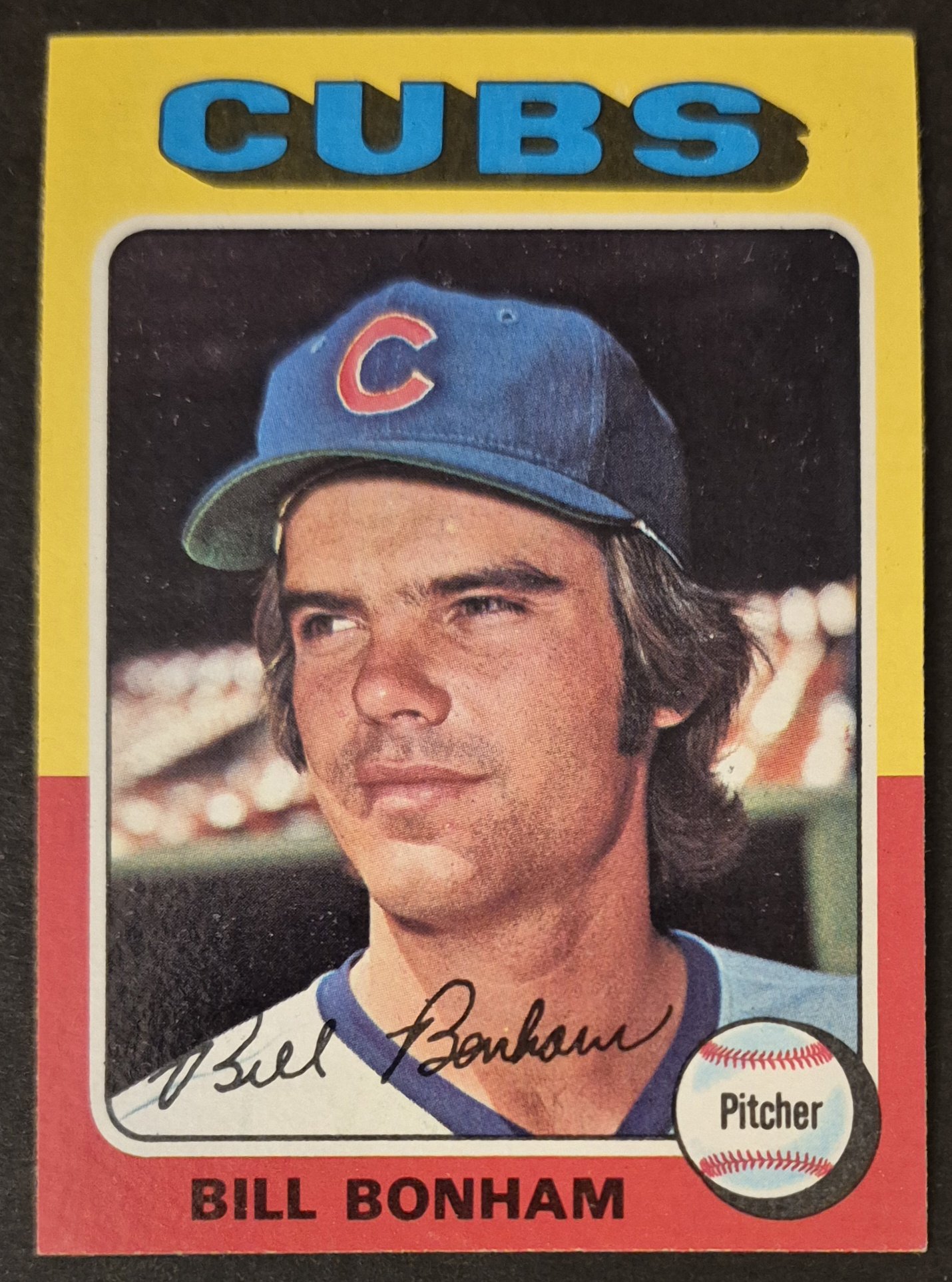
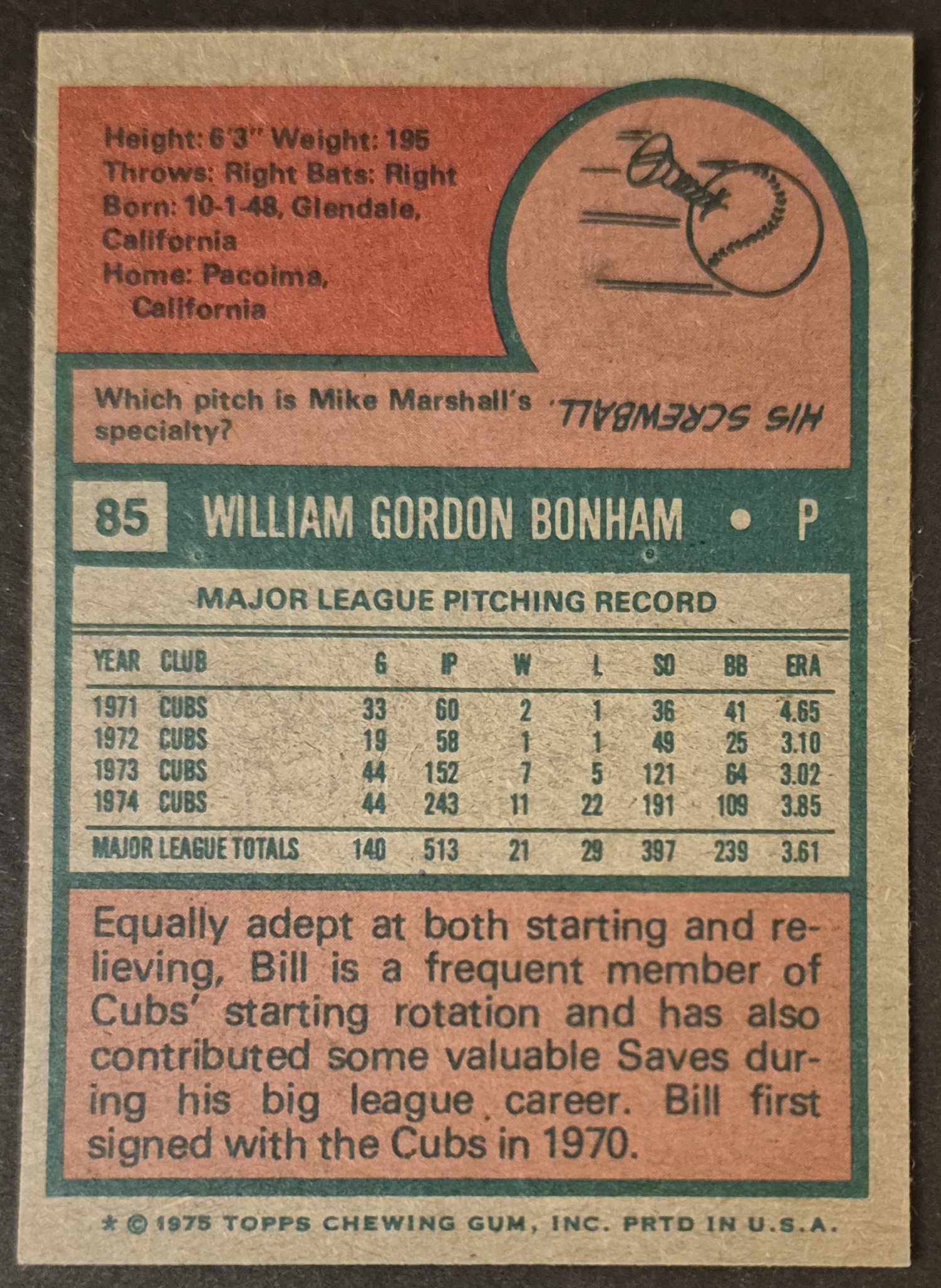
#85 Bill Bonham
.
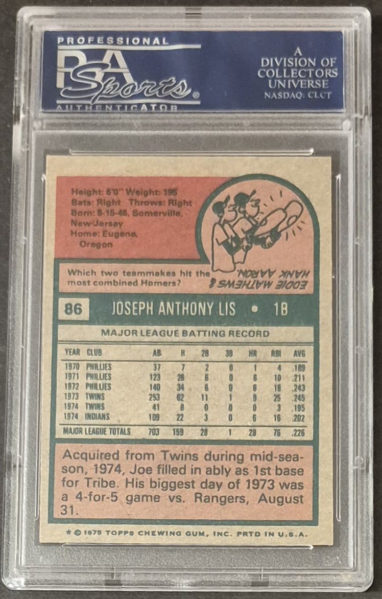
#86 Joe Lis
.
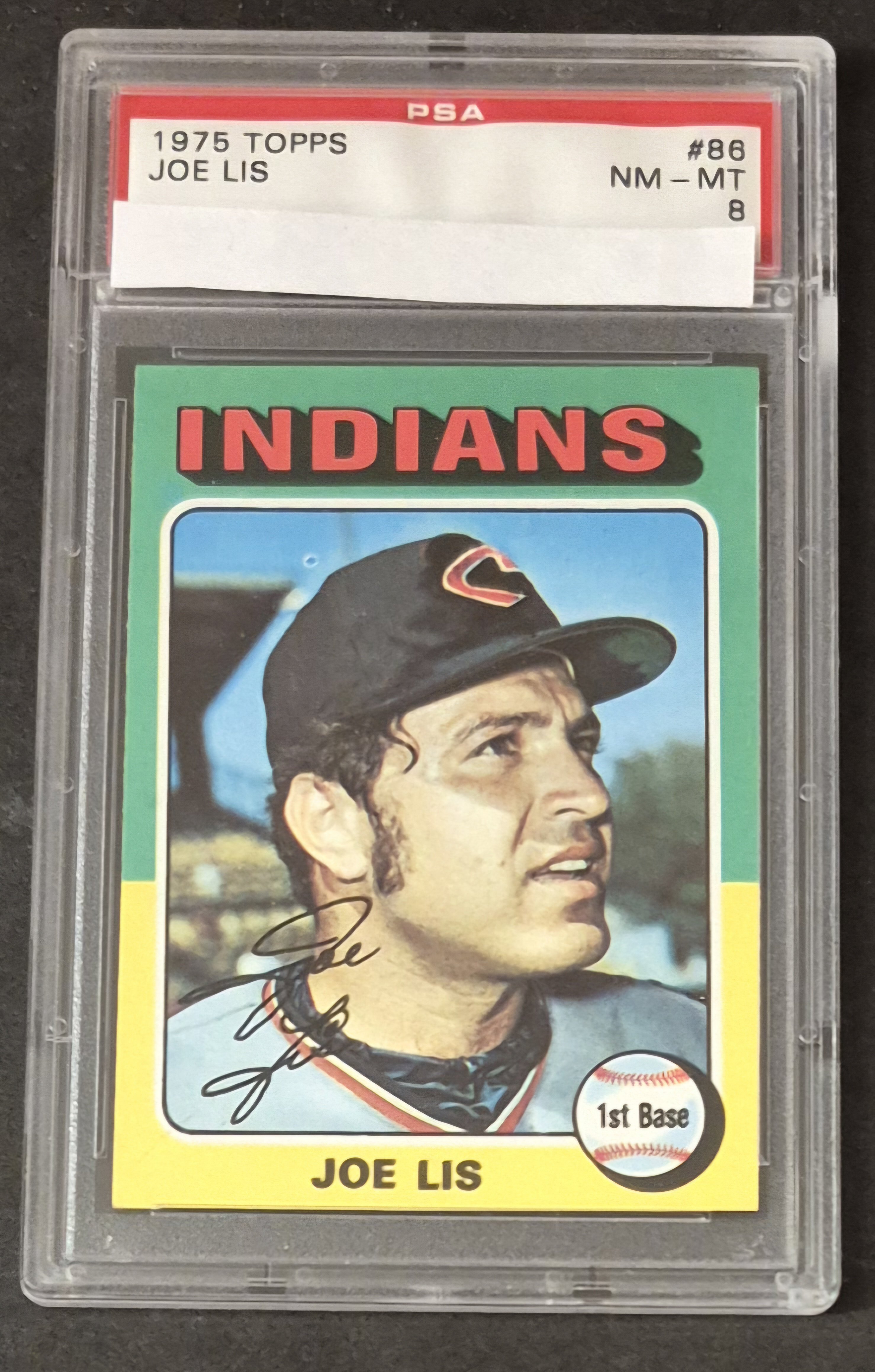
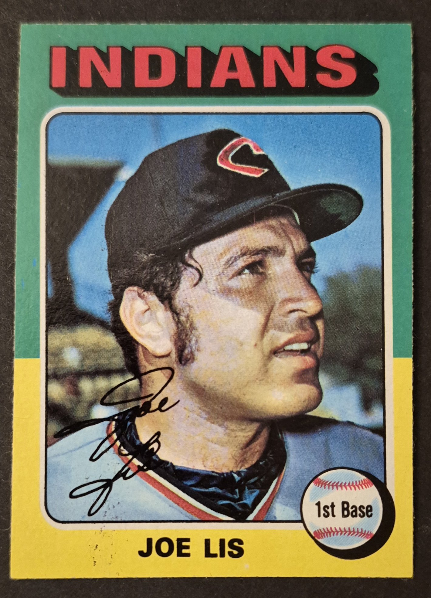
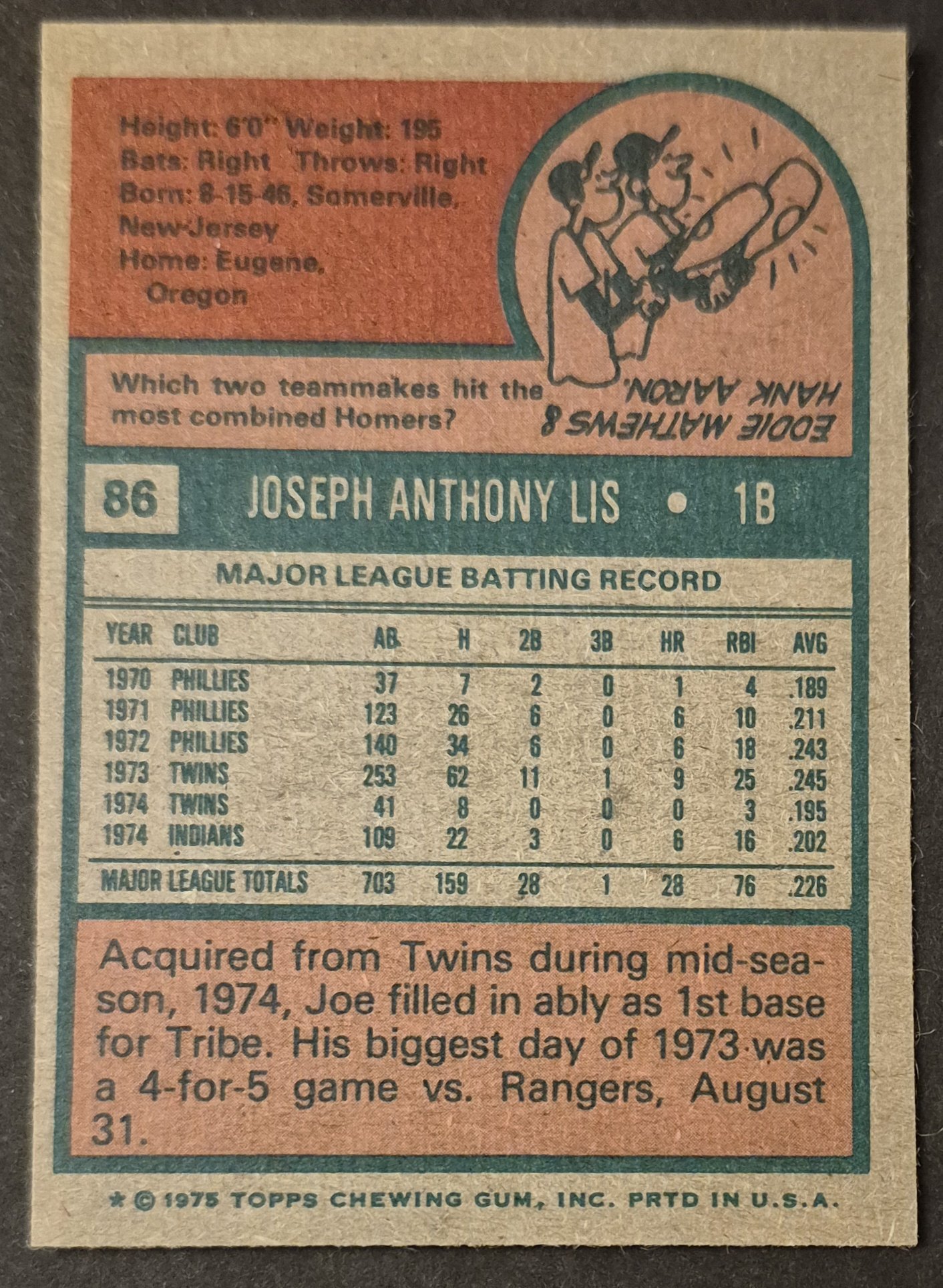
I'm not sure what the pop report says for Joe Lis, but this card was always ugly in my stack of raw ones. Plagued by print issues, often terribly OC or diamond cut, and a lot of time Joe's skin was jaundiced with an excess of yellow ink in the printing of the card.
#87 George Foster
.
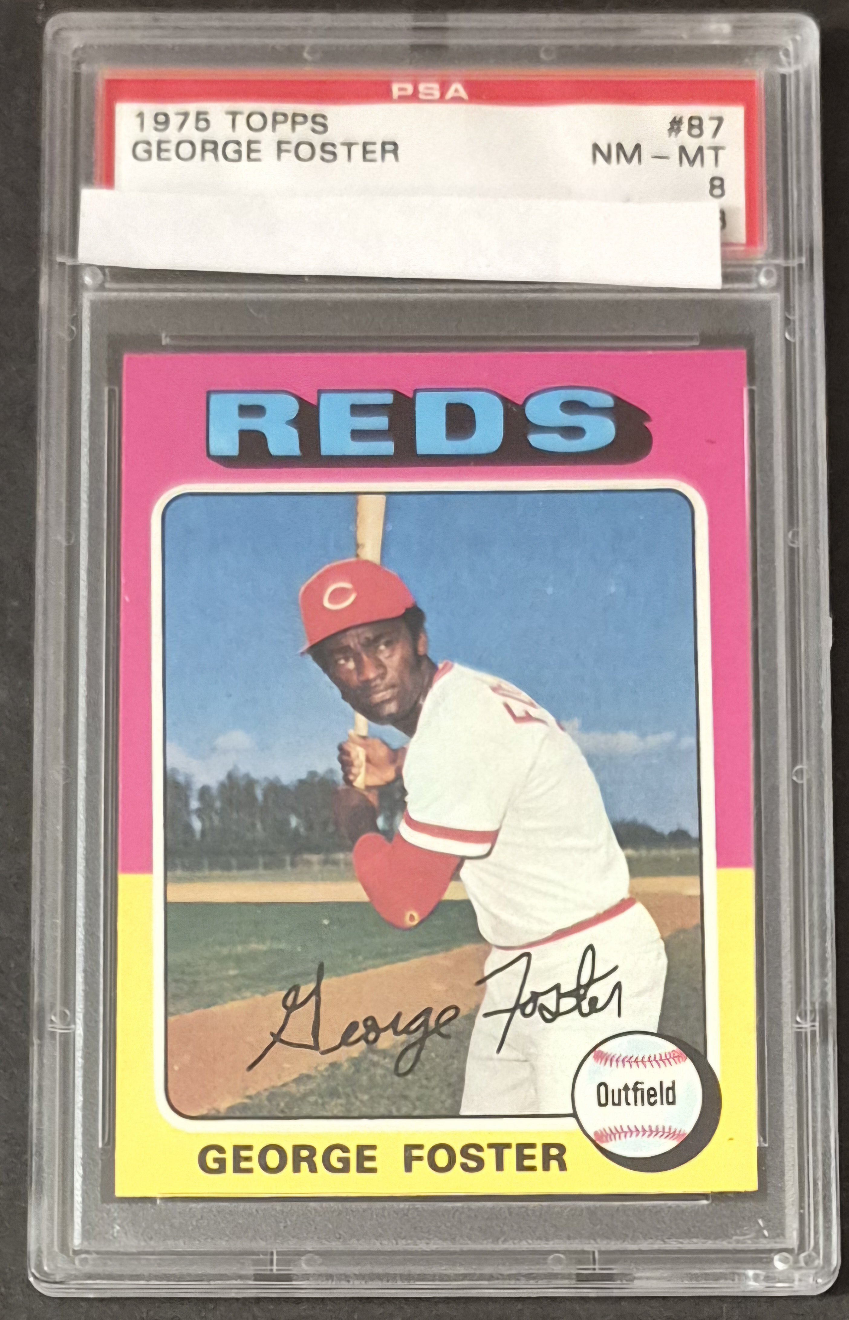
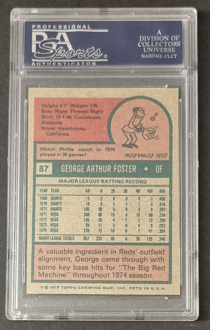
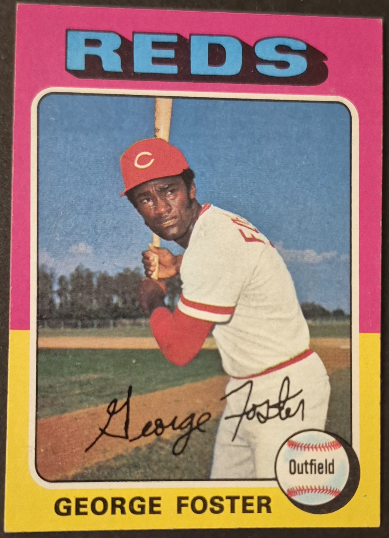
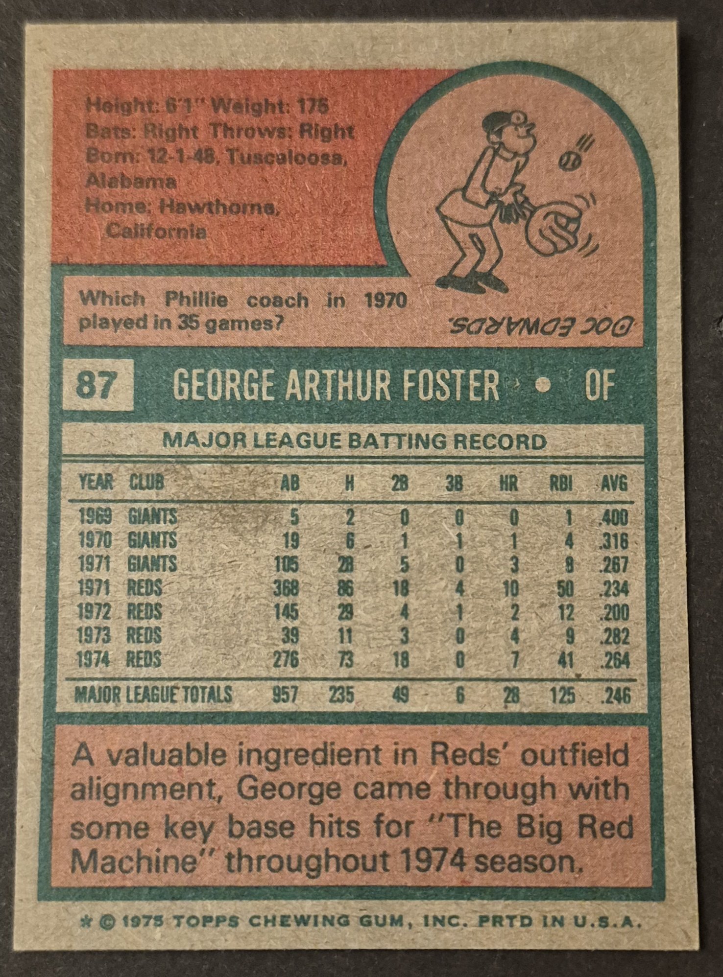
George Foster was another tough one on all of the raw examples that I accumulated. Often diamond cut or OC. This is the best I could come up with, and it required me to overlook the slight wax stain on the back.
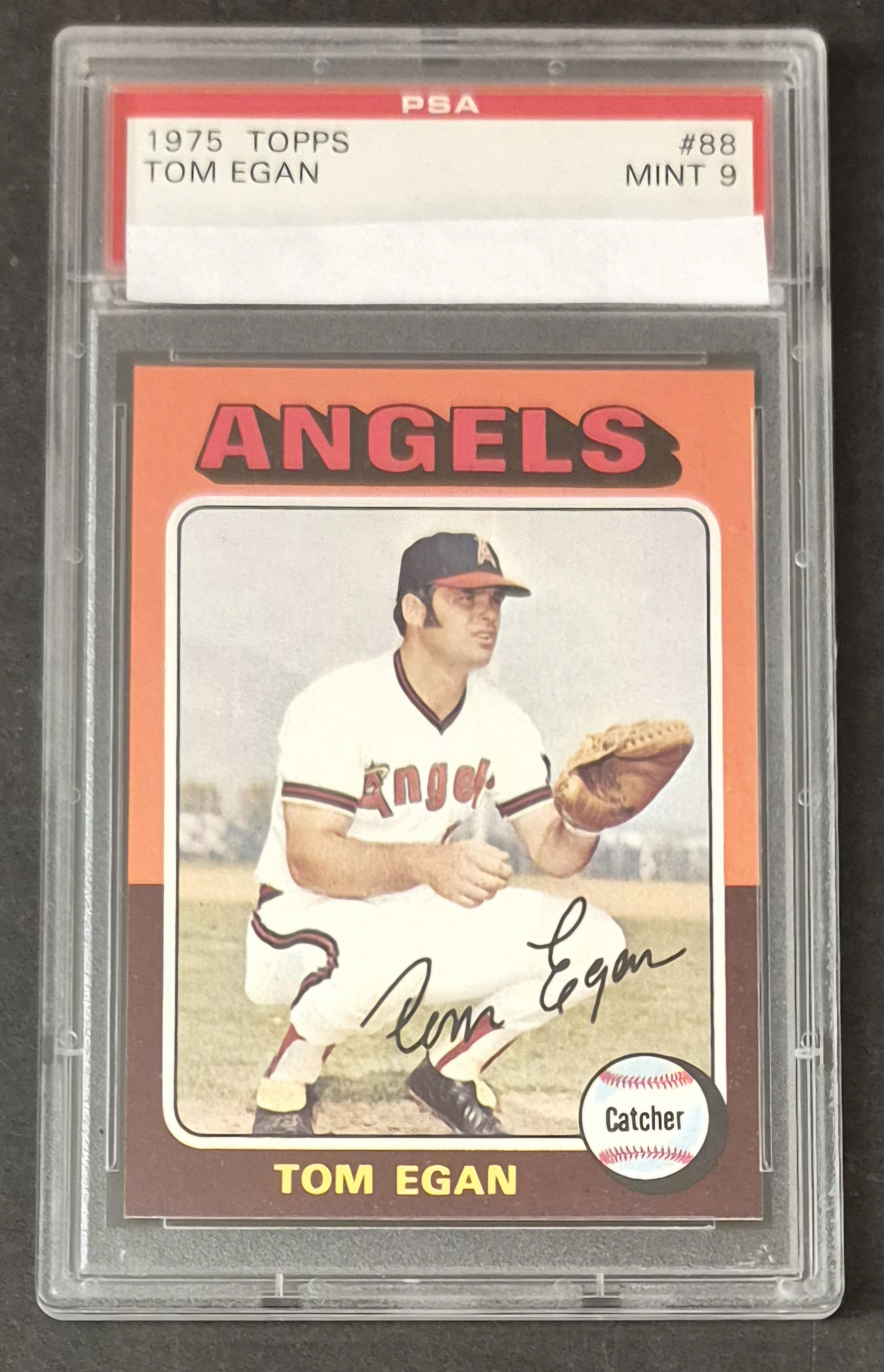
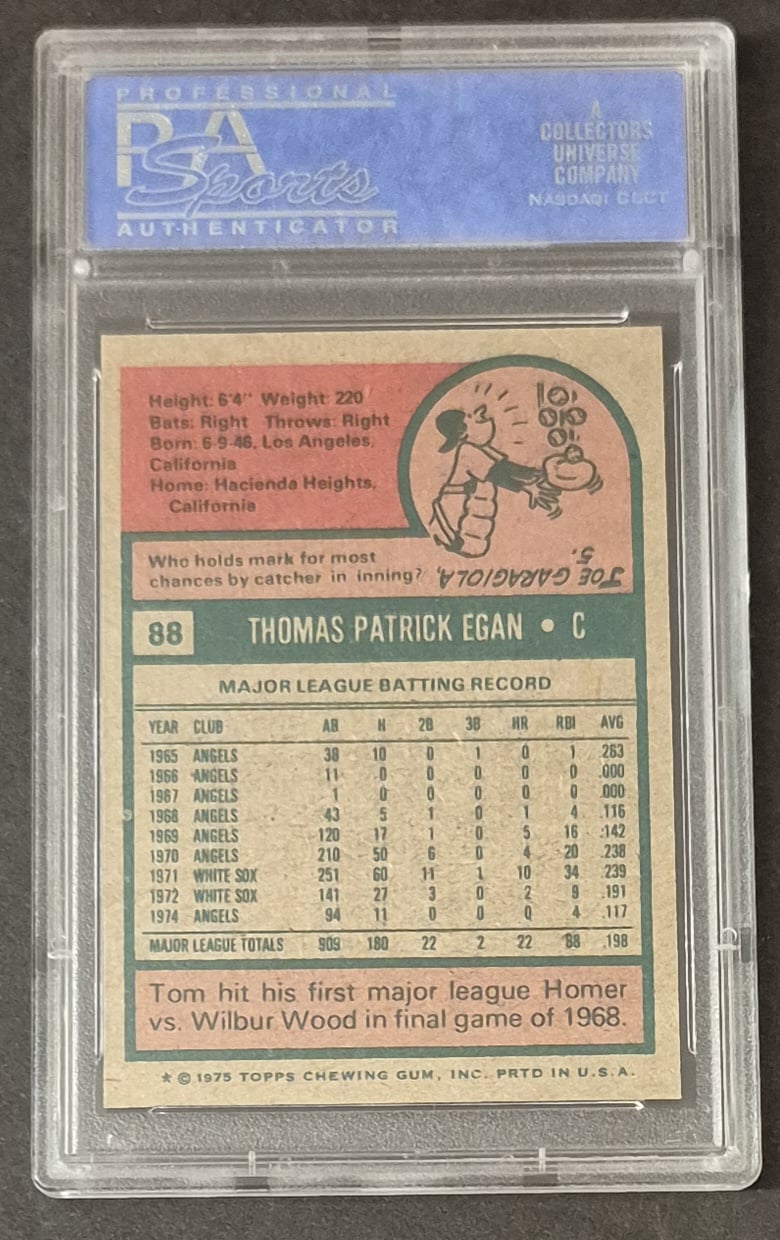
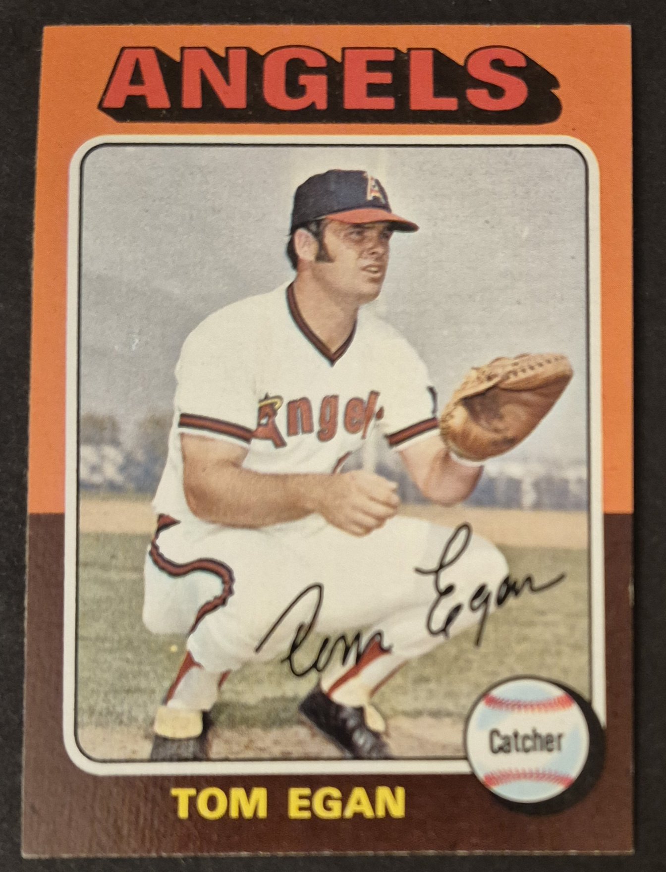
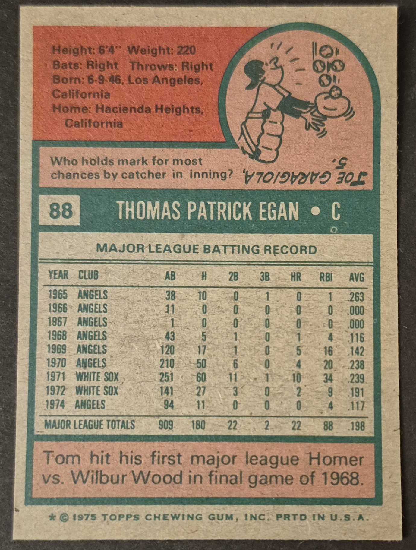
#88 Tom Egan
.
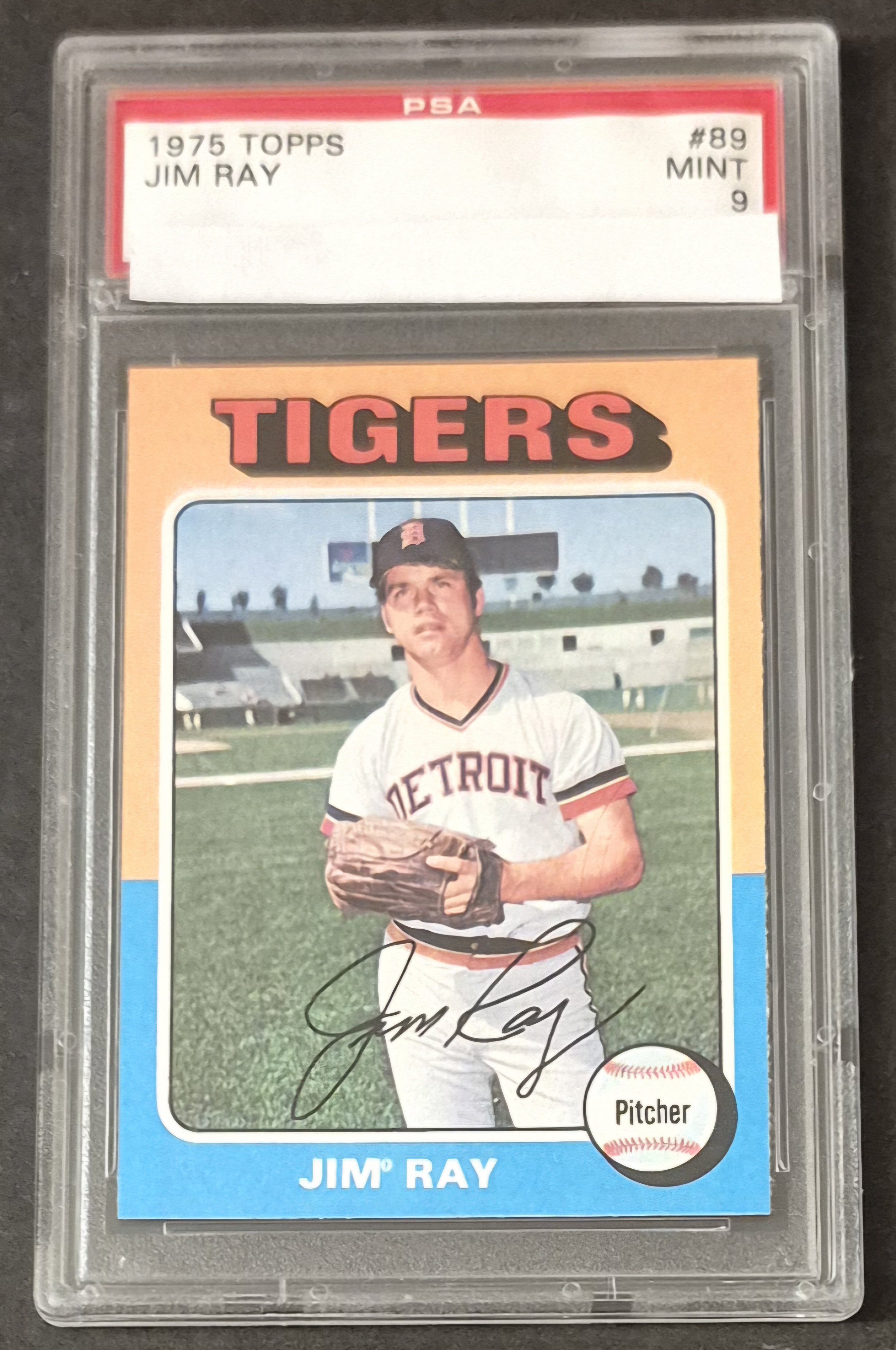
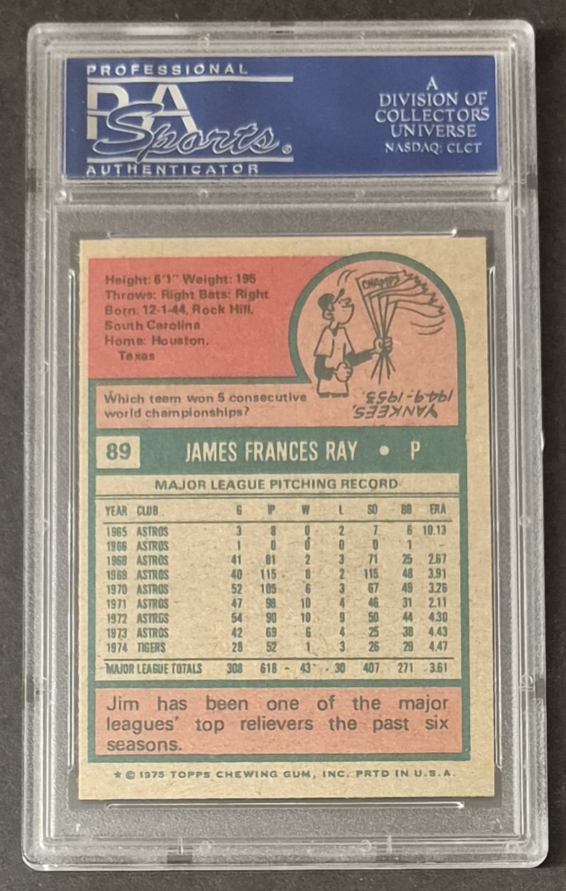
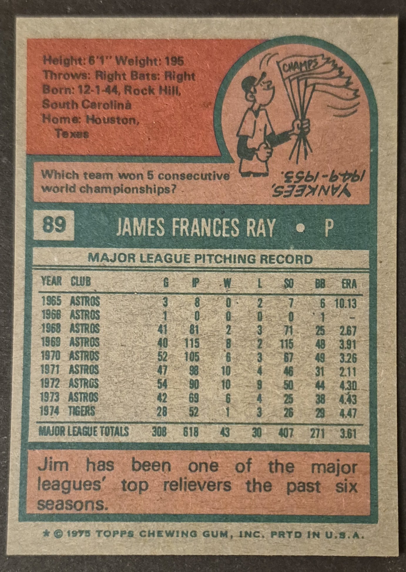
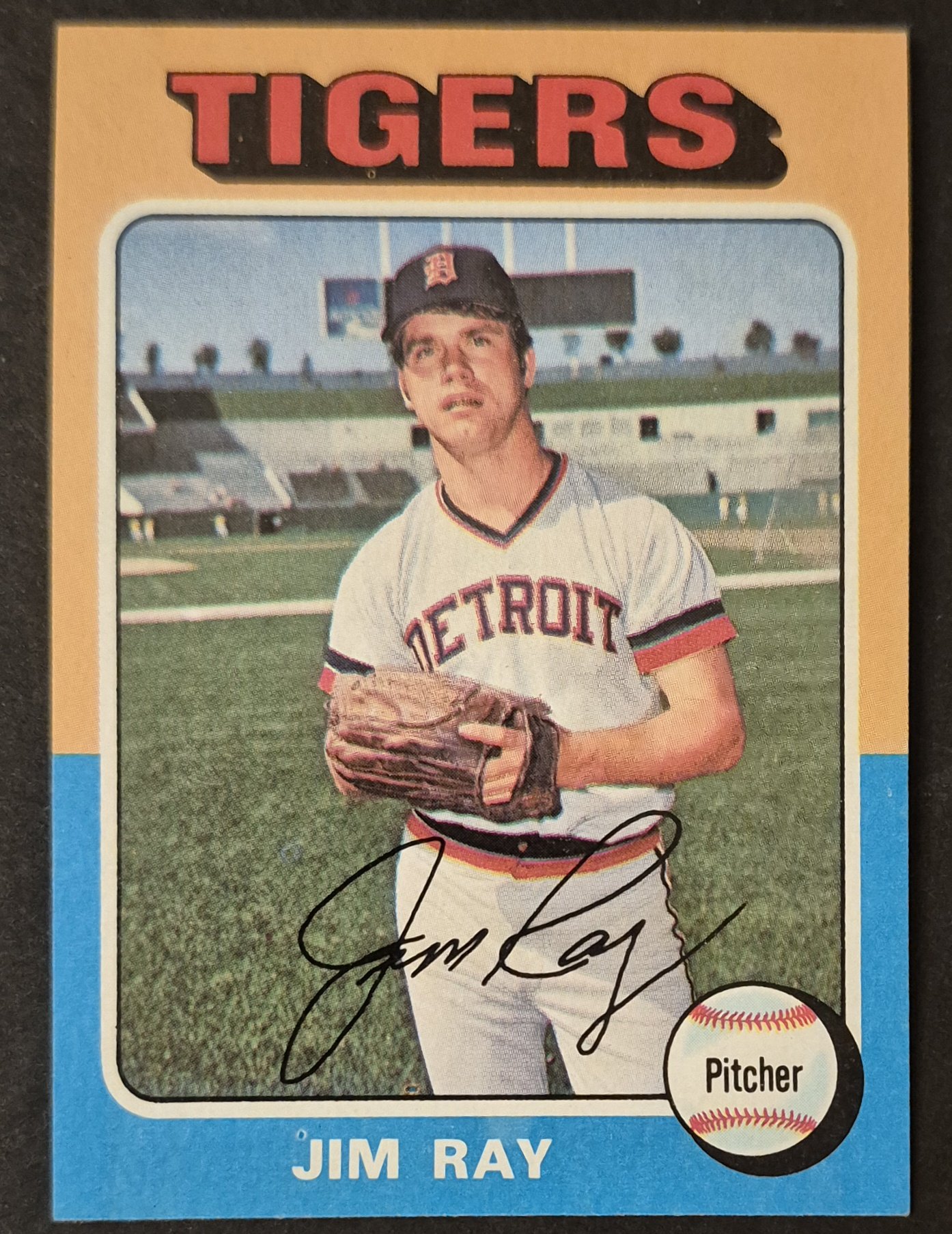
#89 Jim Ray
.
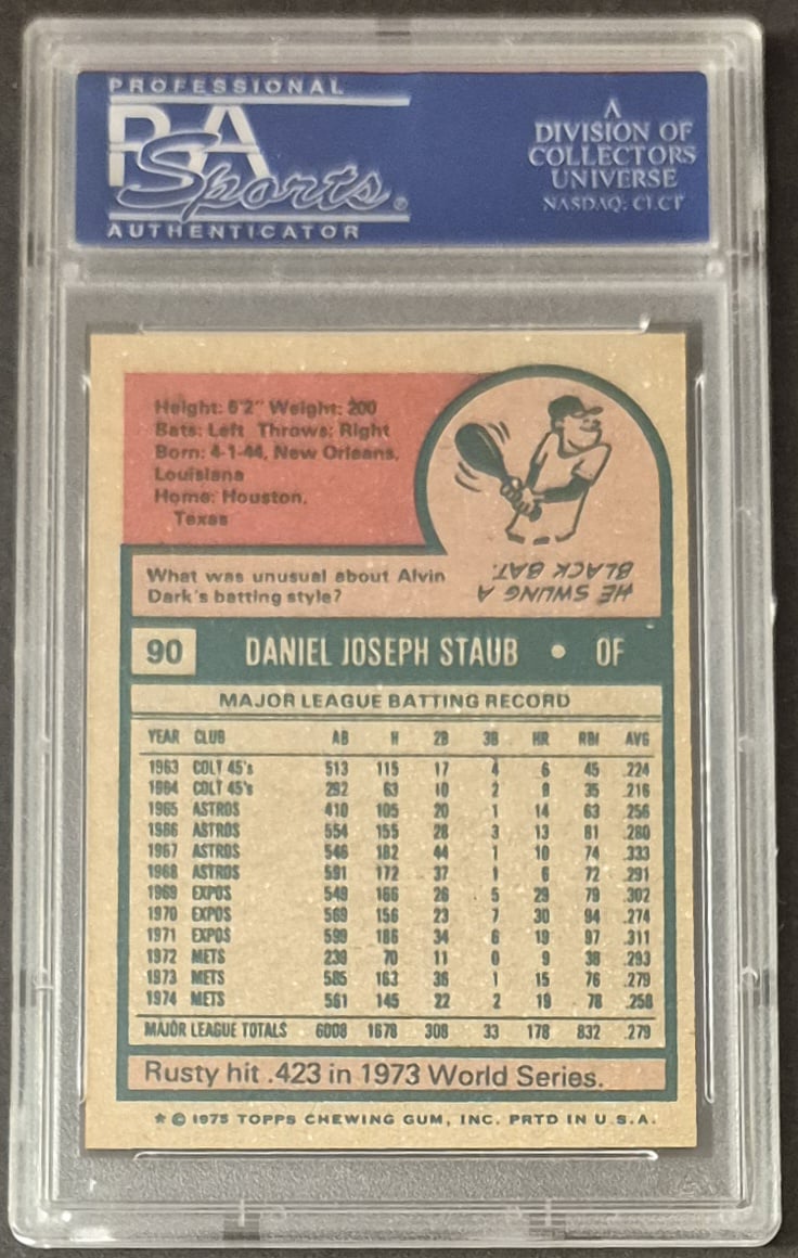
#90 Rusty Staub
.
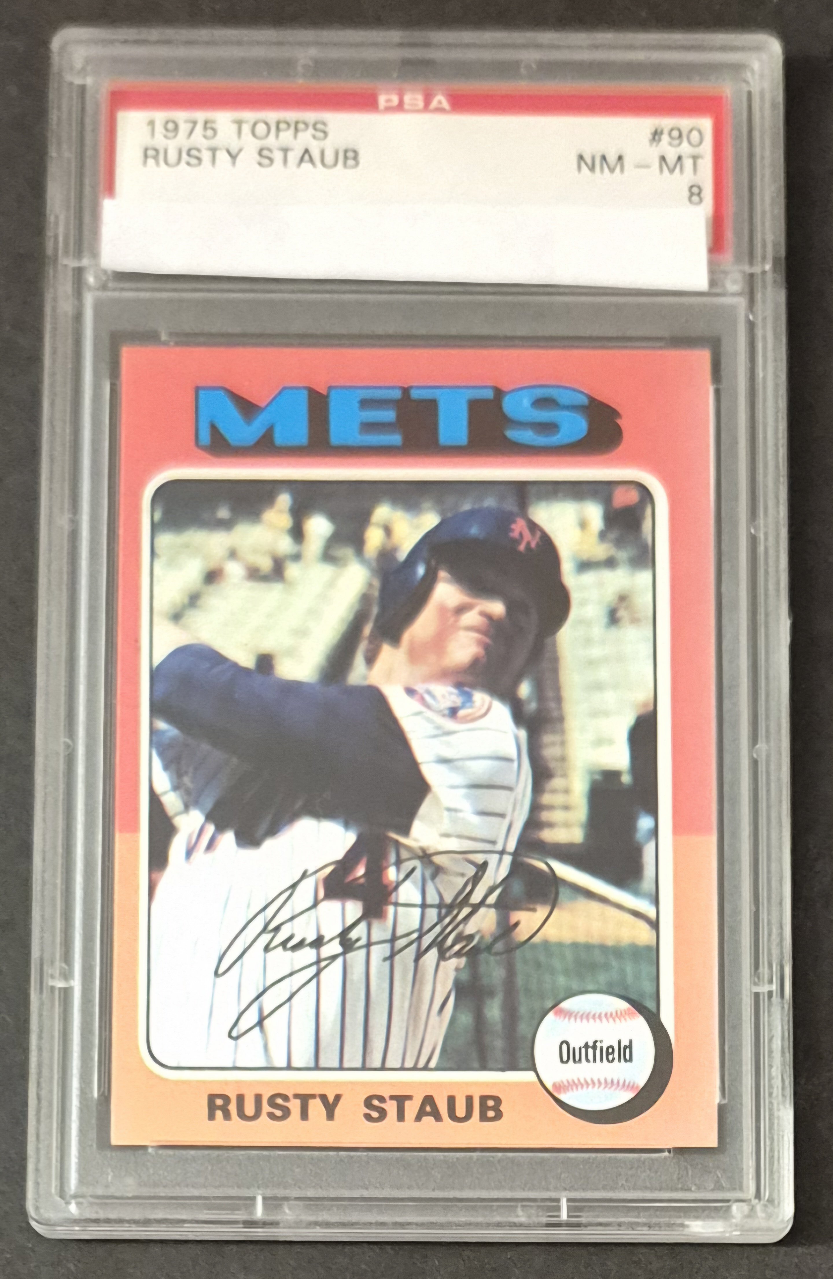
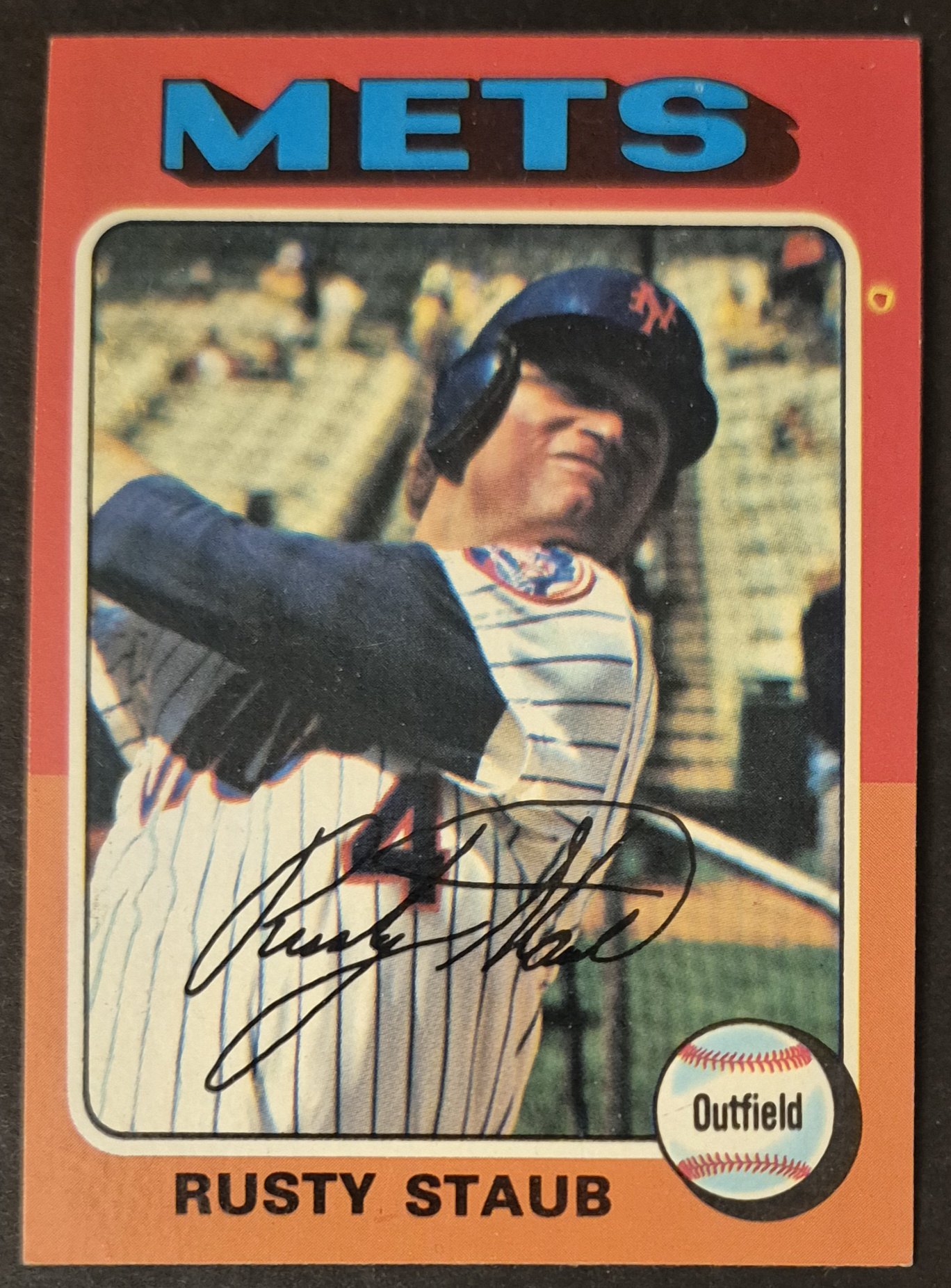
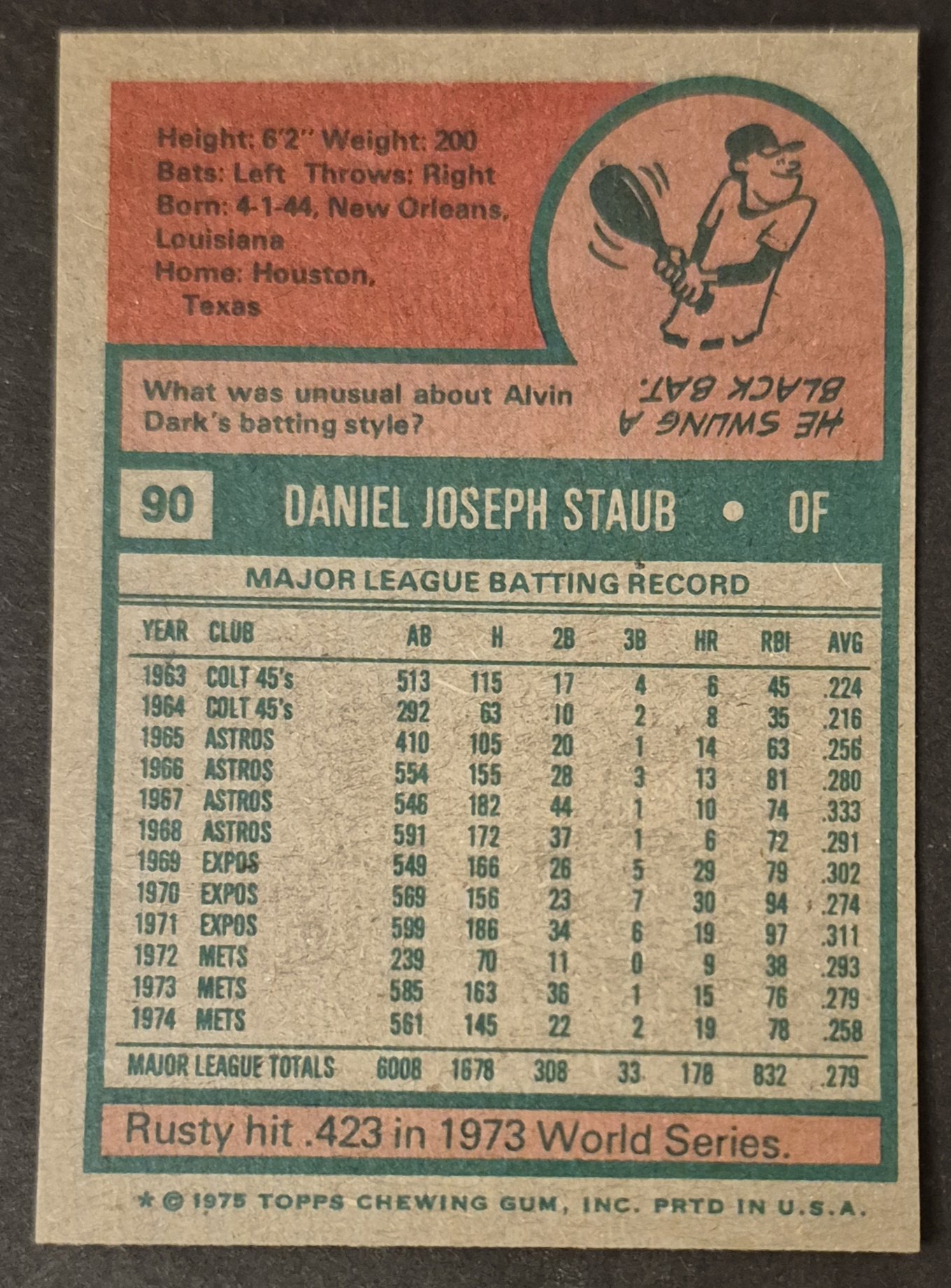
Love that pic. It's like he just spotted a rattler at his feet
It's the singer not the song - Peter Townshend (1972)
Not even a minute do I buy the whole buh buh buh I'm a man-child japery - Me (2025)
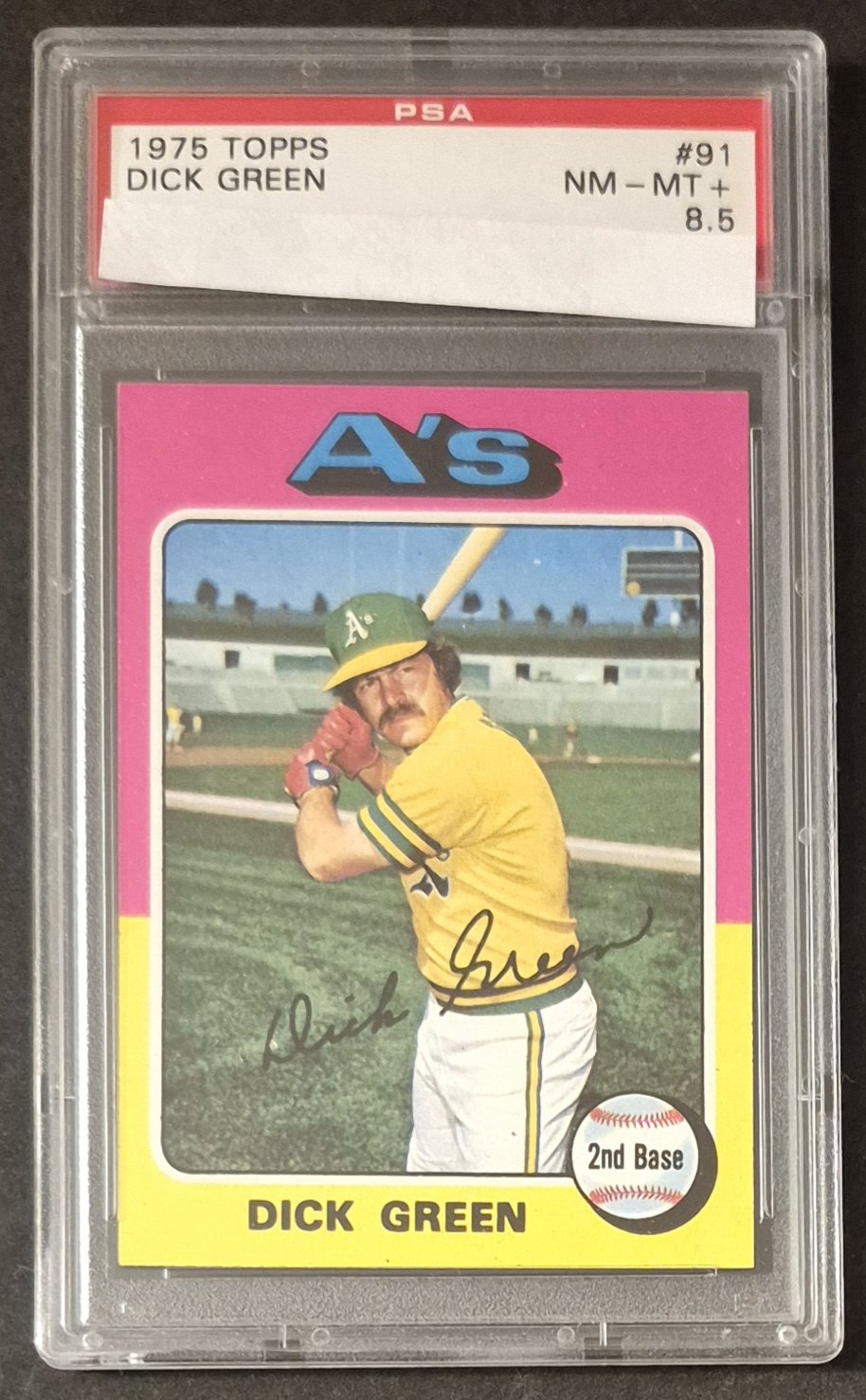
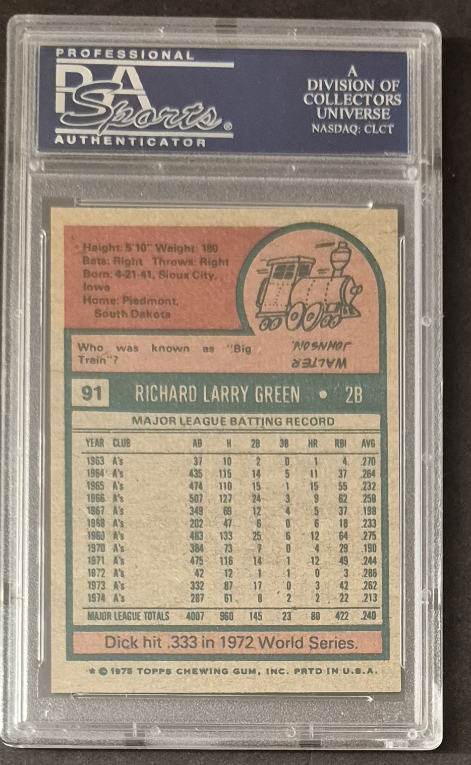
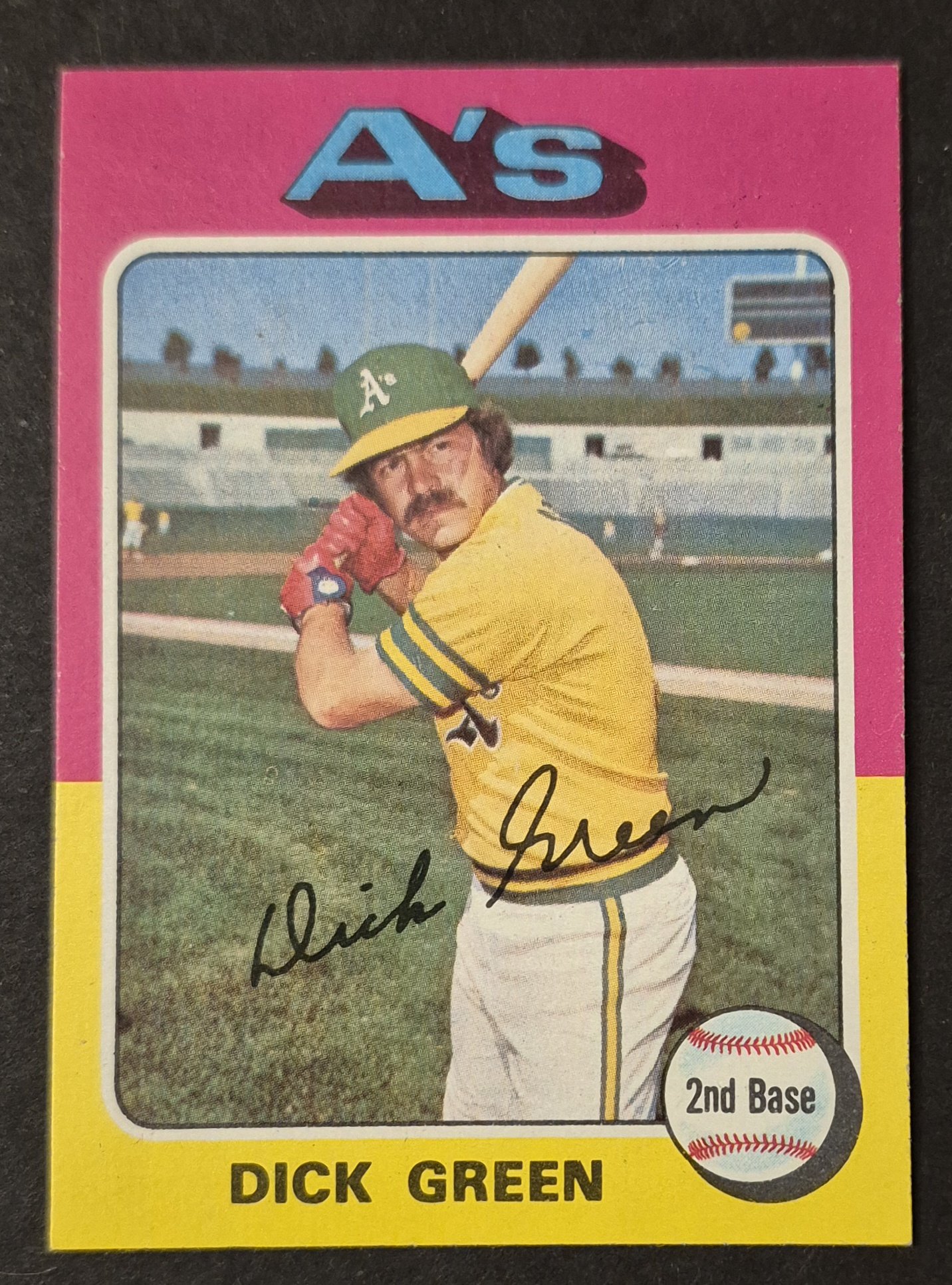
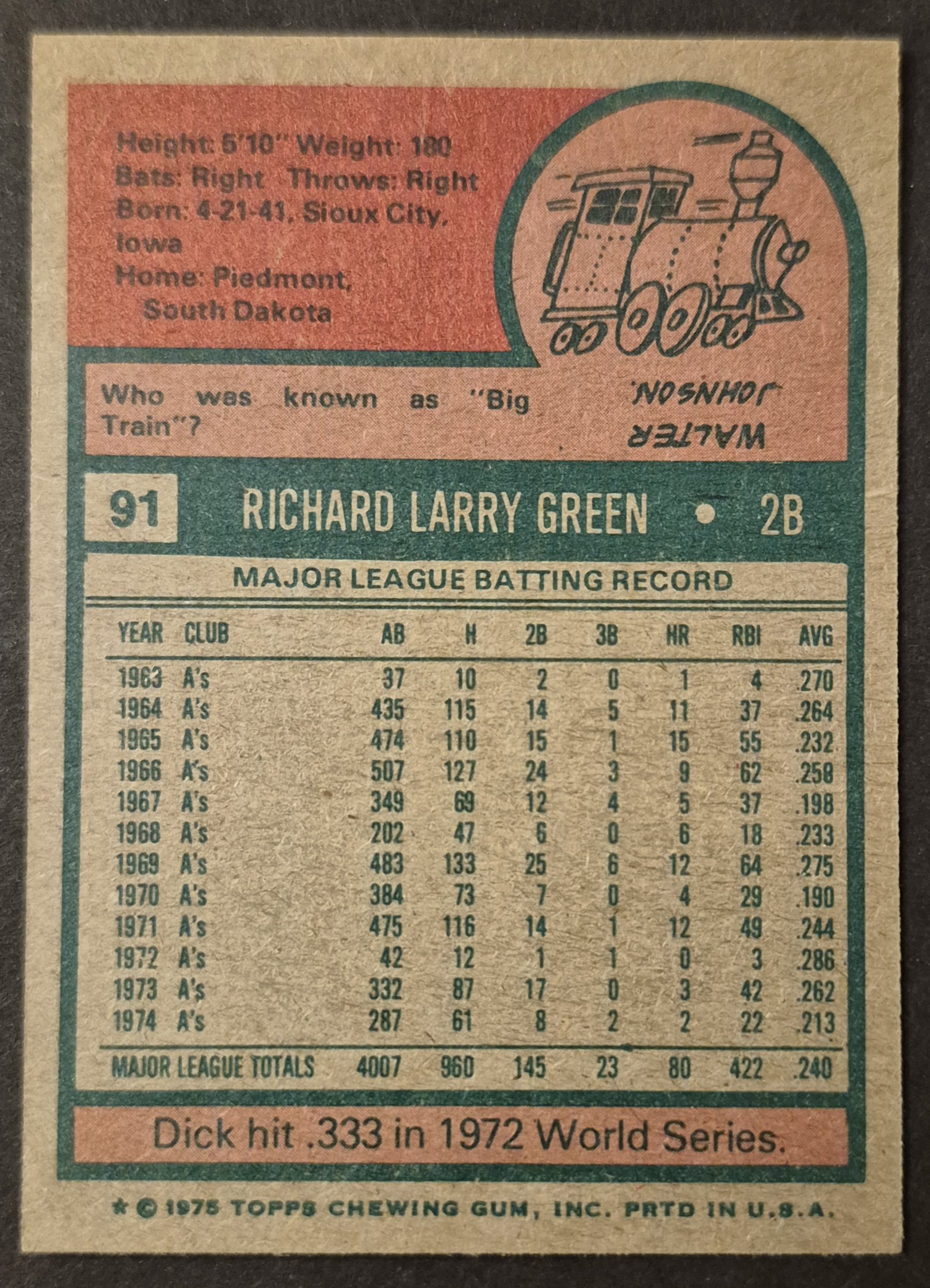
#91 Dick Green
.
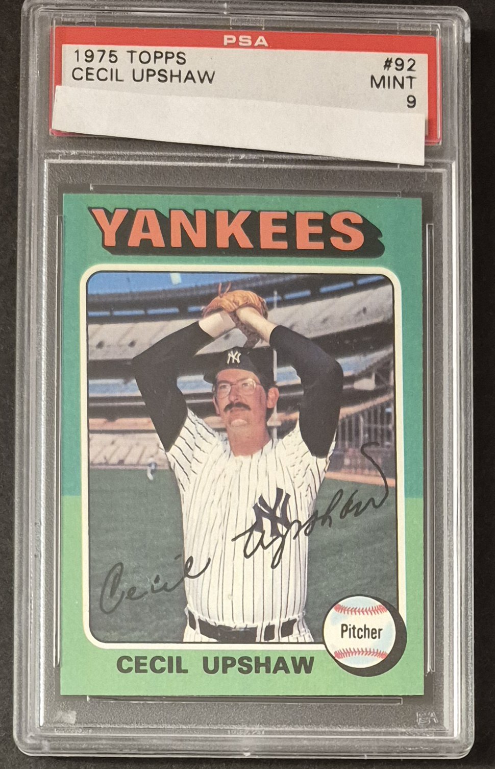
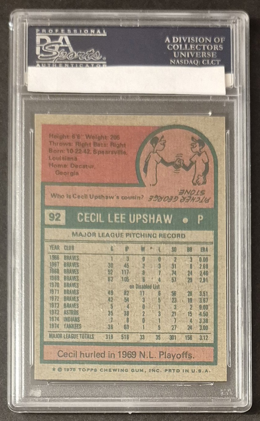
#92 Cecil Upshaw
.

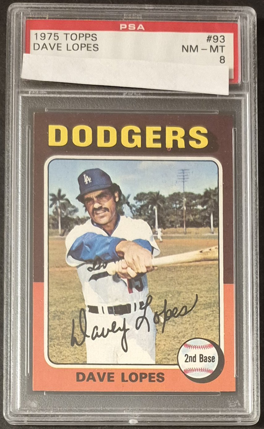
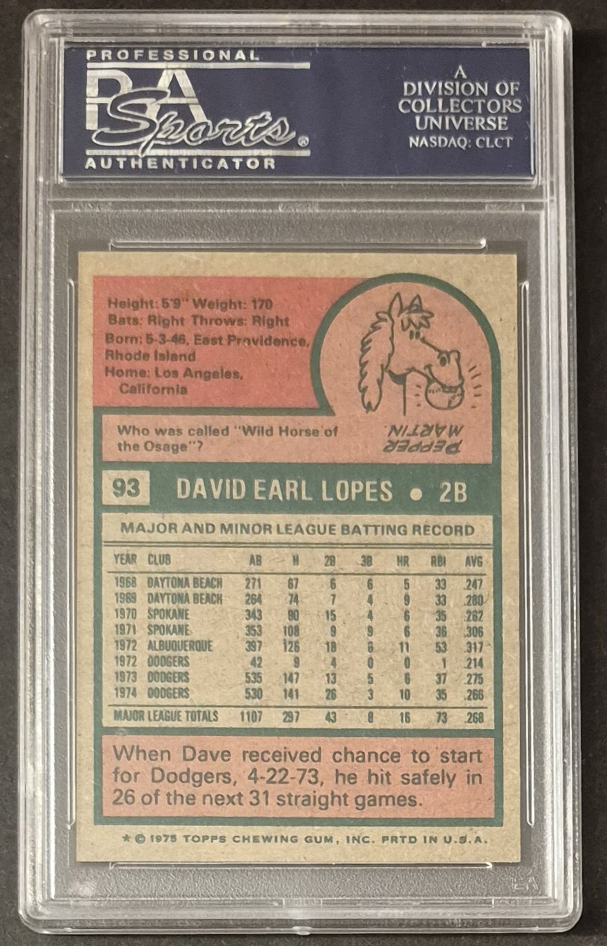
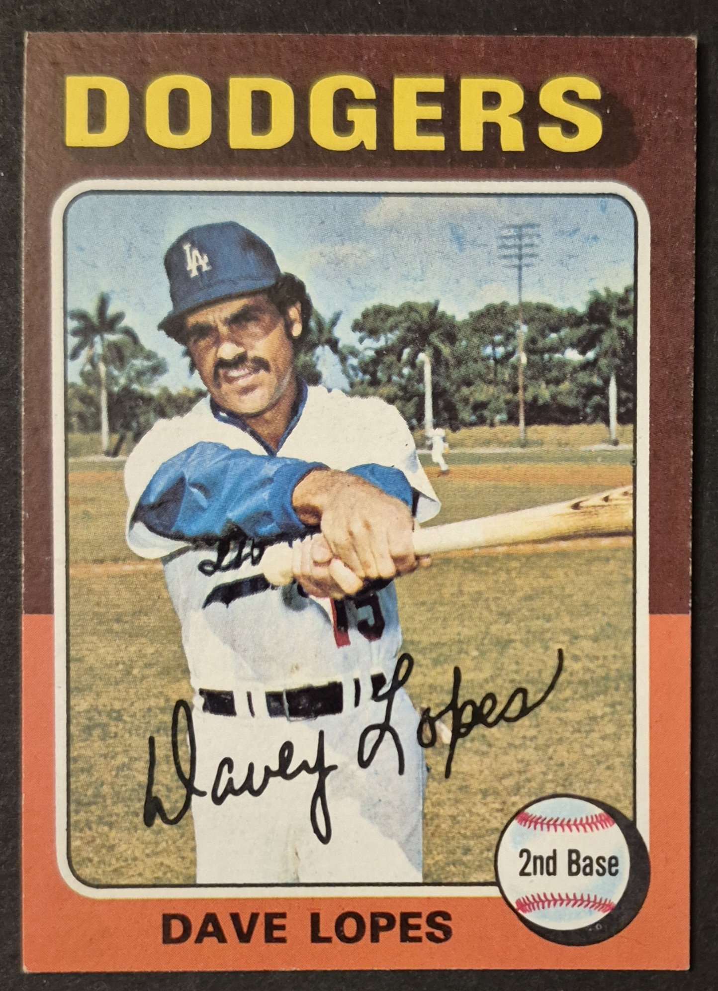
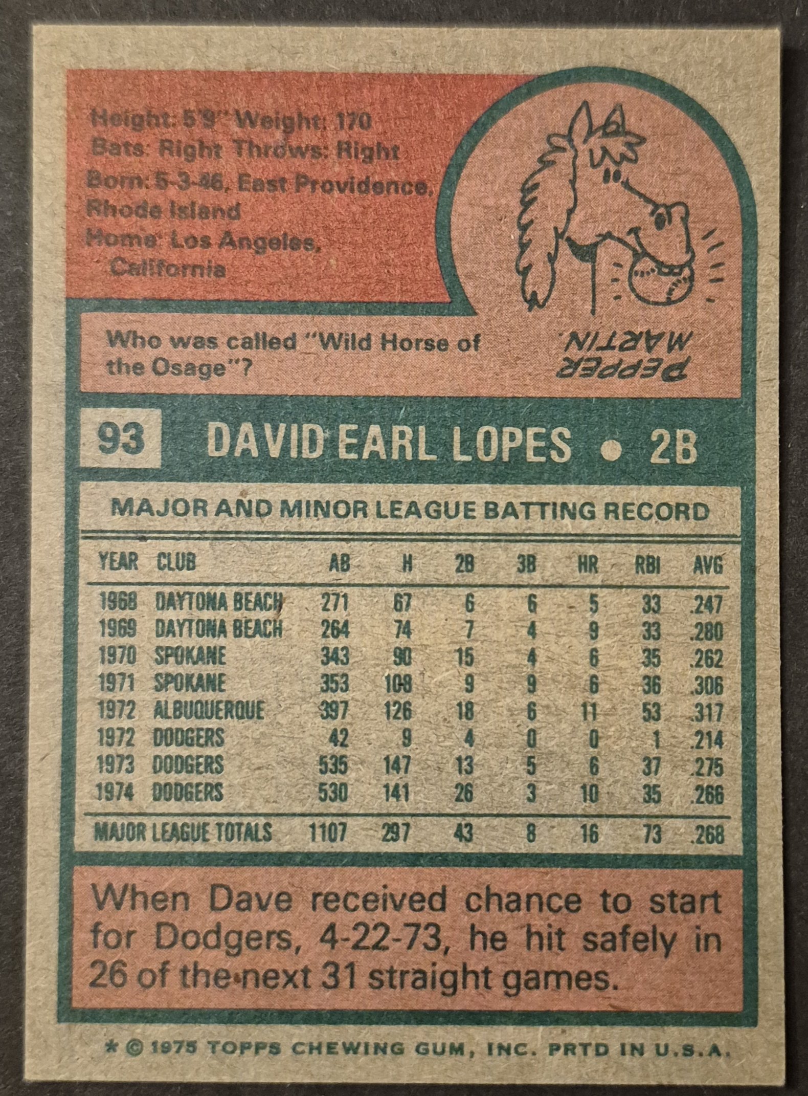
#93 Dave Lopes
.
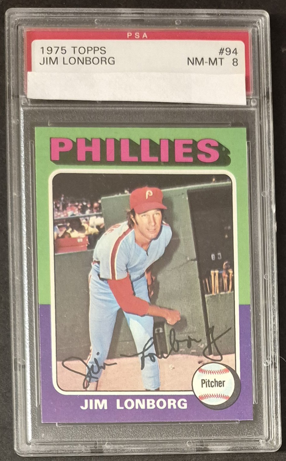
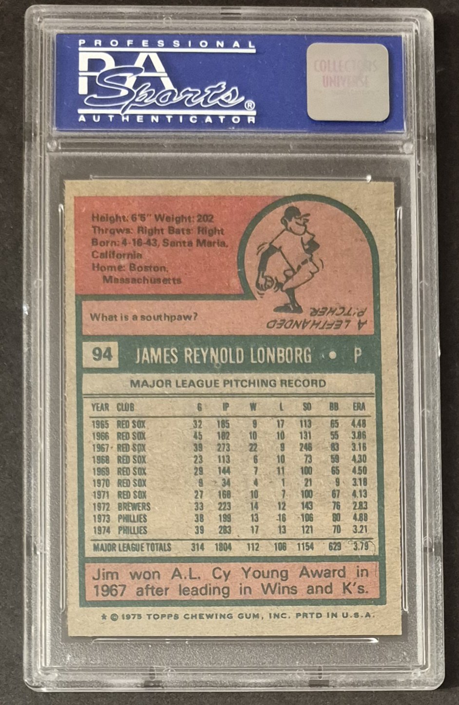
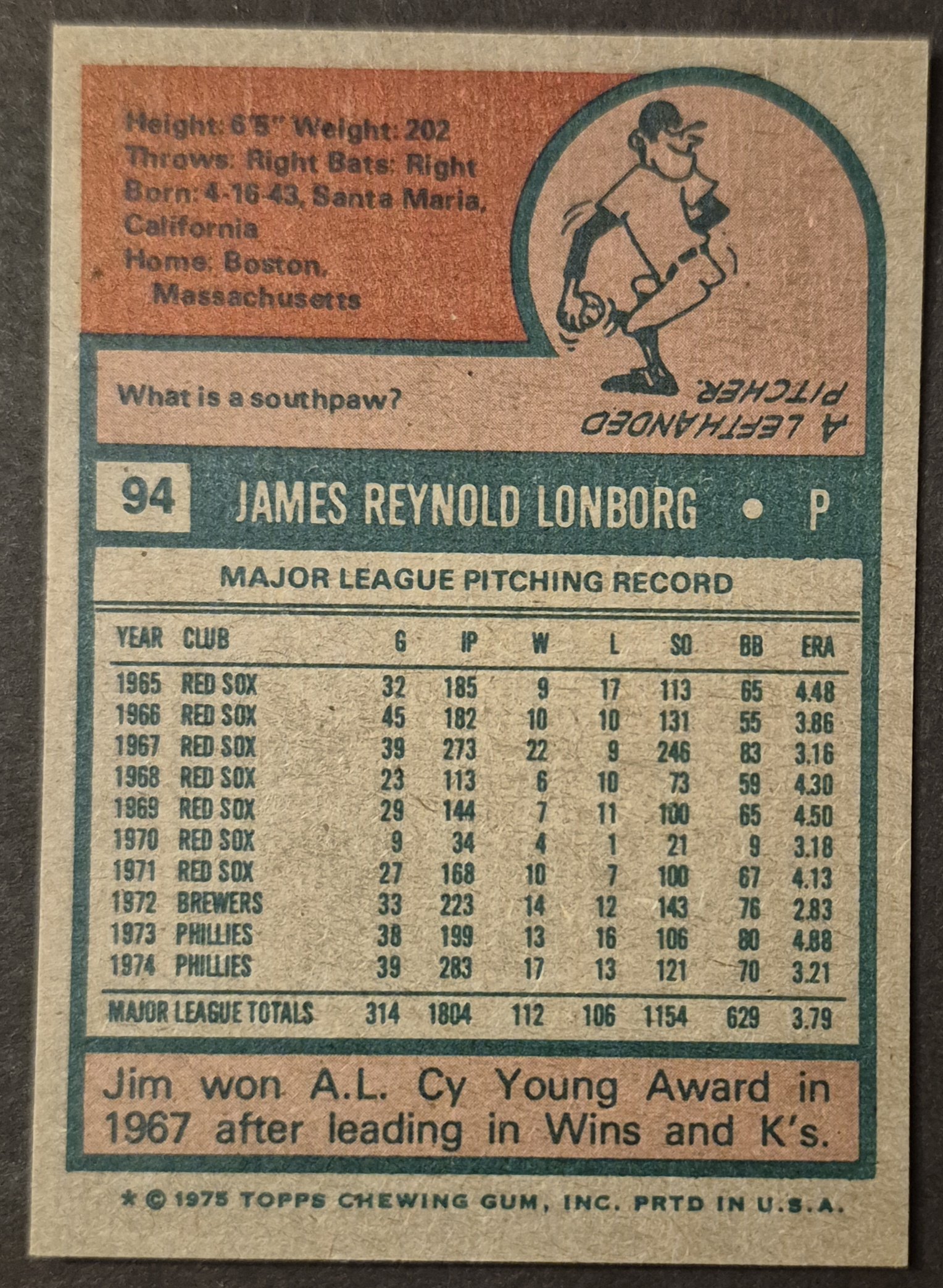
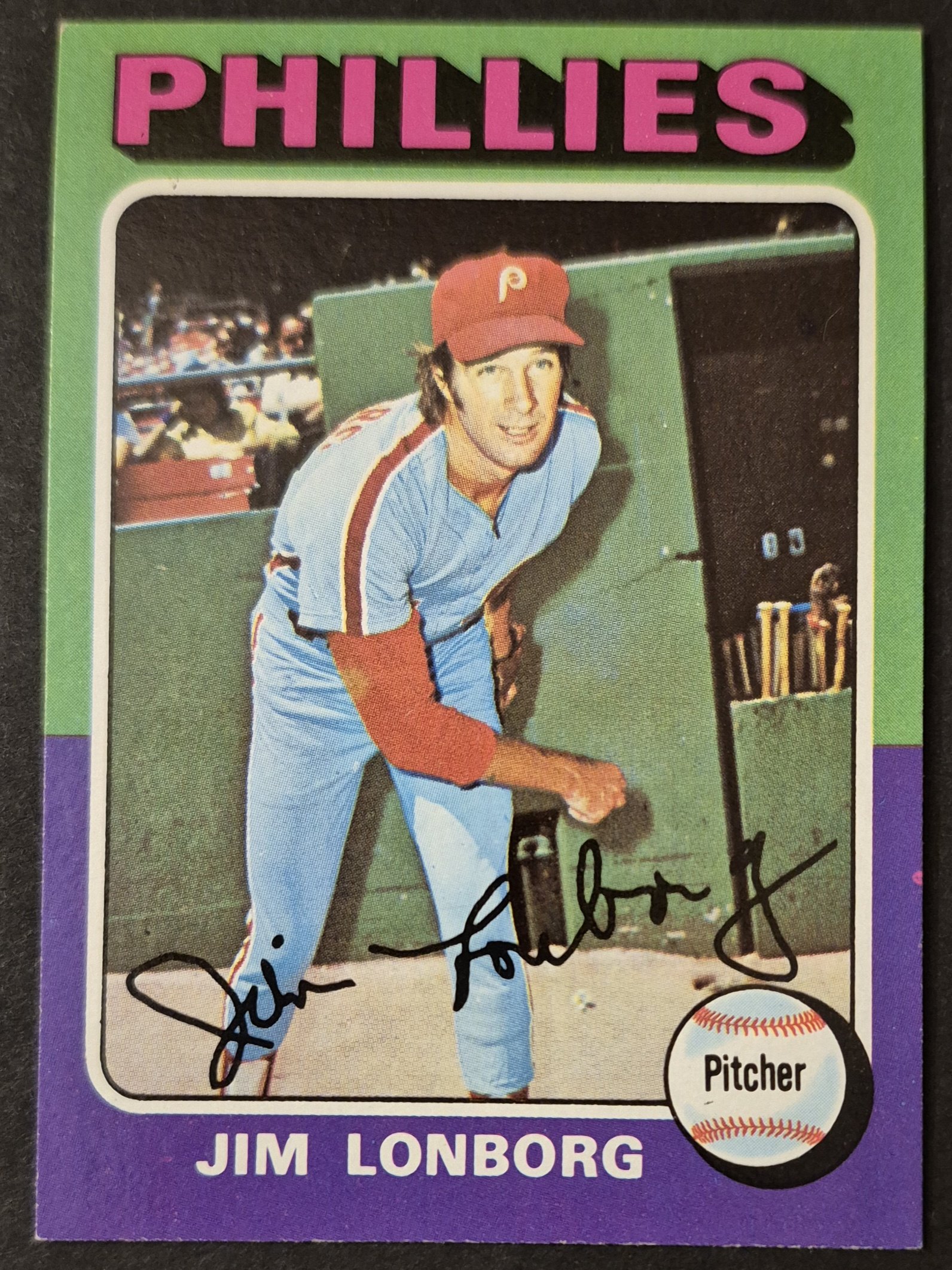
#94 Jim Lonborg
.
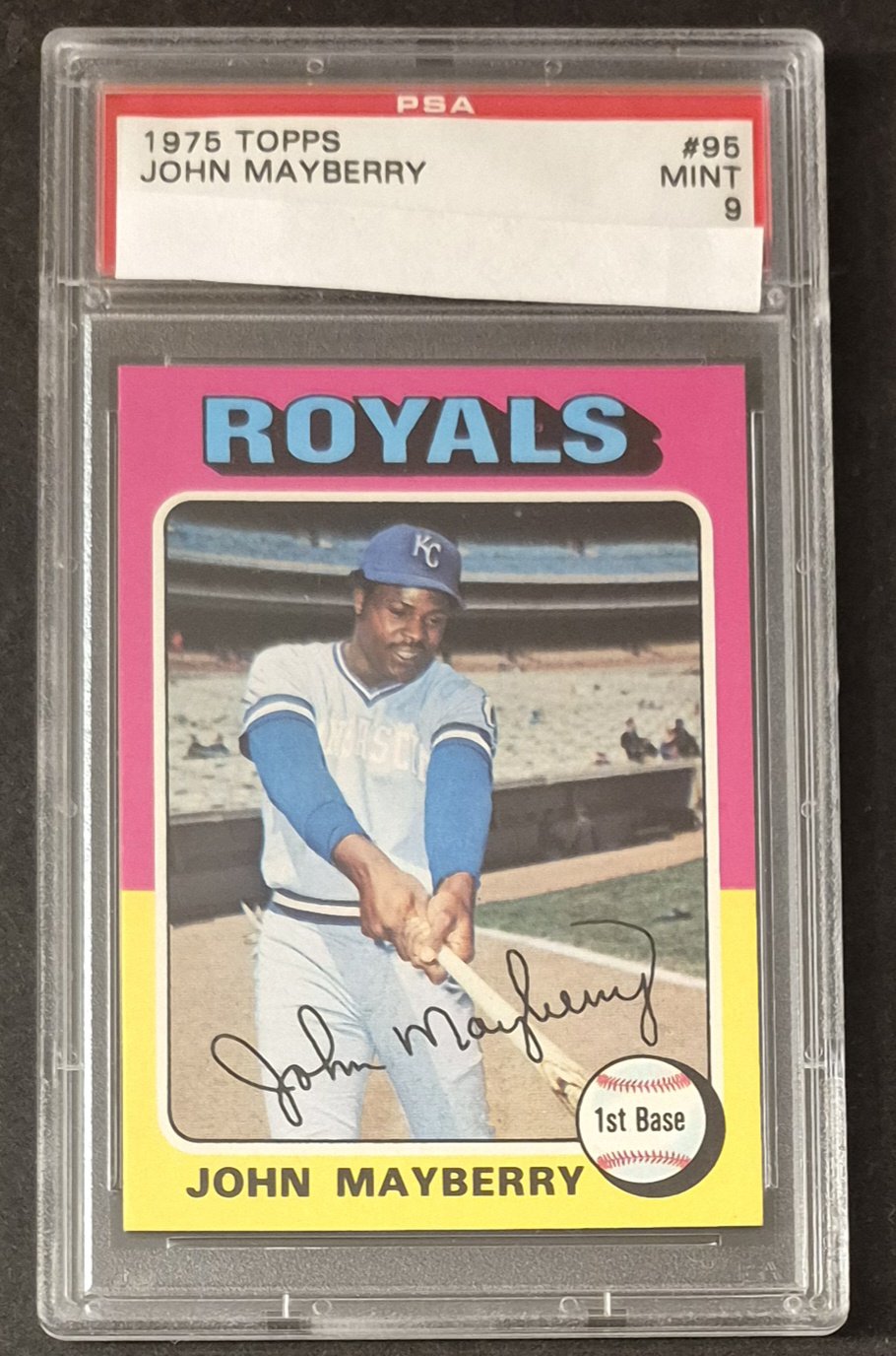
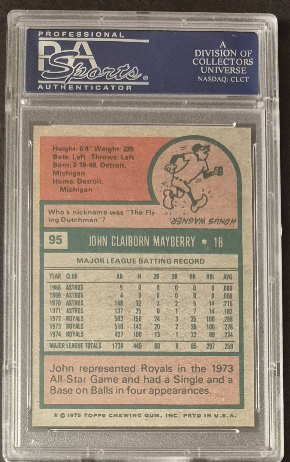
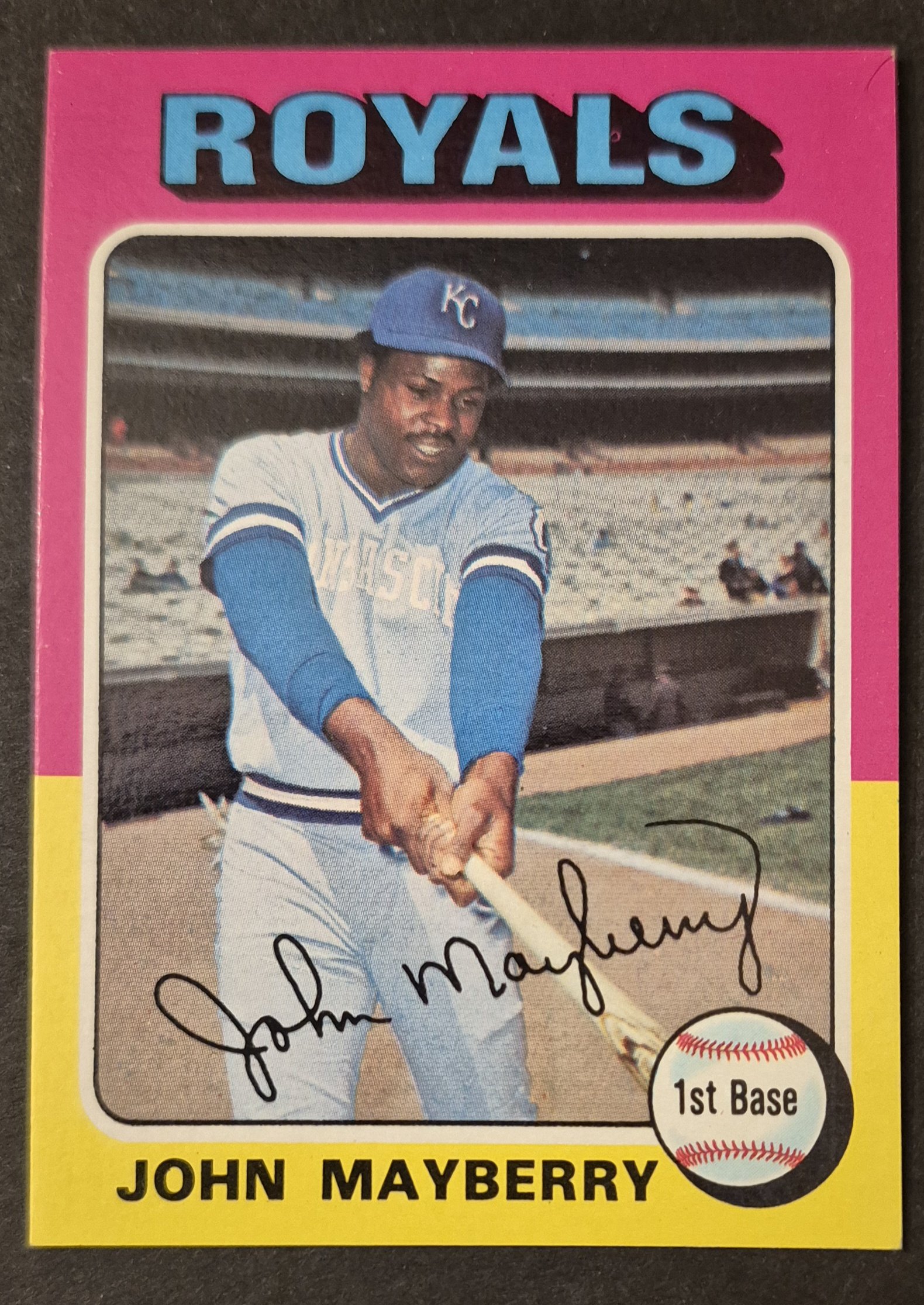
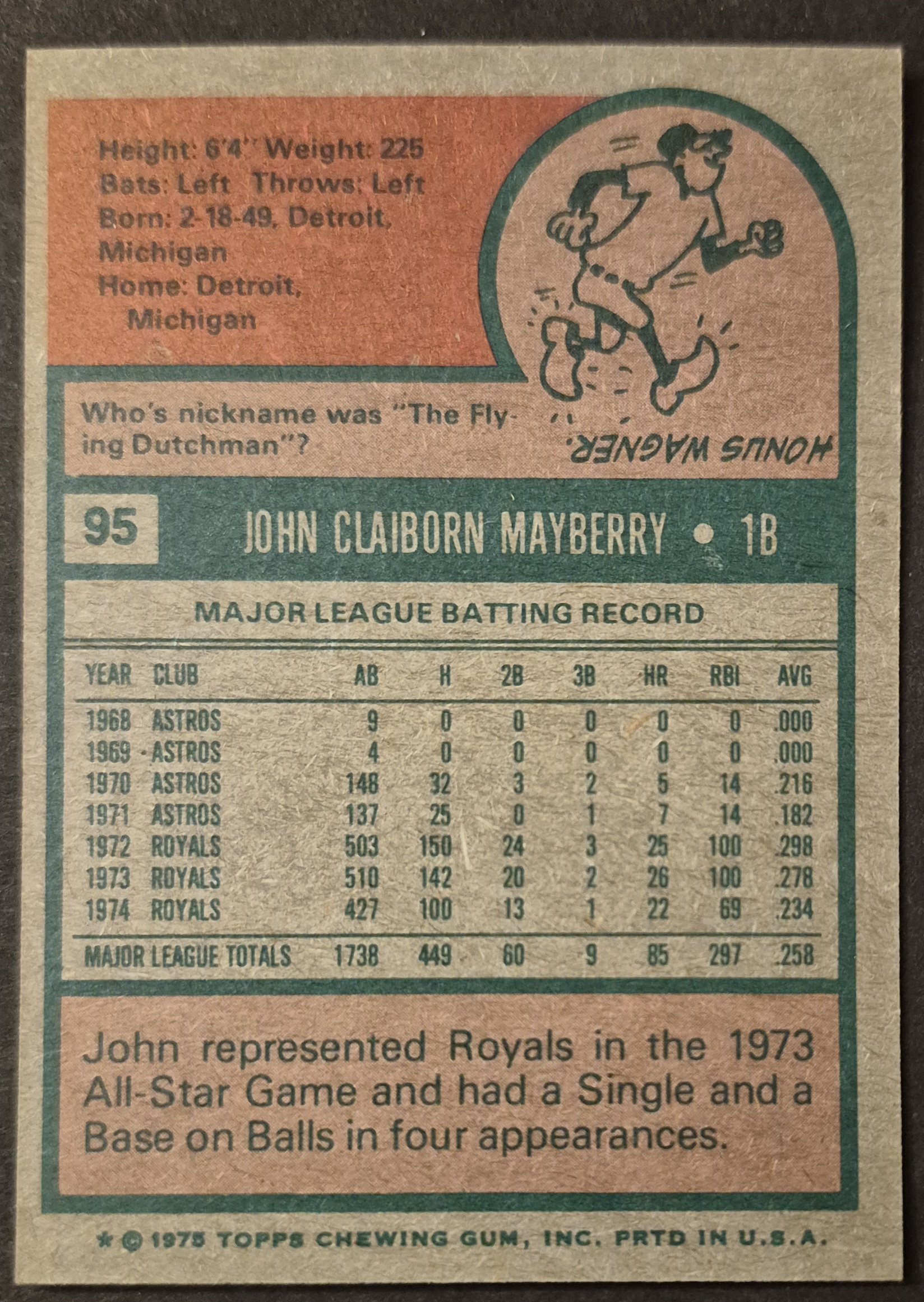
#95 John Mayberry
.
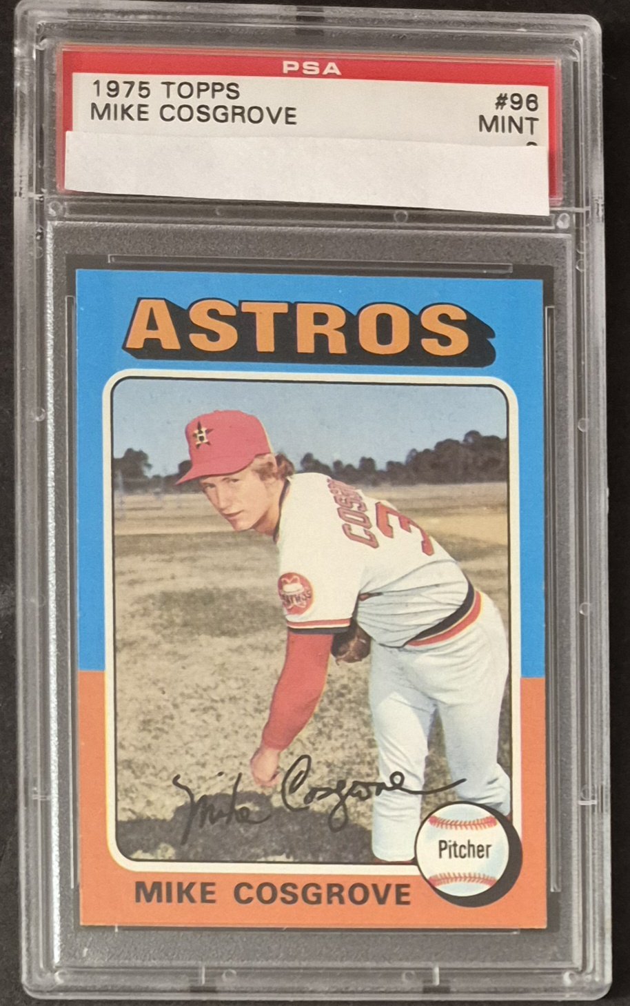
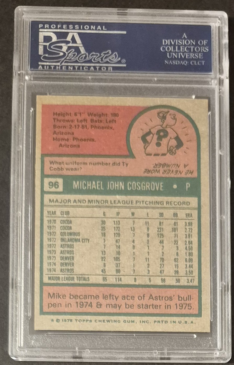
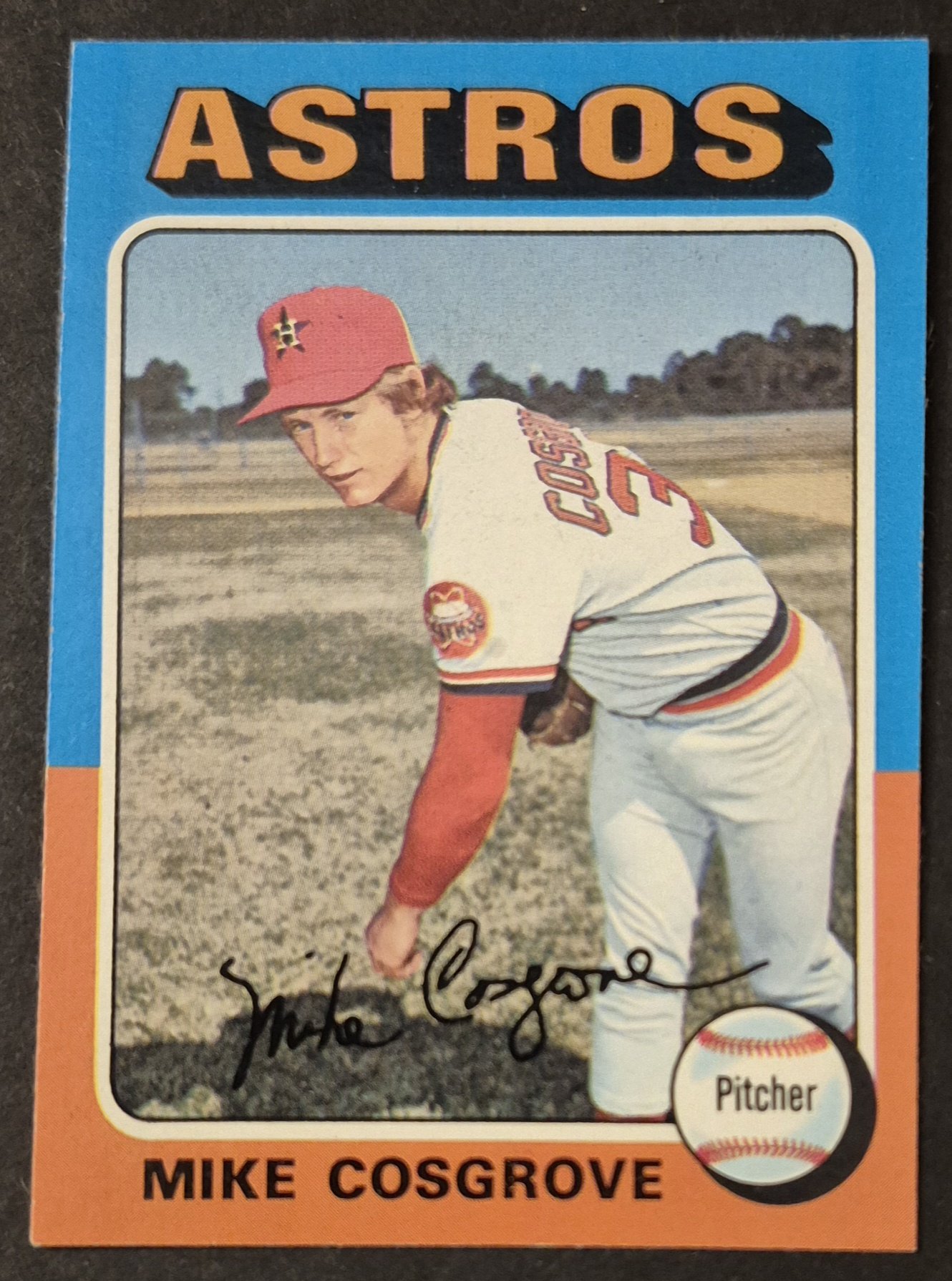
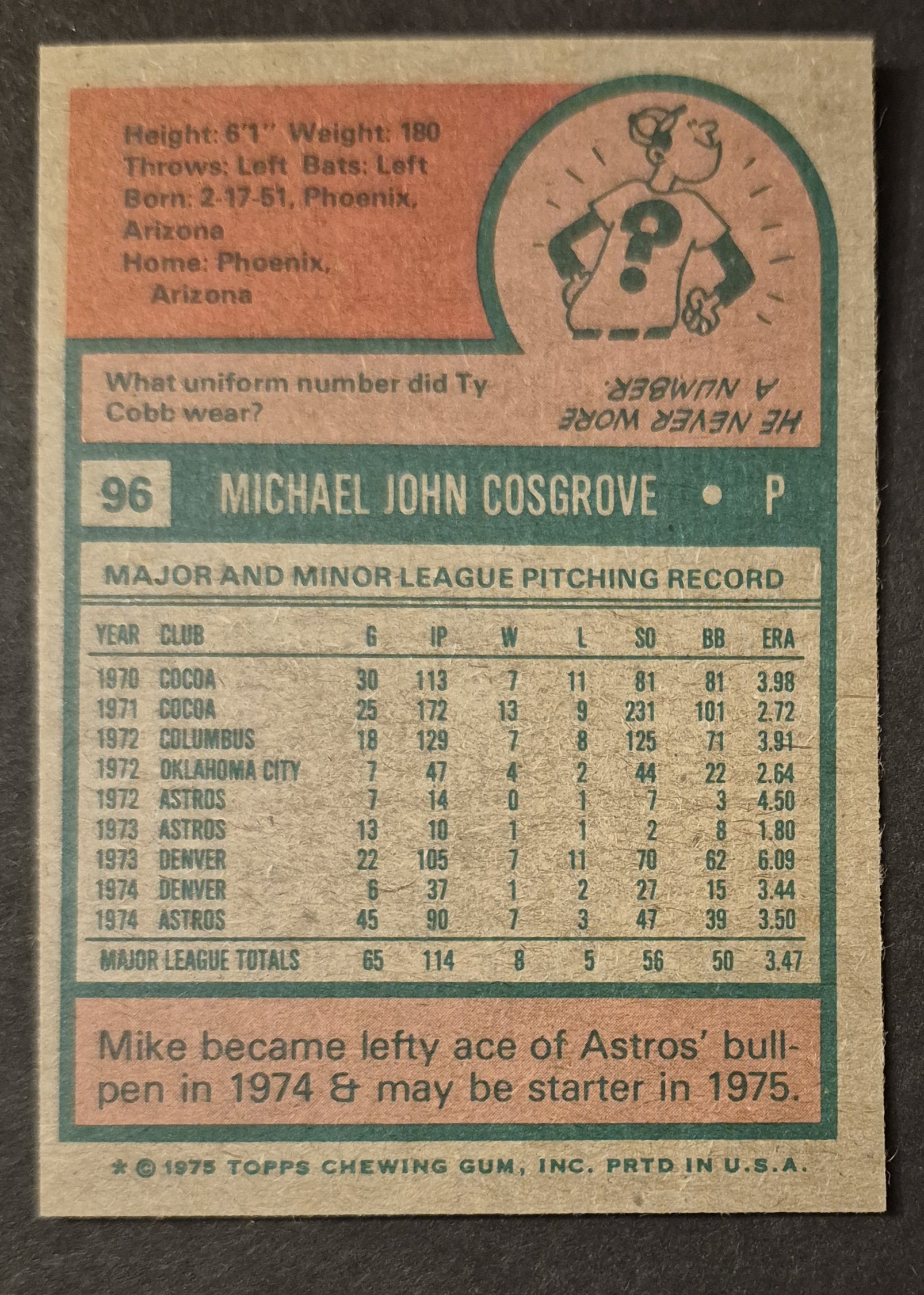
#96 Mike Cosgrove
.
Apropos the A's Dick was Green
It's the singer not the song - Peter Townshend (1972)
Not even a minute do I buy the whole buh buh buh I'm a man-child japery - Me (2025)
I love the 75 set because so many spring training photos look like they’re taken in some random pasture.
I agree with that assessment. On that same note, one thing that has always stood out as a little trippy about the 1975 set (you see it in other years, as well) is how the picture will be shot and cropped in such a way that the earth in the background seems tilted. All of those photos in Oakland Coliseum, especially, look like they're in the middle of an earthquake and the field is about to be swallowed up into a giant hole.
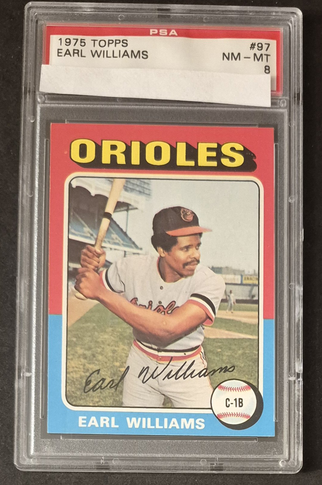
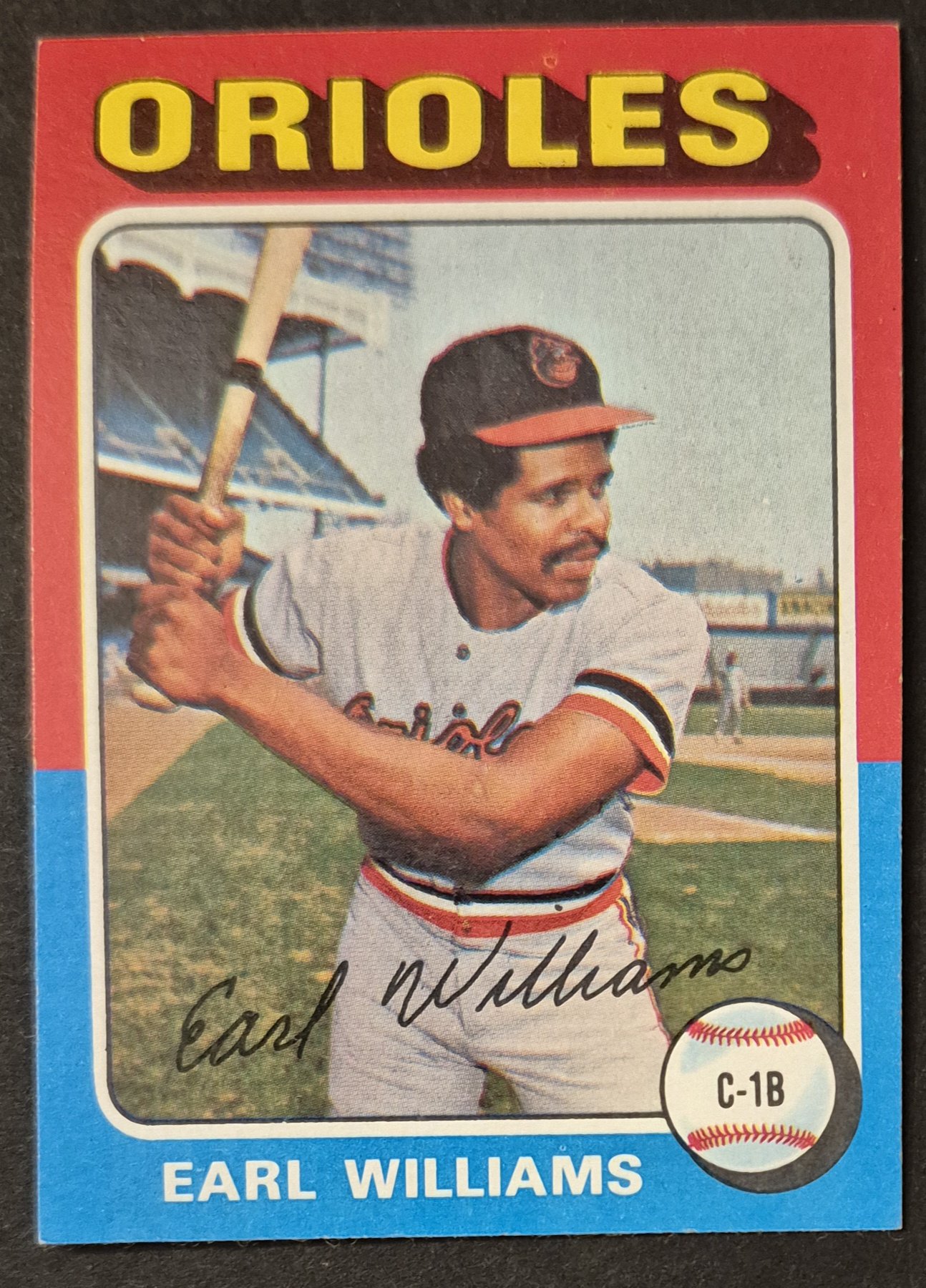
#97 Earl Williams
.
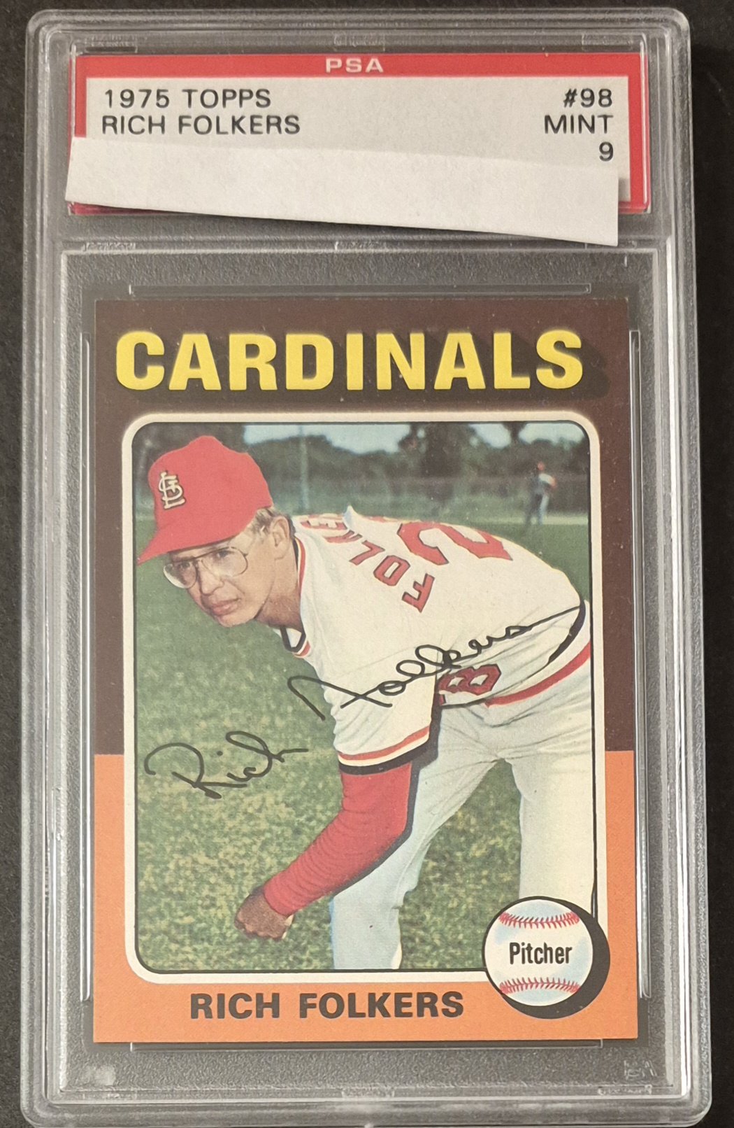
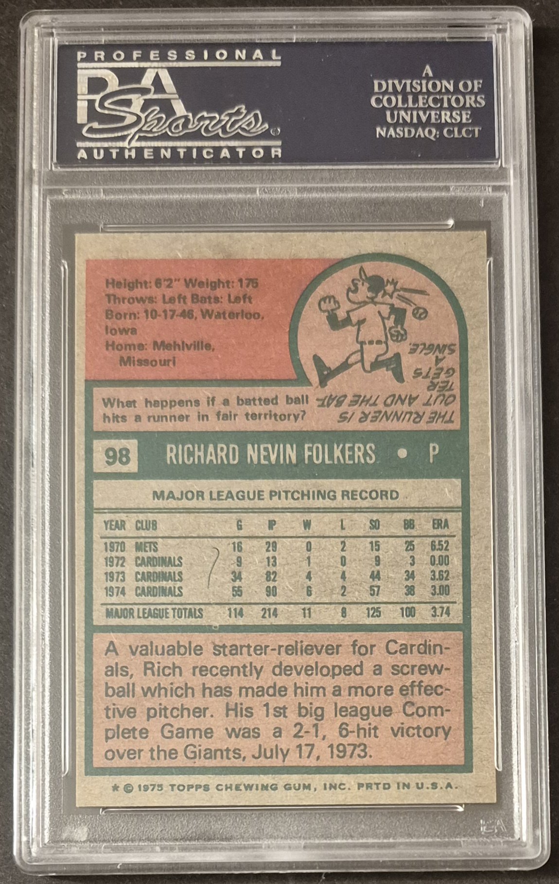
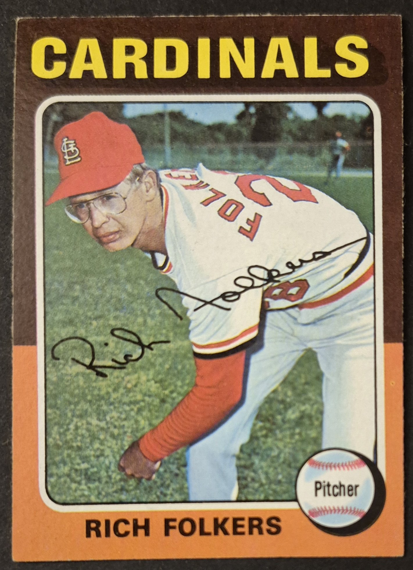
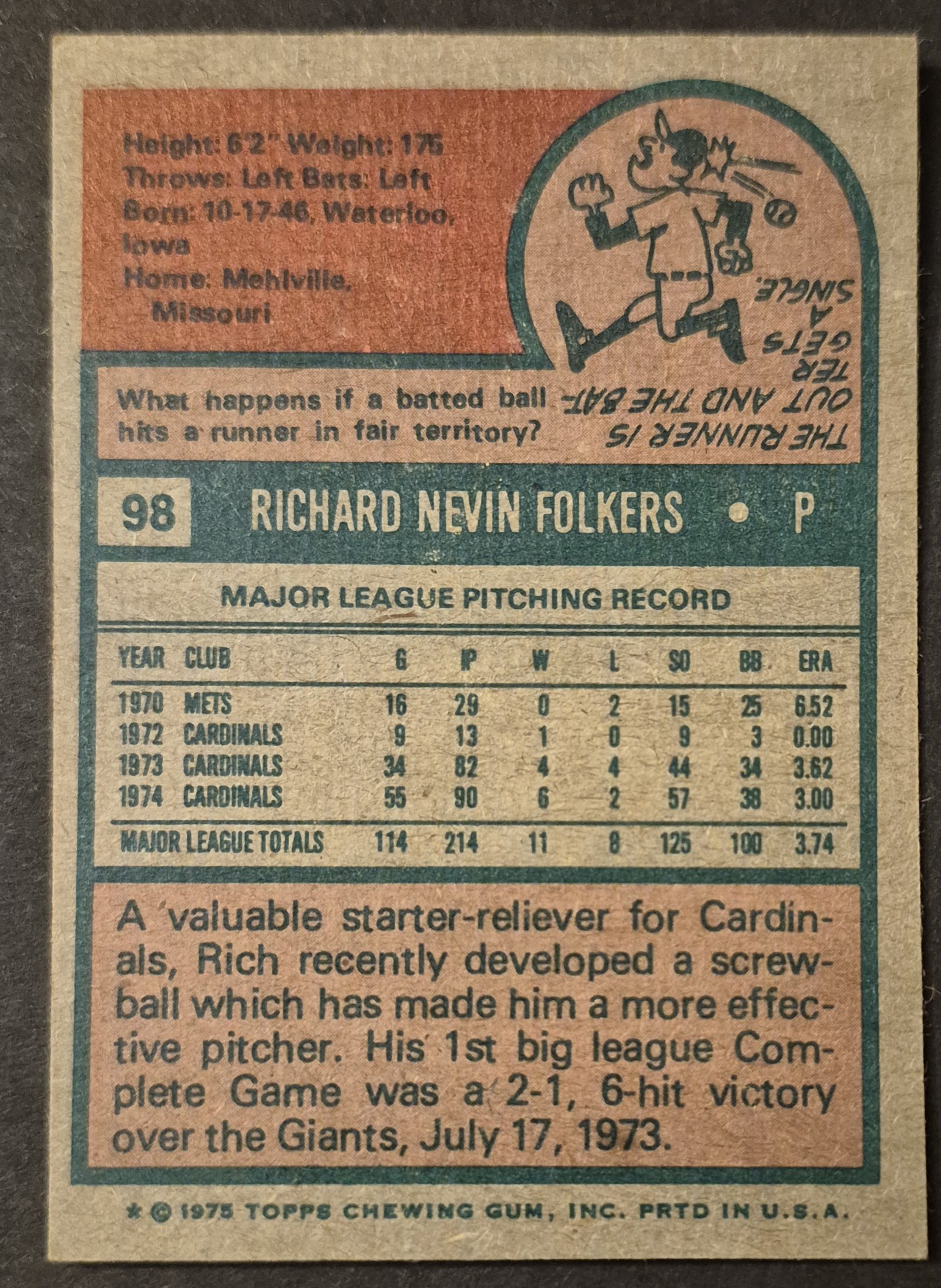
#98 Rich Folkers
.
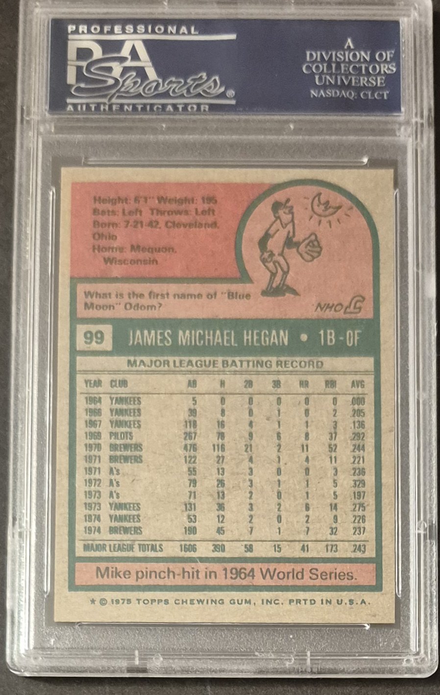
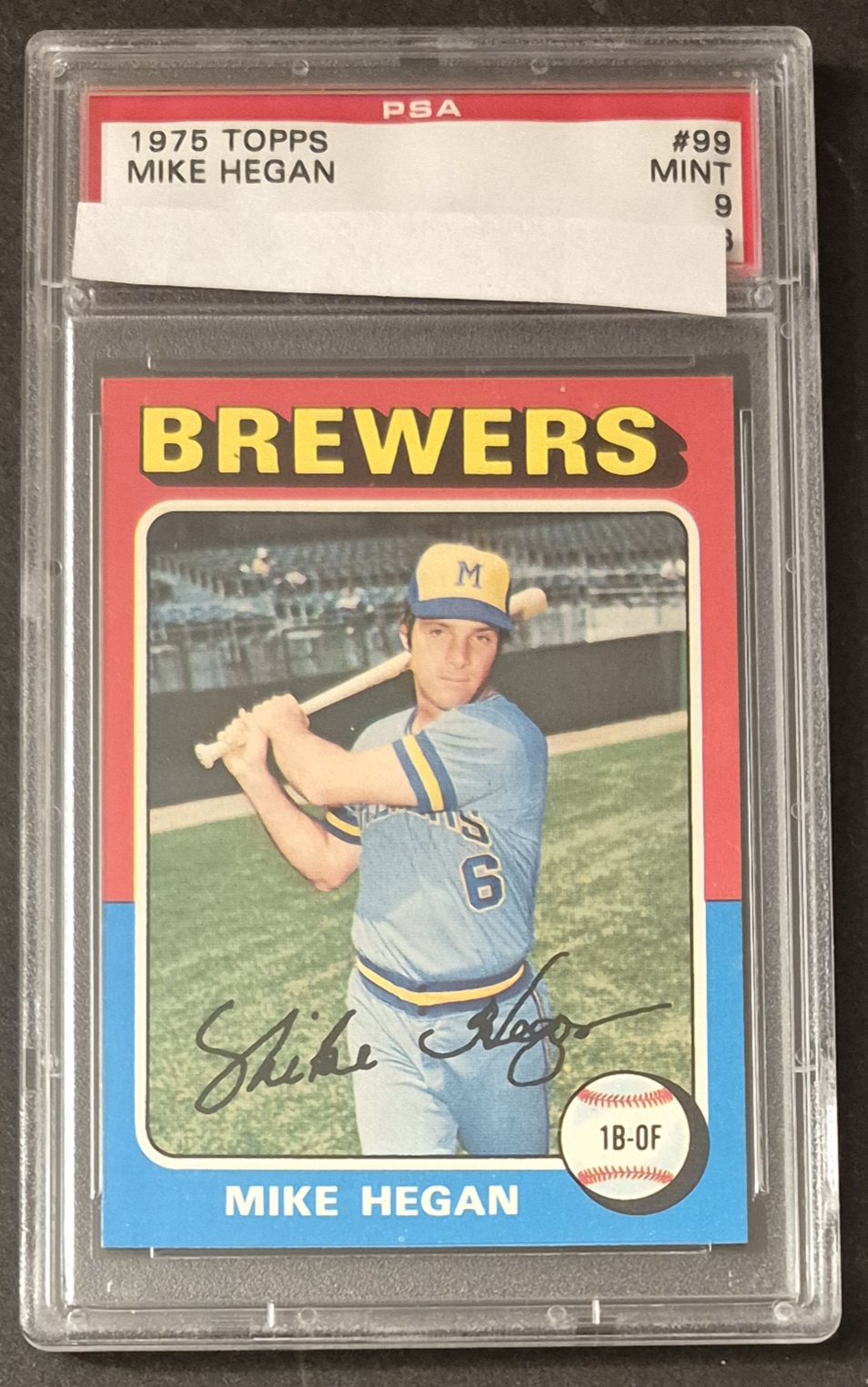
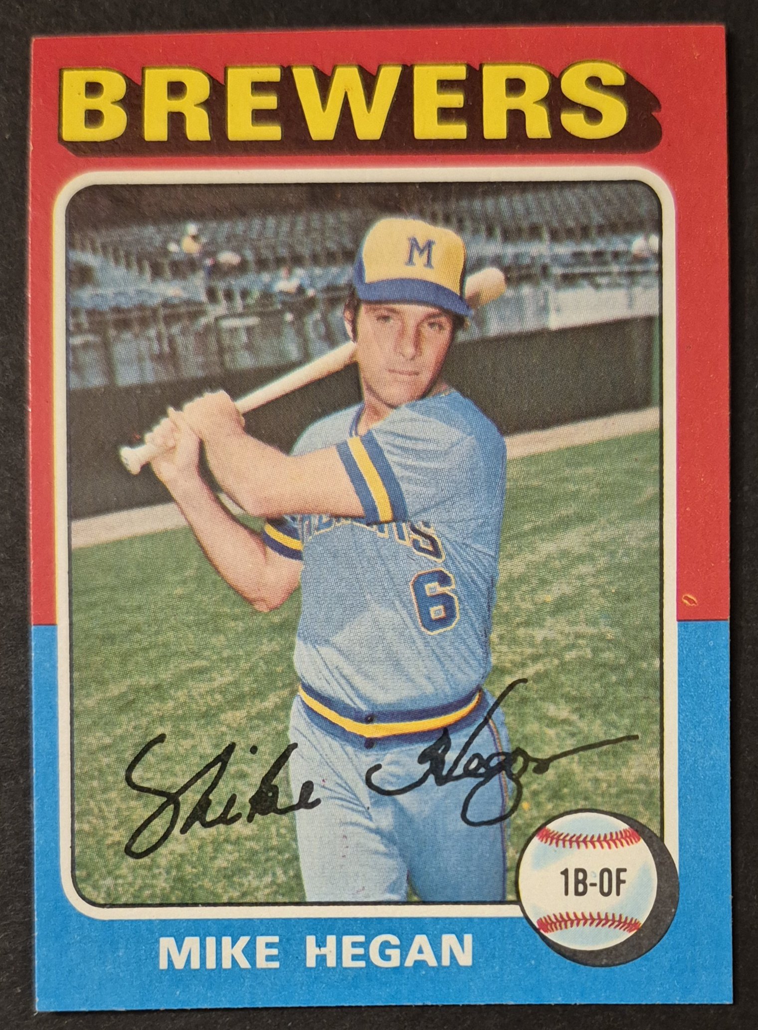
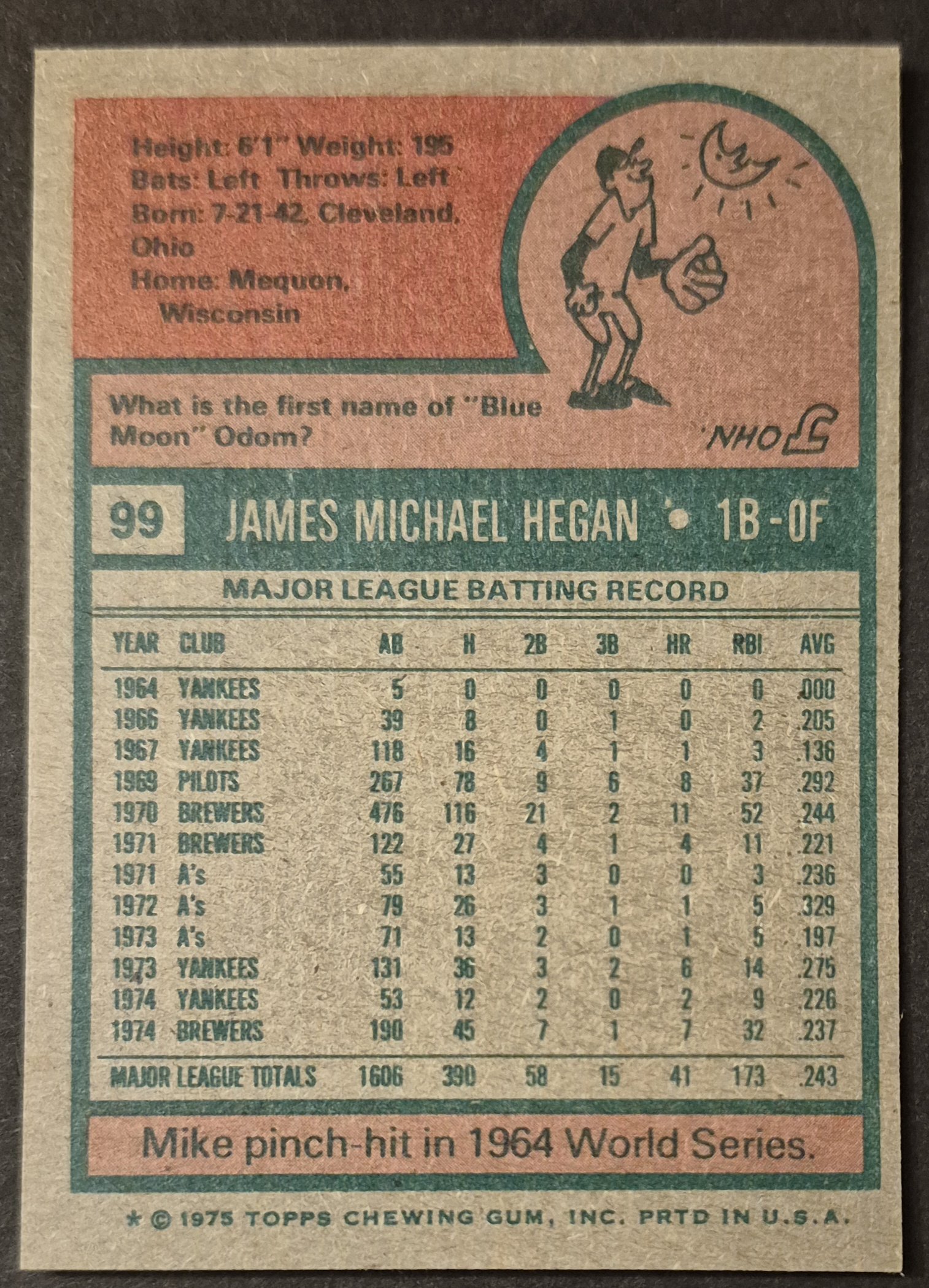
#99 Mike Hegan
.
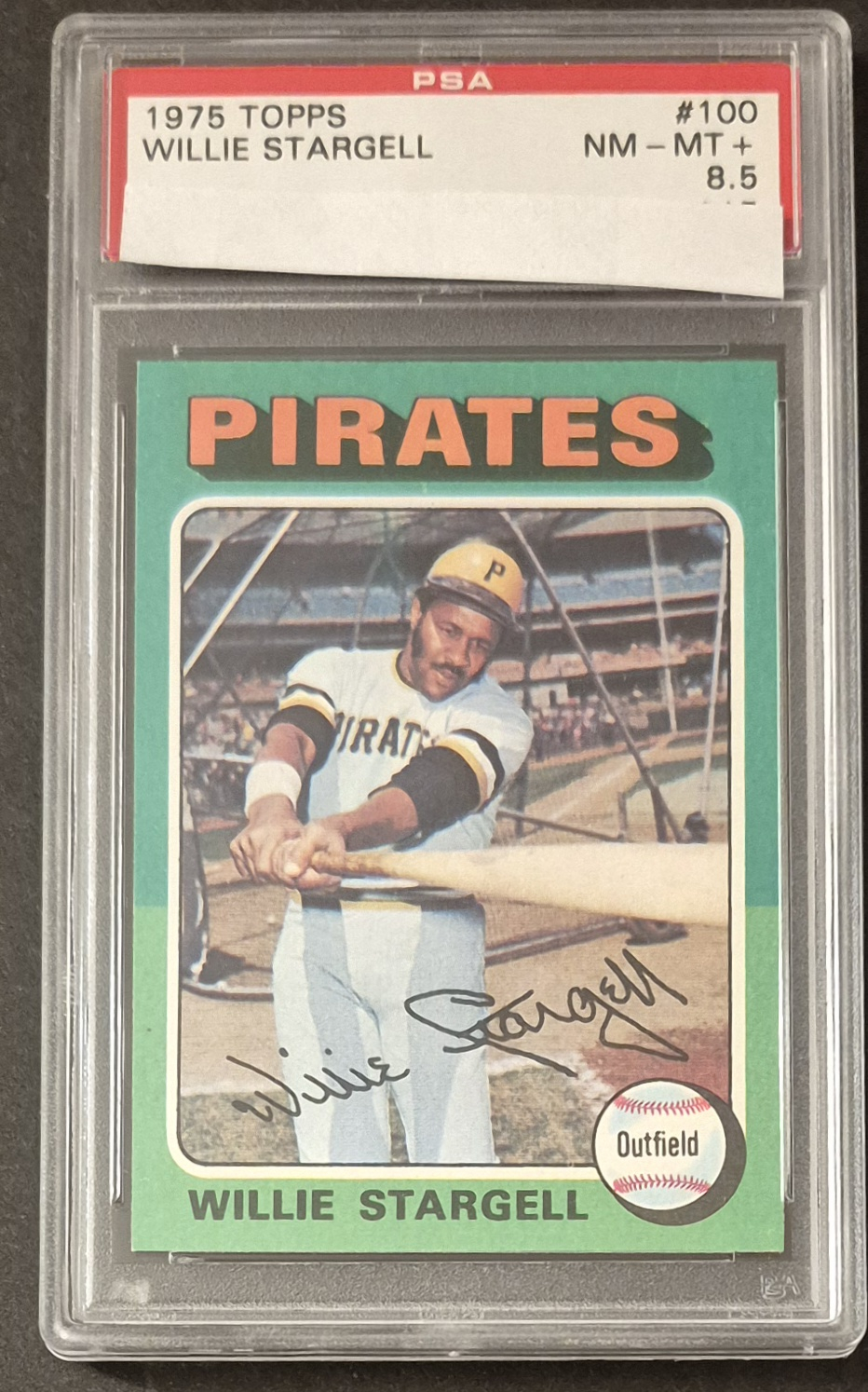
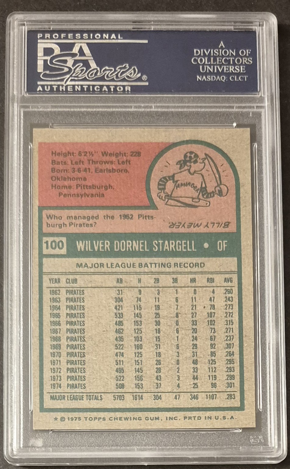
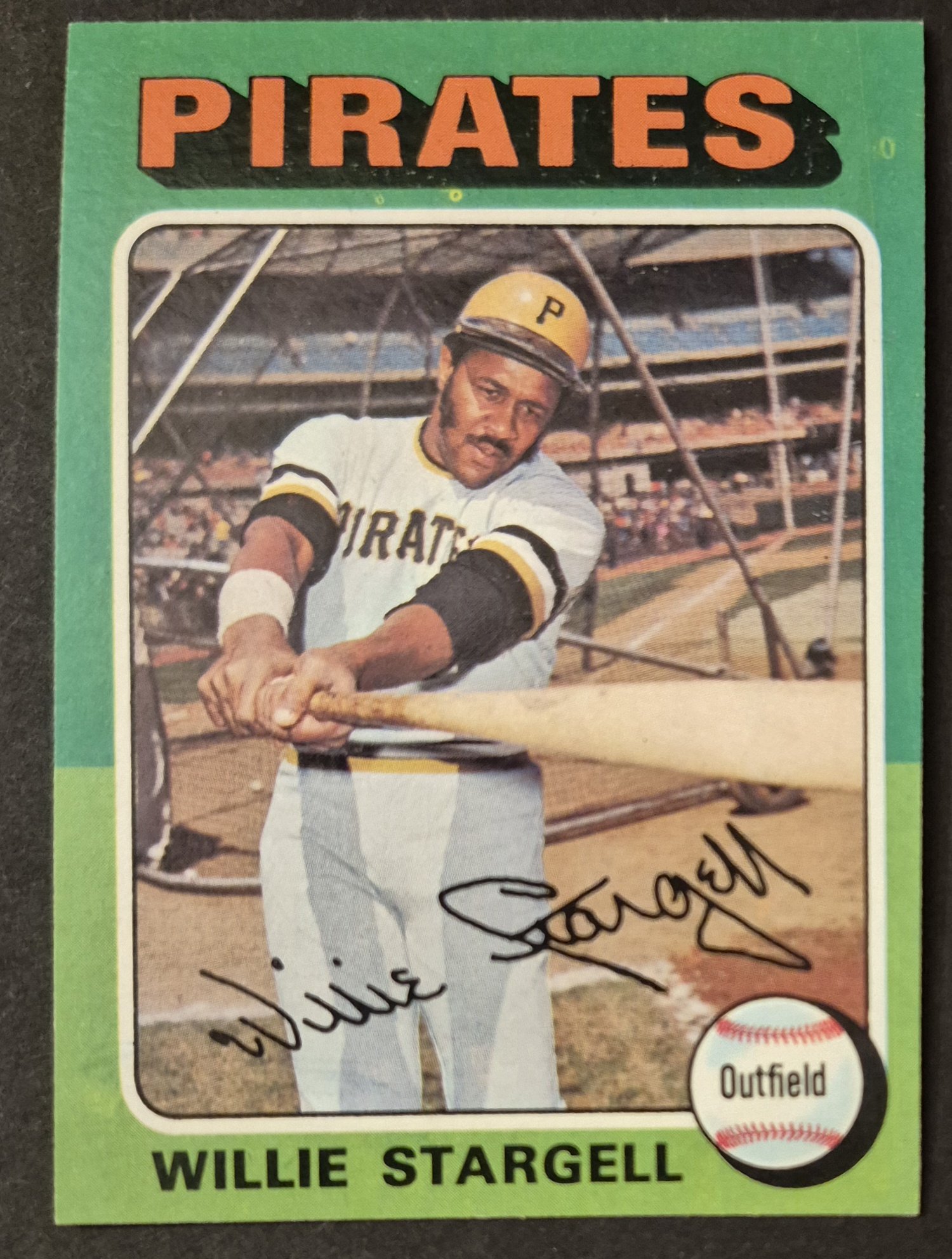
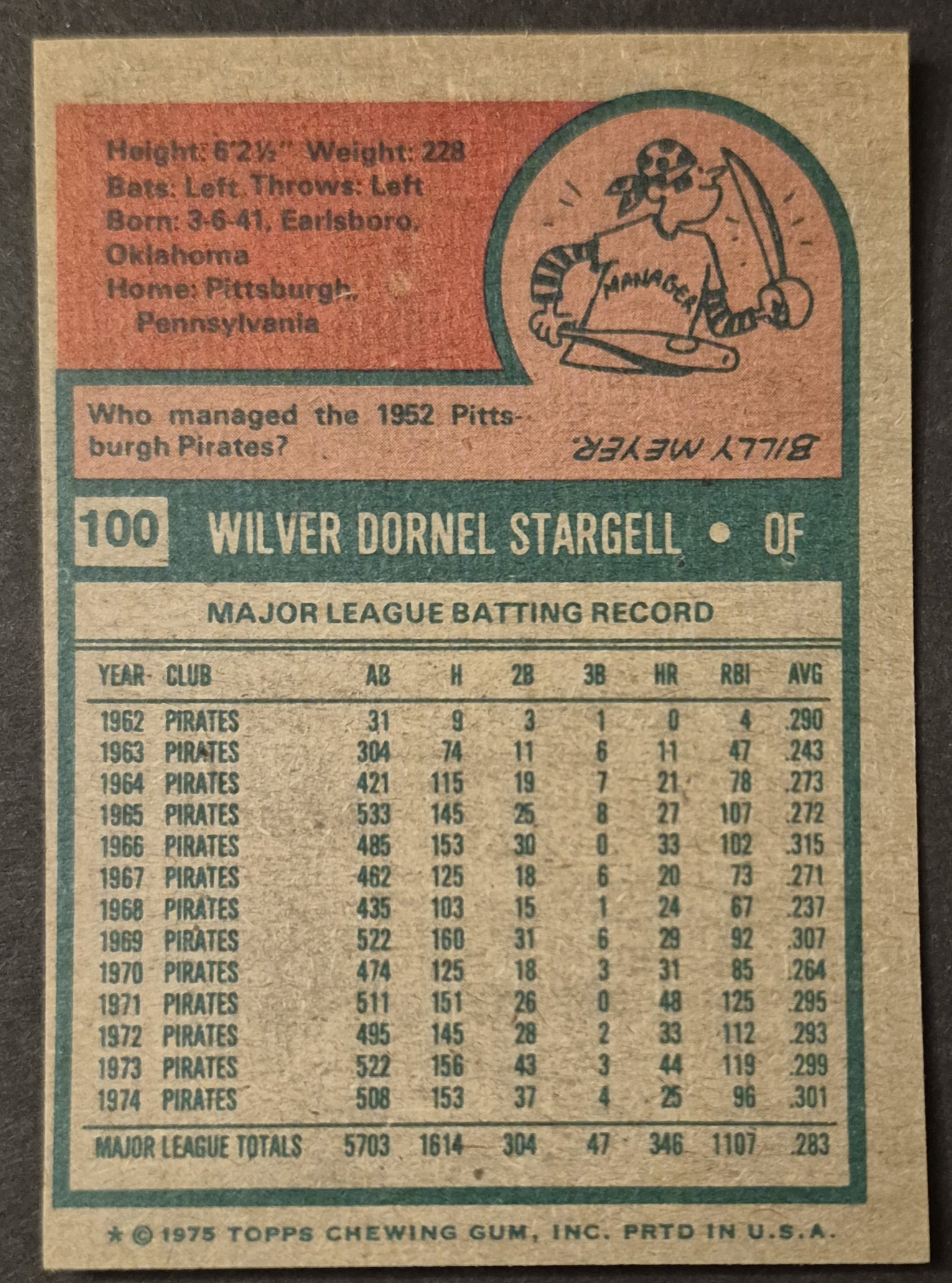
#100 Willie Stargell
.
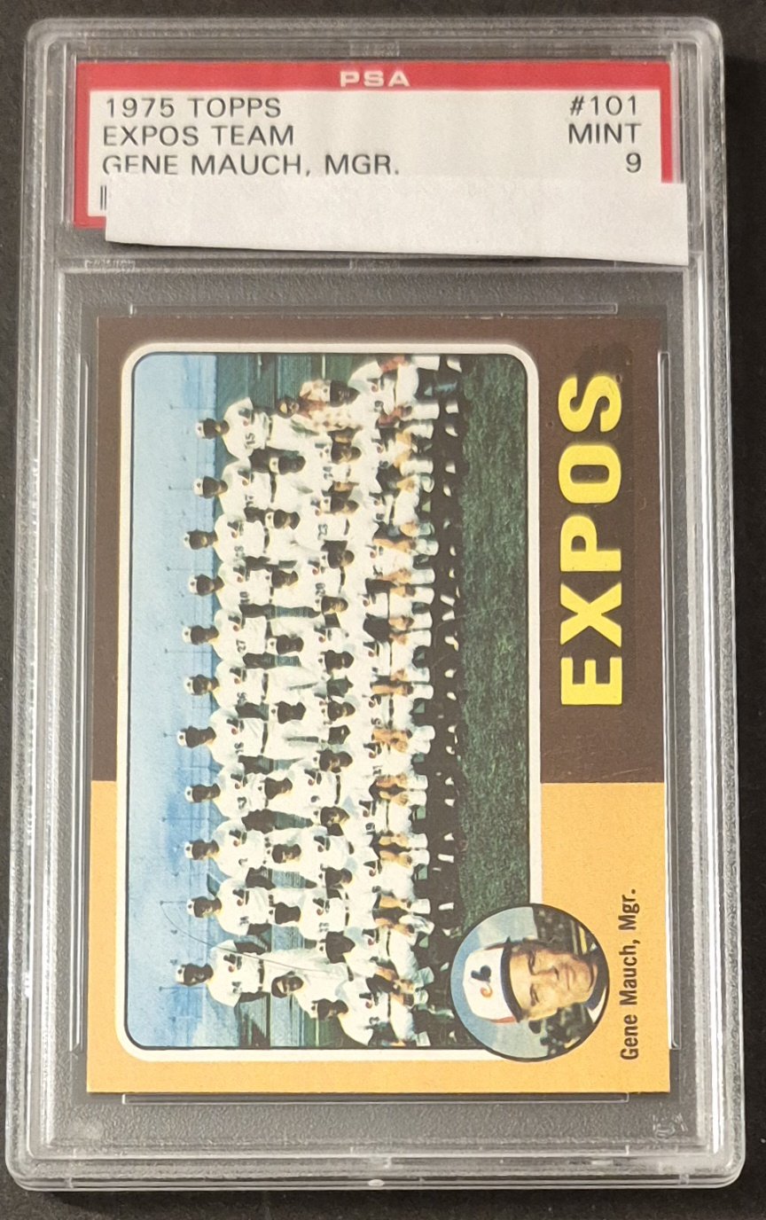
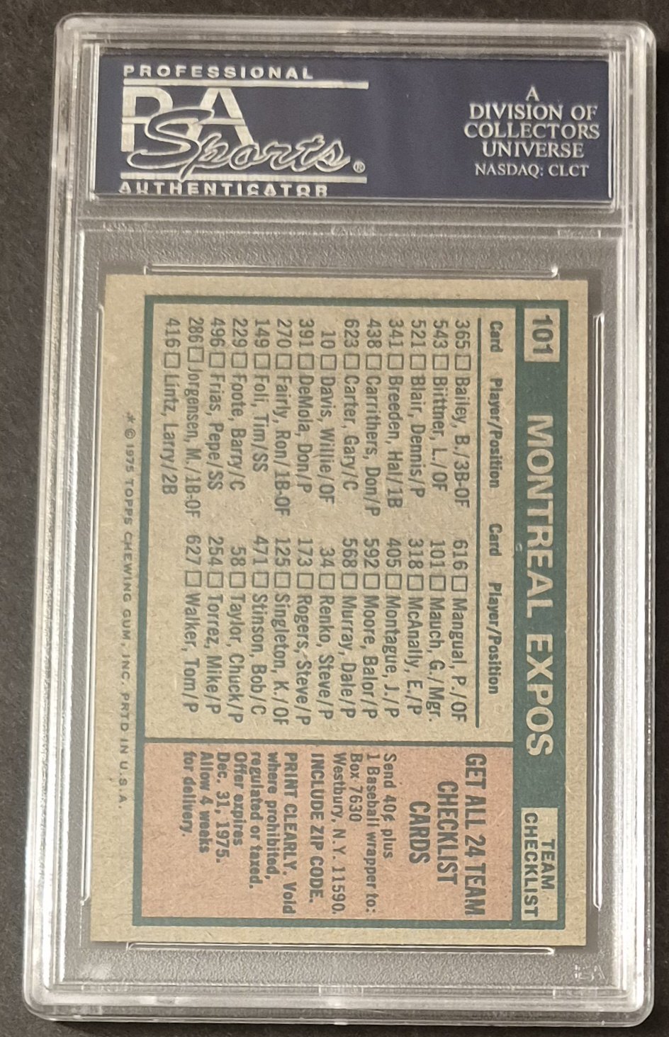
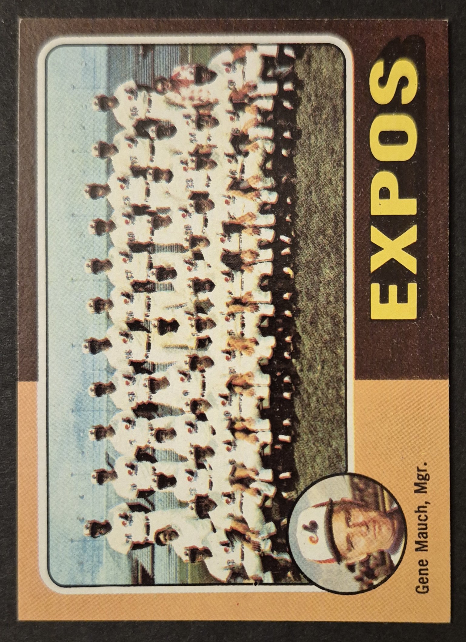
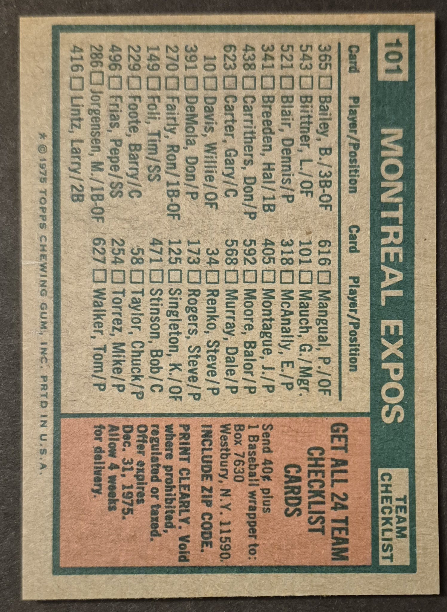
#101 Expos Checklist
.
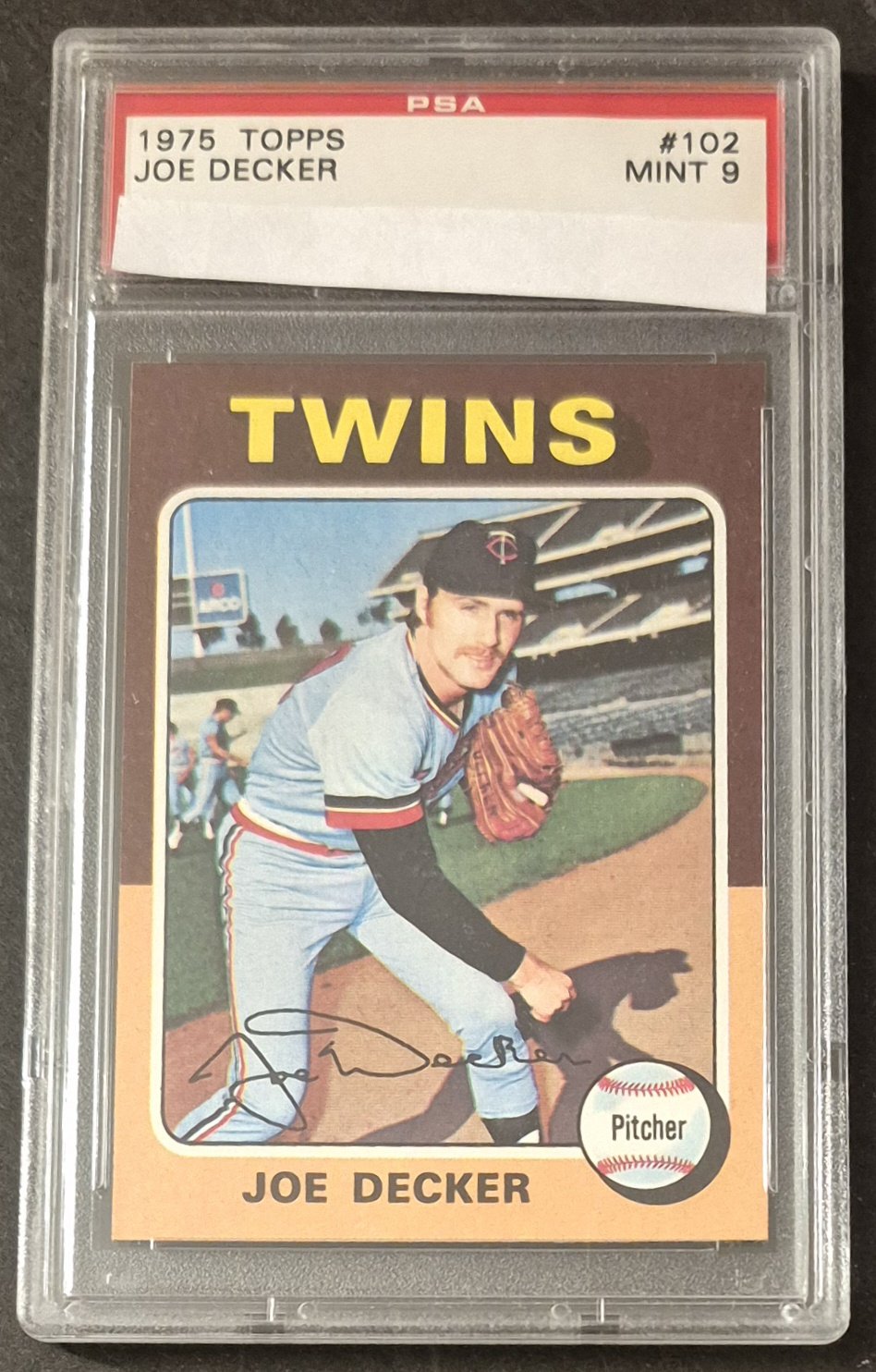
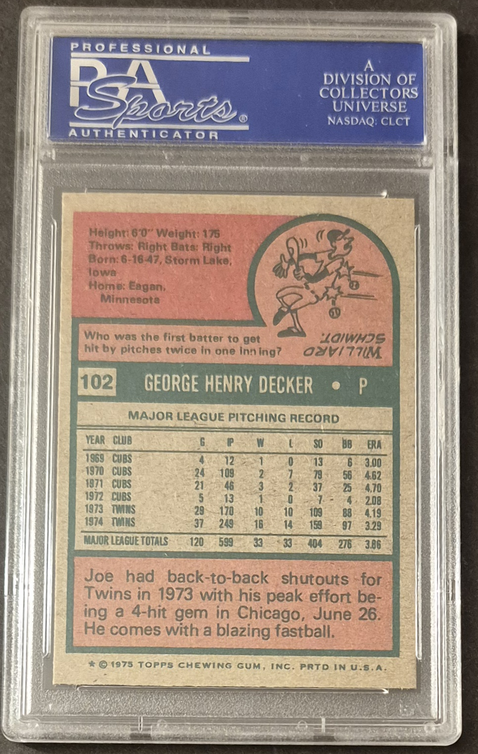
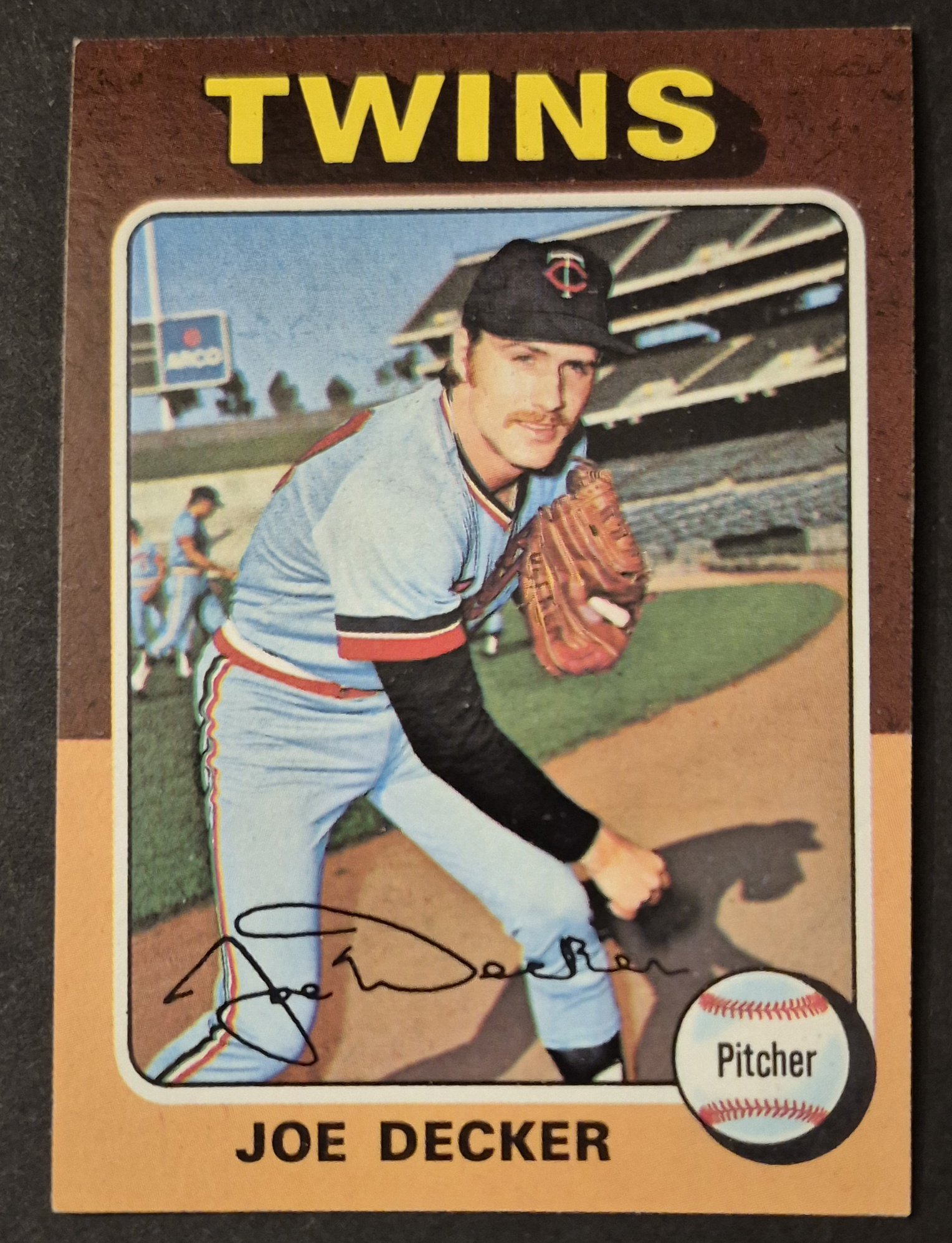
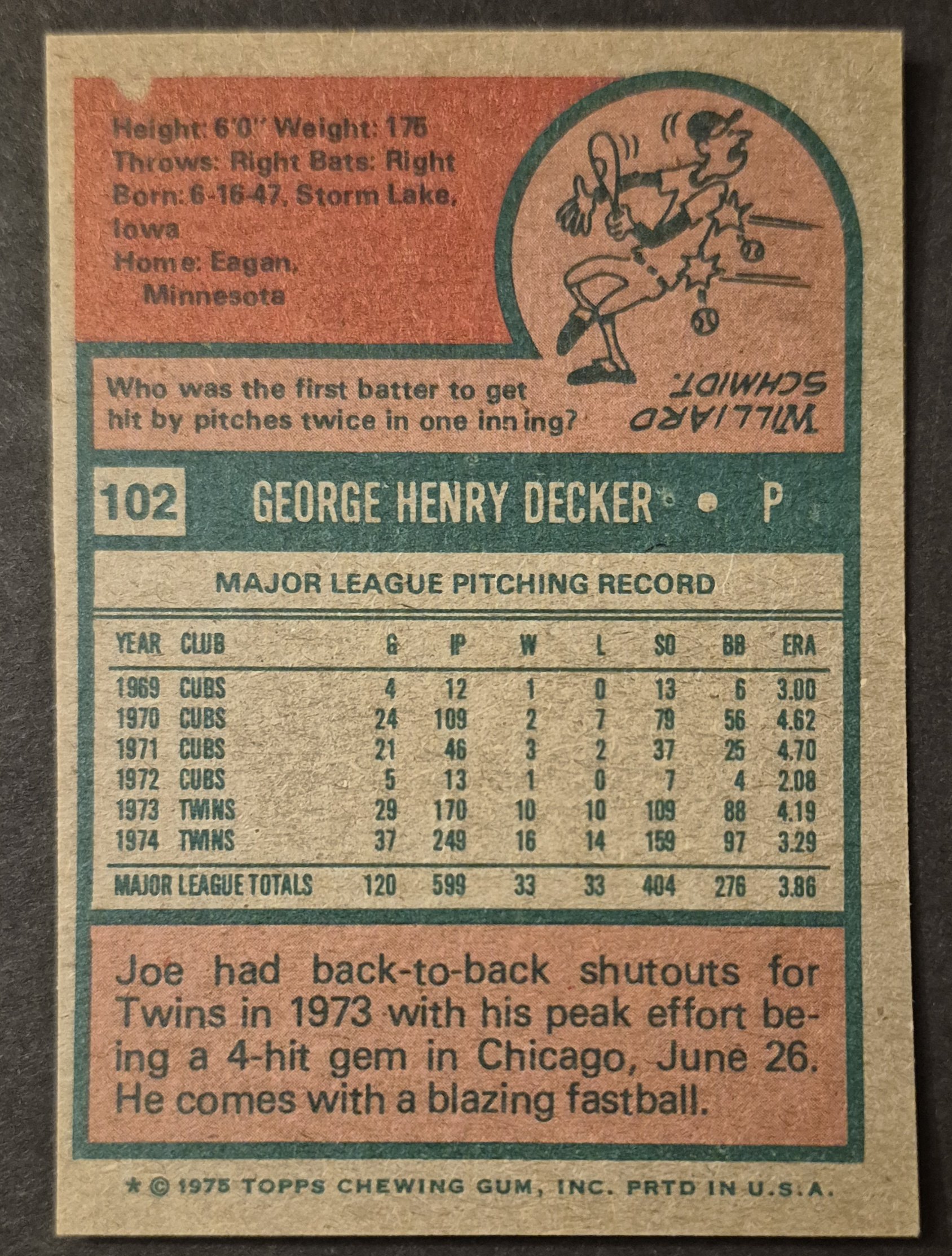
#102 Joe Decker
.
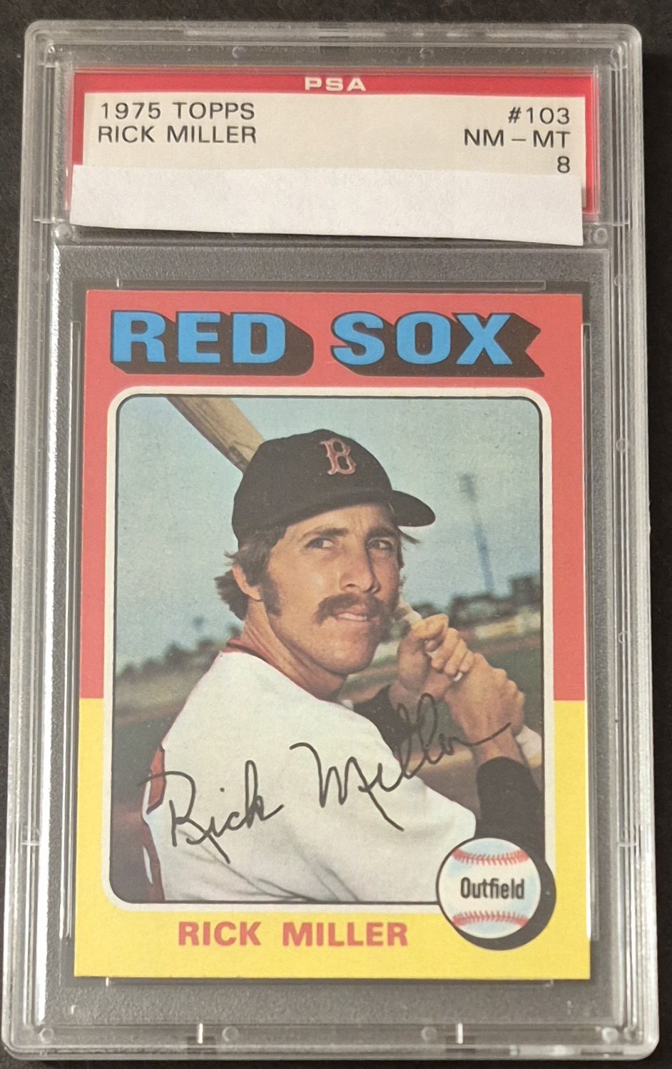
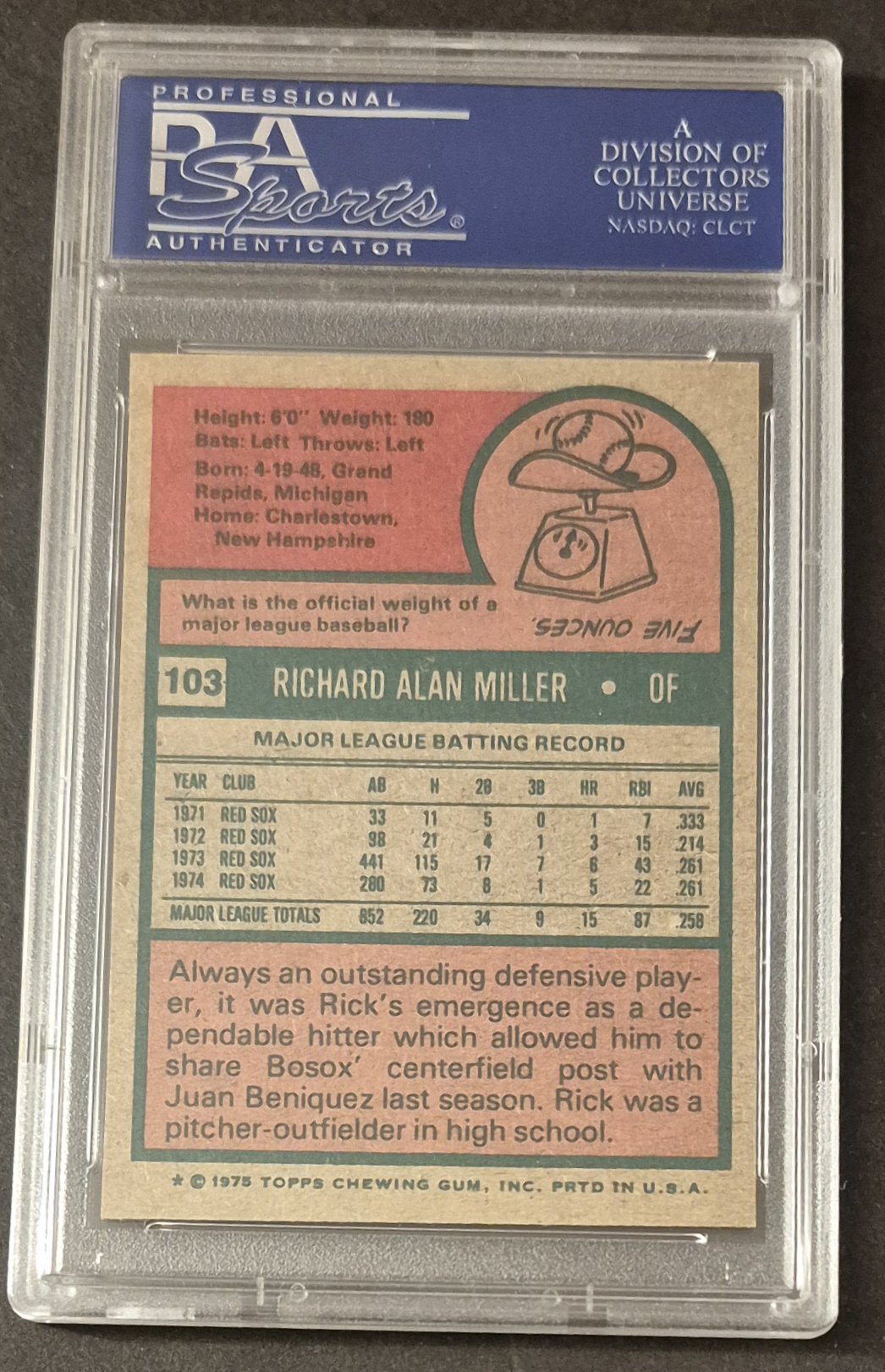
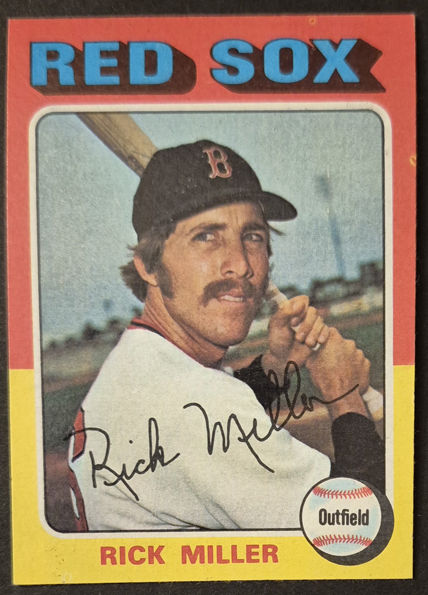
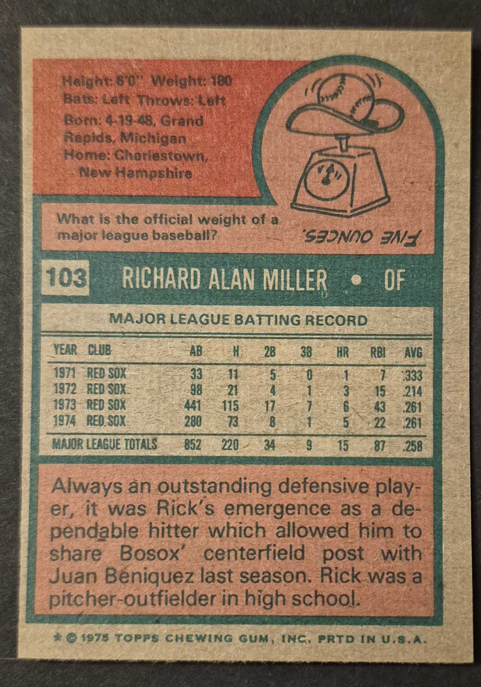
#103 Rick Miller
.
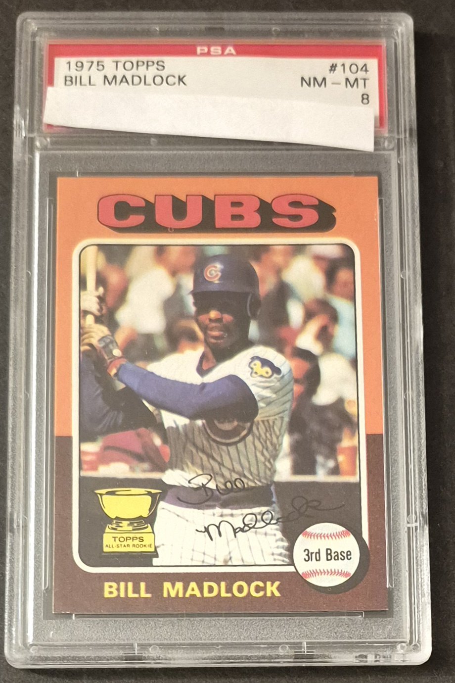
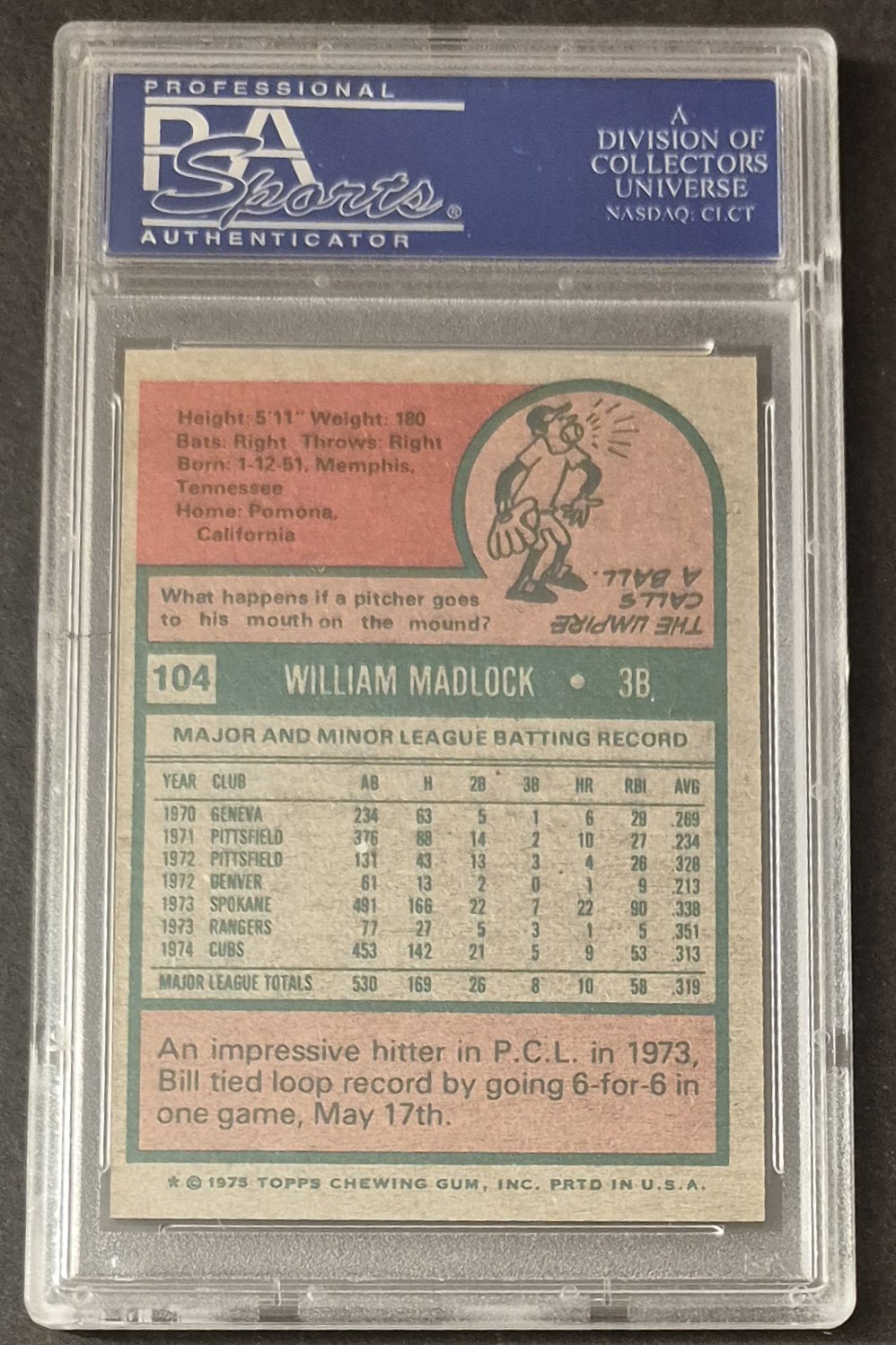
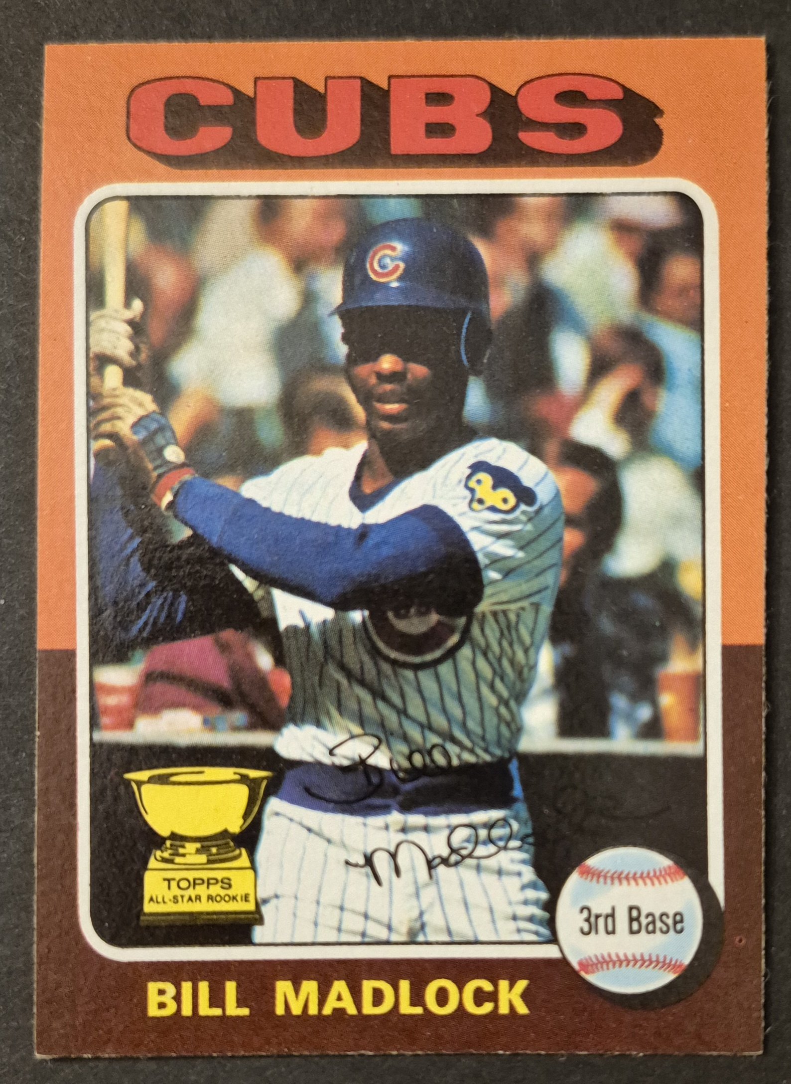
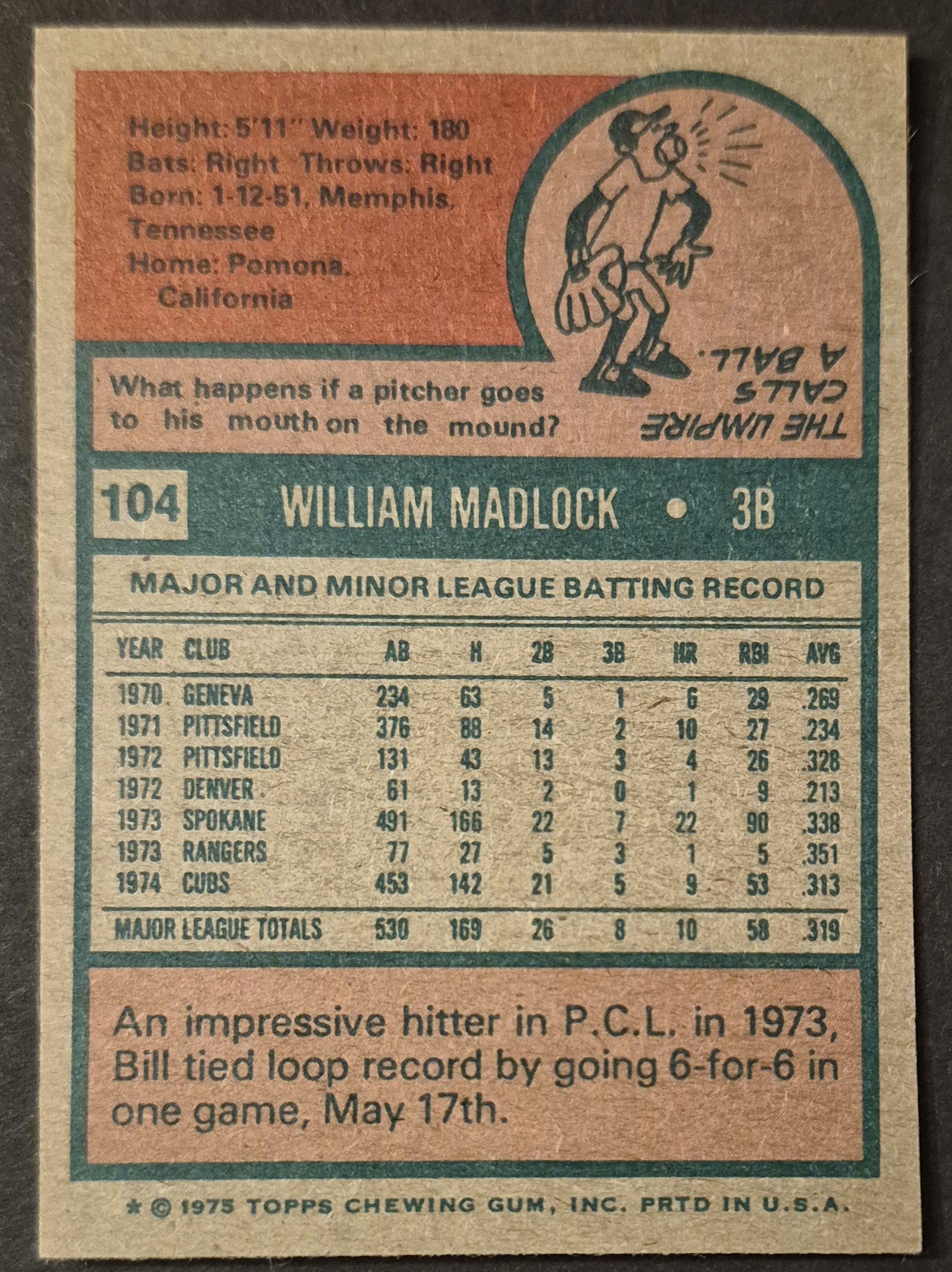
#104 Bill Madlock
.