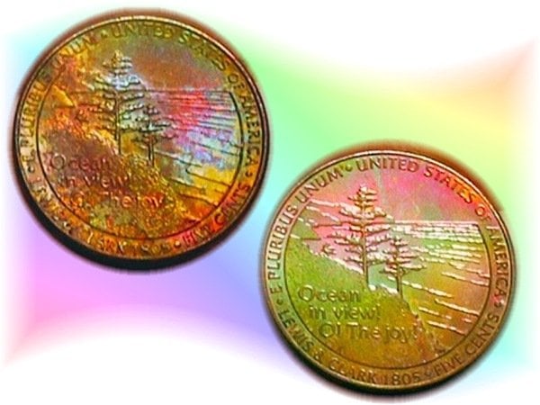
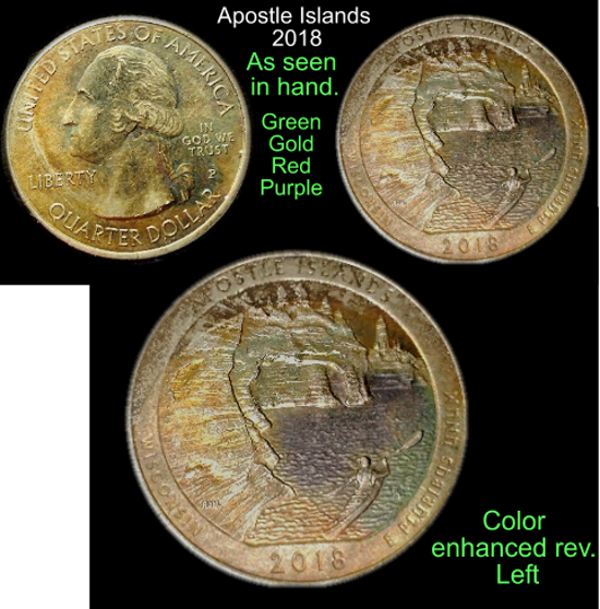
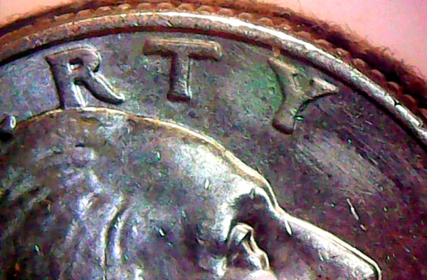
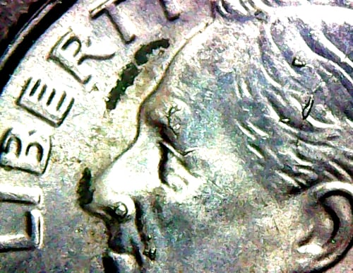
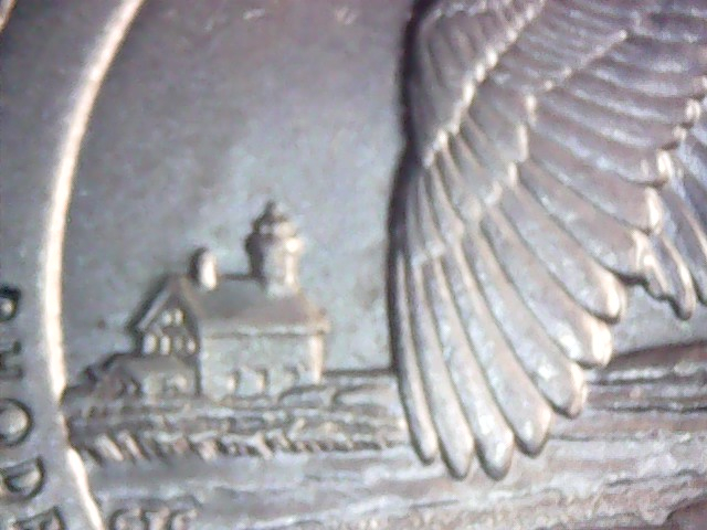
Found this chip off the old block, Apostle Island 2018 quarter, just starting to bloom.
 emeraldATV
Posts: 5,098 ✭✭✭✭✭
emeraldATV
Posts: 5,098 ✭✭✭✭✭
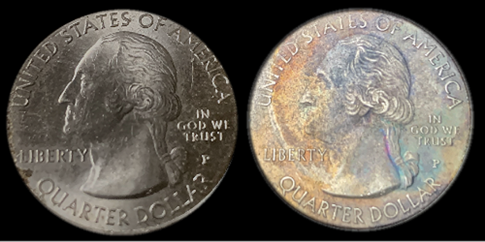
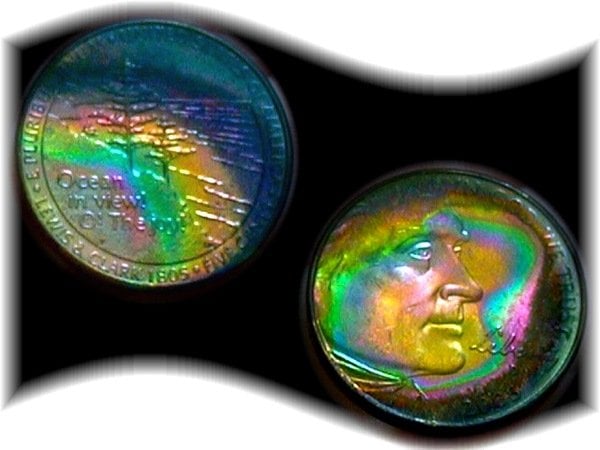
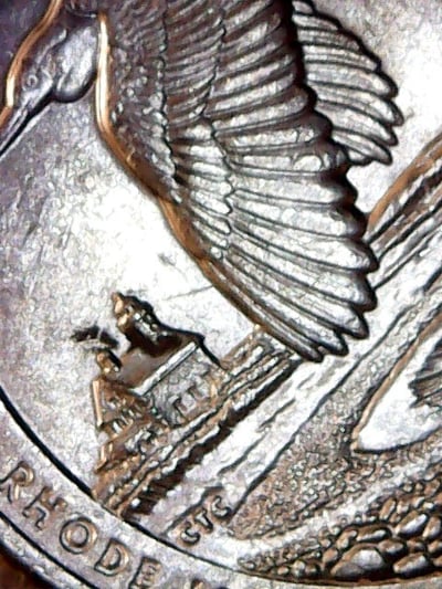
Awhile back I was given a similar coin with massive NT, in pocket change. (Shown on the right side in the panel)
The coin in the spot light, was also given in pocket change. ( Shown on the left side )
I'll call it the rental, I'll explain why.
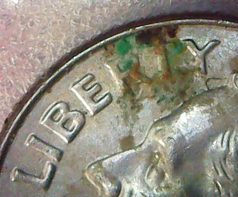
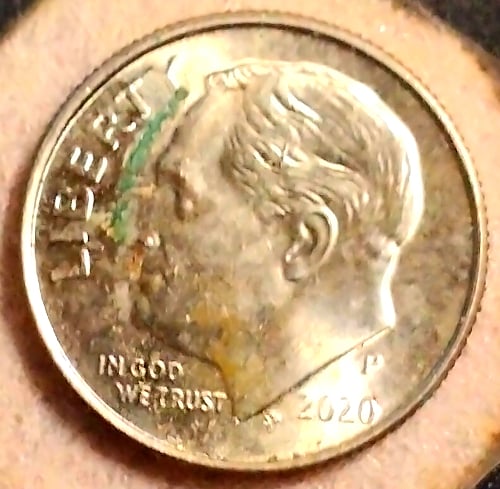
My computer detected, on it's own, a very slight hue of green and red in the center of the rental's reverse.
The reason this was set up like this, is so to show the difference, between the two coin's reverse side strikes.
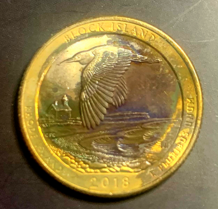
I know most of you have seen the oil slick coin before. (NT, right side) ( Gotta change that name )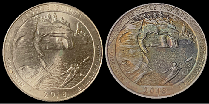
.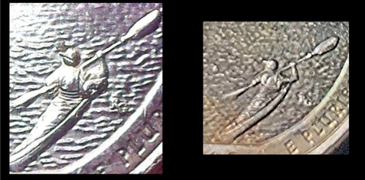
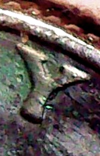
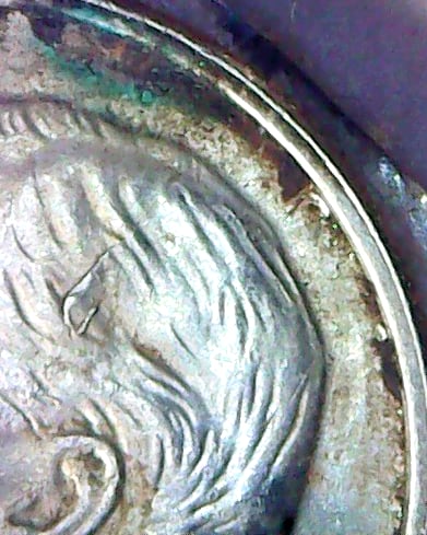
In the left panel, you can clearly see a die chip, under the right arm as it paddles along.
Inside that chip is a capitol R. Thus the name, The Rental. (What?)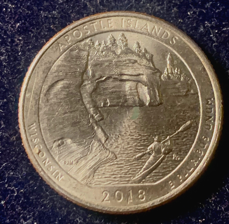
In the center the green hue is present, as on the other coin, but not as pronounced.
Oh !
One other thing I noticed,
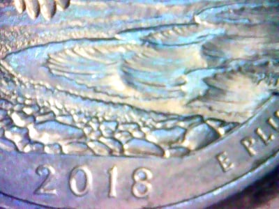
The person in the left kayak has dark hair.
The person in the right side kayak is blonde.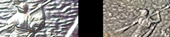
Think there's any more out there ?
Comments
Awesome patina comparison study you got going on there 👍🏼
Mr_Spud
Please update us with more like this, I dig it
Mr_Spud
Of course.
Kind of a study on the AT or NT subject.
I can say this about that.
Progression, or some what of it, could shed a bit more light on color factors.
You just have to play and say.
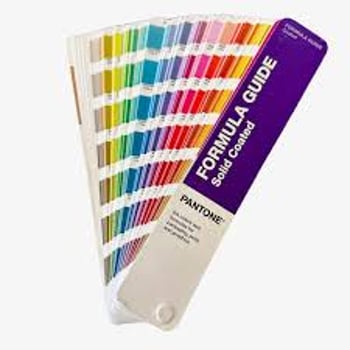
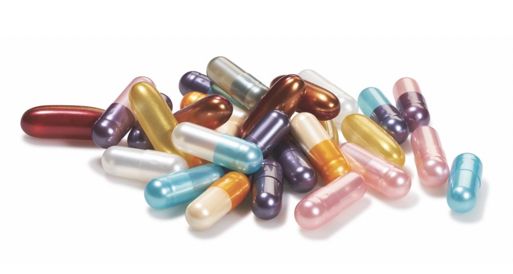
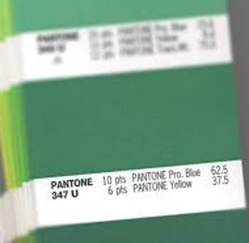
Cool, We use Pantone colors at my work a lot in order to have our customers pick colors that they want their softgels to look like. Here’s 2 of my favorite colors, only I don’t think the pearlescent ruby red matches any of the Pantone colors because of the pearlescence
But the pearlescence reminds me of some types of coin toning. There also are pearlescent colors made by cocrystallizing mica and titanium dioxide that gives the color through thin film interference just like coin toning, and involves no dyes. Only it’s the thickness of the cocrystals. Here’s some examples
And here’s my old AT experiment that shows the progression of colors as the coin goes through the AT process. This is the same coin with the pictures taken every few seconds to show the progression as the interference film grows thicker

And here’s some of my old AT experiments where I made gradients of color and deliberately tried to get some green and red. I know they look amateurish, but I just wanted to do this for educational reason and not really interested in doing it to learn how to doctor coins. It’s just that I’m a scientist.
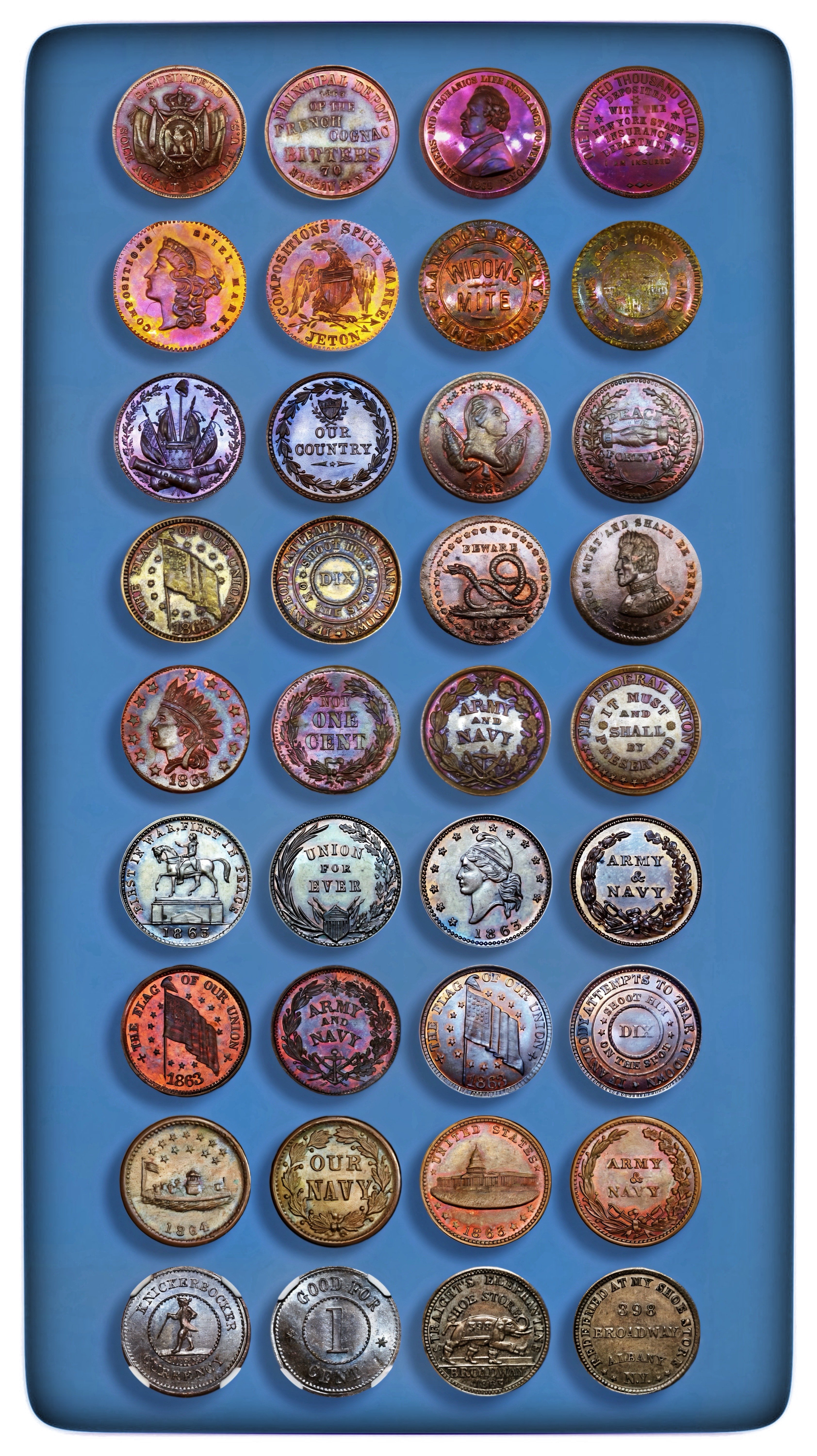
And here’s some toner tokens that I bought that I think are probably NT, hard to tell for sure whether or not someone enhanced the toning somehow or not, but I think they look great and am happy to own them
Mr_Spud
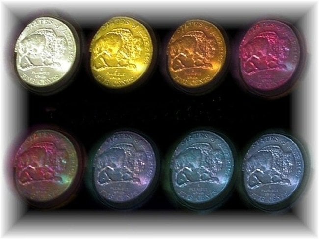
Green and Red are hard, but not impossible, to get on AT coins, also rare on NT coins. Also, in the normal progression on the easy to do AT process they basically don’t exist at all, except for a brief moment as seen below in the 5th image below. See that bit of green on the right side of the coin in the 5th image, too hard to stop the process at the fleeting short time slot that the flash of green happens at. I’m not sure why, just that it is.
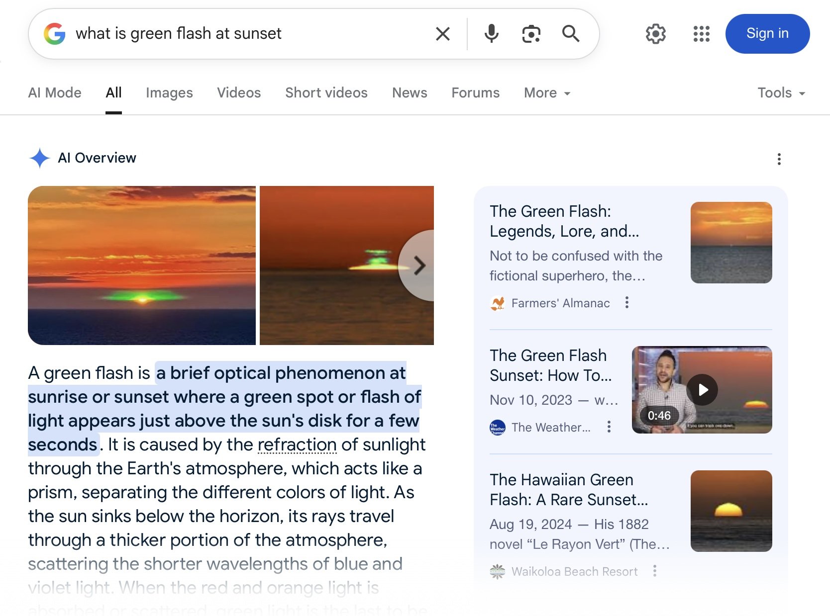
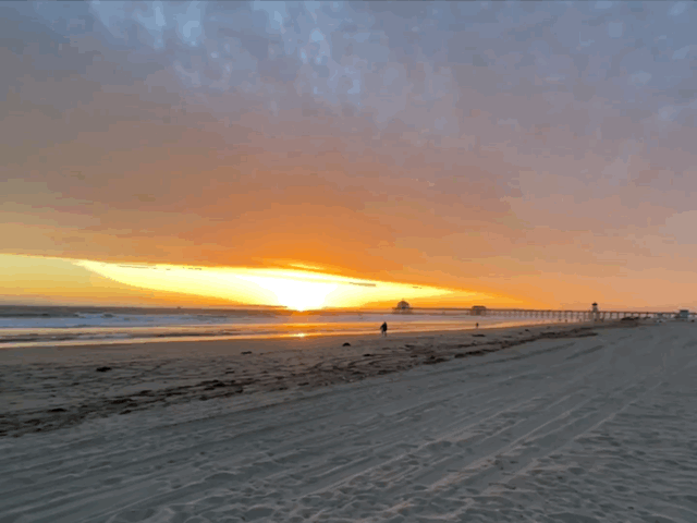
Also, in nature, there sometimes is what is called “the green flash” at sunset when conditions are just right. I’ve been close to capturing it with my iPhone down at the beach 6 blocks from my house, but the green is exclusive and rare. Here’s explanation of the “green flash” at sunset.
And here’s some of my green flash pictures, only it’s more reddish yellow, maybe just a hint of green. I also took some with my fancy DSLR camera with telephoto lens, but haven’t even had the time to upload them yet, let alone to see if I captured the green. Here’s some from my iPhone that I turned into a GIF (hopefully this loads properly, if not I’ll fix it later, gotta go out for a while)

Mr_Spud
The GIF file I was trying to post was too big to load right. Here’s a smaller one showing a GIF of just one of the “green flash” Live Photos I took down at the beach at sunset. I like how the bird seems to be flying straight out of the flash.

Mr_Spud
Reminds me of the Green Hornet And Green Flash, maybe I need that ring to slow down time enough to capture the green flash at sunset maybe? 🤔. 😉

But back to coins, I’ve heard rumors that some of the Coin Doctors try to duplicate conditions on Jupiter and Saturn to get the crystal structure to be iridescent/pearlescent and “mica like” with a bit of green showing up here and there
Mr_Spud
Continued - I am hoping @emeraldATV will give us a his take on the “Green Flash”. At first glance he appears to be not a serious person, but I believe otherwise and that there is a reason his avatar name has “emerald” in it. I know for sure he was a graphic designer/artist in the analog days and I’d love to hear more of what he knows

Mr_Spud
In this group of photo's of the coin on the right (the oil slick), may show it's true colors as my design
program will seek out a coin's skin color. as the app detects.
The colors are true as seen in the photo and also on screen. This is now my guide to examine within it's originality.
After this happens, I use the sharpness effect very carefully. The sharpness, is also used as a guide.
Sometimes if too sharp, so are the highlights, as they blur the image and knock out color.
Reason why is because when brightness and contrast is called for, both issues have their own separate scale in this app as if it's only one effect (2 scales) producing one final photo.
1. a : juxtaposition of dissimilar elements (such as color, tone ) b : degree of difference between the lightest and darkest parts.
What do you think about the one photo below that was created this way ?
Do you see any "significant" change in it's color ?
This coin below I would call it over done with great tone (color).
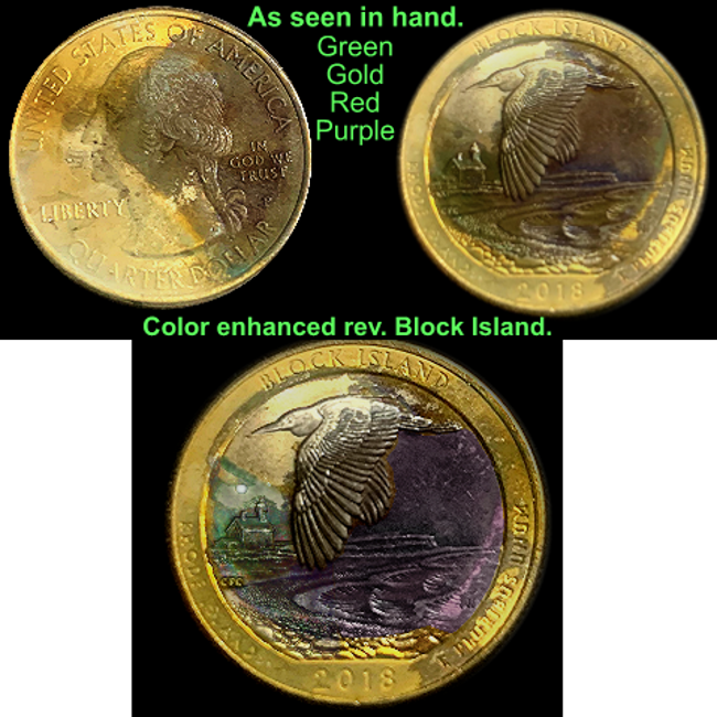
By overdone I mean, having very heavy multi color reactions.
There has to be some kind of twin showing progression out there.
This enhanced bottom photo's color was never changed.
WAIT ! That statement is wrong.
ONLY ONE COLOR CHANGE WAS DONE.
The color of the circle (not added) above the buildings (sun or moon ?) was changed, just because.
UNTOUCHED
The enhanced one definately brings out the green making it much easier to see. That’s cool how you did it without bumping up the saturation. Bumping the saturation would also bring out the green, but would also make every other color show up more. The way you did it with the simultaneous brightness and color adjustment made the green pop more without enhancing the other colors. That’s really cool and interesting to me, thanks.
Mr_Spud
I posted the previous post without reading the one I’m quoting with this current post. It reinforces what I was thinking when I responded in the post above. Once again, very cool and also very interesting to me, thanks.
Mr_Spud
FYI - I used the technique today to make a color show up better today at my work for a softgel product with discoloration. Using the technique of adjusting just the contrast and brightness alone made the discoloration show up in images. At first I could see the discoloration with my eyes, but the contrast wasn’t enough to have the discoloration show up in photos. But using Emeralds technique made the discoloration “pop” in the images.
So the takeaway for me is that what works for coin images also can be applied to non-coin images. And a basic understanding of color itself and how to edit images can help make coin images better.
Thanks 🌞
Mr_Spud
The K factor.
Processing CMYK color, allows a full spectrum of colors.
THE FORMULA OF A MIX.
This photo shows a dried grease stain that I pushed aside softly, with a ball point pen.
You could say it was struck through grease leaving a yellowish/magenta stain. K may be the silver.
Green.
Not of progression.
.
.
.
All photo's in this post were not a product of my design app.
I came across another Block Island quarter slightly toned, about 5%.
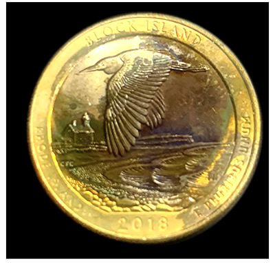
These two have the same design with similar back round reaction's in their strike.
One is toned showing a full blown detailed back round in the night sky, unchanged by me.
The second coin (new to me).
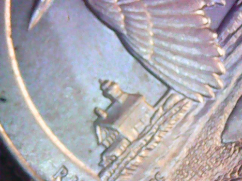
I can't explain (right now) why a blue film ( not lighting) popped up immediately.
Then using a contrast only filter, produced these partial photos.
.
.
.
NOW WATCH THIS.
Another BLOCK ISLAND coin I've had and photographed a few yews ago, needs to be addressed.
I'm now only showing what has changed ( at some point) in that exact area, because to me,
it's like addressing the unknown of the how or why.
See it?
Here's another one
This confirms a strike as it matches the other images using over exposed filters
Also there's another image, but it's not in play. YET.
That deserves at least 1 Billion dollars on EBay!
Nice find. Glad to hear it was in pocket change.
This image shows some kind of liquid was present and dried on the reverse side.
Reason being, if you look at how the filtered,color blue gathers to the 12 o'clock position.
.