Is this toning Attractive? (New photos added from my Motorola Edge Phone)
 BobbyDees
Posts: 55 ✭✭
BobbyDees
Posts: 55 ✭✭
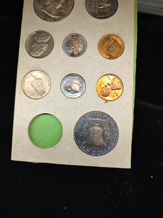
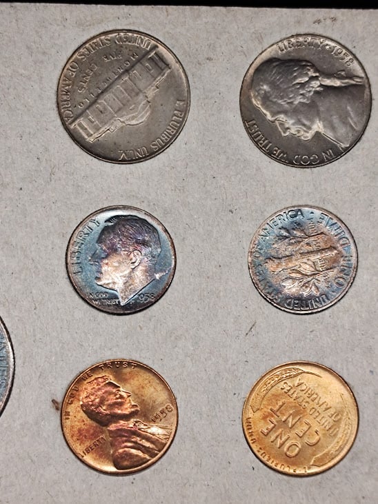
The Benji and both dimes have monster tones(Quarter was already missing).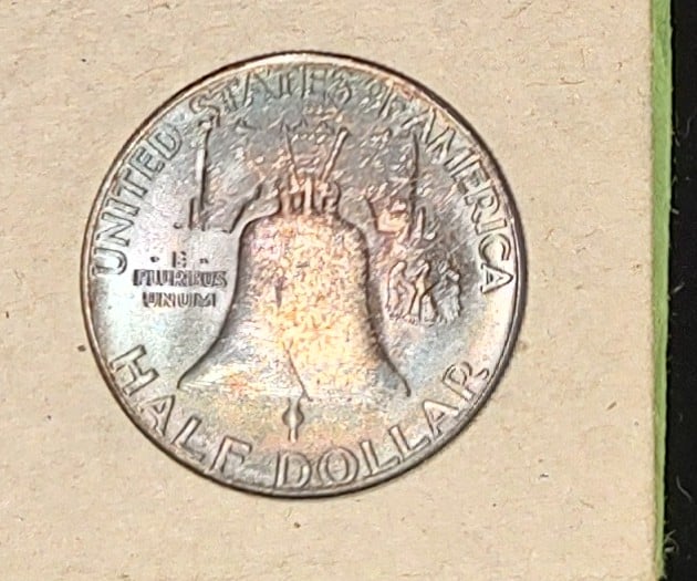
2
Comments
To some, yes, to others, no.
I tend to lean towards no.
Just because something has "a lot of color" doesn't mean it's good.
I find the dimes in that set to be far more attractive than the halves.
Collector, occasional seller
Hard to tell. Dimes, probably yes. Half, probably no.
Simple...
To some yes, to others, no
From what I can see the dimes look attractive (though “monster tones” seems overly optimistic) and the other coins don’t.
Mark Feld* of Heritage Auctions*Unless otherwise noted, my posts here represent my personal opinions.
Not to me.
Hard to tell from the images. The dimes look promising... but we are only seeing one side
Experience the World through Numismatics...it's more than you can imagine.
No. The dime in the center might be okay/neutral but that's about it. Would need more photos (including the flip side) to really know for sure. But based on what I see, no.
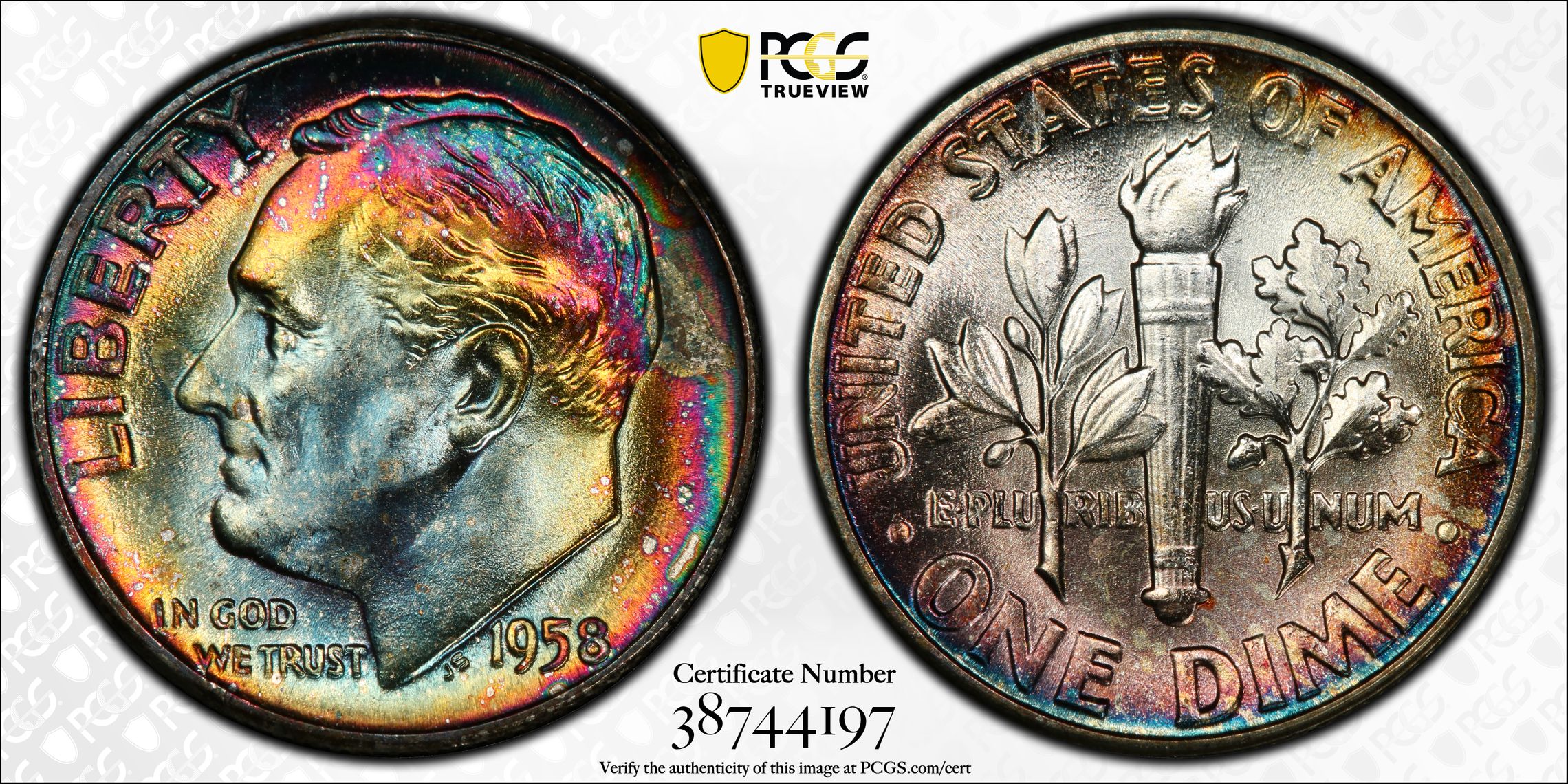
Here's a business strike Roosevelt that I have and consider attractive.
MS67+
Not really looking for much these days but if I were, it might be a toner.
You consider your dime merely “attractive”? 😉
Mark Feld* of Heritage Auctions*Unless otherwise noted, my posts here represent my personal opinions.
Looks nice
Proud follower of Christ! I love the USA! Land of the Bright and Beautiful! 🇺🇸🇺🇸🇺🇸🇺🇸🇺🇸
The missing quarter must've been a wowser!
Leo
The more qualities observed in a coin, the more desirable that coin becomes!
My Jefferson Nickel Collection
They look original and might be attractive, but much of the attraction depends upon how much luster the coins have.
In honor of the memory of Cpl. Michael E. Thompson
Nope. RGDS!
The whole worlds off its rocker, buy Gold™.
BOOMIN!™
Wooooha! Did someone just say it's officially "TACO™" Tuesday????
Retiring at 55, what day is today?
No monsters there. The dimes may have appealing toning, the rest do not.
Successful BST with ad4400, Kccoin, lablover, pointfivezero, koynekwest, jwitten, coin22lover, HalfDimeDude, erwindoc, jyzskowsi, COINS MAKE CENTS, AlanSki, BryceM
"Beauty is in the eye of the beholder." So is ugly.")
Worry is the interest you pay on a debt you may not owe.
"Paper money eventually returns to its intrinsic value---zero."----Voltaire
"Everything you say should be true, but not everything true should be said."----Voltaire
They are ok, but not great. Not the nice rainbow toning that often occurs with the mint sets from that era.
Mr_Spud
Edit to add:
Make 'Em RiTe again. THKS!
The whole worlds off its rocker, buy Gold™.
BOOMIN!™
Wooooha! Did someone just say it's officially "TACO™" Tuesday????
Retiring at 55, what day is today?
If the photos are true to how they look in hand. I like the dark blue toning on the halfs and dimes. So, I find the toning attractive.
https://www.coincommunity.com/forum/pop_profile.asp?mode=display&id=102076
https://www.vamworld.com/forum/memberlist.php?mode=viewprofile&u=2220
https://boards.ngccoin.com/profile/61076-johnhenry9009/
https://www.mycollect.com/Jonhherny9009
They all look NT maybe not highly attractive but NT
Both dimes look like there;s one dominate color.
Better photo's are required, for the absolute eye appeal answer, which will vary.
I'd like you to sway some of us, with a show and tell, as to why you created this thread with a question that you could answer. (to yourself) Wait.....
Post better photo's, and watch the count of views that were interested, with just a simple 5 sec. view.
It's a start.
...
Just a thought.