Options
Input on private pattern variety tables wanted - pre-publication
 RogerB
Posts: 8,852 ✭✭✭✭✭
RogerB
Posts: 8,852 ✭✭✭✭✭
As lengthy articles on Inco and Gould private pattern pieces near completion, I was wondering if members might offer their suggestions on the content and organization of Variety Tables included with each article.
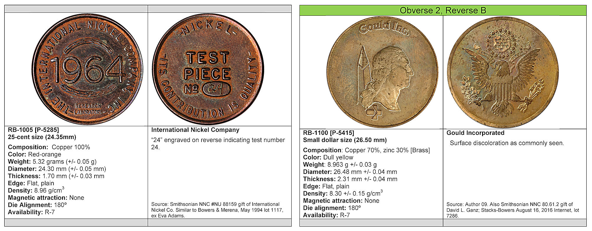
At left is a typical variety listing for Inco “Test Pieces” design items, and at right is a typical variety listing for a Gould piece. Present drafts have similar content for each variety. Inco pieces are broken down by design, composition, etc. Gould pieces are broken down by design variety and composition.
Comments are appreciated either by post or PM. Thanks!
0
Comments
RE: "What are the RB and P numbers? Aren't Pollock numbers standard?"
For both Inco and Gould pieces, the Pollock numbers are functionally obsolete. For Gould, the same Pollock number actually refers to several different varieties, It was felt it was better to replace everything and also allow for discovery of new varieties. With regard to Inco, the number of new varieties is so great that it was best to start fresh.
The articles include concordance tables.
Agreed. New "Roger Burdette" numbers are appropriate.
Another PM asks: "I see R-7 on the samples. What does that mean? What scale is used?"
A modified Sheldon Rarity Scale is defined and used in the articles and tables --
R-1 Common
R-2 Not So Common
R-3 Scarce (201-1,000)
R-4 Very Scarce (76-200)
R-5 Rare (26-75)
R-6 Very Rare (9-25)
R-7 Extremely rare (2-8)
R-8 Unique (1)
All of the pieces described are between R-4 and R-8 with most in the R-7 category.
@RogerB: When you say "color" I presume you mean the initial color as when it was struck? If you don't define this in the text, you might want to do so. It would also be interesting if you you could list a sale and price for each variety. That said, you might not want to do _this_for a couple of reasons: 1) The prices will quickly become dated, and 2) The prices were established before your book, when the rarity of different types was not well recognized.
Good points.
Yes, I refer to the original color of the piece, although after checking the draft I see some inconsistencies such as with pieces struck in silver alloy.
I've avoided prices. As Mark noted, they quickly become outdated and can be misleading. Using data from pre- and post-publication of Pattern and Experimental Pieces of WW-II, certain well-known varieties have maintained auction values, and some new or newly defined varieties have increased substantially.
I find the left / right split to be distracting. I'd be interested in seeing a mockup without the crosshairs. The obverse / reverse pics stay where they are, just without the line between them and without the line above the text. FWIW one of my biggest complaints about the appearance of several recent numismatic books is the use of lots of unnecessary dividing lines. At least you used thin lines here.
With the vertical line gone, there might be a better way to arrange the text.
My eye says there should be room to put the vital statistics in three columns, especially if you save a few characters by formatting the tolerances as "5.32 +/- 0.05 g" A true ± plusminus character would be even tighter.
The first line might also read better in three columns:
"RB-1005 International Nickel Company 25-cent size (24.35 mm)"
I'm not sure if the RB- numbers would stay on the left in that design or move to the center.
Just me talking out loud... I reserve the right to change my mind if it looks worse the other way. :-)
Interesting. Will take a look.
How about this?
The columns are unbalanced because of the composition text. On most pieces this is much shorter and the data columns align better.
I think I like that better, especially in that example with a longer block of descriptive text.
In the description, try not indenting the paragraphs, and separating by a blank line (or half-height blank line) instead?
I still wish you'd get rid of more of the dividing lines. The vertical line between the pics isn't adding anything at all. The other lines really aren't doing much either. In my opinion, of course.
Did you try putting the vital stats in three columns? I see that Composition won't work... but it doesn't really work great in this layout either. Maybe stretch Composition across the full width, and put the rest in three columns?
If you have room to spare on the page (I can't tell from this isolated picture), it might look better to put a little more space above and below the pics. Maybe the same amount of white space above and below the pics as separates the obverse and reverse.
Check your consistency on capitalization. You have "Die Alignment" but "Magnetic attraction"
OK. How about this version? All lines are gone. The light gray bar at bottom is an intentional divider to that readers cannot accidentally associate data with the incorrect image. Image spacing is 0.04-in. from top and bottom of cells. Three columns were tried but it was too crowded. The text is 10 pt which is as small as I want to go for the body material. Each page will have two varieties with data. The photo sizes are roughly proportional to the original so quarter-size pieces have larger images than dime-size. (Dime-size = 2-in, quarter = 2.5-in and halves = 3-in.)
By my eye, I like that. Your book, your call, of course.
If you stick with something like that, maybe take the two columns of vital stats and shuffle them to the right a bit. The left edge of the left column of stats is currently on the left edge of the page. I'd move it in a bit, and move the second column rightwards a similar amount from the centerline.
Might also look at flipping the sections vertically. Above you have the title, description, composition, stats, then source. Maybe try title, stats, composition, description, source? FWIW that order is sort of more like what you had in your first example.
OK. Thanks for the suggestions. I'm going to let it "age" a little, then see what else pops up!
@RogerB As you probably can guess, I think I agree with your decision not to publish prices. But how about adding auctions in which you know a particular type was sold? That way someone in the future would have a head start on creating a pedigree for a certain specimen.
Also, for what it's worth, I like the lines. So I like your 1:38PM version more than your 2:52PM version. But, exactly as @jonathanb says, it's your call.
Good suggestions.
Adding past auction prices is a possibility. However, most of the designs and varieties have never appeared at auction because they were either unknown or incorrectly attributed. This sample from the Gould draft, RB to Pollock concordance, is typical:
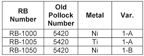
As you can see there is one Pollock number that has been applied to what are really three distinct design and/or metal varieties. This is commonplace in the Gould listings and pervasive in the Inco tables. (The gap between RB-1005 and RB-1050 allows room for design variety 1-A pieces in metals other than titanium and nickel.)
Maybe something for the most frequently see varieties would be useful. I have the data collected as part of the basic research.
As for lines. I will make a more extensive version of the table, print it and see how it looks. The goal is maximum clarity of data and ease of use for collectors and authenticators. I want people to be able to find their coins and match characteristics as easily and efficiently as possible.
A friend, who happens to be looking over my shoulder, facetiously suggests I add some pages of lines that book buyers can cut out and use wherever they wish. I've thanked her for the suggestion....
Any more suggestions?
Well, I certainly like the look of the layout better than the ones with the line dividers. I agree with avoiding text smaller than 10 pt. Young kids with eagle eyesight are probably not your target audience.
Sounds like a huge job to gather and arrange all that info. Doing it with nice-quality photos and keeping it all straight is an impressive feat.
Maybe just include a table of notable auction prices realized in the back? That way it really doesn't matter if it's complete and easy to ignore if the reader isn't interested.
Thanks!
Each piece has it own individual data, so when there are 5 or 6 of the same variety, each has a different data set. Of course the article tables only show one piece for each variety, but more than 250 had to be measured and tested for the study.
FYI - Each piece was given an accession number and photographed in its holder or 2x2 as it arrived, then high resolution images were made. Everything then tracked with the accession number and photos.