Options
A example of hiding a coin's flaw with photos
 BryceM
Posts: 11,852 ✭✭✭✭✭
I've been playing around with my new macro lens and I've noticed it's pretty easy to hide or conceal certain flaws in coins when photographing them.
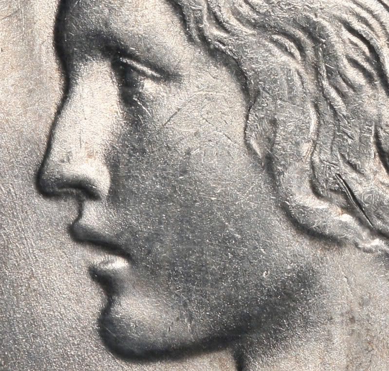
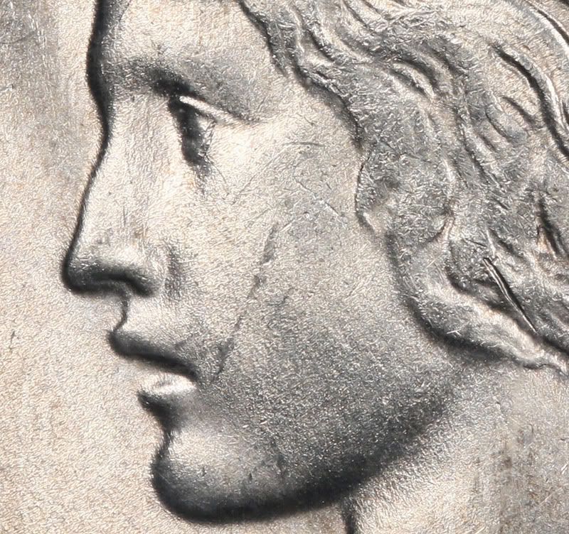
This is one of my favorites, a key date 1934-S from my date/MM Peace Dollar set. The photos were done with a Canon EOS Rebel XSi with a Canon EF 100mm f/2.8 USM Macro lens. I'm using two halogen lamps at roughly 10 and 2 o'clock. As everyone knows, the primary focal area of a Peace Dollar is Liberty's cheek:


The only intentional difference between the two photos is that I've rotated the coin about 45 degrees with respect to the light source for the first photo and the second is shot with a more traditional 10 & 2 o'clock position. I'll let you figure out which one I've linked to my Registry set. In-hand, the vertical "scar" on the cheek is best described as an almost-trivial luster graze. It's not deep enough to call a 'hit' and it's certainly not in the same ballpark as the deeper bagmark to the right in Liberty's curls. In-hand the net effect of this feature isn't nearly so bad as it looks in the second photo, but slightly more visible than in the first.
Playing around with this sort of thing has hopefully improved my ability to assess a potential purchase when seeing it in-hand isn't possible.
I'll post comparison photos of the whole coin later.
This is one of my favorites, a key date 1934-S from my date/MM Peace Dollar set. The photos were done with a Canon EOS Rebel XSi with a Canon EF 100mm f/2.8 USM Macro lens. I'm using two halogen lamps at roughly 10 and 2 o'clock. As everyone knows, the primary focal area of a Peace Dollar is Liberty's cheek:


The only intentional difference between the two photos is that I've rotated the coin about 45 degrees with respect to the light source for the first photo and the second is shot with a more traditional 10 & 2 o'clock position. I'll let you figure out which one I've linked to my Registry set. In-hand, the vertical "scar" on the cheek is best described as an almost-trivial luster graze. It's not deep enough to call a 'hit' and it's certainly not in the same ballpark as the deeper bagmark to the right in Liberty's curls. In-hand the net effect of this feature isn't nearly so bad as it looks in the second photo, but slightly more visible than in the first.
Playing around with this sort of thing has hopefully improved my ability to assess a potential purchase when seeing it in-hand isn't possible.
I'll post comparison photos of the whole coin later.
0
Comments
<< <i>Playing around with this sort of thing has hopefully improved my ability to assess a potential purchase when seeing it in-hand isn't possible. >>
+1.
shooting my own images (tends of thousands) has certainly educated me and i've educated others of the SIGNIFICANT variations that come from everyone's idiosyncratic shooting styles/setups.
Even a few I've tracked from numerous auction firms for the same coin and in each image looked like a completely different coin aside from type/date. still a bit astonished over a few of them.
i'll even take this time for a semi-selfish plug to state that we should reward those that take great images of their inventory for sale because rewarding those that work hard and honest are the ones we should want to see succeed. i see all too often how the buddy system puts the incorrect people into certain positions instead of the correct person(s) and everyone suffers because of it.
remember that every dollar your spend is a vote for what you want.
.
Certainly, there are times this is intentional, so do be wary.
However, just as many times, or moreso, it is unintentional and a photo to bring out luster/toning, or just a quick shot, may be what is being done with no intent to hide any flaws, so a cautionary note to those that would complain/attack first (ie....berate a seller either here or ebay, etc, before maybe knowing the reason for the photo and look)........think before you type.
Also, now that you are playing with a macro lens, you should get used to the fact that macro lenses will bring out many "flaws" not readily noticeable to the hyman eye as it grades a coin, so make sure you understand what grading with the eye is like before you base everything on a macro view of the coin....else you may find you "overpaid for all these overgraded coins" and you are "selling at a loss"....or just not being able to buy anything with eye appeal as you are too critical and the coin doesn't match what you expect.
I've been told I tolerate fools poorly...that may explain things if I have a problem with you. Current ebay items - Nothing at the moment
Thanks for sharing this one...
I love these examples!
Happy, humble, honored and proud recipient of the “You Suck” award 10/22/2014
Bob
Greg Hansen, Melbourne, FL Click here for any current EBAY auctions Multiple "Circle of Trust" transactions over 14 years on forum
Thanks for the education
As you have discovered, the direction of the lighting plays off on grazes and scratches. This is also true of slab scratches. Lighting that is parallel to the flaw diminishes its appearance. Lighting that is perpendicular enhances it.
I never make adjustments to minimize distractions. It is what it is. Screwing with the lighting direction can give the coin an odd appearance, such as the Frankenstein effect of lighting the coin from below, rather than above.
Lance.
I conceptually agree about not fooling around with the photos too much, beyond just trying to replicate what they actually look like in-hand. Experimenting with different surface types is fun. I have a Liberty Nickel that actually has decent luster, but it always looked flat with my usual technique. For that one, the trick was a single light source which really made it pop. Getting acurate colors out of toners is always a fun challenge. Dealing with slab scratches isn't too bad, dealing with pits and abasions is much harder. This coin's slab has a pretty deep abrasion which runs vertically in the center of Liberty's neck. It's out of focus and not too visible, but it does affect the image in this area.
For completeness, here's the same 1934-S dollar with two different looks. Like I said before, in-hand, the graze on the cheek is somewhere between the two extremes:
In honor of the memory of Cpl. Michael E. Thompson