Options
I was going to put this on the toning thread but would like opinions
 Stork
Posts: 5,207 ✭✭✭✭✭
Stork
Posts: 5,207 ✭✭✭✭✭
Which presentation type looks better to you? The top one has a 'transparent' background, so matches whatever is behind it.
A:
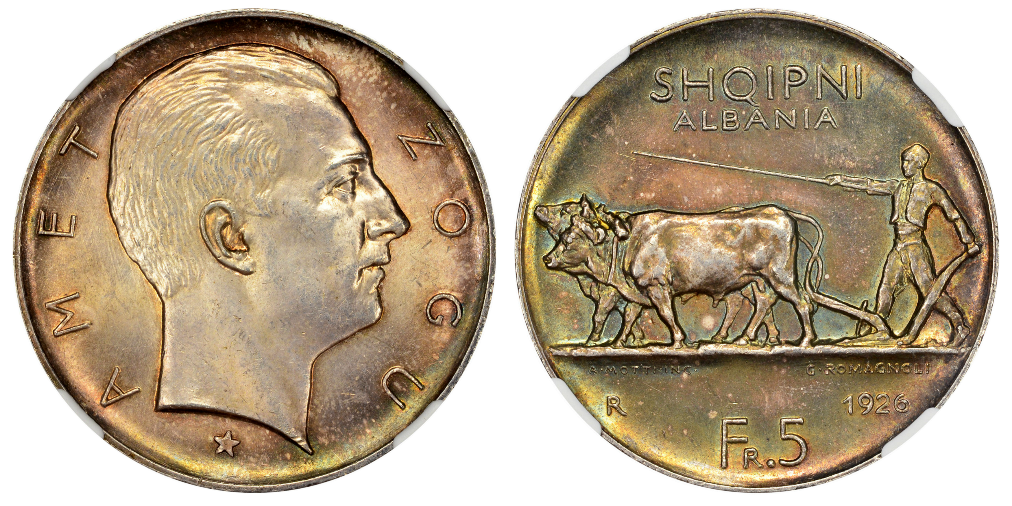
or
B:
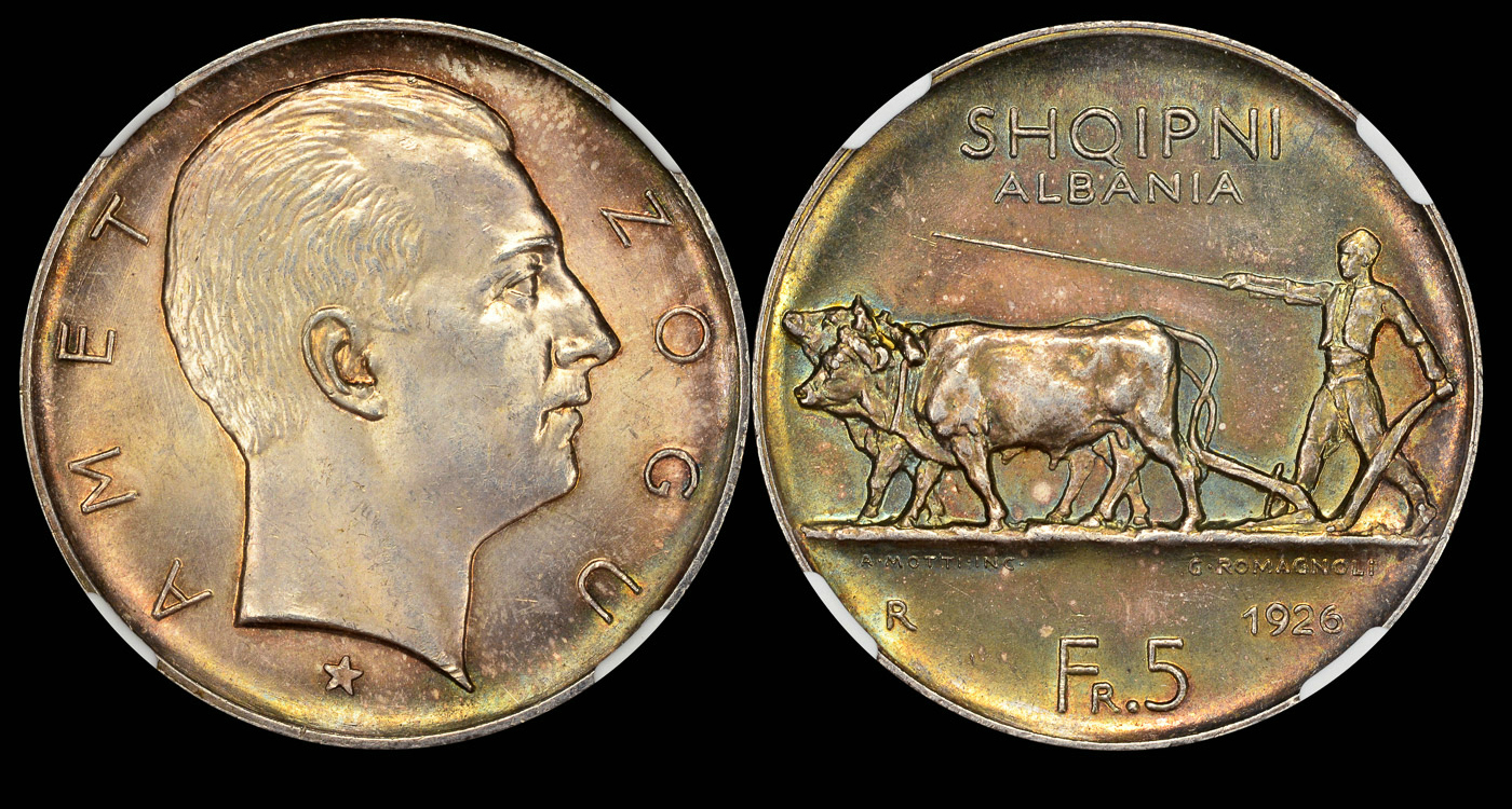
A:
or
B:

0
Comments
Then again, the prong distraction isn't so bad in either image, and it does look very nice against the black background...
Ahh... change my vote to "undecided". Whichever you or the majority think looks better. Either way, it's a sweet looking coin.
Personally, I would use a solid color and not a transparent background for two reasons:
1) More consistent look to images no matter what site they are displayed on. While the transparent background might work well here (and in many other places), there is always a chance you will want to post the picture someplace where there is an unattractive background.
2) File sizes for png images for this type of image (coin photos) will tend to be larger than jpeg images. For example, on these images, if I downsize the png to be about the same resolution as the jpeg and resave it, its file size is still over twice as large as the jpeg file.
Virtus Collection - Renaissance and Baroque Medals
I was thinking the lighter background was a bit nicer with the prongs too. So, maybe not transparent but consider going light...Or stick with black which was my initial choice.
My YouTube Channel
Keeper of the VAM Catalog • Professional Coin Imaging • Prime Number Set • World Coins in Early America • British Trade Dollars • Variety Attribution
-~-~-~-~-~-~-~-~-~-~-~-~-~-~-~-~-~-~-~-~-~-~-~-~-~-~-~-~-~-~-~-~-~-~-~-~-~-~-~-~-~-~-~-~-~-~-~-~-~-~-~-~-
My sets: [280+ horse coins] :: [France Sowers] :: [Colorful world copper] :: [Beautiful world coins]
-~-~-~-~-~-~-~-~-~-~-~-~-~-~-~-~-~-~-~-~-~-~-~-~-~-~-~-~-~-~-~-~-~-~-~-~-~-~-~-~-~-~-~-~-~-~-~-~-~-~-~-~-
World Collection
British Collection
German States Collection
I'm different, I prefer the white background.
Same, looks cleaner.
Great-looking coin!
8 Reales Madness Collection