Home U.S. Coin Forum

Which coin do you like better? UPDATE

WalkerfanWalkerfan Posts: 9,380 ✭✭✭✭✭
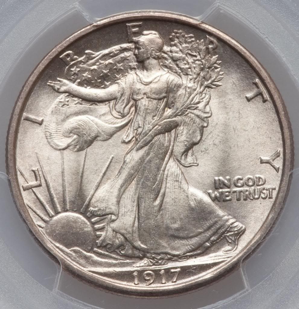
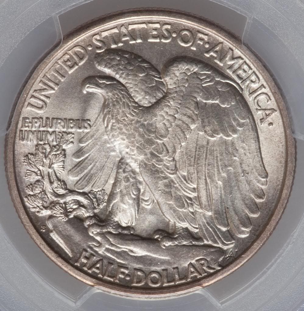
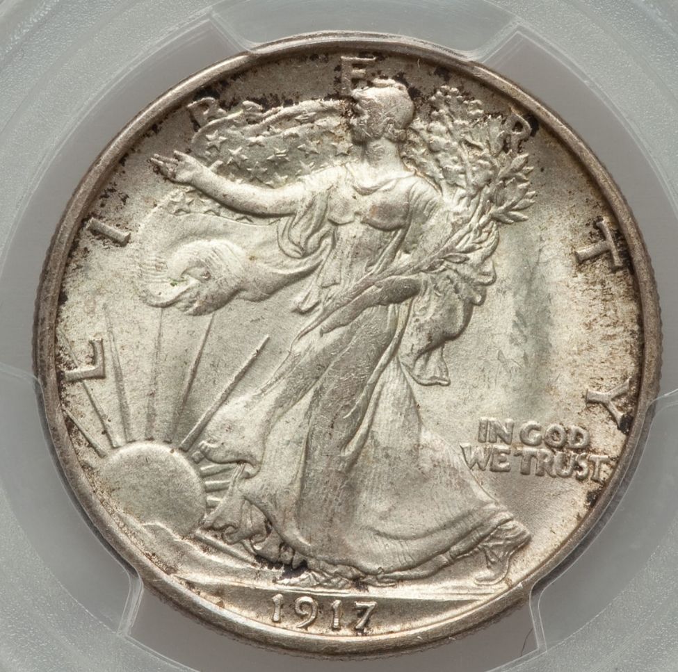
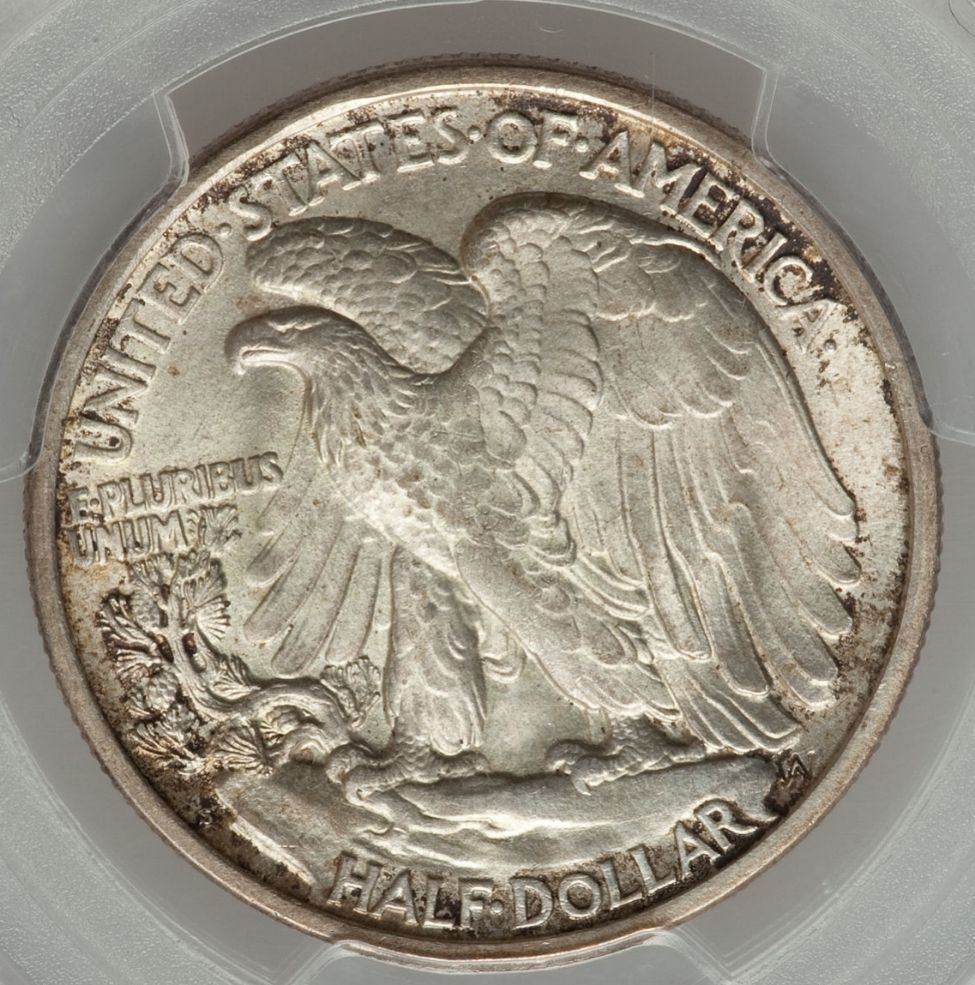
Both are 1917 S rev. coins graded by PCGS with same numerical grades. Please tell me which one you prefer and why? Thanks.
image

image

image

image

Sometimes, it’s better to be LUCKY than good. 🍀 🍺👍

My Full Walker Registry Set (1916-1947):

https://www.ngccoin.com/registry/competitive-sets/16292/

«1

Comments

  • This content has been removed.
  • DennisHDennisH Posts: 13,995 ✭✭✭✭✭


    << <i>Second one. Don't like the spotty, dark toning on the first. >>

    Yep. Beat me to it.
    When in doubt, don't.
  • KyleKyle Posts: 1,822 ✭✭✭✭✭
    I have to agree with the others.

    The second coin.
    Successful BST Transactions With: tonedase, streg2, airplanenut, coindeuce, vibr0nic, natetrook, Shrub68, golden, Lakesammman, drddm, Ilikecolor, CoinJunkie, wondercoin, lablover
  • StrikeOutXXXStrikeOutXXX Posts: 3,352 ✭✭✭✭✭
    I'd take the 2nd coin.

    I actually prefer the color/luster/skin of the first one, but... I'm not a fan of that type of toning, and think I would find it more of a distraction to me than what I would consider a more subdued surface on the 2nd coin without the toning.
    ------------------------------------------------------------

    "You Suck Award" - February, 2015

    Discoverer of 1919 Mercury Dime DDO - FS-101
  • Second one. I think it is struck a little better although I don't know that much or collect walkers. I do like the toning on the first one but its got a mark on the head and a softer struck hand.
  • Second one, due to better eye appeal


    Dozens of BST deals completed, including: kalshacon, cucamongacoin, blu62vette, natetrook, JGNumismatics, Coinshowman, DollarAfterDollar, timbuk3, jimdimmick & many more
  • deltadimemandeltadimeman Posts: 1,036 ✭✭✭
    first one, because it's original
  • 291fifth291fifth Posts: 24,390 ✭✭✭✭✭


    << <i>Second one. Don't like the spotty, dark toning on the first. >>


    I agree as well.
    All glory is fleeting.
  • chrisflchrisfl Posts: 27 ✭✭
    the second one here also....think the spotty toning is more distracting than complimentary.
  • lasvegasteddylasvegasteddy Posts: 10,408 ✭✭✭
    second one
    more eye appeal
    better strike
    frostier luster
    her face doesn't look like it was run over by a mack truck

    thank you for entering me in your generous giveaway too image
    everything in life is but merely on loan to us by our appreciation....lose your appreciation and see


  • stmanstman Posts: 11,352 ✭✭✭✭✭
    I'll take #1. It has a certain skin and glow that I kinda like.
    Please... Save The Stories, Just Answer My Questions, And Tell Me How Much!!!!!
  • erwindocerwindoc Posts: 5,145 ✭✭✭✭✭
    #2

    Whats the grades? 63? 64?
  • Rayman311Rayman311 Posts: 423 ✭✭✭


    << <i>second one
    more eye appeal
    better strike
    frostier luster
    her face doesn't look like it was run over by a mack truck

    thank you for entering me in your generous giveaway too image >>


    +1
  • Wabbit2313Wabbit2313 Posts: 7,268 ✭✭✭✭✭

    Coin one with a little magic would be the better of the 2.
  • WalkerfanWalkerfan Posts: 9,380 ✭✭✭✭✭


    << <i> Whats the grades? 63? 64? >>


    Both are 64s and both are CAC stickered.

    Sometimes, it’s better to be LUCKY than good. 🍀 🍺👍

    My Full Walker Registry Set (1916-1947):

    https://www.ngccoin.com/registry/competitive-sets/16292/

  • Timbuk3Timbuk3 Posts: 11,658 ✭✭✭✭✭
    #2
    Timbuk3
  • keyman64keyman64 Posts: 15,511 ✭✭✭✭✭
    2nd
    "If it's not fun, it's not worth it." - KeyMan64
    Looking for Top Pop Mercury Dime Varieties & High Grade Mercury Dime Toners. :smile:
  • FlatwoodsFlatwoods Posts: 4,139 ✭✭✭✭✭
    I think I like #2 better.
    It would be easier to tell if the lighting/ white balance was the same in both pics.
    The second pic has a purple tint that doesn't seem to do the coin justice.
  • lasvegasteddylasvegasteddy Posts: 10,408 ✭✭✭
    of course price point plays it's roll too

    hopefully someone is not peddling coin #1 off as premium toning example with a price to commensurate
    just saying...as #2 would shine all the more
    everything in life is but merely on loan to us by our appreciation....lose your appreciation and see


  • AblinkyAblinky Posts: 626 ✭✭✭
    The first coin, the second coin is far too white for me.

    Andrew Blinkiewicz-Heritage

  • fcloudfcloud Posts: 12,133 ✭✭✭✭
    2

    President, Racine Numismatic Society 2013-2014; Variety Resource Dimes; See 6/8/12 CDN for my article on Winged Liberty Dimes; Ebay

  • DIMEMANDIMEMAN Posts: 22,403 ✭✭✭✭✭
    1st coin for me. More original and better skirt lines to boot.image
  • roadrunnerroadrunner Posts: 28,303 ✭✭✭✭✭


    << <i>I'll take #1. It has a certain skin and glow that I kinda like. >>


    Me too.

    The luster on the 2nd one is slightly impaired/overdipped. Probably would have been a grade higher if not for that. The better strike and fewer marks on the 2nd one comes at a price.

    I actually like the crustiness of the 1st one....even the orig coppery toning seen so often on original 1916/1917 silver coins of this era.
    Barbarous Relic No More, LSCC -GoldSeek--shadow stats--SafeHaven--321gold
  • crazyhounddogcrazyhounddog Posts: 13,986 ✭✭✭✭✭
    I've gotta say the bottom one is more appealing to me because it has a cleaner appearance. It also seems as though the strike around Miss Liberty's head is a bit better than the top one as the top one looks to be a bit flat do to wear or weakness in strike. Although the top one has an original look, I still gravitate to the bottom one for the reasons stated.
    The bitterness of "Poor Quality" is remembered long after the sweetness of low price is forgotten.
  • YorkshiremanYorkshireman Posts: 4,580 ✭✭✭✭✭
    Second one, with no doubt.
    Yorkshireman,Obsessed collector of round, metallic pieces of history.Hunting for Latin American colonial portraits plus cool US & British coins.
  • Both coins look super nice for pre 20's

    But the slash on the face of the first one ruins it for me even though it is in a secondary focal point
    when I look at walkers, and would most likely be an issue if/when it comes time to sell it.

    The second one seems to be a bit subdued more than the first but trumps the slash on the first one by a long shot
    and most likely much less of an issue if/when it comes time to sell.

    And givin the price range I'd like the upside in my favor.
    Dansco BU washie set empty holes:
    32d,32s,34d,35d,36d,37,37d,37s,38,38s,39s.
  • RayboRaybo Posts: 5,328 ✭✭✭✭✭
    Without a doubt #2 (but I will take your leftovers)
  • Walkerguy21DWalkerguy21D Posts: 11,484 ✭✭✭✭✭
    I honestly can't decide - they are both very nice examples.

    Successful BST transactions with 171 members. Ebeneezer, Tonedeaf, Shane6596, Piano1, Ikenefic, RG, PCGSPhoto, stman, Don'tTelltheWife, Boosibri, Ron1968, snowequities, VTchaser, jrt103, SurfinxHI, 78saen, bp777, FHC, RYK, JTHawaii, Opportunity, Kliao, bigtime36, skanderbeg, split37, thebigeng, acloco, Toninginthblood, OKCC, braddick, Coinflip, robcool, fastfreddie, tightbudget, DBSTrader2, nickelsciolist, relaxn, Eagle eye, soldi, silverman68, ElKevvo, sawyerjosh, Schmitz7, talkingwalnut2, konsole, sharkman987, sniocsu, comma, jesbroken, David1234, biosolar, Sullykerry, Moldnut, erwindoc, MichaelDixon, GotTheBug
  • goldengolden Posts: 9,709 ✭✭✭✭✭
    Door #2 please.
  • lkeigwinlkeigwin Posts: 16,892 ✭✭✭✭✭
    The first was dipped in eZest. The second was dipped in acetone and then eZest. A double dip.

    Both look unimpaired. Though the photographer had the lights wrong on the reverses.

    I'd pass on each.
    Lance.
  • kazkaz Posts: 9,188 ✭✭✭✭✭
    I prefer #1, it doesn't look dipped like #2. The head tics don't bother me very much except when the photos are enlarged to salad plate size. They are both attractive coins in their own way and I think the choice of which to buy is largely a matter of individual taste. My taste is towards #1.
  • david3142david3142 Posts: 3,551 ✭✭✭✭✭
    The 2nd one and it's not that close for me. I don't like the dark toning spots on the first (or the scratch on the face).
    The frosty, clean, appeal of the 2nd is much better to these eyes.
  • WalkerfanWalkerfan Posts: 9,380 ✭✭✭✭✭
    Here's the story----I own coin #2. I passed on the 'perfect' 1917 S Rev. coin in 2012 (I will never, ever live that one down). It took me 2 more years just to find this one (coin #2). 1917 S rev. coins are impossible to find nice in all areas. I paid about 30% above retail for this coin, which is a lot but I love the strike and surface preservation. It had sold a couple years prior to my purchasing it for almost the same amount, so at least I know that the hammer prices are consistent.

    The price of #1 has yet to be determined, as it has not crossed the action block yet. Coin #1 is actually a MS 64 '+' coin, while coin #2 is a MS 64. I thought about buying coin #1 but have decided not to for a variety of important reasons:

    1. Despite the crust; I feel that coin #1 is NOT original and has been dipped. I see luster that has been compromised on both the front and back of the piece. I also feel that the toning on coin #1 is not an attractive or colorful toning but instead looks spotty.

    2. I don't like the scuffs and abrasions in the right facing field of coin #1 along with marks in other areas of the piece.

    3. It would not serve me well to sell my coin #2 in order to just get a '+' upgrade as opposed to having a base 64. Besides, a dealer would not pay me what I have into coin #2 and I would never take that kind of a loss. The only way that I could retrieve my money is to either sell it on Heritage or to hold it longer-----and I am going to do the latter.

    I believe that coin #2 has been dipped, as well, BUT I believe that BOTH coins still have a lot of good luster and frost remaining, when compared to other MS 64 & 65 examples of this issue (MS 65s cost 10-12K)! Although I like # 2 better, both coins are super rare and eye appealing (just in different ways) in this condition. IMO just because a coin has been dipped---that doesn't necessarily make it bad just as long as it retains most of it's luster, as these coins have. I am VERY happy with coin #2. I will be watching from the sidelines, however, with great anticipation to see what coin #1 sells for.

    This has been a super thread for me and I'm really glad that I posted it, as I really had no idea what the opinions and responses would be. I have gained some very valuable insight and it mostly reaffirms my belief in coin #2.

    Thank you SO MUCH to everyone who has responded, thus far.

    Sometimes, it’s better to be LUCKY than good. 🍀 🍺👍

    My Full Walker Registry Set (1916-1947):

    https://www.ngccoin.com/registry/competitive-sets/16292/

  • GRANDAMGRANDAM Posts: 8,546 ✭✭✭✭✭
    #2 by a mile,,,,,

    GrandAm image
    GrandAm :)
  • TootawlTootawl Posts: 5,877 ✭✭✭
    Second one for me.
    PCGS Currency: HOF 2013, Best Low Ball Set 2009-2014, 2016, 2018. Appreciation Award 2015, Best Showcase 2018, Numerous others.
  • coinhackcoinhack Posts: 1,158 ✭✭✭✭
    Definitely #2
  • mariner67mariner67 Posts: 2,746 ✭✭✭
    #2
    Successful trades/buys/sells with gdavis70, adriana, wondercoin, Weiss, nibanny, IrishMike, commoncents05, pf70collector, kyleknap, barefootjuan, coindeuce, WhiteTornado, Nefprollc, ajw, JamesM, PCcoins, slinc, coindudeonebay,beernuts, and many more
  • lordmarcovanlordmarcovan Posts: 43,588 ✭✭✭✭✭


    << <i>Second one. Don't like the spotty, dark toning on the first. >>

    image

    No contest for me on this one. #2 by a landslide.

    Explore collections of lordmarcovan on CollecOnline, management, safe-keeping, sharing and valuation solution for art piece and collectibles.
  • nwcoastnwcoast Posts: 2,877 ✭✭✭✭✭
    Second one for me too.
    Though I'm often a fan of toning, the blotchy toning on the first coin does not do anything for me.
    The hits on the head and face of coin 1 are troublesome for me as well.
    In any case, I'm used to looking at and seeing bright Walkers, so no problems there.

    Happy, humble, honored and proud recipient of the “You Suck” award 10/22/2014

  • WalkerfanWalkerfan Posts: 9,380 ✭✭✭✭✭


    << <i>I have a nice original NGC61 CAC I can post tomorrow if its okay and you are interested in seeing it! >>


    Sure--I'd like to see your coin. image

    Sometimes, it’s better to be LUCKY than good. 🍀 🍺👍

    My Full Walker Registry Set (1916-1947):

    https://www.ngccoin.com/registry/competitive-sets/16292/

  • mommam17mommam17 Posts: 971 ✭✭✭
    being a toning nut, I'll take the first one, which I think would look much nicer in hand?
  • oih82w8oih82w8 Posts: 12,289 ✭✭✭✭✭
    Number 2 for me.
    oih82w8 = Oh I Hate To Wait _defectus patientia_aka...Dr. Defecto - Curator of RMO's

    BST transactions: dbldie55, jayPem, 78saen, UltraHighRelief, nibanny, liefgold, FallGuy, lkeigwin, mbogoman, Sandman70gt, keets, joeykoins, ianrussell (@GC), EagleEye, ThePennyLady, GRANDAM, Ilikecolor, Gluggo, okiedude, Voyageur, LJenkins11, fastfreddie, ms70, pursuitofliberty, ZoidMeister,Coin Finder, GotTheBug, edwardjulio, Coinnmore, Nickpatton, Namvet69,...
  • RollermanRollerman Posts: 1,869 ✭✭✭✭✭


    << <i>second one
    more eye appeal
    better strike
    frostier luster
    her face doesn't look like it was run over by a mack truck

    thank you for entering me in your generous giveaway too image >>

    image
    "Ain't None of Them play like him (Bix Beiderbecke) Yet."
    Louis Armstrong
  • TopographicOceansTopographicOceans Posts: 6,535 ✭✭✭✭
    #2
  • BarndogBarndog Posts: 20,499 ✭✭✭✭✭
    first one seems to have more of its original skin and would be my choice
  • etexmikeetexmike Posts: 6,817 ✭✭✭
    I like "crusty" coins but even the first Walker is too crusty for my liking. Gotta go with coin #2.


    Mike
  • Personally coin 1. For ease of resale coin 2. I like original toning.

Leave a Comment

BoldItalicStrikethroughOrdered listUnordered list
Emoji
Image
Align leftAlign centerAlign rightToggle HTML viewToggle full pageToggle lights
Drop image/file