Gretzky 1979 OPC Centering - A Must For Me
 MULLINS5
Posts: 4,517 ✭✭✭
MULLINS5
Posts: 4,517 ✭✭✭
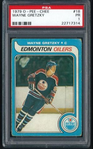
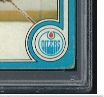
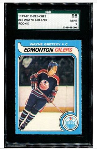
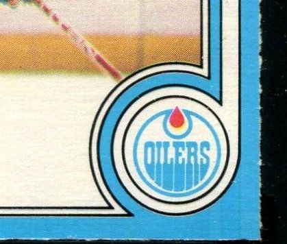
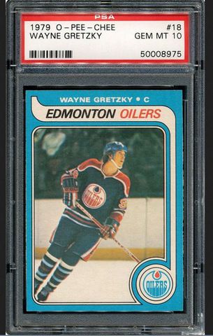
I'm a sucker for centering, as most are, and thought I'd share what is, for me, the biggest X-Factor when considering this card. The orange oil drip in the Oilers logo MUST be perfectly centered. If I could afford the SGC or PSA 10 example pictured, I'd have to pass!
0
Comments
eBay Store
Greg Maddux #1 Master SetGreg Maddux #2 Basic Set
<< <i>Agreed on the centering of the Oilers logo. That is the first thing that I noticed when I saw the PSA 10 posted long ago. Mine is just a tad high, but I have always been more concerned with l/r centering in general. My main preference on the 1979 OPC Gretzky is that it must be from the first print run, otherwise I would have passed right on by. >>
That's one of the nicest 7s I've seen. Oilers drip doesn't bother me one bit (and I'm pretty strict on the centering of it). Bonus points for the first print run, too!
<< <i>
<< <i>Agreed on the centering of the Oilers logo. That is the first thing that I noticed when I saw the PSA 10 posted long ago. Mine is just a tad high, but I have always been more concerned with l/r centering in general. My main preference on the 1979 OPC Gretzky is that it must be from the first print run, otherwise I would have passed right on by. >>
That's one of the nicest 7s I've seen. Oilers drip doesn't bother me one bit (and I'm pretty strict on the centering of it). Bonus points for the first print run, too! >>
One of these days I am going to send it in for a review, maybe it will bump to a 7.5 or dare I say an 8.
eBay Store
Greg Maddux #1 Master SetGreg Maddux #2 Basic Set
Instagram: mattyc_collection
ON ITS WAY TO NEWPORT BEACH, CA 92658
This card has been on my radar. How do you know if it is from the first print run?
Baseball, it is said, is only a game. True. And the Grand Canyon is only a hole in Arizona.
-George F. Will
<< <i>My main preference on the 1979 OPC Gretzky is that it must be from the first print run, otherwise I would have passed right on by.
This card has been on my radar. How do you know if it is from the first print run? >>
On the reverse, you will see the two horizontal blue lines that run the length of the card. This is supposed to signify the playing surface and only seen on the first print run.
eBay Store
Greg Maddux #1 Master SetGreg Maddux #2 Basic Set
<< <i>
<< <i>My main preference on the 1979 OPC Gretzky is that it must be from the first print run, otherwise I would have passed right on by.
This card has been on my radar. How do you know if it is from the first print run? >>
On the reverse, you will see the two horizontal blue lines that run the length of the card. This is supposed to signify the playing surface and only seen on the first print run. >>
Thanks Maddux, good to know.
Mullins- Thanks for starting this thread. I completely agree about the importance of the centered drip. It is surprising that high grade examples of this card mostly have an issue with this.
Baseball, it is said, is only a game. True. And the Grand Canyon is only a hole in Arizona.
-George F. Will
<< <i>I hear a lot about the first print run and the premium attached to it, but I'm not quite sure why that is. Can someone enlighten me? >>
The only reason I can think of is that you know it's 100% real.
ON ITS WAY TO NEWPORT BEACH, CA 92658
<< <i>I want that 1. What eye appeal for the grade! >>
Me too, but not for $2,000
<< <i>
<< <i>I hear a lot about the first print run and the premium attached to it, but I'm not quite sure why that is. Can someone enlighten me? >>
The only reason I can think of is that you know it's 100% real. >>
If there were a way to identify the first printing of any major sports card I think there'd be a premium attached to it. Unfortunately (or fortunately), we don't know which printing cards come from so it's never an issue. The blue lines signify the earliest printing of the card.
There are a few (a very very small few) who believe the blue lines should be considered a printing error (since that's essentially what it is).
I love the blue line but centering of the card and drip comes first for me and the line is only a bonus.
The great thing about Gretzky's OPC rookie is that there are so many different examples out there. OPC cut, smooth edges, centered drip, off-centered drip, first print blue line, no line.
The perfect card for me would be a dead centered card, dead centered oil drip, opc rough edges like the SGC example pictured and the blue print line
<< <i>One more note on the blue lines: I have seen reprints with the blue lines (and they have the yellow shoulder dot on the front). The blue lines are a good sign, but it's not a guarantee. >>
I've noticed this too. They're getting much better.