Home Trading Cards & Memorabilia Forum

Mistakes card companies have made creating a set

This is all matter of opinion of course.

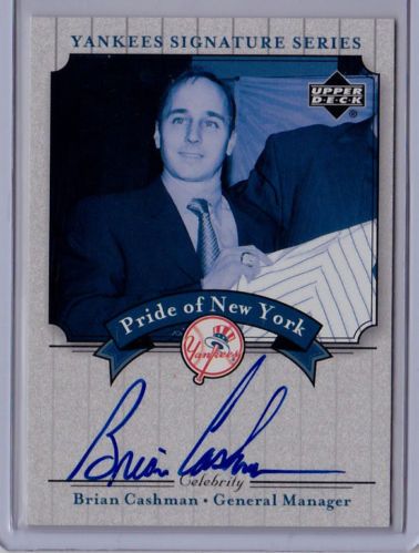
One of the best ideas and WORST designs is the 2003 UD Signature Pride of New York. The black and white...or is it blue and white...photography is horrid. Photos suck and card design sucks. The autograph choices to include were outstanding!

Sad to see such a nice idea look like crap.

image

Comments

  • StingrayStingray Posts: 8,843 ✭✭✭
    Topps 3D comes to mind. The technology made the photos very hard to see, IMO.
  • mikliamiklia Posts: 1,295 ✭✭✭
    not printing nearly enough of these bad boys:
    image
  • lawnmowermanlawnmowerman Posts: 19,477 ✭✭✭✭
    In 2007 all of the football sets made a mistake by including Jamarcus Russell.
  • Nascar360Nascar360 Posts: 1,853 ✭✭✭
    In 2003 Press Pass created a commemorative insert series of Dale Earnhardt cards. They are numbered so when people got them they thought they had real signed cards.

    Well you see them pop up on eBay and sometimes folks bid them up like they are real on card signatures.


    It has to be the worst insert set Press Pass as ever made!
    imageimage
  • bishopbishop Posts: 2,917 ✭✭✭
    Stingray-- are you referring to their original 68 issue ? The two 80s issues ? The 2011 product. I think the 68 and 2011 efforts were great. The two 1980s issues were clunkers for sure.

    The 65 Topps Embossed issue gets my gets my vote as one of their worst . The 61 Rub Offs are a close 2nd. The 74 Emblems get an honorable mention

    image
    image
    image
    image
    image
    image
    image
    image
    image
    Topps Baseball-1948, 1951 to 2017
    Bowman Baseball -1948-1955
    Fleer Baseball-1923, 1959-2007

    Al
  • StingrayStingray Posts: 8,843 ✭✭✭
    They are 1995 Dimension III Topps, ugly.

    That Earnhardt is a real auto, no?? Based on what the back states, it is??
  • frankhardyfrankhardy Posts: 8,135 ✭✭✭✭✭
    How about Topps or Fleer NOT making a 1984-85 basketball set? Those would be epic!

    Shane

  • gemintgemint Posts: 6,121 ✭✭✭✭✭
    1981 Donruss. Lousy design and even worse paper stock. I'd add the '65 Topps Embossed as well. There's also an oddball sticker or stamp set that looks like the photos were drawn in crayon with a split tip. I don't even recall if it was early 60s or prewar.
  • mlbfan2mlbfan2 Posts: 3,115 ✭✭✭
    I think these are ugly.
    image
  • bishopbishop Posts: 2,917 ✭✭✭
    But you can improve them

    image

    image
    Topps Baseball-1948, 1951 to 2017
    Bowman Baseball -1948-1955
    Fleer Baseball-1923, 1959-2007

    Al
  • I am surprised no one has mentioned Sportsflics. Those things were awful and for a time it seemed they where getting pushed as a legitimate every year set like Topps, Fleer etc. As a kid I never knew why anyone bought them. Glad they had such a short run.
  • LarkinCollectorLarkinCollector Posts: 8,975 ✭✭✭✭✭
    Forgetting to put serial numbers on items 'limited to 25'.
  • Pretty sure sometime in the mid nineties there was an attempt to get kids back into collecting with a Looney Tune set. No offense to whoever liked those but they where horrific!
  • bsavagebsavage Posts: 204 ✭✭
    These are pretty ugly, but I think they are kinda cool. I've never seen them before.


    << <i>I think these are ugly.
    image >>

  • BaltimoreYankeeBaltimoreYankee Posts: 3,034 ✭✭✭✭✭


    << <i>Pretty sure sometime in the mid nineties there was an attempt to get kids back into collecting with a Looney Tune set. No offense to whoever liked those but they where horrific! >>


    A card with Ken Griffey Jr and Bugs Bunny comes to mind.
    Daniel
  • bishopbishop Posts: 2,917 ✭✭✭
    I have the first Sportsflics set. I like it. The Topps Kids set was a tad weird...but I have it image. Anything Topps put out baseball wise until 1994

    image
    image
    Topps Baseball-1948, 1951 to 2017
    Bowman Baseball -1948-1955
    Fleer Baseball-1923, 1959-2007

    Al
  • lanemyer85lanemyer85 Posts: 1,336 ✭✭✭
    It seemed to be par for the course for mid-90's issues, but sets that made you immediately flip to the card back in order to simply see the player's name. The set that immediately springs to mind was '95 Fleer.
    image
  • 1980-81 Hockey. Stupid black scratch-offs.
  • itzagoneritzagoner Posts: 8,753 ✭✭
    1976 Topps Basketball Billboards. i'm surprised they weren't captioned with "Have You Seen This Child?"
  • StingrayStingray Posts: 8,843 ✭✭✭


    << <i>It seemed to be par for the course for mid-90's issues, but sets that made you immediately flip to the card back in order to simply see the player's name. The set that immediately springs to mind was '95 Fleer.
    image >>


    I agree with that one, there where like 5 or 6 different front designs throughout this set.
  • Any modern day set that creates and releases a 2013 set in 2014.
  • elsnortoelsnorto Posts: 2,012 ✭✭


    << <i>I am surprised no one has mentioned Sportsflics. Those things were awful and for a time it seemed they where getting pushed as a legitimate every year set like Topps, Fleer etc. As a kid I never knew why anyone bought them. Glad they had such a short run. >>


    For reasons unknown to even myself, I am working on a 1995 Sportflix Football master set. image

    My vote probably goes to 2009 Topps National Chicle. I've coveted 1935 Chicle since I first saw them in a price guide as a kid. I'm close to finishing up my PSA 3 ghetto set. I dig the form factor and unique (at least to football) art deco design.

    So I was excited when Topps announced they were resurrecting Chicle... but some of the art work was so horrendous... as this Dan "Butthead sans Beavis" Marino card attests to:

    image

    Snorto~
Sign In or Register to comment.