Options
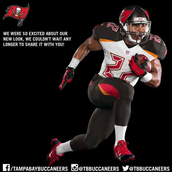
Buccaneers unveil new uni's
 lawnmowerman
Posts: 19,477 ✭✭✭✭
lawnmowerman
Posts: 19,477 ✭✭✭✭
in Sports Talk
I don't like 'em. They are ugly and the numbers look really bad.
Not sure why they changed to this from the red jersey pewter helmet combo that looked really good.
link
Not sure why they changed to this from the red jersey pewter helmet combo that looked really good.
link
0
Comments
Collecting 1970s Topps baseball wax, rack and cello packs, as well as PCGS graded Half Cents, Large Cents, Two Cent pieces and Three Cent Silver pieces.
Hi Matt and Tim
<< <i>I dont think it looks that bad, although the numbers look stupid.
Hi Matt and Tim
Hey, Paul!
I remember the Patriot in the three-point stance back when Grogan was the QB, LOL..
Collecting 1970s Topps baseball wax, rack and cello packs, as well as PCGS graded Half Cents, Large Cents, Two Cent pieces and Three Cent Silver pieces.
<< <i>I dont think it looks that bad, although the numbers look stupid.
Hi Matt and Tim
Hola mi amigo!!
1994 Pro Line Live
TheDallasCowboyBackfieldProject
<< <i>Colors look ok. Much better than the Bucs uniforms of the 80's >>
I loved the creamsicle unis!
<< <i>
<< <i>Colors look ok. Much better than the Bucs uniforms of the 80's >>
I loved the creamsicle unis! >>
I like seeing the creamsicle jerseyss and the Bucco Bruce helmet during throwback games. Kinda like the Patriots throwback which I think is badass.
1994 Pro Line Live
TheDallasCowboyBackfieldProject
<< <i>
<< <i>
<< <i>Colors look ok. Much better than the Bucs uniforms of the 80's >>
I loved the creamsicle unis! >>
I like seeing the creamsicle jerseyss and the Bucco Bruce helmet during throwback games. Kinda like the Patriots throwback which I think is badass. >>
I agree- those two along with the old Broncos uniform are still preferred by this guy
<< <i>Like the new helmet. Jersey not so much.. >>
+ 1
It's almost like they're trying too hard. They didn't have a player crack the top 25 in sales and are typically near the bottom overall, so a redesign is totally understandable.