1980's Topps: Lazy or Nostalgic?
At least 4 Topps issues from the 80’s bear striking resemblances to previous counterparts (some more than others). Maybe this is well-known and already discussed at length in previous posts, but I could not find any and thought it might be a fun topic for discussion, and hopefully quell my curiosity. Coincidence? Laziness? Nostalgia?
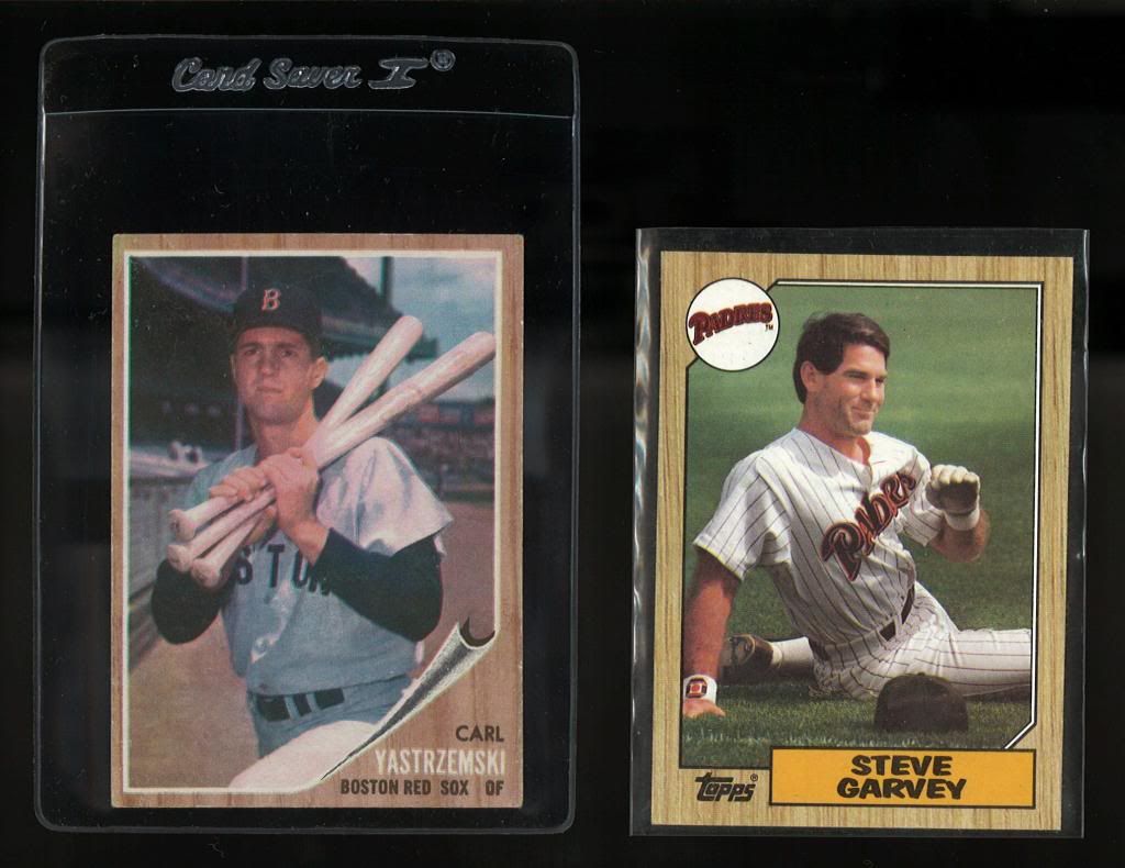
25 Years after the 1962 issue Topps goes back to the wood borders.
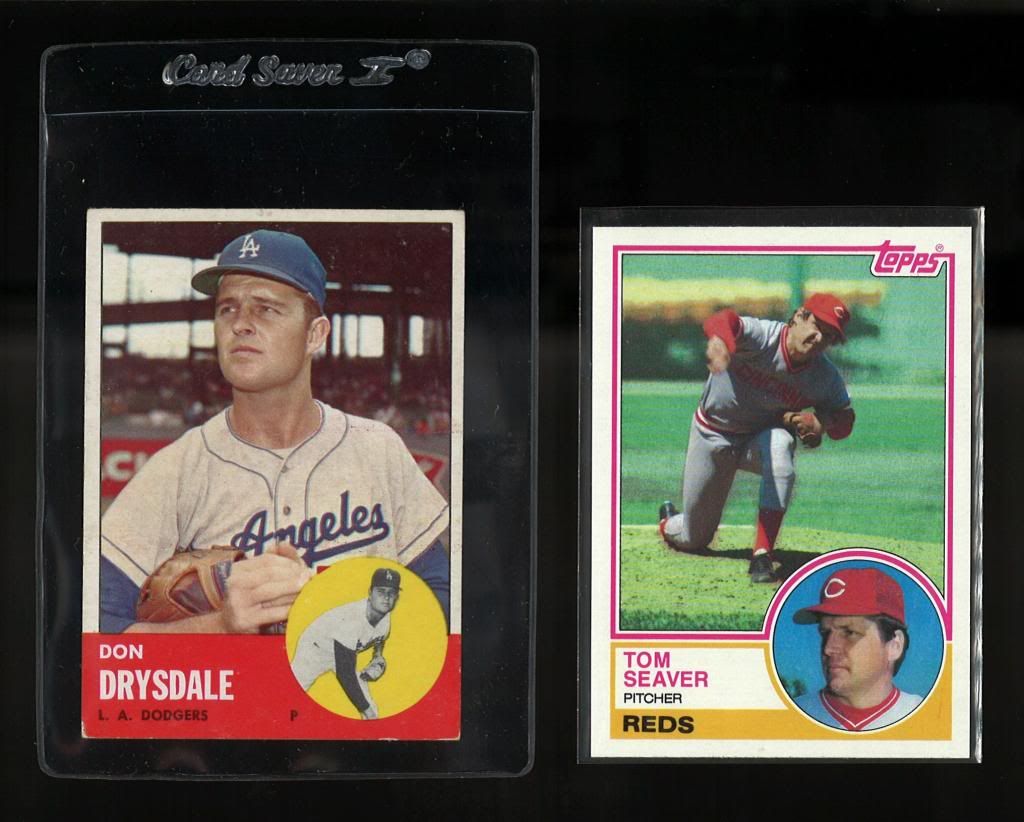
20 years after the 1963 issue Topps goes back to the circles with player photo
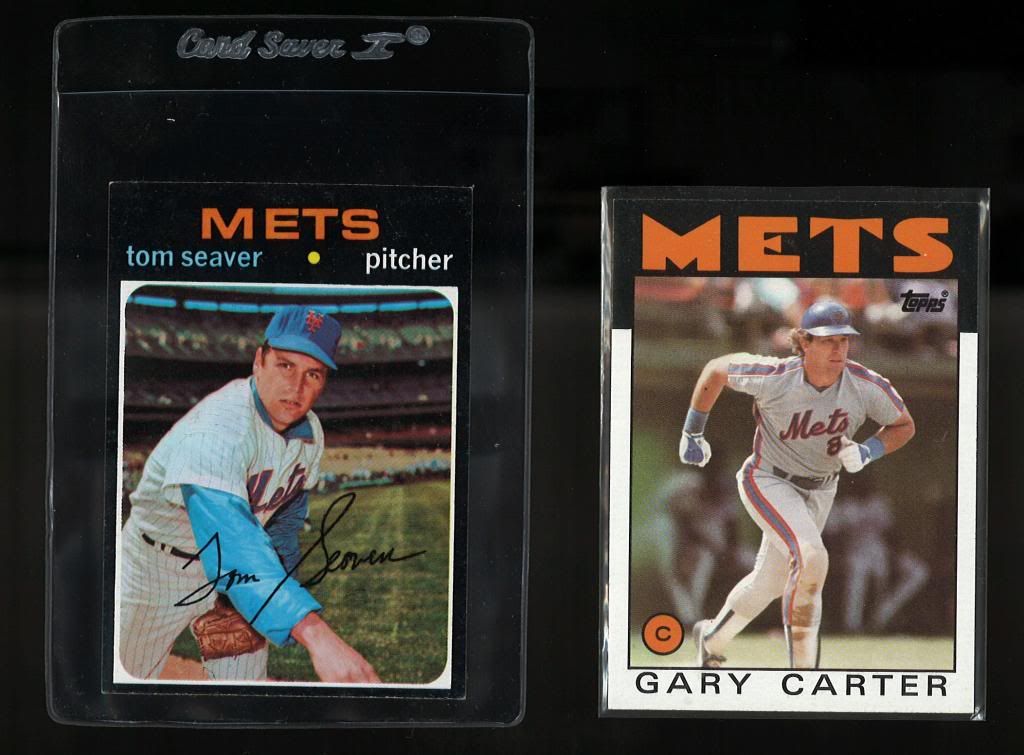
15 years after the 1971 issue Topps goes back to the black borders
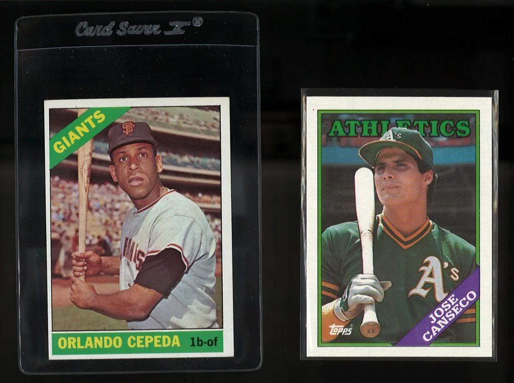
Maybe a bit more of a stretch, the 1966 and 1988 issues look similar in the 45 degree bar across the corner (especially if you turn the 88 upside down).
Just curious if this was an intentional tribute, a la Heritage, or just coincidence or laziness...or option 4, I've spent too much time looking at cards lately, so they're all starting to look the same.
25 Years after the 1962 issue Topps goes back to the wood borders.

20 years after the 1963 issue Topps goes back to the circles with player photo

15 years after the 1971 issue Topps goes back to the black borders

Maybe a bit more of a stretch, the 1966 and 1988 issues look similar in the 45 degree bar across the corner (especially if you turn the 88 upside down).

Just curious if this was an intentional tribute, a la Heritage, or just coincidence or laziness...or option 4, I've spent too much time looking at cards lately, so they're all starting to look the same.
52-90 All Sports, Mostly Topps, Mostly HOF, and some assorted wax.
0
Comments
Jmaciu's Collection
Bowman Baseball -1948-1955
Fleer Baseball-1923, 1959-2007
Al
The 1988 set always seemed like a really uninspired design to me but 1966 isn't really any better.
I think the the difference is in the photography. The 1966 photos overall are just better IMHO.
The eighties sets don't have anything comparable to 1967 per photgraphy either.
DaveB in St.Louis
I'd note that Topps had a habit of having a circle inserted in the bottom of the card in years ending in three. Look at 1953, 1963, 1973 and 1983.
They didn't do this in 1993 or 2013 but they produced something similar in 2003.
One set that I think you missed is 1980 Topps which looks a lot like 1974 Topps.
<< <i>i never noticed before but Garv looks rather nostalgic and wears the confident smirk of a veteran player beloved in many a Major League town. >>
No, it's the "I just laid my teammate's wife" and he doesn't know about it look!!
I think I see the 86 and 71's as similar due to the black border (at least on top), but I can see the 75 relation as well.
I do like that they've borrowed from the past throughout the 80's though.