My coin photography quality over time
 BryceM
Posts: 11,893 ✭✭✭✭✭
BryceM
Posts: 11,893 ✭✭✭✭✭
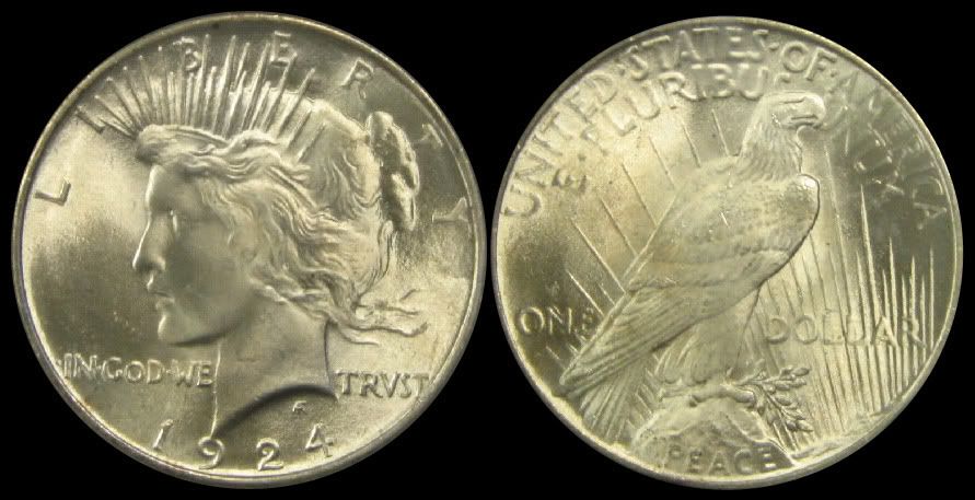
I went back and looked at a few old Photobucket photos of my collection and thought that it was rather interesting. I started photographing my coins to that I could enjoy them even with them locked away in the SDB. Needless to say, my first efforts were a bit primitive. The first "studio" was my bathroom counter. It had the best light in the house (6 fluorescent bulbs above the mirror). I used the same camera that I have now - Canon EOS XSi Rebel, the kit lens - EFS 18-55mm, and a timer to try to reduce shake on top of my gangly tripod.
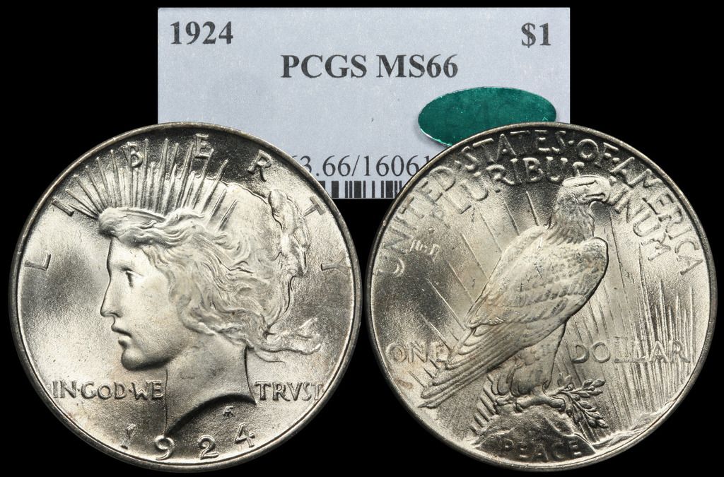
The second set of photos here was taken shortly after acquiring a copy stand, a Canon 100mm 1:2.8 USM macro lens, and two 50W halogen bulbs. I cropped and merged the photos with PhotoShop Elements without applying any sharpening and a very minimal amount of "juicing" with color saturation - just enough to match what I was seeing in-hand.
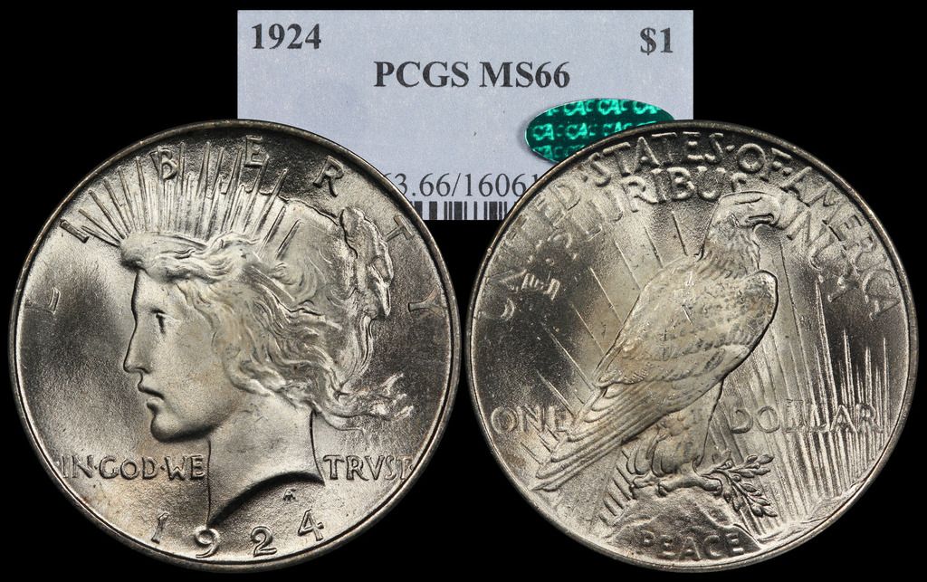
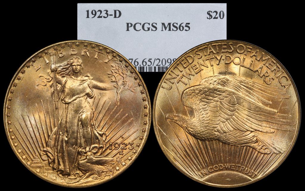
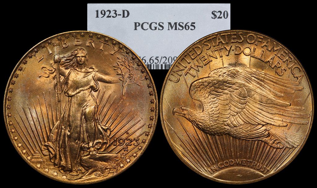
The final set of photos were taken with two 90W halogens, tethering software to allow for precise focusing and better metering, a bit of sharpening, and the same minimal amount of "juice" to the color saturation. Purists will say the color saturation should not be adjusted, but without it my photos are very flat compared to the coins in-hand. I attribute this to the sensor in my relatively inexpensive camera, but I lack enough experience to be sure. I've also found over time that getting beyond basic problems from instability, insufficient and incorrectly placed light, and focus issues has allowed me to concentrate on contrast and sharpness, which has taken me up a notch or two.
Most of my collection consists of basically the same type of coin - slabbed 1800s-1900s silver in mostly AU-BU grades. The next thing I'd like to improve is my ability to shoot proofs, flashy modern clads, rainbow toners, and extreme low-contrast coins like old, worn, brown copper.
I hope to revisit and update this thread in a year or two to see how things are coming over time.
The second set of photos here was taken shortly after acquiring a copy stand, a Canon 100mm 1:2.8 USM macro lens, and two 50W halogen bulbs. I cropped and merged the photos with PhotoShop Elements without applying any sharpening and a very minimal amount of "juicing" with color saturation - just enough to match what I was seeing in-hand.
The final set of photos were taken with two 90W halogens, tethering software to allow for precise focusing and better metering, a bit of sharpening, and the same minimal amount of "juice" to the color saturation. Purists will say the color saturation should not be adjusted, but without it my photos are very flat compared to the coins in-hand. I attribute this to the sensor in my relatively inexpensive camera, but I lack enough experience to be sure. I've also found over time that getting beyond basic problems from instability, insufficient and incorrectly placed light, and focus issues has allowed me to concentrate on contrast and sharpness, which has taken me up a notch or two.
Most of my collection consists of basically the same type of coin - slabbed 1800s-1900s silver in mostly AU-BU grades. The next thing I'd like to improve is my ability to shoot proofs, flashy modern clads, rainbow toners, and extreme low-contrast coins like old, worn, brown copper.
I hope to revisit and update this thread in a year or two to see how things are coming over time.
1
Comments
PCGS Registries
Box of 20
SeaEagleCoins: 11/14/54-4/5/12. Miss you Larry!
Keeper of the VAM Catalog • Professional Coin Imaging • Prime Number Set • World Coins in Early America • British Trade Dollars • Variety Attribution
And gorgeous coins!!!
Takes a good eye for both...
Happy, humble, honored and proud recipient of the “You Suck” award 10/22/2014
<< <i>I hope to revisit and update this thread in a year or two to see how things are coming over time. >>
I'm not sure there's any need to get any better as these a really great shots!
That 23-D is outta sight
.
CoinsAreFun Toned Silver Eagle Proof Album
.
Gallery Mint Museum, Ron Landis& Joe Rust, The beginnings of the Golden Dollar
.
More CoinsAreFun Pictorials NGC FOR SALE
the difference between yellow and brown is a difference of luminance. yellow is brighter; brown is darker. Yet we perceive brown and yellow as rather different...moreso than a luminance variance of any other color. A bright and a dark green generally look both 'green'.
But a bright yellow and a dark yellow (brown) are seen very differently. A simple alteration of lighting can dramatically alter perceived color.