1978 Rocky Colavito custom completed
 AUPT
Posts: 806 ✭✭✭
AUPT
Posts: 806 ✭✭✭
Thanks to a suggestion from fellow custom card creator Keith Conforti, I switched up the presentation for my 1978 Topps-style Rocky Colavito card to the horizontal "AS PLAYER/AS MANAGER" format.
Here's the result . . .
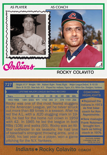
Here's the result . . .
0
Comments
Donato
Donato's Complete US Type Set ---- Donato's Dansco 7070 Modified Type Set ---- Donato's Basic U.S. Coin Design Set
Successful transactions: Shrub68 (Jim), MWallace (Mike)
<< <i>Very nice, but I think his name on the front should be in bold letters, like this. >>
Am I wrong about this?
<< <i>Topps may have used a bold(er) font on the Torre card because his name is so short. My Colavito name was a close match to the weight of Jeff Torborg's name on the '78 Indians' manager's card. >>
I respectfully disagree. I just looked at a few of the other manager's cards and all of the manager's names that I saw are bolder than the "as player" font, including Torborg's. Rocky's name doesn't stand out like it does on the original 1978 cards. I noticed that something was "off" literally within one second of first seeing your card. Just trying to help.