...very nice coin! looks like some shelf doubling going on, too.
"government is not reason, it is not eloquence-it is a force! like fire, it is a dangerous servant and a fearful master; never for a moment should it be left to irresponsible action." George Washington
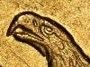
Nice looking piece of gold. What is up with "America" on the obverse?
Mike >>
You must be referring to the 'Longacre' doubling on the lettering. It affects most designs of the Longacre period. It's believed that it's caused by the letter punches being driven into the die too far, creating an impression of the base of the punch around the letters...
You Suck! Awarded 6/2008- 1901-O Micro O Morgan, 8/2008- 1878 VAM-123 Morgan, 9/2022 1888-O VAM-1B3 H8 Morgan | Senior Regional Representative- ANACS Coin Grading. Posted opinions on coins are my own, and are not an official ANACS opinion.
Nice looking piece of gold. What is up with "America" on the obverse?
Mike >>
You must be referring to the 'Longacre' doubling on the lettering. It affects most designs of the Longacre period. It's believed that it's caused by the letter punches being driven into the die too far, creating an impression of the base of the punch around the letters... >>
And now I know the rest of the story. Thank you very much Mr. Merlo for that bit of info.
 RYK
Posts: 35,800 ✭✭✭✭✭
RYK
Posts: 35,800 ✭✭✭✭✭

Comments
I knew it would happen.
<< <i>
Nice looking piece of gold. What is up with "America" on the obverse?
Mike
...very nice coin! looks like some shelf doubling going on, too.
<< <i>
Nice looking piece of gold. What is up with "America" on the obverse?
Mike >>
Nothing. Why do you ask?...what have you been drinking?
``https://ebay.us/m/KxolR5
<< <i>
Nice looking piece of gold. What is up with "America" on the obverse?
Mike >>
You must be referring to the 'Longacre' doubling on the lettering. It affects most designs of the Longacre period. It's believed that it's caused by the letter punches being driven into the die too far, creating an impression of the base of the punch around the letters...
<< <i>
<< <i>
Nice looking piece of gold. What is up with "America" on the obverse?
Mike >>
You must be referring to the 'Longacre' doubling on the lettering. It affects most designs of the Longacre period. It's believed that it's caused by the letter punches being driven into the die too far, creating an impression of the base of the punch around the letters... >>
And now I know the rest of the story.
Thank you very much Mr. Merlo for that bit of info.
Mike