SSP: Would like critique of new coin page.
 coinpictures
Posts: 5,345 ✭✭✭
coinpictures
Posts: 5,345 ✭✭✭
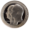
I decided to make a new web page devoted to the toned pieces in my collection. I didn't want to use the same black background as coinpictures.com, so after soliciting opinions on the lightside I opted for a light brown/tan background.
Linky
As time goes on I hope to flesh it out not just with more coins, but with some additional descriptive commentary about the individual coins.
All feedback welcome.
Linky
As time goes on I hope to flesh it out not just with more coins, but with some additional descriptive commentary about the individual coins.
All feedback welcome.

0
Comments
DPOTD-3
'Emancipate yourselves from mental slavery'
CU #3245 B.N.A. #428
Don
8 Reales Madness Collection
<< <i>SSP: Would like critique of new coin page. >>
PM sent.
<< <i>All feedback welcome. >>
YOU SUCK!!!!!!!
eBay Store
DPOTD Jan 2005, Meet the Darksiders
Virtus Collection - Renaissance and Baroque Medals
<< <i>PM sent.
To whom? I received no pm from you.
<< <i>YOU SUCK!!!!!!!
1/2 Cents
U.S. Revenue Stamps
WNC Coins, LLC
1987-C Hendersonville Road
Asheville, NC 28803
wnccoins.com
<< <i>Looks pretty good to me! >>
Your not only dead your color blind......lol.
Great site CP and great coins.
The only serious comment I can make is I think you should try one of your pages with a VERY light yellow background. NOT the bright one. It might make the contrast stand out a lot more and still show the bright silver of the coins.
It might be worth checking anyway
1-Dammit Boy Oct 14,2003
International Coins
"A work in progress"
Wayne
eBay registered name:
Hard_ Search (buyer/bidder, a small time seller)
e-mail: wayne.whatley@gmail.com
Of the background colors below, which do you like the best? I already use black on my main site, so I want to try something different. Grey is the most neutral, but oh so boring...
Thanks!
1/2 Cents
U.S. Revenue Stamps