Heritage's copper photos
 MikeInFL
Posts: 10,188 ✭✭✭✭
MikeInFL
Posts: 10,188 ✭✭✭✭
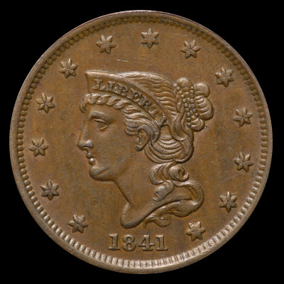
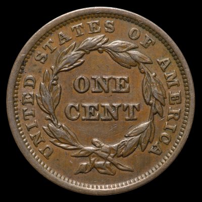
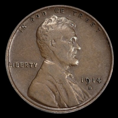
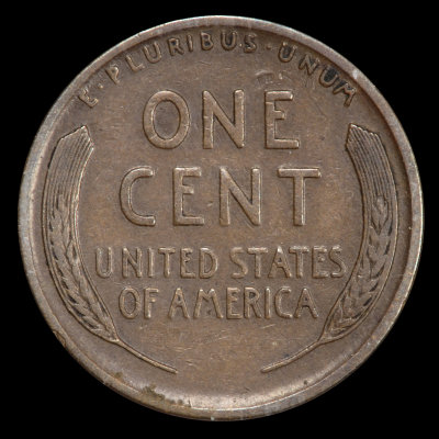
While buying coins from a photo is fraught with risk, I hope these two examples will give you an idea what to look for should you like circulated copper:
Heritage:


My unretouched (other than resize and border) photo:
Heritage:


My unretouched photo:
I am probably shooting myself in the foot with posting this info, but I thought sharing was the right thing to do given all that I've learned here from you all. I hope this helps...Mike
Heritage:
My unretouched (other than resize and border) photo:
Heritage:
My unretouched photo:
I am probably shooting myself in the foot with posting this info, but I thought sharing was the right thing to do given all that I've learned here from you all. I hope this helps...Mike
Collector of Large Cents, US Type, and modern pocket change.
0
Comments
Leo
Successful BST transactions with: SilverEagles92; Ahrensdad; Smitty; GregHansen; Lablade; Mercury10c; copperflopper; whatsup; KISHU1; scrapman1077, crispy, canadanz, smallchange, robkool, Mission16, ranshdow, ibzman350, Fallguy, Collectorcoins, SurfinxHI, jwitten, Walkerguy21D, dsessom.
I've been an observer/critique of Hertitage copper images since 2001. I've both bought and sold coins through them, so I have
a large sample of images to judge. Their copper images have fluctuated all over the place through the years, they never could get
them right -- though they've come close at times.
What they're doing now with their full slab images isn't working. Mike's very realistic photos prove this.
Heritage is now on a white background balance craze. And their use of brightness makes it worse. Less brightened the 1841 label
looks right but the coin is too dark. More brightened the 1914-D label doesn't look right but the coin does, barely.
In both cases Mike's images look so much more realistic than Heritage's.
<< <i>The first one looks worse, the second looks better. >>
Greg, I'm not sure what you mean by "looks", and you are certainly entitled to your opinion. To be more clear, I wasn't discussing the hit on Liberty's chin (which was visible in Heritage's supersized photos, along with a few old scratches), but rather the color of circulated copper. I apologize for being unclear in my original post...Mike
Successful BST transactions with: SilverEagles92; Ahrensdad; Smitty; GregHansen; Lablade; Mercury10c; copperflopper; whatsup; KISHU1; scrapman1077, crispy, canadanz, smallchange, robkool, Mission16, ranshdow, ibzman350, Fallguy, Collectorcoins, SurfinxHI, jwitten, Walkerguy21D, dsessom.