Options
Which photo do you prefer?
 RYK
Posts: 35,800 ✭✭✭✭✭
RYK
Posts: 35,800 ✭✭✭✭✭
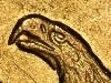
The coin in hand looks like the first photo, but when you tilt it just a bit, it picks up the red toning of the second photo. If you were going to display the coin, which image would you choose (or both)?


And where the hell is FatMan?
And where the hell is FatMan?
0
Comments
Russ, NCNE
Mark did.
The second one because it hides the scratches.
If I only had a dollar for every VAM I have...err...nevermind...I do!!
My "Fun With 21D" Die State Collection - QX5 Pics Attached
-----
Proud Owner of
2 –DAMMIT BOY!!! ® Awards
<< <i>Russ,how could you ever think that RYK could take a picture like that?!? >>
I'm optimistic by nature.
Russ, NCNE
<< <i>
<< <i>Russ,how could you ever think that RYK could take a picture like that?!? >>
I'm optimistic by nature.
Russ, NCNE >>
Well,not to put RYK down,but have you seen his pics lately?
Is the loss of contrast on the second photo slab reflection?
<< <i>Is the loss of contrast on the second photo slab reflection? >>
Yes. Only way to show the color was to shoot into the glare.
<< <i>Top is sharper, but makes the coin look like it's been cleaned with a number of hairlines. >>
Agree. The hairlines would spook me enough to be a deal breaker.
Didn't wanna get me no trade
Never want to be like papa
Working for the boss every night and day
--"Happy", by the Rolling Stones (1972)
<< <i>
<< <i>Top is sharper, but makes the coin look like it's been cleaned with a number of hairlines. >>
Agree. The hairlines would spook me enough to be a deal breaker. >>
The second picture is too "Goldbergoise" and would get you a return, though. Can't get anything in between?
Keeper of the VAM Catalog • Professional Coin Imaging • Prime Number Set • World Coins in Early America • British Trade Dollars • Variety Attribution
Keeper of the VAM Catalog • Professional Coin Imaging • Prime Number Set • World Coins in Early America • British Trade Dollars • Variety Attribution
My posts viewed
since 8/1/6
If I were considering a purchase of this piece, it's a whole different story. I'd like to be shown #1, which is much less forgiving of the coin's marks.
Agree. The hairlines would spook me enough to be a deal breaker.
There are a few contact marks. It is easily among the most original and most attractive AU-58's I have ever seen. Oh, Doug Winter thought so, as well.
Messydesk,
I like your hybrid image.
I have chosen to include both images (for now) on my website.
There are a few contact marks. It is easily among the most original and most attractive AU-58's I have ever seen. Oh, Doug Winter thought so, as well.
how can it be au58 with such an obvious scratch going through the hair?
if not a scratch, cannot one call that tooling? thus a BB.
otherwise i like it a lot. lots of luster for a D coin.
~~~~~~~~~~~~
Coin collecting is not a hobby, it's an obsession !
New Barber Purchases
2) I lit the coin for the photos with one light and a little diffusion to soften it up a little. I used one light to keep some contrast in the pics as circ coins tend to get washed out with more lights.
3) One light from about 11 o'clock will accentuate any marks that run at right angles to the light - thus the lines that you can see.
#2 makes it look cleaned.