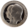
Too bright? Too much glare? Or ok?
 coinpictures
Posts: 5,345 ✭✭✭
coinpictures
Posts: 5,345 ✭✭✭
I think that this setting/setup captures detail well and has a good depth of field, but am not sure sure about brightness and color.
I think the coin is a VF by U.S. standards. What about UK? F?


I think the coin is a VF by U.S. standards. What about UK? F?

0
Comments
1/2 Cents
U.S. Revenue Stamps
WNC Coins, LLC
1987-C Hendersonville Road
Asheville, NC 28803
wnccoins.com
<< <i>What do you mean? >>
Details look mushy and the fields a bit rough - makes me wonder if it's a counterfeit. I have no expertise on these at all, just a gut feel of the image.
Picture is fine.
Coin is Fine, too, I would say. (By US standards, not by Brit standards).
DPOTD-3
'Emancipate yourselves from mental slavery'
CU #3245 B.N.A. #428
Don
<< <i>Nice coin and good image. >>
Darker Bronze and all bronze and copper can be hard to capture color, one thing that seems to help me is using the angeled glass tech niques with ligthing directly above the coin......