Home U.S. Coin Forum
Options

Toned coins..post one and/or explain your likes and dislikes.

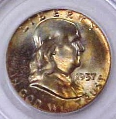
I've been contemplating the subjective nature of Eye appeal, with toning the main focus. Sort of a market psychology expedition. Here is an example of what I find attractive. I love the first one because of the mutitude of pretty colors. Especially for a 55 FRanklin. The second one (1956) Is a very pretty electric blue with a contrasting rim. Chrome like luster. The last is a very lustrous coins basically pretty golds with hints of blue. Just a very nice coin with no real wow factor, but very good for a Franklin.
If you have a picture of what you like best, please post it.
If you like it or hate it, please explain why. No flames or debates please, just honest opinions.
imageimageimage
Today's mighty oak is just yesterday's nut that held its ground.

Comments

  • fivecentsfivecents Posts: 11,207 ✭✭✭✭✭
    My favorite is the 1957 because of the fantastic underlying luster and nice even color.

    My 2nd favorite is the 1955 because of the cressent of wild colors to the left of the coin.

    I like the 1956, but it is my least favorite of the three. The luster doesn't look as strong as the other two and the colors are not as dramatic.
  • I like the rainbow colors on the 1955 the best......the 57 has a nice even mint set toning with good luster as previously mentioned...the 1956 does nothing for me and I would not pay a premium with that type of toning. I do feel it probably looks better in hand though!!!
  • Rainbow colors rule, but I like most any toning that is natural and attractive.image
    "Wars are really ugly! They're dirty
    and they're cold.
    I don't want nobody to shoot me in the foxhole."
    Mary


    Best Franklin Website
  • I love any toned proof Franklin.
  • This Washington is a most beautiful coin. I recently tried to have it graded with PCGS and it came back in a BB. Very dissapointed. The Roosevelt is an example of what I call natural toning, it came out of a fire in my house. BTW the only things that survived the fire was my collection.

    image
    image

    image
    image

  • I prefer the target toners, symmetry. I like to see how the colors enhance the "depth" of the coin. Like in the Buffalo I bought yesterday. The lighter colors are in the foreground, on the mound in particular, and the darker colors are underneath the Buffalo and in the background. If you look at any quality painting, the lighter colors are close and the darker ones are distant. Makes for depth of field. Pronounces the 3-D effect. But the only toners I dont like are artificial (if I can tell the difference) and blotchy ones.image
  • imageimage

    Bought this a few months ago.
  • A lot of my good toners are currently not in my possesion... image

    This is making me sad, cause I can only look at their pictures image

    Well, I do have this Buffalo at PCGS... it has nice album toning, but I'm concerned that there's some ATedness mixed into the album toning... it has this really vibrant blue, and I don't think that's a normal color on Buffs... but, we'll see what PCGS says... and if they say no, I'll try it at NGC image
    -George
    42/92
  • LeeGLeeG Posts: 12,162
    image Nice Coins shown by all!! This Frankie came in the mail today. The sellers photo showed some great luster. It's not the greatest photo so I wasn't really sure. Plus it had some great amber color. I look for eye appeal, luster, and some color in my coins. I'm not a "Monster Toning" fanatic. I'm showing the sellers photo and three of my pictures using different lighting. Lee


    Sellers Photo
    image


    My Pictures
    image

    image

    image
  • mgoodm3mgoodm3 Posts: 17,497 ✭✭✭
    My preferences for toning. I don't like mirrored proofs to be too darkly toned (silver), I think that it covers up the details and starts to get hazy. I love darkly toned copper of all kinds, but some of the proof toned copper can also start to get hazy and I don't like that.
    coinimaging.com/my photography articles Check out the new macro lens testing section
  • Dennis88Dennis88 Posts: 5,797 ✭✭✭
    Sometimes I do like them, especcially nice rim toning, but I think they are at this point waaaaaay overpriced.

    So I keep with white coinsimage

    Dennis
  • didn't always like toned cions till I saw some of the real beauties posted here. here's a dime end roll my wife found at the bank image
  • Found a more subtle toned Washington today. Goes from golden rim to the steel green to a redish purple in the middle, but softly. I like it.

    image
  • me likey this one:hotcha!
    "Wars are really ugly! They're dirty
    and they're cold.
    I don't want nobody to shoot me in the foxhole."
    Mary


    Best Franklin Website
  • coinlieutenantcoinlieutenant Posts: 9,319 ✭✭✭✭✭
    I post this pic alot but it is by far my favorite...

    I have yet to find a prettier AU58 half that the 1818...and the 32's arent bad either...

    image
  • calgolddivercalgolddiver Posts: 1,551 ✭✭✭✭✭

    one of my favorites :

    image


    an interesting cal gold toner :

    image
    Top 20 Type Set 1792 to present

    Top 10 Cal Fractional Type Set

    successful BST with Ankurj, BigAl, Bullsitter, CommemKing, DCW(7), Downtown1974, Elmerfusterpuck, Joelewis, Mach1ne, Minuteman810430, Modcrewman, Nankraut, Nederveit2, Philographer(5), Realgator, Silverpop, SurfinxHI, TomB and Yorkshireman(3)

  • MadMonkMadMonk Posts: 3,743


    << <i>Rainbow colors rule, but I like most any toning that is natural and attractive.
    image >>


    A great example of what I like best. Most of mine that had this type of toning are long gone. I don't
    feel too bad about it though, Payed for a nice down payment on a house and car.
    I do like Bushmaster's comment that Rainbow colors rule, but liking any toning that is natural
    and attrative. That's the rub with this hobby. Coins like this one are tough to find, and hideously
    expensive for the average working Joe.
    So, and especially with Franklins, some of us set builders do have to settle for natural and attractive.
    This is where it pays to really know your series. Then you can make educated judgements
    on the merits of a coin, as to how it compares to what is normally available.
    Today's mighty oak is just yesterday's nut that held its ground.
  • darktonedarktone Posts: 8,437 ✭✭✭
    originality and no question NT is what I like. mike image
    image
  • MadMonkMadMonk Posts: 3,743
    VERY sweet for a 57!
    Today's mighty oak is just yesterday's nut that held its ground.
  • tmot99tmot99 Posts: 5,238 ✭✭✭
    We need some smaller toners here. Let's try this...

    image
    image
  • darktonedarktone Posts: 8,437 ✭✭✭
    again how do you beat originality like this? image
    image
  • A face only a mother could love...

    image
  • MadMonkMadMonk Posts: 3,743


    << <i>again how do you beat originality like this? image
    image >>


    imageimageimageimage Where is the drool emoticon?
    Today's mighty oak is just yesterday's nut that held its ground.
  • darktonedarktone Posts: 8,437 ✭✭✭
    Did I ever show you my really nice ones?image
  • LongacreLongacre Posts: 16,717 ✭✭✭
    I prefer subtle toning, and I really like champagne colored silver.
    Always took candy from strangers
    Didn't wanna get me no trade
    Never want to be like papa
    Working for the boss every night and day
    --"Happy", by the Rolling Stones (1972)
  • here is one I got last year from dlc image
  • I'm not a big "Toned coin" lover but, I'm getting there....
    imageimageimageimageimageimage
    Constellatio Collector sevenoften@hotmail.com
    ---------------------------------
    "No Good Deed Goes Unpunished!"
    "If it don't make $"
    "It don't make cents""

Leave a Comment

BoldItalicStrikethroughOrdered listUnordered list
Emoji
Image
Align leftAlign centerAlign rightToggle HTML viewToggle full pageToggle lights
Drop image/file