Home U.S. Coin Forum

Nebraska quarter design "dreadful" by mint artists

I was really disapointed reading this article tonight. Omaha World Herald article

First the football team and now the state quarter design is bad too. Not a good year for Nebraska.image
What Mr. Spock would say about numismatics...
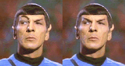
image... "Fascinating, but not logical"

"Live long and prosper"

My "How I Started" columns

Comments

  • I kinda like the Chief Standing Bear design - I hear the kansas quarter is a replica of the buffalo nickel, somewhat.


  • << <i>I kinda like the Chief Standing Bear design - >>


    I do too now. I liked one with Chimney rock but not after seeing what the mint suggest it look like. I like what the guy said about the designs looking like something from a coloring book.image
    What Mr. Spock would say about numismatics...
    image... "Fascinating, but not logical"

    "Live long and prosper"

    My "How I Started" columns
  • It'll just go into that category of laughable states and laughable designs, like Wisconsin, Iowa, and Alabama.

    Edited to mention: the Standing Bear is the best, but will never fly with "Equality before the Law."
    to live outside the law, you must be honest ---- bd
  • anablepanablep Posts: 5,096 ✭✭✭✭✭
    They're "aight"
    Always looking for attractive rim toned Morgan and Peace dollars in PCGS or (older) ANA/ANACS holders!

    "Bongo hurtles along the rain soaked highway of life on underinflated bald retread tires."


    ~Wayne
  • coppercoinscoppercoins Posts: 6,084 ✭✭✭
    Very few of the statehood quarter designs actually have any artistic merit, and none of them are fantastic. Artistically the whole series is a big belly flop. Some worse than others.
    C. D. Daughtrey, NLG
    The Lincoln cent store:
    http://www.lincolncent.com

    My numismatic art work:
    http://www.cdaughtrey.com
    USAF veteran, 1986-1996 :: support our troops - the American way.
    image
  • MyqqyMyqqy Posts: 9,777
    I agree that most of those suck. I like the standing bear design best, but find it unbearably ironic that a design would incorporate a native american and the words "equality before the law"..... maybe that should read "equality before the law.... if you're a white male".......
    My style is impetuous, my defense is impregnable !
  • For every person that dislikes a coin design, there is one that will like it.

    How many designs and years of time would they have to spend until they got one that everyone agreed to??
  • I like the Chimney Rock or the Chief. Both decent designs. Could have been a lot worse.
  • CoinHuskerCoinHusker Posts: 5,033 ✭✭✭
    one of those looks familiar to me for some reason. image
    Collecting coins, medals and currency featuring "The Sower"
  • I agree with that newspaper -- those designs really bite it. Hey, what ever came of the 50-state quarter design race on this forum? What are the standings?
    Realtime National Debt Clock:

    image

Leave a Comment

BoldItalicStrikethroughOrdered listUnordered list
Emoji
Image
Align leftAlign centerAlign rightToggle HTML viewToggle full pageToggle lights
Drop image/file