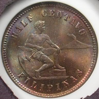
coin photo: before and after, opinions?
not happy with my overexposed NGC-MS65BN, 1904 U.S.-Philippines half centavo. Took several shots last night; finally sttling for a shot on 2048 size, medium black slab covering(letting some of the white in to partially confuse the camera!), moderate light and taking the shot from 3" away(not 1.75" minimum where the light is too intense). I think I got the right balance of proper brightness, toning and luster. These ngc holders are a killer! Opinions on other options I have?


0

Comments
The second picture is more appealing to me, but I doubt thats a useful criteria unless your goal is to make artwork.
designset
Treasury Seals Type Set
They look good. Here they are tweaked a bit with Photoshop:
How do they look in comparison to the real coin?
Great transactions with oih82w8, JasonGaming, Moose1913.
Your reverse image is beautiful. I prefer it to the PhotoShoped version MS70 posted, though he did a great job. You could take hundreds of images of that obverse before finally shooting it to your satisfaction. Makes you appreciate what photographers who work for major dealers/auction houses struggle with on a daily basis, they don't get paid to take hundreds of pics of the same coin.
I've always felt that an image that needs more than minor tweeking in photo editing software needs to be shot again. Your image of the reverse is a bit dark but I sense the luster and wonderful underlying color was nailed. When you start jacking up the brightness in Photoshop those qualities become watered down. For every correction Photoshop makes in one area, in this case brightness, other qualities suffer, in this case contrast. Trying to counter the added brightness with added contrast doesn't work, it starts an endless cycle of image quality loss. Photoshop should only be used as a minor compliment to your camera. When you start using it to recreate images that weren't shot well to begin with it's time to send the pic to your waste basket.
designset
Treasury Seals Type Set