Home U.S. Coin Forum

5 designs for Nebraska Quarter head to the Mint.

I guess the voting is over on the Neraska Quarter. 5 designs were picked and are being sent to the Mint for them to pick one out. Link to story


I have a funny feeling it's going to be the one of the state capitol. Yuck! image
What Mr. Spock would say about numismatics...
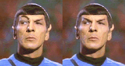
image... "Fascinating, but not logical"

"Live long and prosper"

My "How I Started" columns

Comments

  • TheNumishTheNumish Posts: 1,628 ✭✭
    IMHO the Chimney Rock and covered wagon is by far the best.


  • << <i>IMHO the Chimney Rock and covered wagon is by far the best. >>

    image I also like the one on the left on the bottom...
    -George
    42/92
  • jomjom Posts: 3,441 ✭✭✭✭✭
    I like either the top left or bottom left.....

    jom
  • LanLordLanLord Posts: 11,714 ✭✭✭✭✭
    I like the one on the top left. Why are images of Chimny rock so different on a couple of the coins? Does it look that differently from different angles?
  • I like the one on the top left also. But they are all better than the one with the state outline.
    Even states who have never been known for a unique state outline (like Texas or Florida for example) are including designs with state outlines. It is truly amazing. They almost all look like total crap.
  • mgoodm3mgoodm3 Posts: 17,497 ✭✭✭
    Top left is best
    coinimaging.com/my photography articles Check out the new macro lens testing section
  • CoinHuskerCoinHusker Posts: 5,033 ✭✭✭


    << <i>Why are images of Chimny rock so different on a couple of the coins? Does it look that differently from different angles? >>


    Just a guess, but I think one image may be portraying Chimney Rock 100 years ago, the other a more comtemporary image of the rock. Erosion has been taking it's toll.

    As you can guess I'm a little bias in my choice. The one with Chimney rock and wagon...besides it looks a lot like my icon!image
    Collecting coins, medals and currency featuring "The Sower"
  • anablepanablep Posts: 5,097 ✭✭✭✭✭
    Covered wagon looks the best IMHO.

    All others a distant 2nd

    except the state outline, a very distant last...

    which is why they'll pick that one for the design image
    Always looking for attractive rim toned Morgan and Peace dollars in PCGS or (older) ANA/ANACS holders!

    "Bongo hurtles along the rain soaked highway of life on underinflated bald retread tires."


    ~Wayne
  • I think it is funny that Nebraska is trying to make it look as if it not actually flat, at least by western standards, with most of the designs.
  • FlashFlash Posts: 1,090 ✭✭✭
    I prefer either the top left or the top middle coin.
    Matt
  • CoinHuskerCoinHusker Posts: 5,033 ✭✭✭


    << <i>I think it is funny that Nebraska is trying to make it look as if it not actually flat, at least by western standards, with most of the designs. >>


    I think someone entered a design of flat prairie, with nothing but grassland to the horizon but it was rejected. wonder why? image
    Collecting coins, medals and currency featuring "The Sower"
  • sumnomsumnom Posts: 5,963 ✭✭✭
    The mint will choose the sower, minus the sower. Only the state outline will remain.
  • Well so far of those that have expressed an opinion Chimney Rock with the covered wagon is winning 8 out of 8 with the Chimney rock/capitol/indian second with 3 out of 4 votes for second place.

    I'l add my vote of Chimney Rock/wagon top choice (9 out of 9), but for second I like the rock/capitol design. (nicely balanced and an interesting cortrast of the natural spire and the man-made one. I think the indian on the bottom left one just adds clutter.) So for second the bottom left is now 3 out of 5. The state outline is still dead last.

  • No B-52? image

    All the rest are as good as IL.

  • tincuptincup Posts: 5,124 ✭✭✭✭✭
    I have to go with the majority on the covered wagon. A nice design. I agree the design with the Indian looks covered. But I saw a drawing of this design earlier, and it looked much better. I think it would depend on the final engraving and how they could balance it out by reducing some images, etc.

    At least the final selections do not have a cow's head like Wisconsin?!
    ----- kj
  • tincuptincup Posts: 5,124 ✭✭✭✭✭
    ok, ok... my spelling sucks when I am in a hurry! I meant to say the design with the Indian was crowded, not covered!! image
    ----- kj
  • I like both the top left and bottom left.

    Sorry sower. Ugh. Also don't like just the capitol building.

    -KHayse
  • flaminioflaminio Posts: 5,664 ✭✭✭
    Put me down for upper left as well. The rest are abysmal, especially the SO one.

    image
  • The one on the upper left is the least fugly.
  • Of course the final design probably won't anything like any of these. Remember the mint engravers will not see ANY of these designs. All of them have to be submitted as WRITEN descriptions, NO ARTWORK.

    (Chimney Rock/wagon is at 13 for 13 now.)

Leave a Comment

BoldItalicStrikethroughOrdered listUnordered list
Emoji
Image
Align leftAlign centerAlign rightToggle HTML viewToggle full pageToggle lights
Drop image/file