Options
1976 Vending Set Purchase
 PaulMaul
Posts: 5,001 ✭✭✭✭✭
PaulMaul
Posts: 5,001 ✭✭✭✭✭
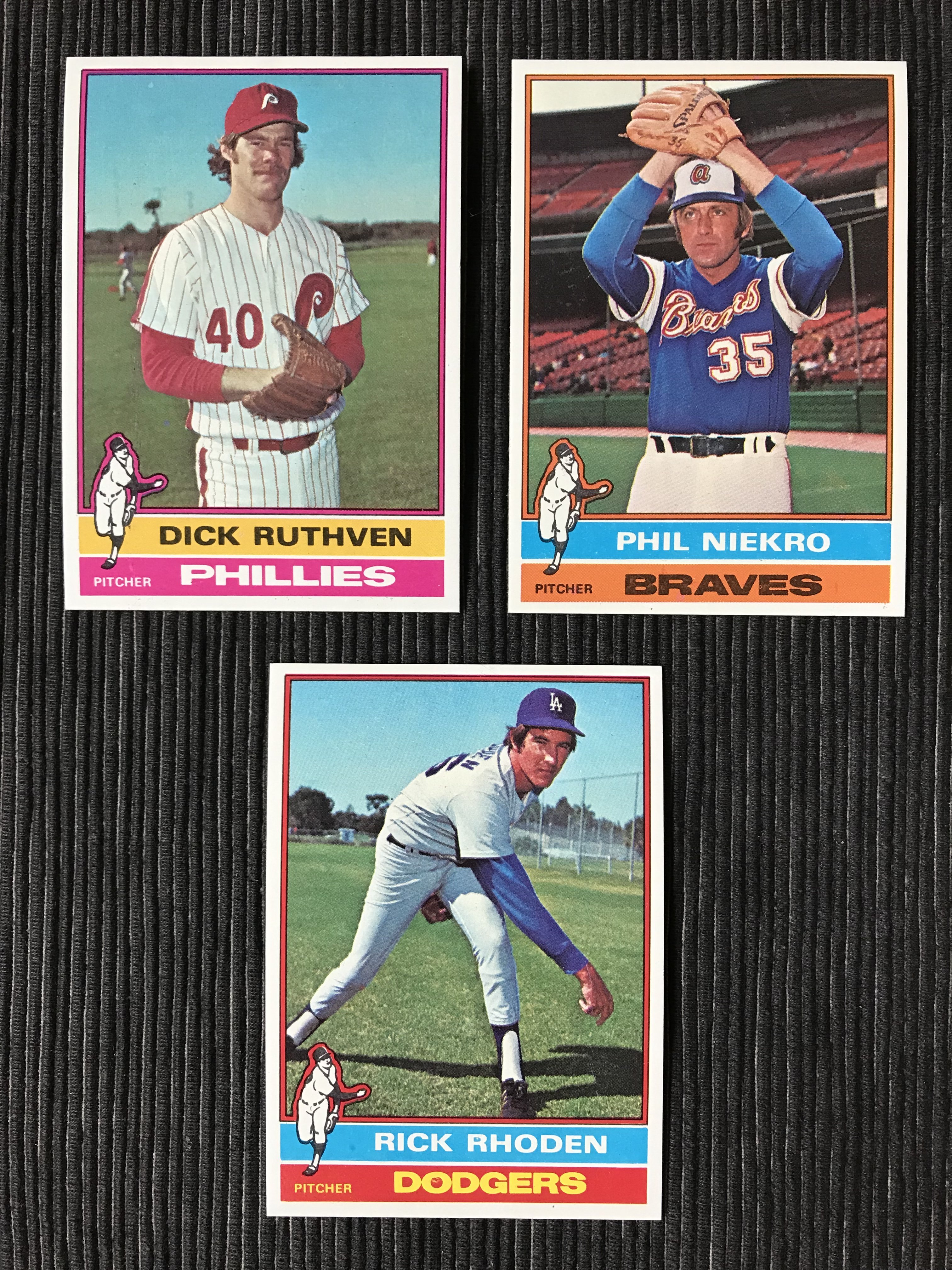
Way back in 2002, I won a 1976 baseball set at auction on eBay. The set was advertised as a vending set, and looked nice from limited photos.
I ended up winning it for only 200 bucks. I think this may have irritated the seller, because he shipped the set in a long card box largely unprotected. As a result, a bunch of the cards incurred a dinged corner during shipping.
Most of the stars were not that well-centered, but at the end of the day I retained about 25% of the set, which I still have today. The well centered, undamaged cards are beautiful with fantastic color saturation. If only the entire set could've been this nice!!
10
Comments
Nice cards. Can you show more photos for the hall of famers.
I no longer have most of the hall of farmers, as they were not well centered. I probably have a few 2nd tier HOFers like McCovey. I’ll have a look.
The colors on your look as rich as the proof cards. Nice registration as well.
It's the singer not the song - Peter Townshend (1972)
Not even a minute do I buy the whole buh buh buh I'm a man-child japery - Me (2025)
I had a few more than I remembered, mostly 2nd tier. The ones that are well centered (Perez, Sutton, Simmons, Gossage) are exceptional.
Beautiful cards. I'm surprised the seller would have been upset with $200 back then. On the lower side, yes, but not dirt cheap for a 1976 set back in 2002. I remember picking up a NM-MT set around that time for a similar price.
Collecting 1970s Topps baseball wax, rack and cello packs, as well as PCGS graded Half Cents, Large Cents, Two Cent pieces and Three Cent Silver pieces.
Amazing color on those 76's. There is something really special about how Topps used color in the 70's on the design of their cards. Of course, they also had the best photography ever seen on sports cards before or since.
This will always be my favorite set of all time. Just great colors and perfect photos to match the design and color scheme. (The eritage set did NOT understand how to capture that mix).
Yours are amazing. Perfect coloring.
One more for @Yankees70!
Very nice. Catfish was awesome in his prime. He won 20+ games five straight seasons from 1971-1975. I remember watching him pitch in person against the California Angels in 1975. He pitched 10 innings for a complete game win.
Assume you never bought from that seller again if he did intentionally muck up the packing, or lack of. Not a great way for a seller to build a positive customer base.
how was the ryan and rose cards do you still have them. really great looking set.
I don’t remember what those two were like, but if they were nice I would still have them, and I don’t. 🙂
And of course the Brett and Eckersley.
Yeah, I have no major stars except the Bench which is nice but not that well centered.
the opc 1976's have crazy bad centering. And the topps aren't much better.
I've never visited the Hall of Farmers. Must add to bucket list.
Also, Aarons last card. Hard to find centered.
It's a shame we never got this as his last card.
Yeah, those are hard to find . I think they are in those 77 Christmas packs .🎄
I think every 70's card has centering issues. OPC had other issues as well. Bad gum including..
First time I've seen that one.
I looked at two dozen 1976 Steve Carlton cards at the most recent Philly Show. That is one tough card to find centered and without print marks on the lower border.
Erik
That's a really nice Simmons example. That's a tough 9.
I haven't really checked carefully, but I have noticed a few nice lower pop commons.
Nice Pierce but the black print spots in the name/team plate might prevent a 9.
True, I’m not particularly bothered by things like that so I often miss them, and they’re often the very reason for the low pop. 🙂
That Pierce is just an amazing card. So cool.