Options
TrueView vs GreatPhoto
 Samets
Posts: 387 ✭✭✭✭
Samets
Posts: 387 ✭✭✭✭
Just for fun I love admiring and comparing the art form that is coin photography!
Here's my latest purchase that happens to have both!
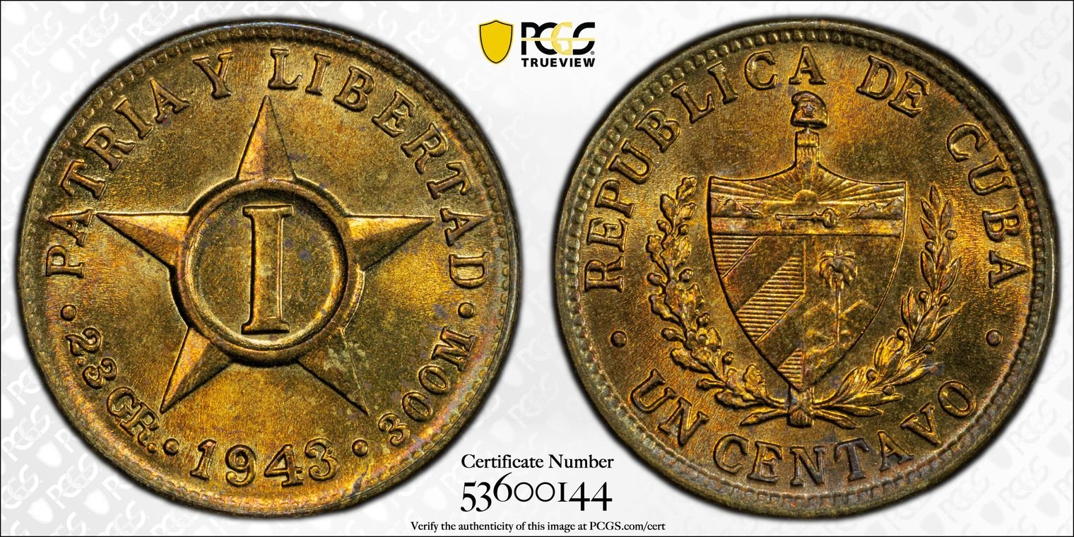
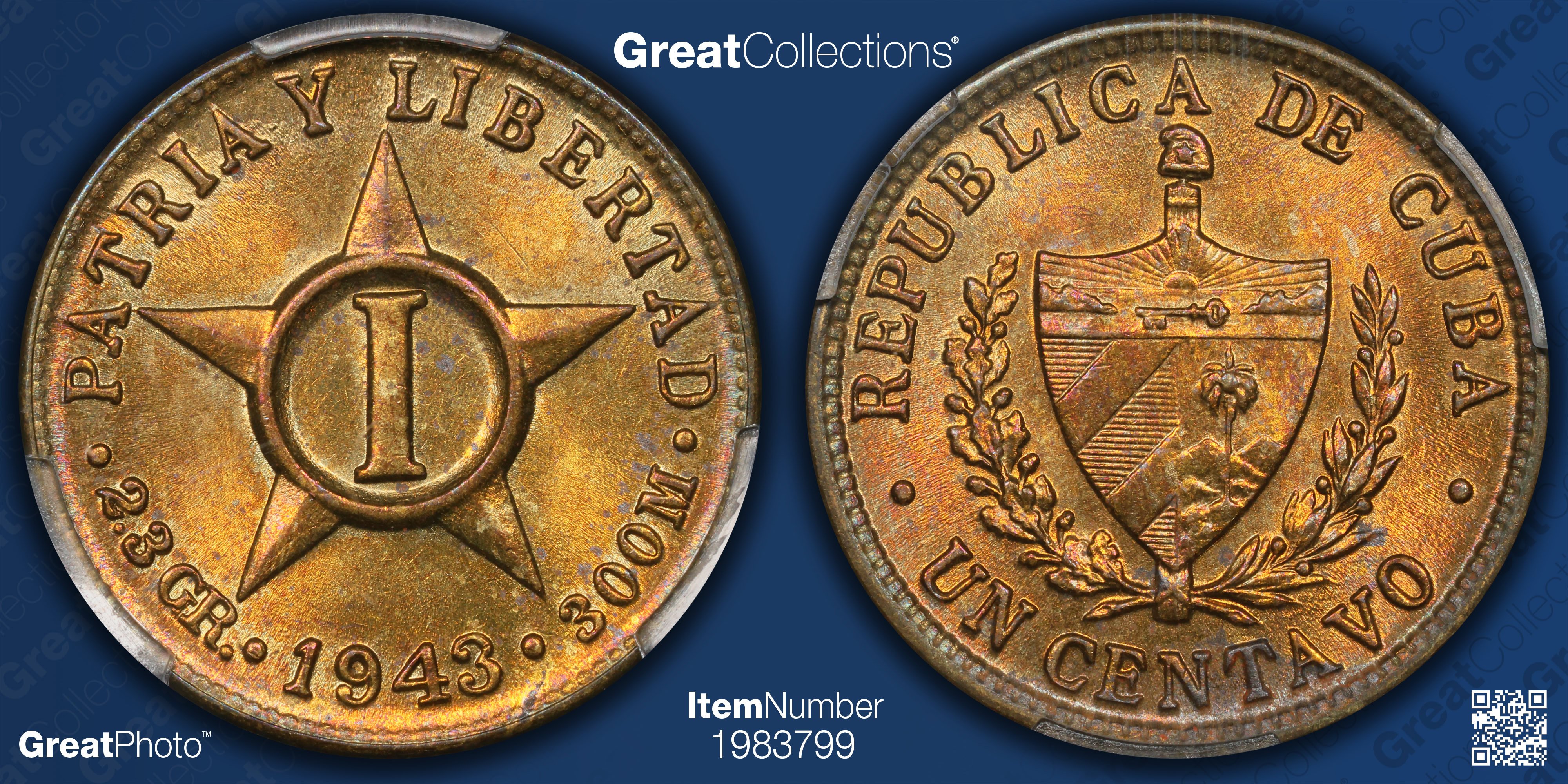
Enjoy!
6
Comments
The ultimate photo battle of Phil vs Phil
@Samets - which photo best represents the coin in hand?
The Tru-View may not be a Phil image.
Life member #369 of the Royal Canadian Numismatic Association
Member of Canadian Association of Token Collectors
Collector of:
Canadian coins and pre-confederation tokens
Darkside proof/mint sets dated 1960
My Ebay
For this one, like the GreatPhoto better.
It’s not. The last coins I shot at PCGS had 47XXXXXX cert numbers. Maybe a few 48XXXXXX certs, but not many.
Phil Arnold
Director of Photography, GreatCollections
greatcollections.com
Here’s a likely me vs. me TrueView and GreatPhoto.
Personally I like the GreatPhoto better.
Phil Arnold
Director of Photography, GreatCollections
greatcollections.com
Out of curiosity, is the equipment at GC same as PCGS? I guess I'm just wondering if the post photo editing is at play vs pure equipment difference.
@PhilArnold I always heard the PCGS serial numbers were purposely not consecutive. In other words, they occasionally jump around. Is this true?
Maybe this was a NGC thing, not PCGS.
@PhilArnold I have to say that in the example you show, they look quite similar.
Gorgeous 1859 cent. To my eye the Great Photo shows more depth and is slightly brighter. Maybe from shooting thru the slab?
Life member #369 of the Royal Canadian Numismatic Association
Member of Canadian Association of Token Collectors
Collector of:
Canadian coins and pre-confederation tokens
Darkside proof/mint sets dated 1960
My Ebay
There are some similarities, but key hardware and software differences.
Phil Arnold
Director of Photography, GreatCollections
greatcollections.com
Without seeing the 1859 coin in hand, I like the Trueview image.
DPOTD-3
'Emancipate yourselves from mental slavery'
CU #3245 B.N.A. #428
Don
Judging from the almost closed gap at leaf 7, this was a VERY early '59 strike from the master to the die. It may not have taken many more to open it up some, and then open up more toward the end. The gap at 13 was always there, after the first 2-3 dies struck for 1858.
Here’s a comparison to a more recent TV.
The coin has fantastic blue toning in hand.
Phil Arnold
Director of Photography, GreatCollections
greatcollections.com
Well I know which one I like better…..Phil, I assume there’s a method to the madness in terms of background color. Or not?
Did you select the blue background for your work at GC? Interested in your thoughts on the impact of the blue GreatPhoto background, which I usually find superior to present day TVs with the white background (also used when you were there), and certainly do in this case as well.
Hopefully I’m not asking for any trade secrets here, and if I am please ignore!
@MEJ7070 The blue background color is pretty much a result of GC’s blue branding. Thankfully the color worked well as a background color.
Phil Arnold
Director of Photography, GreatCollections
greatcollections.com
The 50 centavos example is very difficult to judge to me without seeing the original coin as those tone very differently. But nice pictures nonetheless.
Phil. your pictures continue to be amazing and without peer.
GreatPhoto look like the coin in hand.
Cool thread, I enjoyed looking at the comparisons
Mr_Spud
A new example featuring a huge rarity coming up. This is the hardest coin I’ve shot in a holder, but I feel it’s more true to life than the TV I shot years ago. The lustrous blues come out a lot more clearly. I like some of the eagle details a bit better in the TV, but it doesn’t show as much of the blue or specimen quality.
Phil Arnold
Director of Photography, GreatCollections
greatcollections.com
Wow! What a coin!
What a toss-up between choosing the better set!
Although the GC image shows true color, it also looks a bit washed out in regards to the details on the head but the reverse shows the wing behind the head whereas TV seems to be missing that detail in the photo yet the feather details are more pronounced on the TV photo.
I'm torn on this one! Just goes to show how much difference can be seen depending on equipment and post processing.
I have a question maybe someone here can answer. Many of my coins have TVs and they render full page in PCGS inventory when expanded. I tried uploading pictures for my non-TV coins in the same format as TVs but they only render as about 1/4th screen size in the center. The pictures I am uploading have the same size, resolution and so on as the PCGS TV ones.
@koincollect - I think it's by design. Makes you spend the money to get the TV for the larger pictures...