Space Font Used
 Onastone
Posts: 4,207 ✭✭✭✭✭
Onastone
Posts: 4,207 ✭✭✭✭✭
The mint doesn't mention it, but they used a very decisive font on the new Florida Innovation Dollar...
created just for NASA in 1975...NASALIZATION...featuring open letters and spacey rounded edges...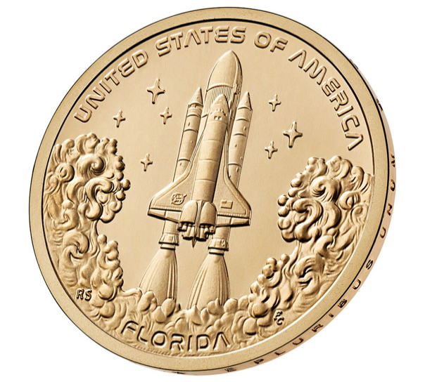
12
Comments
My rolls arrived today!
Coins are Neato!

"If it's a penny for your thoughts and you put in your two cents worth, then someone...somewhere...is making a penny." - Steven Wright
The P&D rolls are almost sold out.
D has less than 100. P just over 200 rolls left.
.
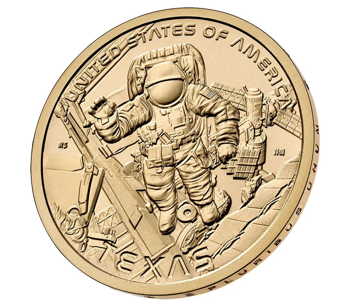
Same thing with the Texas $1 coins coming out this summer. I like the NASA Font.

.
Finally! A coin that actually looks good with little bag marks and scratches, it actually looks like space debris, meteors, galaxies, and planets. Some of those look better than the stars included in the design!
Nice catch @Rc5280 , now we'll have two coins with this unique space signature.
I like these, I jut bought a few rolls of both. #FLrepresentin'
Founder- Peak Rarities
Website
Instagram
Facebook
Good timing Dan, the D's are gone and the P's have 150 left.
Just to give a little recognition to the originators of the font (from a Google search):
The "worm" NASA logotype, introduced in 1975, was designed by Richard Danne in partnership with Bruce Blackburn.
Fifty year anniversary!
These are back up after being unavailable just a few days after release a couple of weeks ago.
Very limited supply this go around fyi...
https://www.usmint.gov/american-innovation-1-coin-2025-rolls-and-bags-texas-MASTER_INNOVATIONTX.html
The font was used to create the iconic second generation NASA logo, called, "The Worm". (The first generation NASA logo was called, "The Meatball").
U.S. Type Set
Got a few...I looooove them
Coins are Neato!

"If it's a penny for your thoughts and you put in your two cents worth, then someone...somewhere...is making a penny." - Steven Wright
Those coins look nice.