Options
Is this 1915 buffalo nickel a proof or uncirculated?
 BUFFNIXX
Posts: 2,759 ✭✭✭✭✭
BUFFNIXX
Posts: 2,759 ✭✭✭✭✭
Here is a nice 1915 buffalo nickel that some collector is offering for sale as a proof. I know that a great many 1915 proof buffalo nickels have an “arcing die crack” running across the buffaloes back and this has it. It is difficult to determine this from just the
picture so I was wondering what others thought. I tend to think it is but am just not 100 percent sure. What say you? Thanks!!
Tom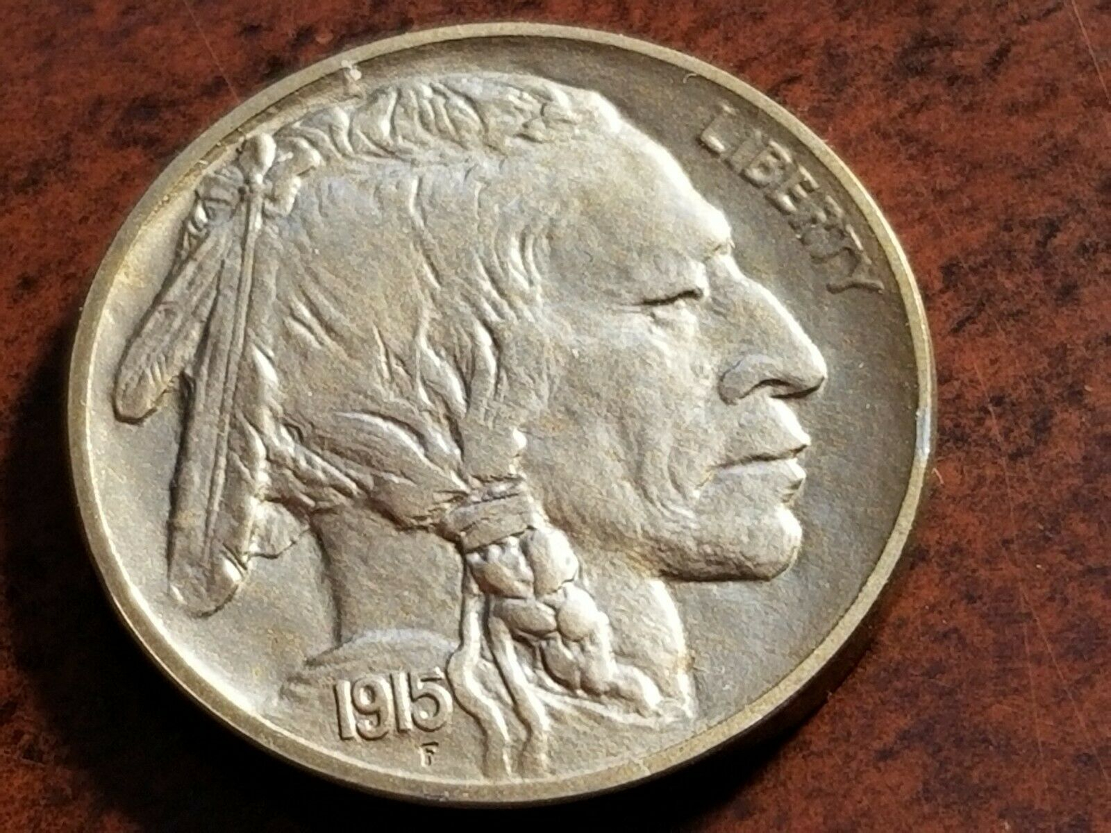
Collector of Buffalo Nickels and other 20th century United States Coinage
a.k.a "The BUFFINATOR"
a.k.a "The BUFFINATOR"
4
Comments
Except for the reverse rim from 9:00 to 1:00 it looks like a proof. Strike and surfaces are there. Obverse rim is there. The edges will tell. Gotta ask, tho-why ain't it slabbed? If he's asking proof money I'd want to see it in a top tier slab. It must be remembered that proof dies were often used to strike business strike coins once they were no longer fit to strike proofs as well.
It does have the appearance of a proof... If this were a poll, I would vote yes. Cheers, RickO
Looks like a proof to me. There are many reasons why it may not be in a slab - one of them being it is from an estate and the seller does not want to pay to get it slabbed. I collected most of my coins pre-slab days and they have been in albums in a bank SDB for many years.
So how do you tell the difference?
The lettering, in particular, makes me think business strike.
Mark Feld* of Heritage Auctions*Unless otherwise noted, my posts here represent my personal opinions.
It really looks like a proof. I am not a buff expert but deal with a fair few, and it definitely has a different "look". That being said, it also has tilt angle photos. There could be a lot of problems lurking. I think it's definitely worth a flyer as long as you're comfortable with a gamble and leave yourself plenty of upside. I wouldn't pay straight grade proof price for it.
Aercus Numismatics - Certified coins for sale
I agree, there may be hidden problems. I don't like the area just above the ribbon tie. Could be some type of damage, but then maybe not. This is a coin you need to see in person.. i guess you could send it back if you don't like it. Judging from the sellers feedback and he does allow returns, you would only be out the postage.
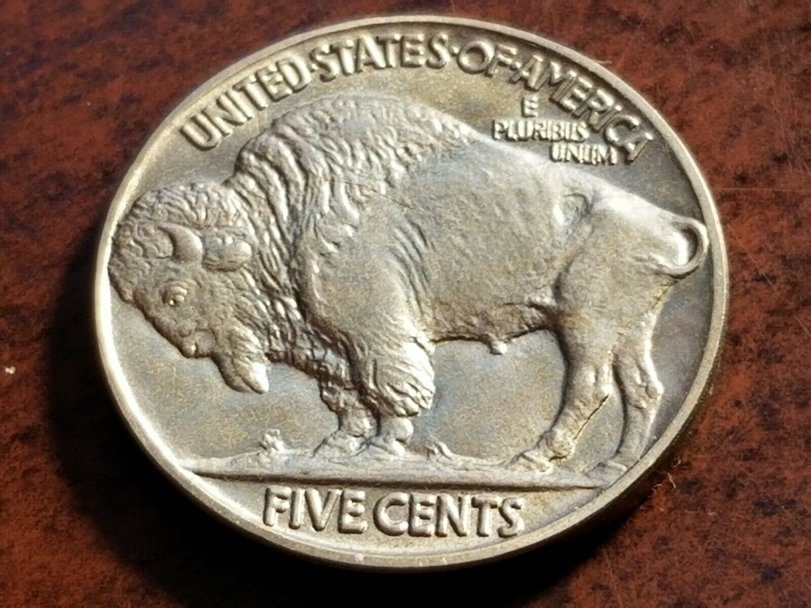
Let’s see some good photos or the rims. Matte dies have a unique surface, the collars are polished. Not familiar with Matte buffalos, but certainly there are recorded diagnostics for 1915?
OK. Here’s an old thread from another forum which gives good info regarding specific die markers you can use. https://www.coincommunity.com/forum/topic.asp?TOPIC_ID=39830
It looks like a business strike to me. There are a lot of hammered 1915 buffs.
There also appears to be a repair made to the obv rim at 3 o’clock.
Here’s another link to another forum with a diagnostic. https://coins.coolkarma.com/?p=800. This shows a reverse rim proof die diagnostic which is clearly seen on the OPs coin.
That makes it a bus strike made from proof dies. I have one of those as well. It has all the die markers but lacks the wide, square rims.
1915's come really well struck. You would have to look at the edge, it should be more reflective than a circulation strike. Seems that the medal presses had smoother collars than standard presses.
Collector, occasional seller
That mark goes back to 1913. I think it is an artifact of the hub or a master die.
Collector, occasional seller
Ron is, of course, correct. It should be encapsulated.
Slab it, Danno!
Pete
That area near 3:30 could be corrosion or PVC damage.
I would not pay $1200 for this raw coin, and not sure how much I would even offer. It is their problem not yours. Maybe lowball and suggest certifying or ask for approval type purchase.
On a proof the rims are wider than on a circulation strike as seen here (circ strike first.) This is not as distinctive as it is on the matte Lincoln cents but it is discernible.
I agree with others above about the 1915 issue-it typically comes with an excellent strike and can be very deceptive.
Up to you but I do not belive that it is a proof.
Looks like a business strike to me.
I don’t know how the OPs coin can have wider stronger squarer rims than it has, but I DO understand the need on this forum to disagree with what they see. Crazy.
Look at the reverse rim. It doesn't quite "make the grade" IMO.
It's the edges that will make it or break it.
3:00 obverse rim...what is that? Solder? Duct tape?
Among other areas, does the detail in the lettering, date, braid and ribbon on the subject coin look as sharp to you as it does on these? :
https://www.pcgs.com/coinfacts/coin/1915-5c/3992
Mark Feld* of Heritage Auctions*Unless otherwise noted, my posts here represent my personal opinions.
That is what I was referring to in a post above. It would not even straight grade IMO. Without that its an MS64, which is a $100 coin.
Proof. Probably PR65 if slabbed.
I think the strike is just the tiniest bit deficient for a proof, especially on the reverse. Not all MP are 100% fully struck, tho. But this is just an overall deficiency on the entire bison.
Edited to add-as long as there's a return privilege it might be worth a shot.
That is a hard call I don't know if that is the arching die crack or a lamination it looks like it is inline from the shoulder to the center of the tail not going down over the ribcage toward the rear legs the sharp edge and the look of the coins edge is the key the seller should send you a picture of the coin standing on edge if not I would pass or there must be a reason it is not slabbed. JMO.
Eagle eye @JBK as I'm zooming in on that silver-grey spot! Wassup. Peace Roy
BST: endeavor1967, synchr, kliao, Outhaul, Donttellthewife, U1Chicago, ajaan, mCarney1173, SurfinHi, MWallace, Sandman70gt, mustanggt, Pittstate03, Lazybones, Walkerguy21D, coinandcurrency242 , thebigeng, Collectorcoins, JimTyler, USMarine6, Elkevvo, Coll3ctor, Yorkshireman, CUKevin, ranshdow, CoinHunter4, bennybravo, Centsearcher, braddick, Windycity, ZoidMeister, mirabela, JJM, RichURich, Bullsitter, jmski52, LukeMarshall, coinsarefun, MichaelDixon, NickPatton, ProfLiz, Twobitcollector,Jesbroken oih82w8, DCW
From what I can see it’s a very well struck business strike. Just the lettering alone is too weak to be a proof. Looks like it was an early strike with a proof die. Nice Buff but no cigar.
Regarding the return privilege: I don't see anything so misleading from these pictures that the OP would know for sure in hand whether the coin is proof or business strike, so he'd need to submit it to our host rather than eyeball it before returning it.
I think the OP has enough knowledge about this type of thing to tell if it's a proof or not. As I said-the edge will make it or break it.
At $1200, the coin would be a bad deal, unless it were to grade Proof 65 or better. Based on the images/questionable Proof status, I think it would be a poor wager.
Mark Feld* of Heritage Auctions*Unless otherwise noted, my posts here represent my personal opinions.
I'm no expert but I think it's a proof that's been overdipped.
"“Those who sacrifice liberty for security/safety deserve neither.“(Benjamin Franklin)
"I only golf on days that end in 'Y'" (DE59)
Totally agree. That's the type of coin that I wouldn't have any interest in unless it were slabbed by a major grading service or it was priced dirt cheap.
Worry is the interest you pay on a debt you may not owe.
"Paper money eventually returns to its intrinsic value---zero."----Voltaire
"Everything you say should be true, but not everything true should be said."----Voltaire
Not enough 'meat' on the strike especially on the braid for a proof imo. One that I would pass on if indeed a proof.
I am in the group that think it a business strike struck with proof dies. But the surfaces look rather dull to me, but that could be typical for matte proof planchets. Compared to the proof 1915 Buffs in CoinFacts it just does not seem to have the right look.
Lettering SHOULD be bold and blocky. Not a proof coin.
My 1913 T2 Proof has that line on the reverse rim.
it seems that the experts on grading and the Buffalo Nickel series that have given an opinion in the thread are in agreement on this coin, I would trust that judgement and pass. to me it looks like just a well struck, monkeyed with Mint State coin.
I say send it in to our hosts. Either way you got a coin that's worth the cost of slabbing.
At the time the thread was started, the OP said the coin was for sale (not that he owned it, to be able to send it in).
If he ended up buying it or buys it later, I think there’s an excellent chance he’ll send it in.😉
Mark Feld* of Heritage Auctions*Unless otherwise noted, my posts here represent my personal opinions.
May be impaired proof. Looks like a scratch above Buffalo shoulder and possibly a trace extending back to his tail. Might be more obvious from different angle
IMHO it is not a Proof.
I look at the surfaces and really cannot see any contact marks. That tells me this coin, from the die strike onward, received special care and attention. This is typically how proof coins are treated.
Lots of proof coins exhibit marks/flaws. At the same time, many business strikes have received special care and attention and are extremely well preserved. As another poster mentioned, there looks to be a rather large hairline scratch on the reverse of this one. And based on the odds, there’s a good chance that if you held it in hand and tilted and rotated it under a light, you’d see other flaws.
Regardless of its state of preservation, the coin does not look well enough struck to be a Proof. And I’m far from the only one with that opinion.
Mark Feld* of Heritage Auctions*Unless otherwise noted, my posts here represent my personal opinions.
11....is. 14.....isn’t. In hand opinion. 1....is (seller).
Yes my mistake. I guess I got too distracted by the coin porn lol!
Hmmm, not my series but based on the photo would see it being worth certainly more than $100, regardless of it possibly being a very pleasant-looking business strike!
Well, just Love coins, period.
But do you think the coin is certainly worth $1100 more than $100? The seller is asking $1200.
Mark Feld* of Heritage Auctions*Unless otherwise noted, my posts here represent my personal opinions.
True, but because of the above quote was responding in that there can be "base" prices of sorts for coins that are aesthetically pleasing - which is why often some slabbed "genuine" coins are worth adjusted purchase prices IMO.
Well, just Love coins, period.
I’d be willing to bet cold cash it’s NOT a proof. That’s how sure I am. Just look at the lettering on Liberty on the obverse. Just that alone screams it’s not a proof coin.