Options
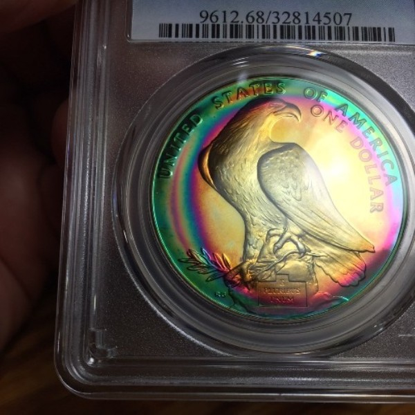
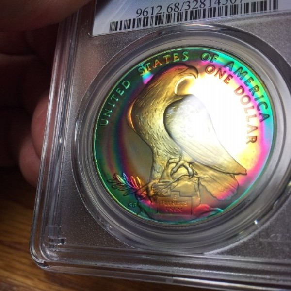
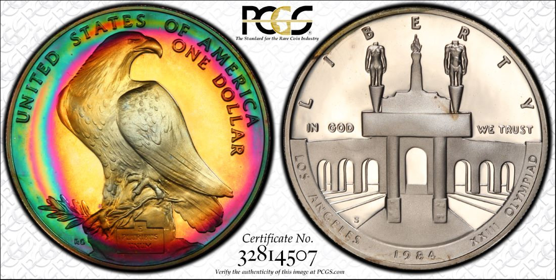
Some Iphone pictures and a TrueView of the same coin.
 bolivarshagnasty
Posts: 7,359 ✭✭✭✭✭
bolivarshagnasty
Posts: 7,359 ✭✭✭✭✭
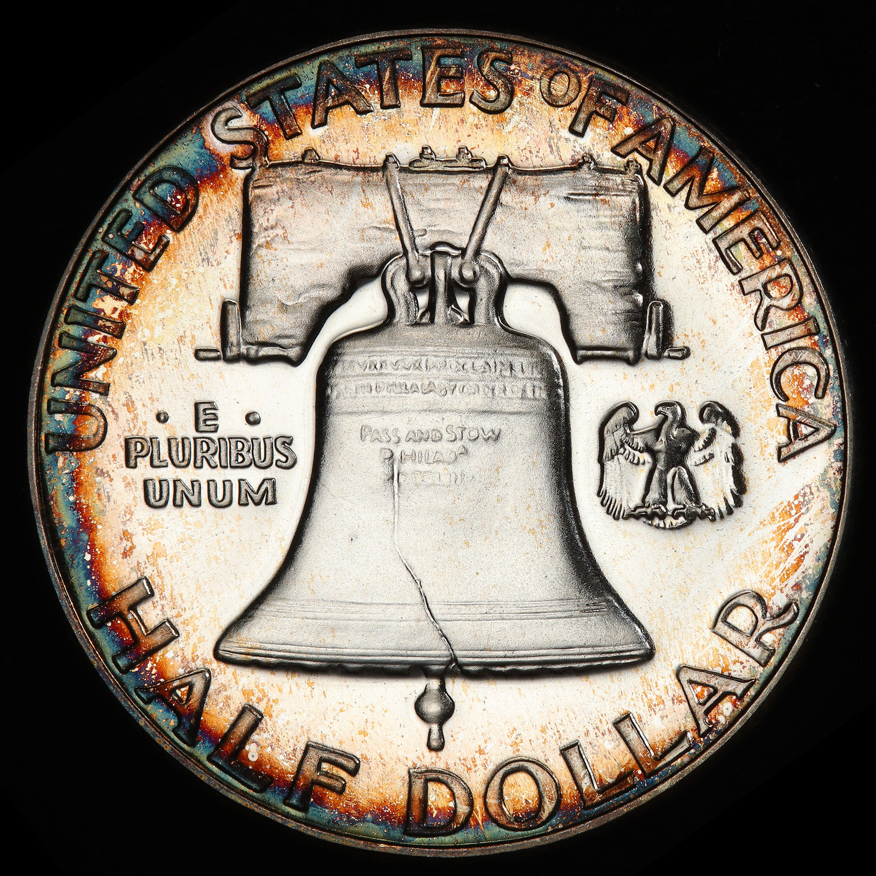
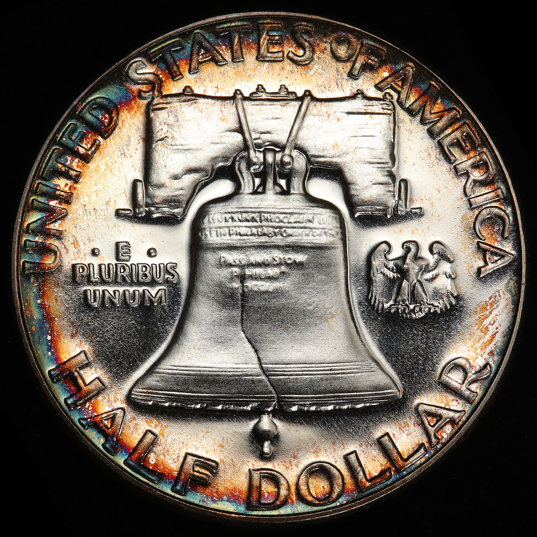
I've always lamented the fact that the TrueViews do a phenomenal job of capturing color, BUT on proof coins don't capture the reflectivity and luster. The pics taken with my Iphone hopefully show what I'm talking about. Just messing around this evening.
*
*
*
9
Comments
Not bad.
I do agree with you but I would take either image of that fantastic coin!
.
CoinsAreFun Toned Silver Eagle Proof Album
.
Gallery Mint Museum, Ron Landis& Joe Rust, The beginnings of the Golden Dollar
.
More CoinsAreFun Pictorials NGC FOR SALE
Either way, it's very nice !!!")
I agree on proof coins. I have a several nickels that have great color and luster and are really tough to photograph unless the coin is tilted to show both.
I get mesmerized by coins like yours.
“In matters of style, swim with the current; in matters of principle, stand like a rock." - Thomas Jefferson
My digital cameo album 1950-64 Cameos - take a look!
I prefer a picture taken without the coin tilted.
Very Pretty, very nice
That's a beauty!
My YouTube Channel
Hi
Are you saying you'd like to see more photos of coins that show more variance in the surfaces of toned proofs? I usually do one full way of one or the other. If I were to do something in between it's tough for me to know where exactly the customer might expect the shadow to be, or may come off as an uneven shot. Here's a quick example from this morning:
This would be the "luster" shot. I would also photograph a proof coin this way if there's a cameo, along with the bands of luster.
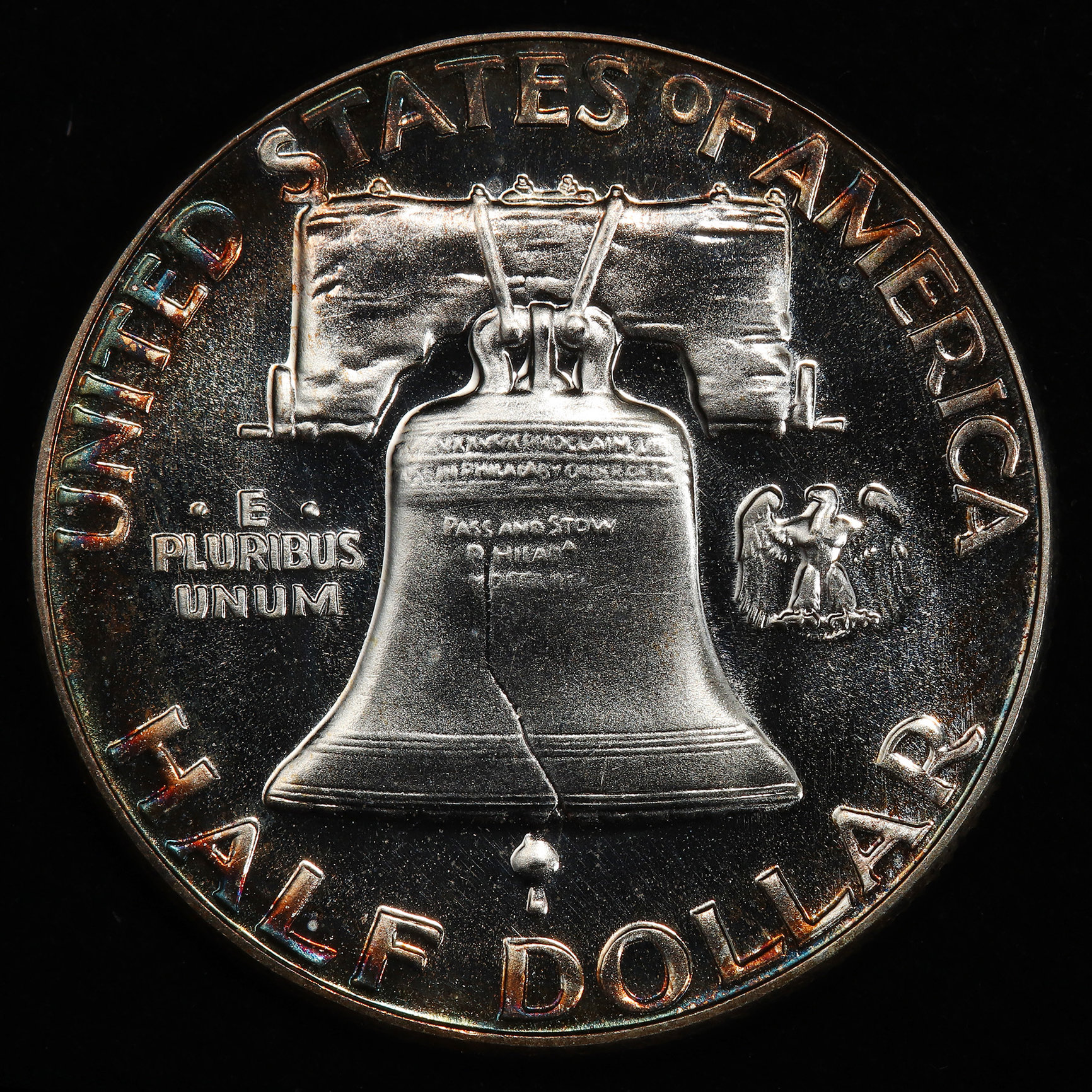
Here's a full color shot, illuminating the surfaces:
Here's half. But like I said it's hard for me to know how to place this in aesthetically pleasing way.
Radiant Collection: Numismatics and Exonumia of the Atomic Age.
https://www.pcgs.com/setregistry/showcase/3232
Coins can look so many different ways based on light angle, etc. It's hard to know which way people will prefer. I usually leave a note for Phil when I submit letting him know what I want highlighted in the pics, and he always does a great job!
The 3rd shot of that half is in my opinion the best representation of the coin. It shows the luster, the fields in good clarity, and the toning. That pic could be framed and hung on the wall as true art.
Bob Sr CEO Fieldtechs
Seeing coins like that frustrate me because Id bet my house that if I submitted it, it would come back questionable toning 10 out of 10 times
My Early Large Cents
That is remarakable. Any one who has tried to take a picture of ANY proof gets it.
WS
Looks awfully familiar to me
Great 3rd shot.
Most likely I would NOT have submitted it for that reason
Got a PF68 dcam though
First let me say I agree with @bobsr that the bottom picture is spectacular. I would guess most people would pick that photograph over the other two. The Franklin reverse shows white proof surfaces as well as rim toning that will be different than the coin above.
The best explanation that I can come up with is this.... The TrueView of the Olympic coin above is two dimensional. It shows the color accurately but there is no depth to the shine. When holding in hand under a lamp, the greens, red, and gold all look like they are backlit and really pop. The same can be said for many other proofs I own that are naturally toned.
I have always assumed that your group uses filtered lights and that took away the luster. Is this correct? To be honest, I'm not sure that we can get to where I am talking about, but the third picture of the Franklin is a vast improvement. Keep in mind this is only the Proof coins I am speaking of. Business strikes and other finishes all seem to be spot on. Just my two cents.
*
*
Those are excellent slab shots ... clearly neutral white balance showing portions of your fingers (as you’d expect them to look in real life) and label coloring (as you’d expect it to look in real life) and background (etc..). Yes with those slab shots you could be 99.9% sure that the toning in-hand would match up.
But perhaps you’d be better off showing more run-of-the mill-color examples to make your larger case. Since in this case the colors are so outrageous, and they’re proofs, so the TrueViews are capturing color/luster very well, too. Or perhaps try illustrating using non-proof color examples. I’m still not sure I agree with you.......very fun examples nonetheless.
Thanks for chiming in !
I for one really like this “half” shot and would love to see more of them.
I remember seeing dozens of these being sold on ebay a few years back all by the same seller. All with those lime green and pinks/blues toning. Lots of ikes and kennedys and other cheaper, modern proof coins. Nice to now see a few making it into holders.