An Abstract Contemporary Cast
 harasha
Posts: 3,113 ✭✭✭✭✭
harasha
Posts: 3,113 ✭✭✭✭✭
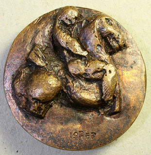
I collect horses on medals, usually without any human interaction, but this cast medal intrigued me. A 1967 choice of the Association for the Art Medal, by a noted artist, Arthur Spronken.
Honors flysis Income beezis Onches nobis Inob keesis
DPOTD
DPOTD
1
Comments
No disrespect, and you know how much I like your taste, but this must be the ugliest medal I’ve laid my eyes on. 😋
PS: Why does it have wear on it and what’s the purpose of an almost identical reverse to the obverse? (I’m guessing that the reverse is a rendition of the original design copied from an ancient design ?)
myEbay
DPOTD 3
It is my understanding that the medal is supposed to show how a rough sketch becomes a finished design. In other words, the subject of the medal is its creation.
DPOTD
Is it bronze? Is it one of a kind? Diameter? Peace Roy
BST: endeavor1967, synchr, kliao, Outhaul, Donttellthewife, U1Chicago, ajaan, mCarney1173, SurfinHi, MWallace, Sandman70gt, mustanggt, Pittstate03, Lazybones, Walkerguy21D, coinandcurrency242 , thebigeng, Collectorcoins, JimTyler, USMarine6, Elkevvo, Coll3ctor, Yorkshireman, CUKevin, ranshdow, CoinHunter4, bennybravo, Centsearcher, braddick, Windycity, ZoidMeister, mirabela, JJM, RichURich, Bullsitter, jmski52, LukeMarshall, coinsarefun, MichaelDixon, NickPatton, ProfLiz, Twobitcollector,Jesbroken oih82w8, DCW
Bronze and 39.8 mm. Unlikely that it is one of a kind. I believe it was available to members of the medal appreciation society rather than to the general public.
DPOTD
It's kinda growing in me. I see a date 1953. What is between the 9 and the 5? Cast in US or where? Anything on the edge? Peace Roy
BST: endeavor1967, synchr, kliao, Outhaul, Donttellthewife, U1Chicago, ajaan, mCarney1173, SurfinHi, MWallace, Sandman70gt, mustanggt, Pittstate03, Lazybones, Walkerguy21D, coinandcurrency242 , thebigeng, Collectorcoins, JimTyler, USMarine6, Elkevvo, Coll3ctor, Yorkshireman, CUKevin, ranshdow, CoinHunter4, bennybravo, Centsearcher, braddick, Windycity, ZoidMeister, mirabela, JJM, RichURich, Bullsitter, jmski52, LukeMarshall, coinsarefun, MichaelDixon, NickPatton, ProfLiz, Twobitcollector,Jesbroken oih82w8, DCW
The numbers are not sharp, but they read 1967. (Actually, that 6 does look more like a 5). I am wondering whether the description is correct. Anyway, this is a Dutch medal and there is nothing on the edge. Finally, I would guess that the mark between the 9 and the 6 (or 5) is the foundry mark. I will see if I can find out more.
DPOTD
I find that a stunningly beautiful medal, and even though the horse be of archaic design, reminds me of the best of all cavalry with man and horse blended as one....And even though millennia and continents away, perhaps evocative of such as the Plains Native Americans once they took to the horse.
Well, just Love coins, period.
Yeah, what 7Jaguars said. Peace Roy
BST: endeavor1967, synchr, kliao, Outhaul, Donttellthewife, U1Chicago, ajaan, mCarney1173, SurfinHi, MWallace, Sandman70gt, mustanggt, Pittstate03, Lazybones, Walkerguy21D, coinandcurrency242 , thebigeng, Collectorcoins, JimTyler, USMarine6, Elkevvo, Coll3ctor, Yorkshireman, CUKevin, ranshdow, CoinHunter4, bennybravo, Centsearcher, braddick, Windycity, ZoidMeister, mirabela, JJM, RichURich, Bullsitter, jmski52, LukeMarshall, coinsarefun, MichaelDixon, NickPatton, ProfLiz, Twobitcollector,Jesbroken oih82w8, DCW
That thing is sort of freakish. but it is very artistic and has a way of growing on you.