Best Of
Re: Please post your Seated Liberty images.
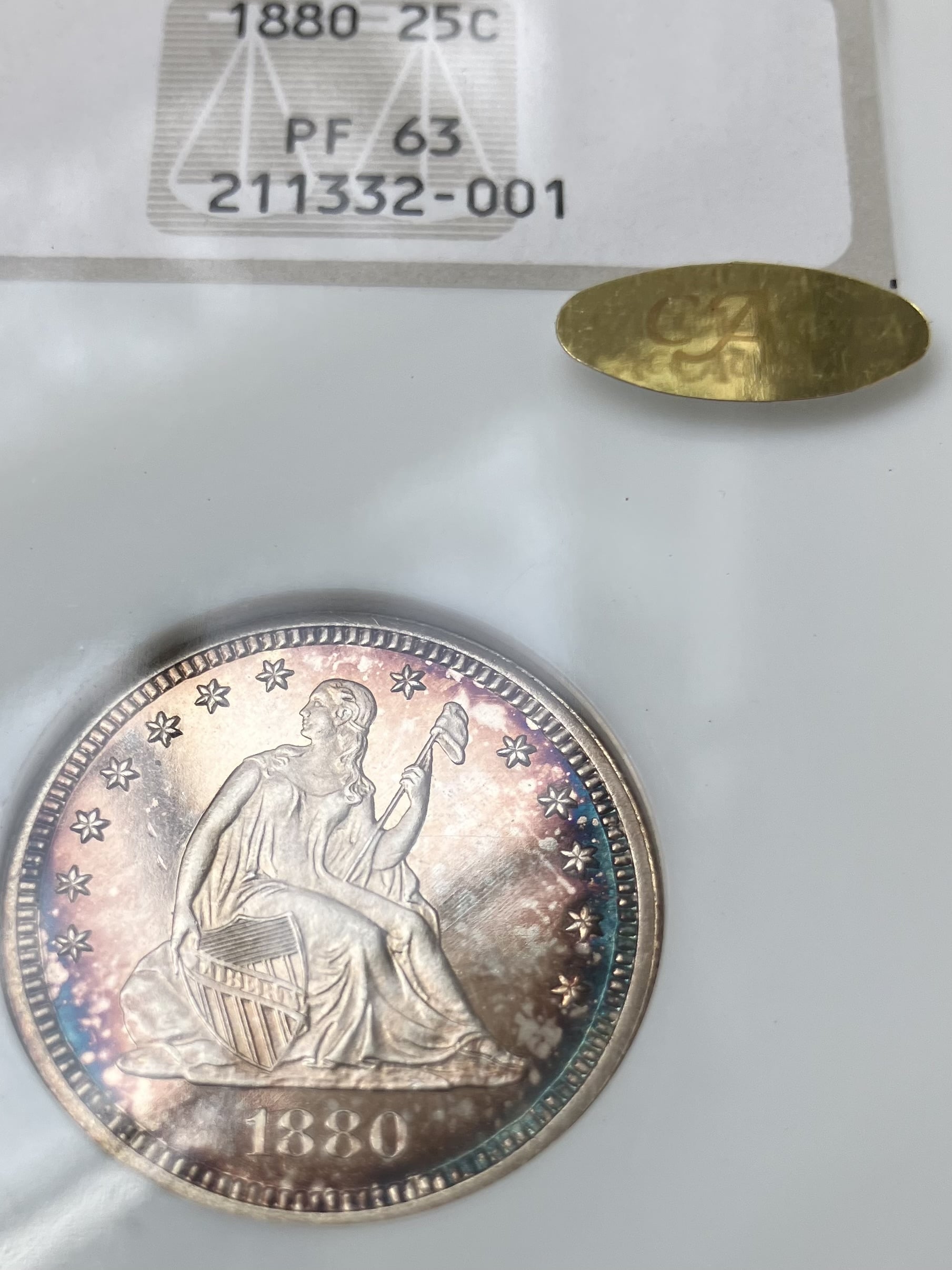
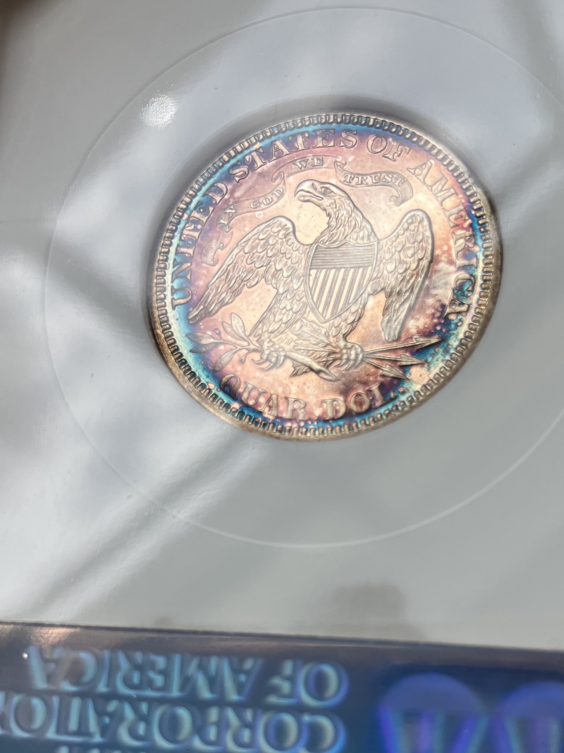
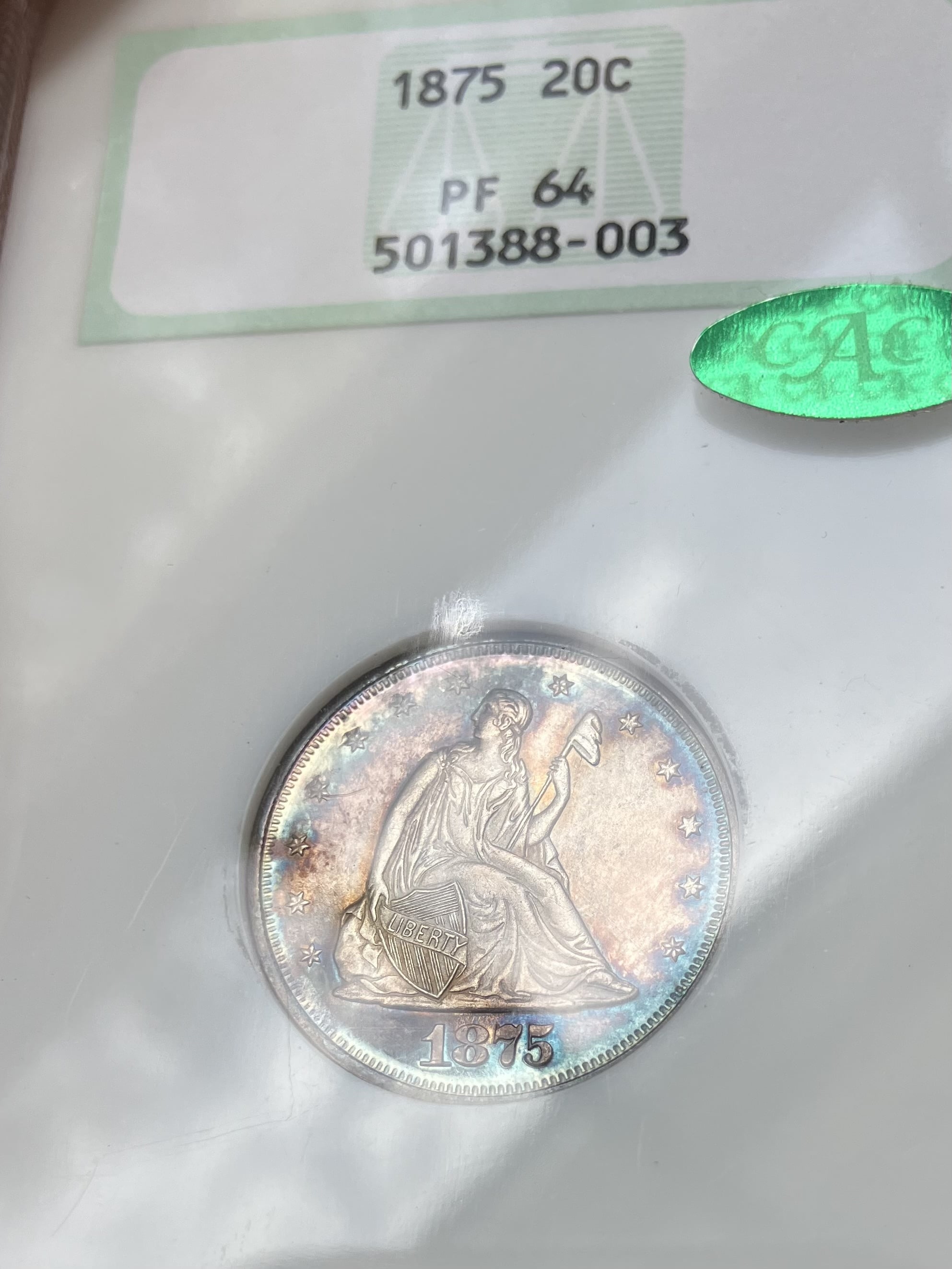
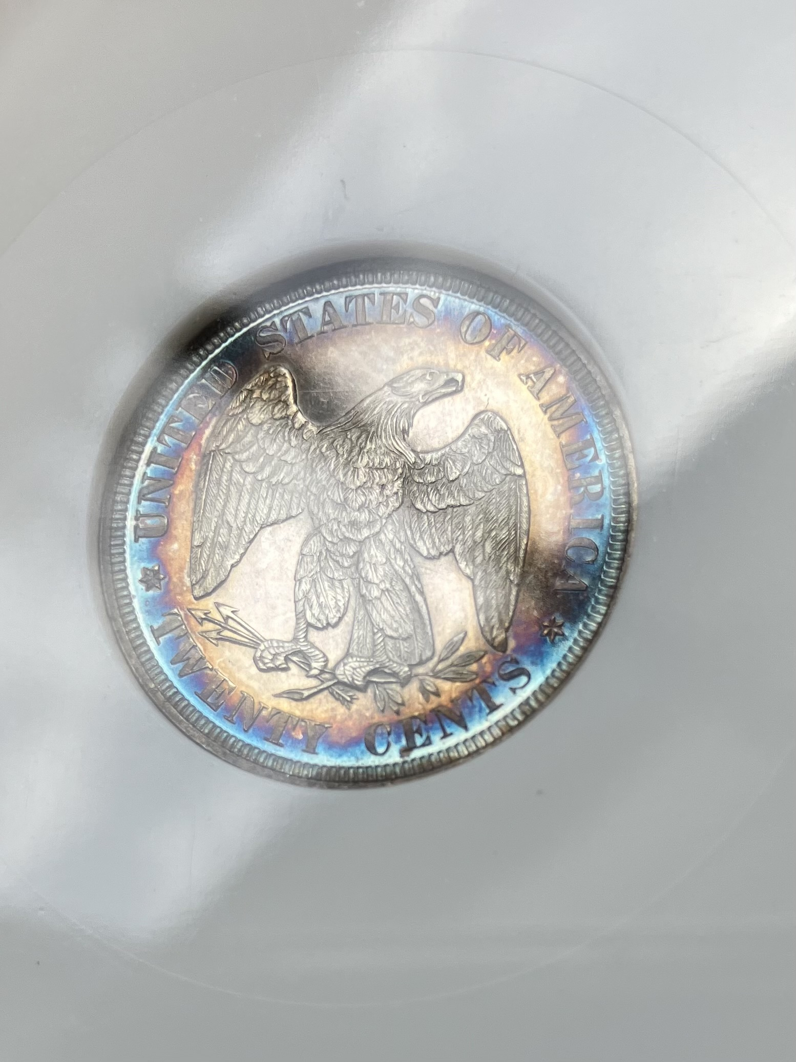
I’ve posted these before but the pics were awful, and I had them out of my SDB so I figured I’d take a few more that highlight the color. The pics are still not very good, ah well.
The fatties are perfect as well.
I like these two a lot.
 GuzziSport


Dealer Day at CSNS
Hi Folks,
So I arrived on Tuesday evening to be prepared for Dealer Day on Wednesday here in Schaumburg. The only remarkable thing about my journey here is first, I got bumped to first class. This happens about 1/3 of the time since there are very few regular flyers coming out of my regional airport. Second, landing in O’Hare on time, but hit a traffic jamb and it took 30 minutes to taxi to the gate. There were two runways being used for takeoffs, I timed it and they were taking off every 75 seconds. On the one closest to us, I counted of 30 planes in the cue waiting for their turn to fly into the big sky. So you can do the math. There must have been close to 100 planes moving in and around O’Hare when we landed. Imagine the job the air and ground traffic controllers have at a big hub. But suffice to say with the hub concept, there are so many planes now that takeoff and landing are going have delays. Hence if I have a connection, I try to have at least 2 hours or more between built in for these delays.
Wednesday at CSNS started out for me going to Heritage lot viewing. I saw about 20 coins to consider and took notes on them. The primary issue for all of them is I expect the bidding to be aggressive, so we will see. That took me to about 10 am, where I hit the bourse during the PNG Day. I went right to the tables of those folks who would have the inventory I was targeting - pre-civil war US coins with eye appeal and CACed. I literally was pulling out every coin from boxes and cases at these tables that fit my criteria. I would then carefully inspect every one in hand and under the lens, split out the no gos, and then get prices for the ones left. Virtually every coin that made my short list was purchased. There were also coins I was searching for, for clients, but alas I did not find a single coin that fit into what they wanted. I was also doing buisness by memoing coins out to dealers where they had clients with interest for a particular coin in my cabinet and handing them over to said dealers. In the end, one fairly expensive coin got sold for me by the dealer at my ask, and when I came around for the second time the dealer handed me a nice fat check. Can’t complain about that.
I also had one to one meetings pre-arranged with several dealers. My liberty seated dollars from XF-AU were a big hit and several picked out ones they wanted to buy. So I started the day with 7 and ended the day with 4, one of which was a trade across for one of mine. I was hoping to have all of these for collectors on Wednesday and I still have a few nice ones but not the whole group to display.
I also had a visit to CRO to pick up 6 coins I bought in advance of the show. 3 were for inventory, 3 were for me. Two of the latter were foreign, a nice big, originally skinned, piece of 18th century gold, and a hanging man Conder Token. My first Conder since buying a white metal Am I not a Brother example from John about a decade ago. Cool. For the 18th century gold piece from another land, I am always amazed how inexpensive these are compared to buying anything US gold. So I am putting together, albeit slowly and about 1 a year, a 1 per country set of 18th century gold. The key is to get something original, not scrubbed and dubbed like the majority are, with an interesting design. A great way to learn about history of that Era.
I went back to the hotel room for noon time to see where I was in terms of newps. I was there for an hour doing the paper work and getting some ready for the cases, until I got texted for another meeting. After that meeting I roamed the floor some more, talked to the folks at CAC, GC, and other friends at tables until 3 pm where PNG day was over and official CSNS Dealer Set Up began. And as seems to be the norm now at shows for me, it took me over 2 hours to get completely setup because Dealers and Early Birds were coming to my table non-stop to peruse my inventory and some to sell. I did buy 4 coins from David Sunshine including a big boy and girl coin (BBGC), that at least for me, are coins over $10K. It was a great exchange. David knew I would want it, I knew he knew I would want it, he had priced it aggressively but fairly and knew I still had some room on this exceedingly rare piece of gold, and although we went back and forth on value and price, the price remained the same throughout the whole process and we both knew that is how it would work out. So now I have this lovely BBGC for my table today, and David and I are both happy about that.
I also sold over a dozen coins in that 3.5 hours I was behind the table including some more expensive ones. And that combined with the pre-sales of seated dollars during the day, and sales committed for pick up today and tomorrow, I have already made my number for sales that I was hoping for here. Can’t complain. So here we are, only through dealer set up, and I have added significant and cool inventory, sold enough coins to meet my sales goals, and the show really hasn’t started. Can’t say I am complaining.
My final stop just before closing was to go over to GFRC to visit with Darrell who was manning the table and see if he had any coins that would fit my inventory. There was, I bought 4 bust halves that fit right in. I was pleased to find that even up to closing GFRC had alot of folks there. Suffice to say that since Matt and Darrell have taken over as GFRC.2 from Gerry (who retired) earlier this year, it is clear that they are thriving and carrying on the excellent numismatic tradition that was the key to success that Gerry built.
Finally, I went to the hotel pub for dinner after 14.5 hours of numismatic activities, had a nice Goose Island Ale, and a chicken pesto flatbread. My Oilers were not on the TV yet, they started later on, so I caught up on world politics instead on the web (yikes). Oilers lost alas, so glad I missed it. On the way out ran into Barry Sunshine and we chatted for about 20 minutes. Alas I wished the timing was better and he had been at the pub to eat same time as me as we would have had probably 2 hours of talking coins. But nevertheless I had a sunny day with father and son Sunshine at different times.
That is it folks, time for the big show to begin about 2 hours from now and we will see how it goes when the public is in the building. Several folks are stopping by to see coins I have held back for them, so let’s get to it. If you are here today, please stop by at Table 609.
Best, DM
 Desert Moon
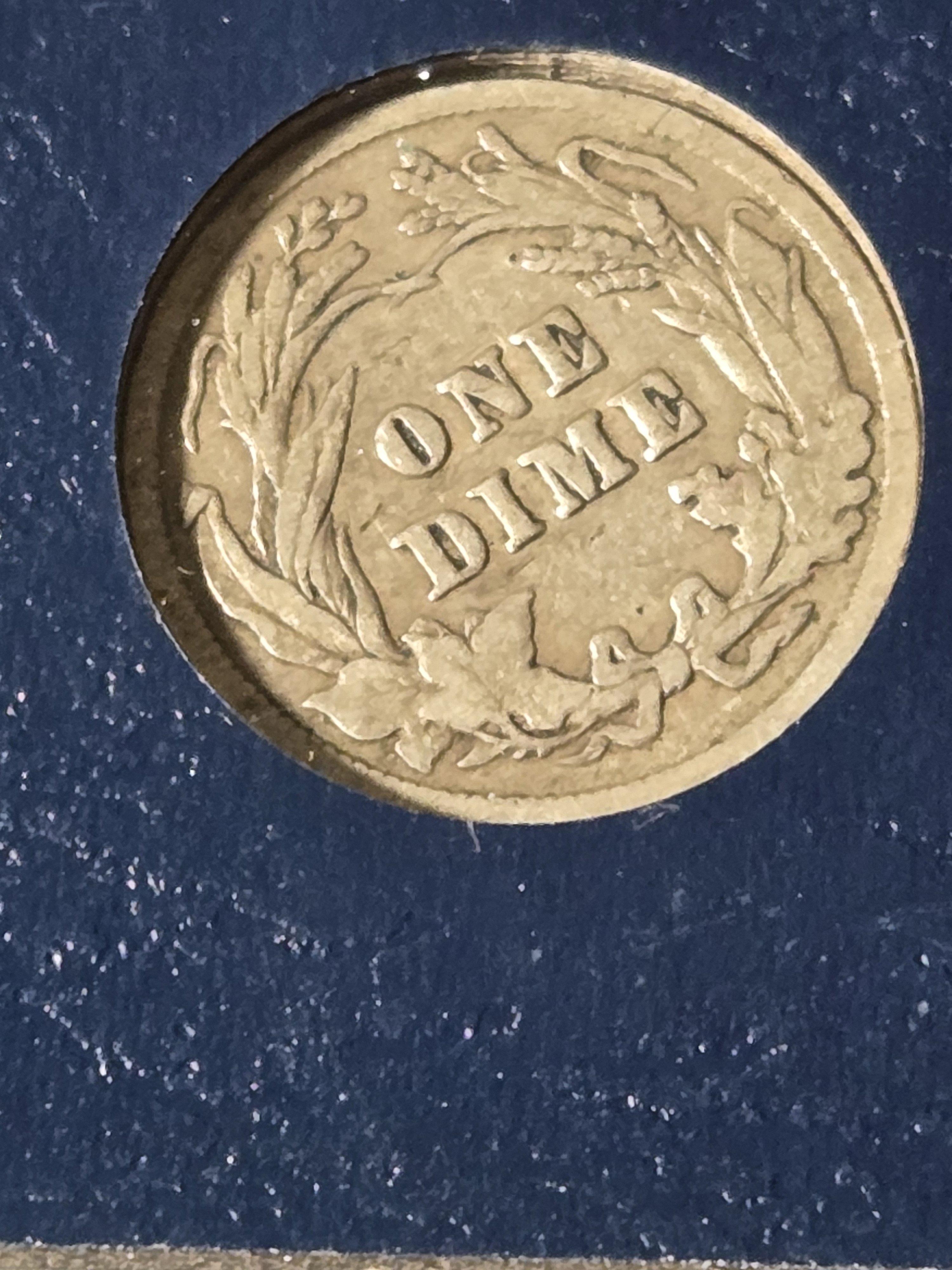
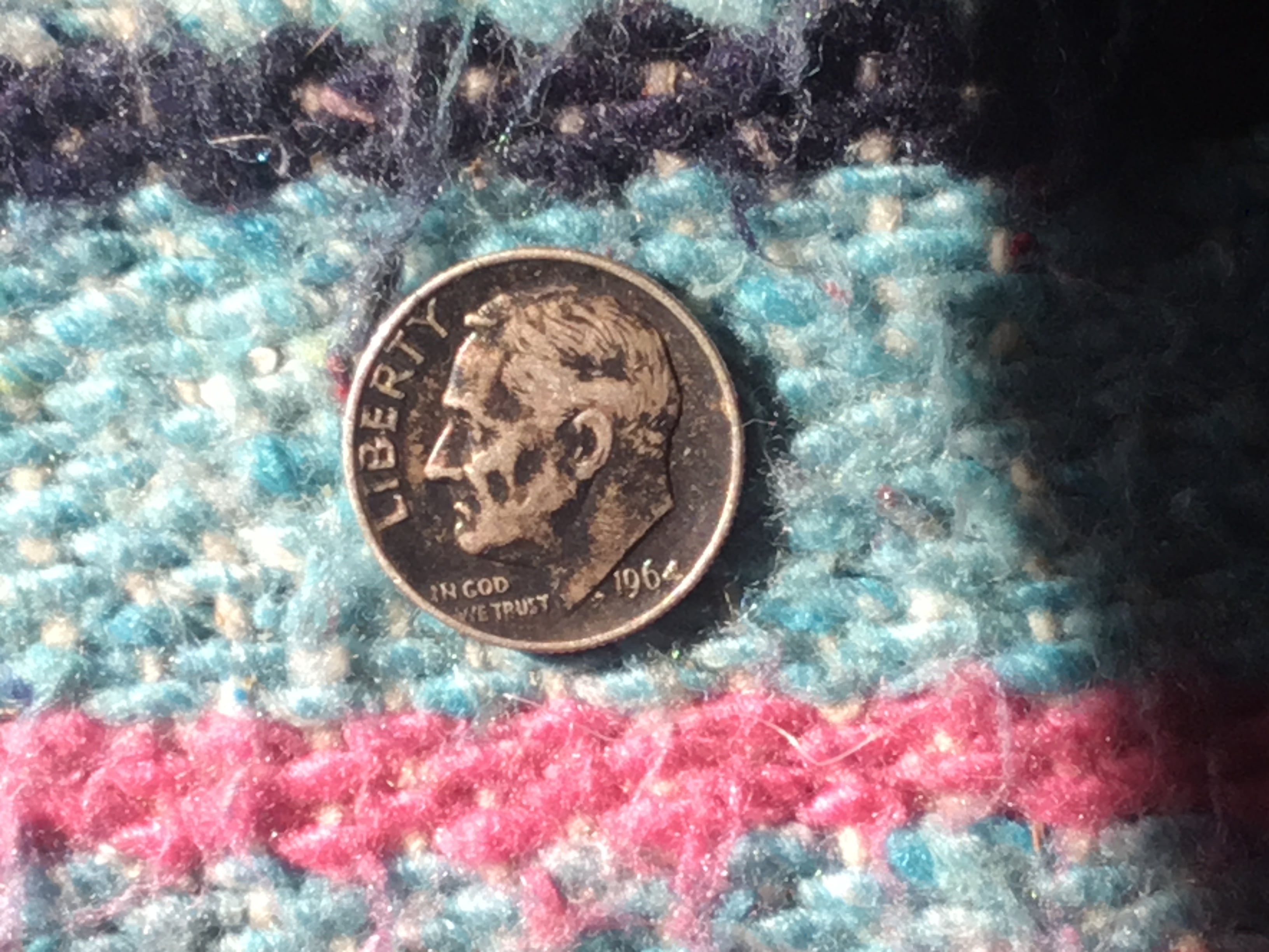
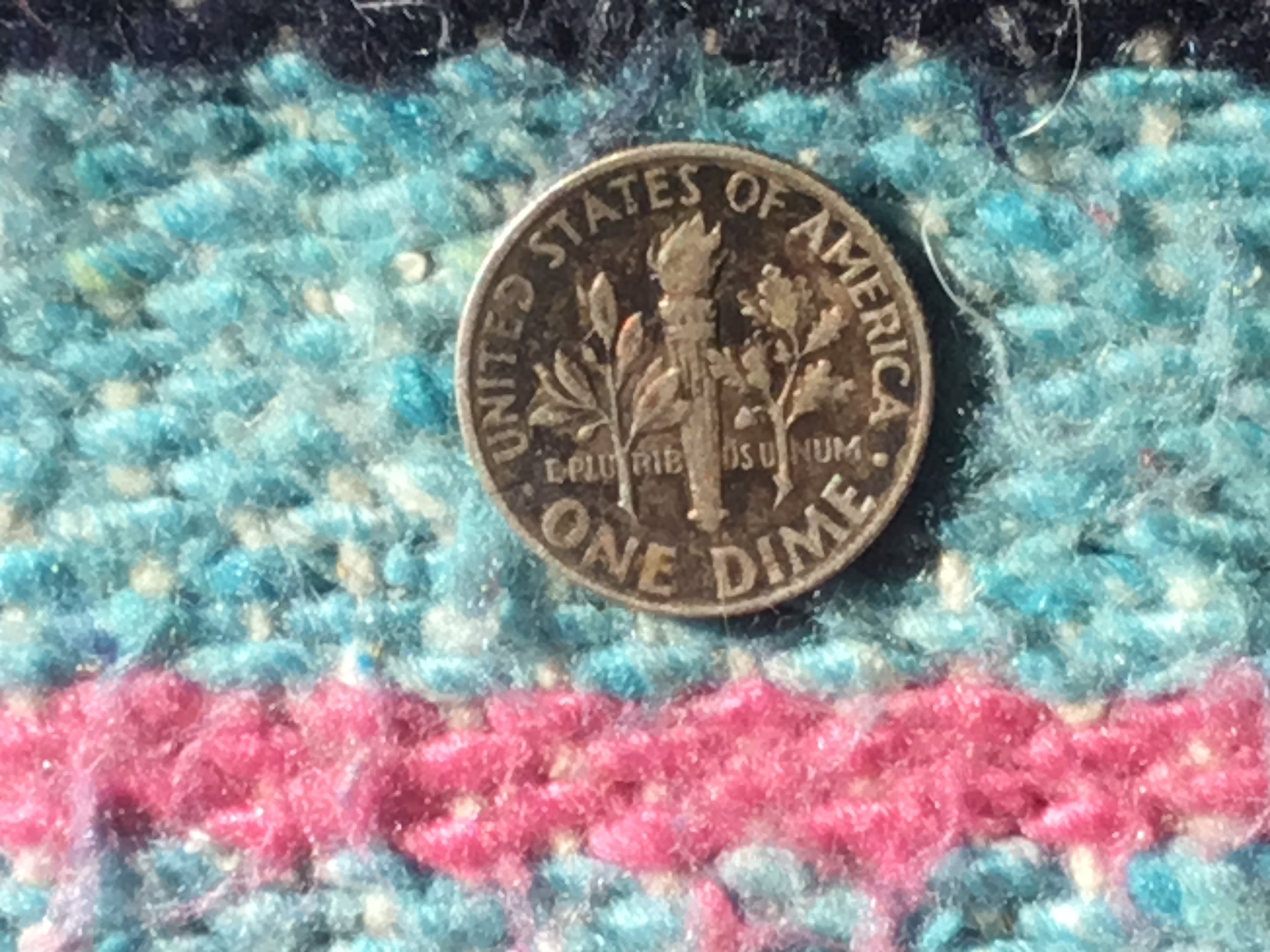
Re: The OFFICIAL COINSTAR FINDS THREAD
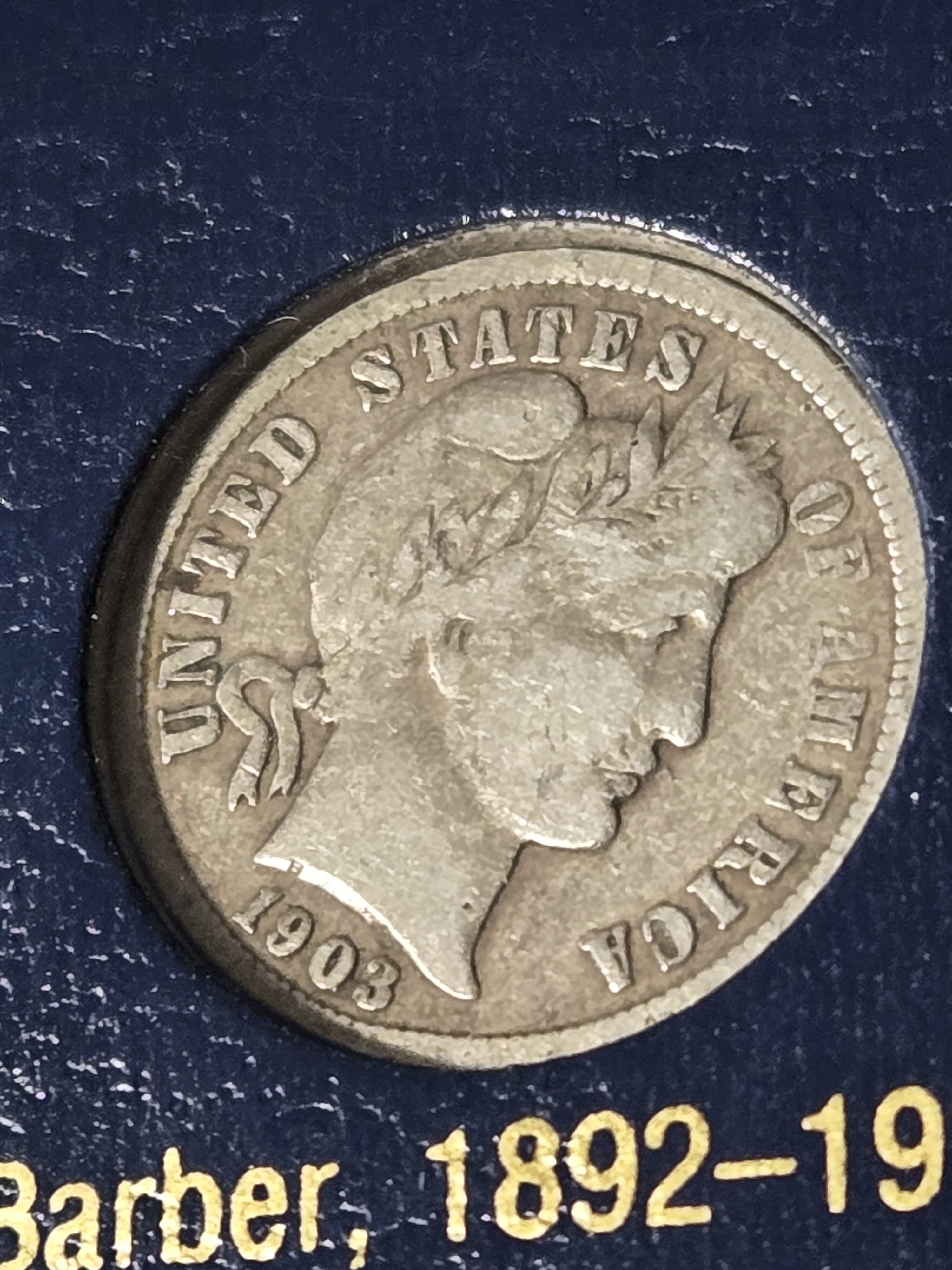
Almost missed this one at the Wal-Mart coin star. At first, I didn't see anything. Then I saw a lone dark coin in the back of the reject slot. I thought that it was a cent. I pulled it out, and saw that it was a dime that appeared to be silver. I wasn't sure though, because I couldn't make out the date. When I got home, I checked it out with my magnifier, and verified that it was a 1964 silver dime. ![]()


Re: Why the 2026 Congratulations set should be a winner
Hopefully the HHL is reinstated before 06 May just like they did for the US Army Privy coin restocking campaign in summer 2025. Can you imagine the marketing disaster for the USM to go and advertise the restocking only to have bots purchase the remaining X units in less than 10 seconds.
