Question for those who collected 1990's baseball cards....
 Kdog08
Posts: 771
Kdog08
Posts: 771
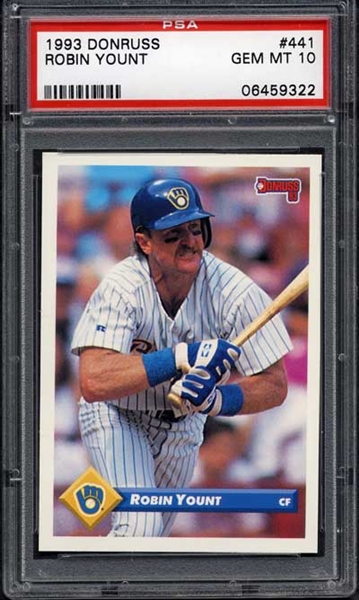
What year was your favorite design? Although it's not worth much and there were not any great cards that came out of the set...I always kinda liked the 93 Donruss. Basic look, nothing special....but I liked it!  Not my card...just showing as example:
0
Comments
Topps White Out (silver) letters Alex Gordon
80 Topps Greg Pryor “No Name"
90 ProSet Dexter Manley error
90 Topps Jeff King Yellow back
1958 Topps Pancho Herrera (no“a”)
81 Topps Art Howe (black smear above hat)
91 D A. Hawkins BC-12 “Pitcher”
My small collection
Want List:
'61 Topps Roy Campanella in PSA 5-7
Cardinal T206 cards
Adam Wainwright GU Jersey
<< <i>Has to be '91 Fleer.
You must have a passion for the color yellow!?
My small collection
Want List:
'61 Topps Roy Campanella in PSA 5-7
Cardinal T206 cards
Adam Wainwright GU Jersey
Who would have thought back then that those sets, with the exception of the Favre RC, would be so incredibly worthless now?
'91 Fleer looks like it was produced using Windows Paint. If you pressed on the side of the packs you could see a black line if an insert was included, neighborhood kids were amazed when my sister and I came back from Revco with 20+ packs all with those painted whimsical satr cards. I thought I had won the lottery at the time.
What a waste the backs were actually cool with the circular color head shot of the player and complete stats for baseball careers.
saucywombat@hotmail.com
There is a distinct lack of color in the cards from the 90's.
but if i had to choose:
<< <i>none - I realize that is not very constructive, but there were few and far between samples of cards that I like from the 1990's.
There is a distict lack of color in the cards from the 90's. >>
Interesting coming from someone who has 3 b/w cards in their signature
<< <i>What year was your favorite design? Although it's not worth much and there were not any great cards that came out of the set...I always kinda liked the 93 Donruss. Basic look, nothing special....but I liked it!
1994 Fleer might be a good candidate for you as well.
saucywombat@hotmail.com
Mike
I would have to go 1991 Stadium Club as well. For oddball sets I guess I will go with the 1991? Denny's Holograms.
Raw: Tony Gonzalez (low #'d cards, and especially 1/1's) and Steve Young.
<< <i>There is a distict lack of color in the cards from the 90's. >>
These are pretty colorful.
1993 Upper Deck Fun Packs
Jeff
Miscut Museum
My Mess
1992 Fleer Ultra was always one of my favorites.
CDsNuts, 1/9/15
<< <i>I don't get the lack of color comment... as there are a ton of colorful sets from the 90's. The Fun Packs that Barfvader posted was one that came to mind right away... along with the 95 Fleer, 90 Topps, 90 Score, 92 Triple Play, 93 Select, etc... I'm sure there's a lot more, but those were just the ones off the top of my head. >>
I didn't get that either but I imagine he more means style..as there was trend in the 90s to do away with borders and the like.
I think most cards went from a four-color press to four-color press plus a second press to add foil and the like.
Raw: Tony Gonzalez (low #'d cards, and especially 1/1's) and Steve Young.
<< <i>1994 Fleer might be a good candidate for you as well. >>
I liked those too. Don't get me wrong...I loved some of the non-bordered cards also. The Stadium Club as mentioned and also these!!!! Though there was not too big of a difference between 1992 and 1993!
1992:
1993:
If any one of the detractors like the 1990's that much - I've got a ton of your "colorful" card to sell you. (I doubt there are any takers)
I think there is a difference between finding a few card with color in the 1990's and actually wanting them.
But it was a question of opinion - so everyone is entitled.
cheers
This is my one all-time fav card:
Kirby Puckett Master Set
Kiss me twice.....let's party.
<< <i>I'm just kidding. I can't stand the '91 Fleer set. Which is ironic because I spent a lot of money on that set in '91.
I bought boxes of that crap, not sure why.
I think hands down 1995 Bowman's Best (I only have a Refractor pic but the base has silver/aluminum backgound), great layout, modern look almost 15 years later, crisp photography, great player selection.
I liked 1993 Donruss BB. Simple and clean and some nice photography. Also liked 91 Stadium Club BB. For some strange reason I always like 1997 Fleer BB but the Ortiz RC is the only meaningful card in that set. As for football, 1996 Bowman's Best was excellent.
My Podcast - Now FEATURED on iTunes
<< <i>Surprised we didn't have a 1994 Finest response yet.
I would have to go 1991 Stadium Club as well. For oddball sets I guess I will go with the 1991? Denny's Holograms. >>
I'd vote 1994 Finest if all the cards had been done in the style of the all-stars and rookies. 1993 Finest All-Stars are up there as well.
The '93 Greg Maddux Finest is very cool especially in the jumbo in its psa slab. (Its the only clue in my living room that a complete nut case lives in the house with his horde of sports cards.)
saucywombat@hotmail.com
Non-baseball, for some weird reason I like the '90-91 Skybox basketball set design. Can't really explain why, I just like it.
The main reason I am posting to this thread is to voice my opinion that 1990 Topps baseball is, hands down, the ugliest, most eye-gougingly painful set of cards ever produced by humans. Twenty years later, I STILL can't believe anyone in a position of power at Topps ever green-lighted that design.
-CDs Nuts, 1/20/14
*1956 Topps baseball- 97.4% complete, 7.24 GPA
*Clemente basic set: 85.0% complete, 7.89 GPA
<< <i>
The main reason I am posting to this thread is to voice my opinion that 1990 Topps baseball is, hands down, the ugliest, most eye-gougingly painful set of cards ever produced by humans. Twenty years later, I STILL can't believe anyone in a position of power at Topps ever green-lighted that design. >>
True story
1992 Ultra is a very pretty set as well.
WTB: 2001 Leaf Rookies & Stars Longevity: Ryan Jensen #/25
Jeff
Miscut Museum
My Mess
D's: 50P,49S,45D+S,43D,41S,40D,39D+S,38D+S,37D+S,36S,35D+S,all 16-34's
Q's: 52S,47S,46S,40S,39S,38S,37D+S,36D+S,35D,34D,32D+S
74T: 241,435,610,654 97 Finest silver: 115,135,139,145,310
73T:31,55,61,62,63,64,65,66,67,68,80,152,165,189,213,235,237,257,341,344,377,379,390,422,433,453,480,497,545,554,563,580,606,613,630
95 Ultra GM Sets: Golden Prospects,HR Kings,On-Base Leaders,Power Plus,RBI Kings,Rising Stars
<< <i>The main reason I am posting to this thread is to voice my opinion that 1990 Topps baseball is, hands down, the ugliest, most eye-gougingly painful set of cards ever produced by humans. Twenty years later, I STILL can't believe anyone in a position of power at Topps ever green-lighted that design. >>
Really? Over '90 or '91 Donruss? I think not.
Like others I think Fleer made some great inserts in the early 90's - especially the Team Leaders and All-Stars in '92 basketball, and '92 All-Pro in Football.
Jeff
Miscut Museum
My Mess
<< <i>I personally LOVE the Fleer/Ultra insert sets from 1992-95. Especially 1994 Fleer/Ultra. >>
The base gold medallions were epic!
I was a big fan of 1997 Ultra, and 1996 and 1997 Fleer, also.
Only an idiot would have a message board signature.
<< <i>1999 Topps Finest, the gold refractors are beautiful! >>
yes they are:
1. 1990 Donruss baseball: I love the all red borders, seriously! The Rated Rookies look especially nice with the classic blue coloring against the red borders.
2. 1990 Fleer Football: A very simple design with white borders, a classy look, I just don't like many cards without borders (like Stadium Club, etc.)
3. 1990 Fleer Football All-Pro inserts: The silver backgrounds look great, and a gem mint card is very pretty!
On the flip side, 1990 Topps Baseball and 1991 Fleer Baseball are pretty awful, and some of the mid-90's Donruss were not so pretty either (ie 1995 or 1996 if I recall without looking it up)...
My eBay Store: Chosen Point's Heroic Diversions eBay Store
<< <i>
>>
I agree, has to be 91 Topps bb
1990 Upper Deck Baseball (All-time favorite Upper Deck design --see the Dave Justice RC or Dale Murphy card for examples -- Hobby history/controversy, $100 Ben McDonald ERROR at release during the peak of the error craze. My only complaint is that there isn't a Frank Thomas RC in it. What a beautiful card that would've been!)
1990-91 Upper Deck French Hockey (Great design. Great photography and the history/controversy behind it is fascinating)
1990 Pro Set Football (Great set overall, loaded with variations, weird promos and it's ERR/COR distribution/collation is still a mystery)
1990 Topps Baseball (I looovve this set! The Ryan tributes are still some of my favorite cards. Many great memories with this product!)
1991 Topps (Great design. Great photography and it's a variation collector's dream set)
1991 Stadium Club (The set that taught me where the hobby-poverty line was and just how far below it I was)
Honorables:
1993 Upper Deck Star Rookies subset
1997 Upper Deck Griffey's Hot List
1993 S.P. Platinum Power
Collecting Robin Ventura and Matt Luke.
<< <i>+1 for 91 Stadium.
This is my one all-time fav card:
I agree
https://www.psacard.com/psasetregistry/pdub1819/othersets/6204