Really cool toning on my new 1972 Canadian Voyageur
 MEJ7070
Posts: 870 ✭✭✭✭✭
MEJ7070
Posts: 870 ✭✭✭✭✭
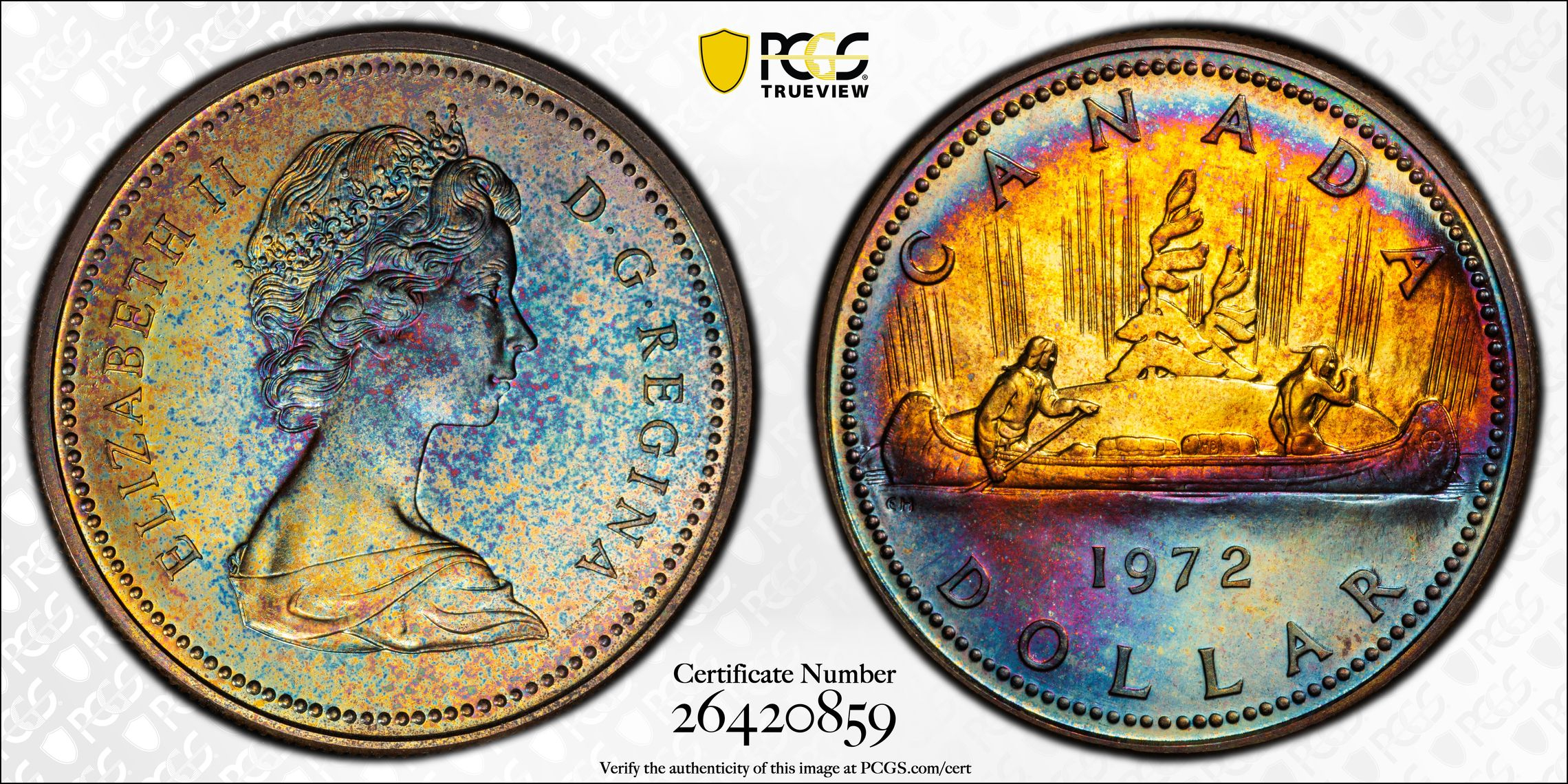
Some of the neatest toning I’ve ever seen on one of these. Somehow the blue turns to gold right at the water line, and the rainbow coloration at the top rim really accentuates the portrait.
One of those coins I had to have as soon as I saw it!
8
Comments
That's very attractive!
Several years ago, I started following someone on Instagram who posts lots of Canadian coins from the last 100 or so years. I have really come to appreciate many of the designs and the some of the more toned examples are beautiful like this one!
Beautiful coin!
Peace
Did yours come out of an RCM clamshell case? I've seen a number of wildly toned coins that came out of those cases with a foam insert.
Canada 1971, 1972 and 1973 have lots of nicely toned coins because of the foam insert.
I've owned many of the Canadian cased dollars. 1972 has the best toning of the three. The OPs coin is one of the nicest I've seen.
DPOTD-3
'Emancipate yourselves from mental slavery'
CU #3245 B.N.A. #428
Don
I would absolutely suspect so, but I can’t say with certainty since I purchased the coin after it had been graded by PCGS. However, the toning pattern here is obviously quite unique and not the standard rainbow coloration starting at the rims and progressing into the center of the coin over time that is often seen on these. So while the odds are that this coin saw significant time inside its original RCM clamshell, I really can’t be 100% sure.
I’ve owned a few of these and agree with both @jt88 and @ajaan. Have to say that this particular specimen is my favorite. Not sure a prettier portrait could be painted into the coins’ reverse side…..much less somehow toned.
Very neat coin! Here's another colorful Canada/British Columbia
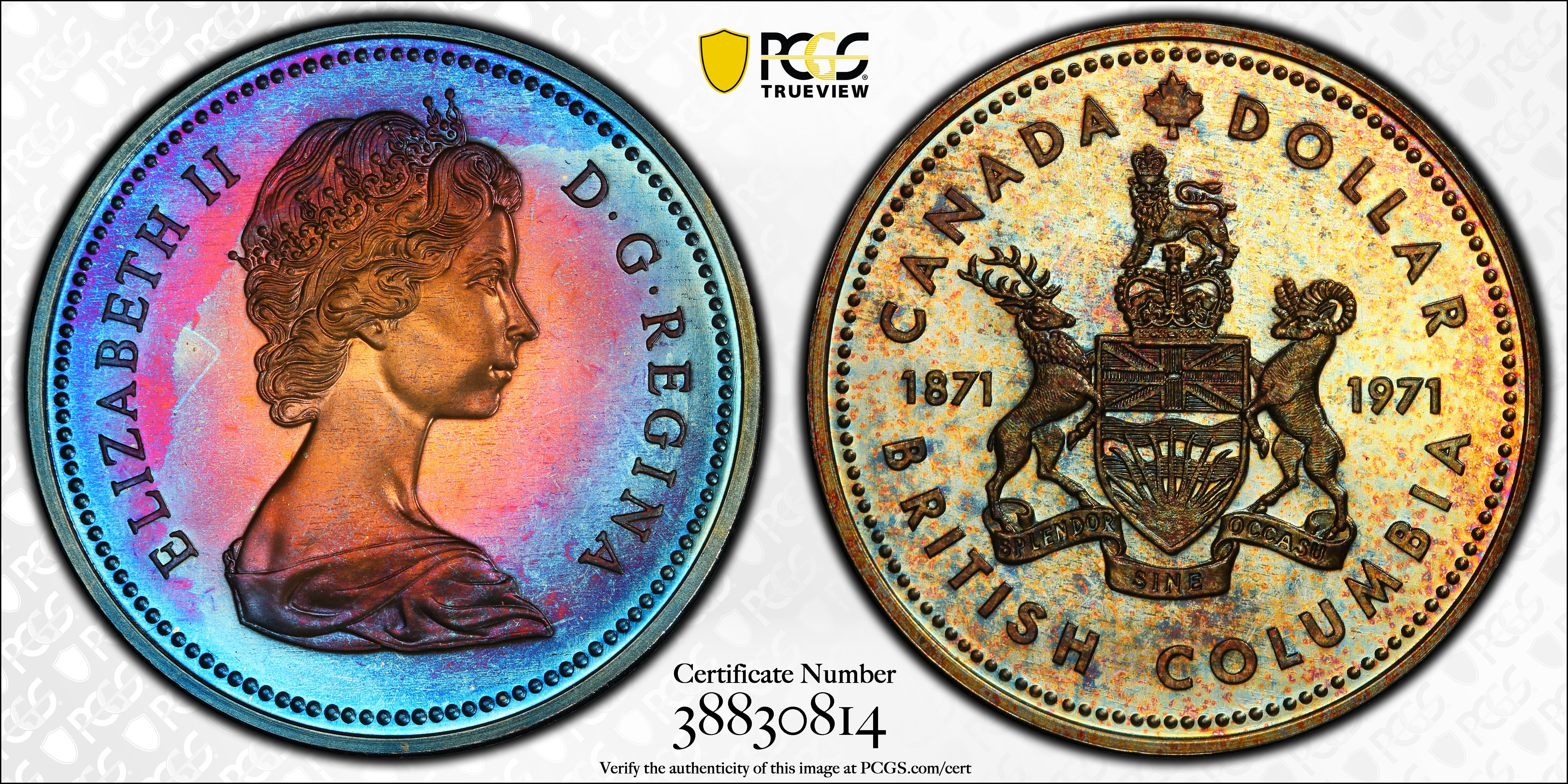
This is the one I like a lot.
The blue compliments the water and the yellow accentuates the sun rays. Very nice pickup.